We all know quantitative easing devalues the Dollar but contrary to that general statement it looks as though we could see the dollar index continue to rise for a few more weeks.
If we analyze the chart of the Dollar ETF (UUP) it is clear that the short term momentum has turned up. The break above the down trend line and recent bounce off support bodes well for the dollar index.
The bull flag chart pattern that has formed in the past month has a measured move price target of roughly $22.30. The level also happens to be a key pivot point on the chart along with high volume resistance.
I expect the dollar to continue to work its way higher over the next week or two with $22.30 being the line in the sand where sellers will jump on price and drive it back down, or at minimum force price to consolidate for a few days.
US Dollar ETF Trading Strategy – Daily Chart Analysis
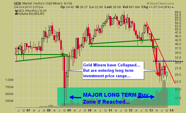
A couple weeks ago I posted these same charts talking about the pending breakout (in either direction) with silver, gold and mining stocks. Fast forwarding to this week its clear this sector continues its struggle to rally. Key support levels are now being tested and if these levels fail prepare for a sharp correction with mining stocks showing the most downside potential of roughly 25% for the GDX ETF trading fund.
Let’s take a quick look at what is going on.
Gold Trading Chart:
The chart of gold shows price being wedge into the apex of the down sloping resistance trend line and the rising support trendline. Gold was trading below this level but has since bounced. But if gold closes the week below this line in the sand the price could start to fall quickly and test the $1200 per ounce within a week or two.
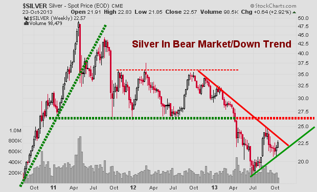
Silver Trading Chart:
Silver is under performing gold and trading below its support level currently. If silver does not recover by Friday’s closing bell then things could get ugly for a few weeks as investors start to exit their positions. That being said, I need to point out that silver is more of a wild card when using trend lines like this. Both gold and gold miners should be confirming this breakdown in silver if it is the real deal.
Gold Mining Stocks ETF:
The chart of gold miners I like the most. I like it because it’s pointing to lower prices, roughly 25% lower if the breakdown takes place. Gold mining stocks could be a fantastic long term investment if we see the $17.50 level reached on this GDX etf.
Last week I talked about ETF trading strategies and the big picture on gold, silver, miners and bonds. They look to be nearing a major bottom and once they do bottom it should be a great buying opportunity for specific stocks or the entire sector.
The next few weeks are going to be crucial for precious metals and we will keep an eye on them as this bottom unfolds. Get more reports like this here: www.GoldAndOilGuy.com
Chris Vermeulen
http://www.thegoldandoilguy.com/wp-content/uploads/2014/11/tgaoglogo.png00adminhttp://www.thegoldandoilguy.com/wp-content/uploads/2014/11/tgaoglogo.pngadmin2013-11-18 16:23:472013-11-18 16:23:47Silver, Gold & Miners About To Sell Off Again
Stock market continue its momentum from yesterday but struggled to climb. More weak comments from Fed Chair nominee Janet Yellen suggested that she would likely see QE continue for a while to help the US economy get back up on its feet.
QE liquidity has been one of the main forces driving the stock rally over the past year and today was no exception. The Dow and S&P broke out to new highs while the NASDAQ lagged a bit weighed down by Cisco’s poor earnings numbers. Gold and silver also rebounded today but with falling gold demand, it still has work to do to convince traders this is more than just a dead cat bounce.
Retailer Nordstrom beat expected earnings, which offset Wal-Mart’s disappointment numbers this morning. This news, along with Macy’s and JC Penney’s numbers suggest that high-end retailers are starting to outperform discounters, a sign on increasing consumer spending and an improving economy.
A Canadian magazine I read today shows that 91% of Canadian startup companies are planning to hire more staff in the 2014. That is very encouraging numbers…
ETF Trading Strategies video analysis and forecasts
SP500, gold, silver, oil, natural gas, bonds & the dollar index
This video provides insight on current trend and some new big trends likely to unfold early in 2014. With the proper ETF trading strategies we will be able to profit from both rising and falling market conditions.
My Stock market trend analysis is likely different from what you think is about to unfold. Keep an open mind as this is just showing you both sides of the coin from a technical stand point. Remember, the market likes to trend in the direction which causes the most investor pain.
Since the stock market bottom in 2009 equities has been rising which is great, but this train could be setting up to do the unthinkable. What do I mean? Well, let’s take a look at the two possible outcomes.
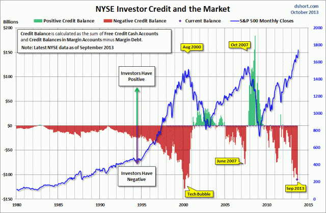
The Bear Market Trend & Investor Negative Credit
The S&P500 has been forming a large broadening formation over the last 13 years. The recent run to new highs and record amounts of money being borrowed to buy stocks on margin has me skeptical about prices continuing higher.
Take a look at the chart below which I found on the ZeroHedge website last week. This chart shows the SP500 index relative to positive and negative investor credit balances. As you can see we are starting to reach some extreme leverage again on the stock market. I do feel we are close to a strong correction or possible bear market, but we must remember that a correction may be all we get. It does not take much for this type of borrowed money to be washed clean and removed. A simple 2-6 week correction will do this and then stocks will be free to continue higher.
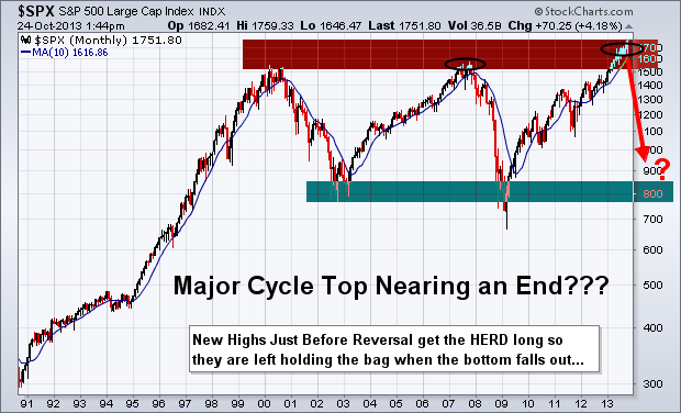
Monthly Bearish Trend Outlook
Below you can see the simple logical move that should occur next for stocks based on the average bull market lasts four years (it has been four years) and the fact the negative credit is so high again.
Also, poor earnings continue to be released for many individual names across all sectors of the market. While corporate profits may be holding up or growing in some of the big name stocks, revenues are not. This means the big guys are simply laying off workers and cutting costs still.
Overall the stock market is entering its strongest period of the year. So things could get choppy here with strong up and down days until Jan. After that stocks could start to top out and eventually confirm a down trend. Keep in mind, major market tops are a process. They take 6-12 months to form so do not think this is a simple short trade. The market will be choppy until a confirmed down trend is in place.
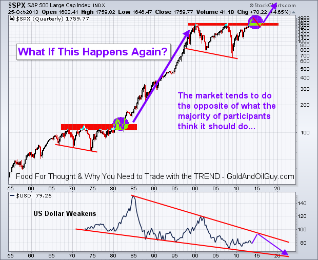
Monthly BULLISH Trend Outlook
This scenario is the least likely one floating around market participant’s minds. It just does not seem possible with the global issues trying to be resolved. With the Federal Reserve continuing to print tens of billions of dollars each month inflating the stocks market this bullish scenario has some legs to stand on and makes for the perfect “Wall of Worry” for stocks to climb.
The US dollar is likely to continue falling in the long run, but I do not think it will collapse. Instead, it will likely grind lower and trade almost in a sideways pattern for years to come.
Major Stock Market Trend Conclusion:
In summary, I remain bullish with the trend, but once price and the technical indicators confirm a down trend I will happily jump ships and take advantage of lower prices.
Remember, this is big picture stuff using Monthly and quarterly charts. So these plays will take some time to unfold and within these larger moves are many shorter term opportunities that we will be trading regardless of which direction the market is trending. As active traders and investors we will profit either way.
Traders and investors all around the world is having trouble climbing over the wall of worry/fear with the US stock market, and rightly so. There is a lot of things taking place and unfolding that carry a high level of uncertainty. Let’s face it, who wants to invest money into the market when it’s hard to come by (high unemployment, banks are still extremely tight with their money, companies are nowhere near wanting to hiring new staff).
The hard pill to swallow is the fact that the stock market loves to rise when uncertainty is high. It’s almost doing it just to drive investor’s nuts who sold out near market bottom or recent correction. You must overcome the urge to short the market when the economy looks so bearish in the years ahead, and continue to trade with the trend.
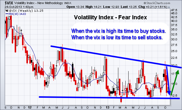
Short Term Investing – Weekly Volatility Index Chart
Below you can see the fear index. The chart is self-explanatory showing where it should move next. But if you are not familiar with the VIX then here is definition by investopedia:
“The first VIX, introduced by the CBOE in 1993, was a weighted measure of the implied volatility of eight S&P 100 at-the-money put and call options. Ten years later, it expanded to use options based on a broader index, the S&P 500, which allows for a more accurate view of investors’ expectations on future market volatility. VIX values greater than 30 are generally associated with a large amount of volatility as a result of investor fear or uncertainty, while values below 20 generally correspond to less stressful, even complacent, times in the markets.”
Weekly Investing Chart of the SP500 Index
After reviewing the VIX chart above which points to stocks nearing a level of selling pressure, then review the chart below we come to a conclusion that a minor pullback of 2-5% is likely to take place in the next week ortwo.
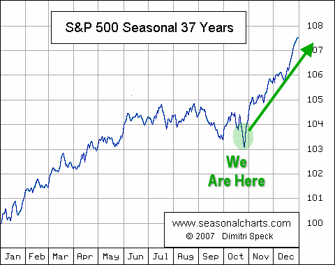
The divergence in the Relative Strength Index is a bearish sign for the broad market. While I feel a pullback is do and needed for the market to regroup, it is important to review the seasonality chart and know that we are entering one the strongest times of the year for stocks.
SP500 Seasonality Chart
Again, using the data from the previous two charts along with this graph clearly shows that a pullback in the stocks is likely going to be bought back up by the brave investors willing to override their fear and go with the trend. For more interesting charts check out my stock chartlists: https://stockcharts.com/public/1992897
The Wall Of Worry Conclusion:
In short, expect the stock market to correct in the next week or two. But once we get a correction of two percent or more, be prepared for buyers to step back in and buy things up into year end.
http://www.thegoldandoilguy.com/wp-content/uploads/2014/11/tgaoglogo.png00adminhttp://www.thegoldandoilguy.com/wp-content/uploads/2014/11/tgaoglogo.pngadmin2013-10-25 07:02:212014-03-04 13:59:26The Great American Wall Of Worry – US Stock Market
The precious metal market has been stuck in a strong down trend since 2012. But the recent chart, volume and technical analysis is starting to show some signs that a bottom may have already taken place.
This report focused on the weekly and monthly charts which allow us to see the bigger picture of where the precious metals sector stands in terms of its trend.
This chart clearly shows the trends which gold has gone through in the last three years. With simple technical analysis trend lines, clearly price is nearing a significant apex which will result in a strong breakout in either direction.
Remember, this is the weekly chart, so we could still have another month or three of sideways chatter to work through. But a breakout in either direction will trigger a large move.
Silver Spot Price – Weekly Chart
Silver is also stuck in a similar pattern. Currently the odds still favors lower prices and for the upper resistance trend line to reject price and send it lower. But if we keep out eye on the leading indicators like gold miners, we may be able to catch a breakout or traded the rejection of resistance in the next month or so.
Gold Mining Stock ETF – Monthly Chart
Gold miners have a very sloppy looking chart. Price is extremely volatile and the recent price action in 2013 could go either way VERY quickly. I have a gut feeling GDX in the coming months could have a washout bottom and tag the $20 price level. While I hope I am wrong for many investors sake, if it does happen, it will be a very strong investment level to accumulate a position.
Precious Metals Bigger Picture Outlook:
In short, I remain neutral – bearish for this sector. In the next 1-3 months we are likely to see some strong price action which will be great. We need a breakout or bottoming pattern to form before we get involved at this level.
I know everyone is dying to get involved in precious metals again for another huge rally… but sometimes it’s just best to wait for the big picture chart to catch up with your bias before taking a position of size.
Get My Free Weekly Trading Sector Reports
Delivered To Your Inbox: www.GoldAndOilGuy.com
http://www.thegoldandoilguy.com/wp-content/uploads/2014/11/tgaoglogo.png00adminhttp://www.thegoldandoilguy.com/wp-content/uploads/2014/11/tgaoglogo.pngadmin2013-10-24 14:56:192014-03-04 14:05:43Precious Metals: Gold, Silver and Miners Are Trapped
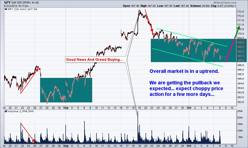
Last week on October 8th the financial market experienced a broad based sell off. Every sector was down with utilities being the only exception.
The individual leadership stocks, which are typically small to mid-cap companies (IWM – Russell 2K) that have a strong history and outlook of earnings growth, were hit hard as well.
Whenever the broad market experiences a price correction, one of the most important factors I analyze is how well leading stocks hold up and show relative strength to the broad market.
So, where does this leave us going forward?
When stocks that have been leading the market higher and only pausing during market corrections in the S&P500, Dow, and NASDAQ, it’s a positive sign. This tells us investors and big money continues to flow into the risk on assets (stocks).
Conversely, when these leading stocks/sectors begin succumbing to the selling pressure of the broad market, it quickly grabs my attention and tells us it’s time to be aware that a major top may be forming.
It looks as though the broad market rally is just barely hanging on. If the leading stocks and sectors begin breaking below their 50-day moving averages, my proprietary SP500 Market Timing & Trading System will shift to sell mode and things could get ugly for those who do not know how to trade a bear market.
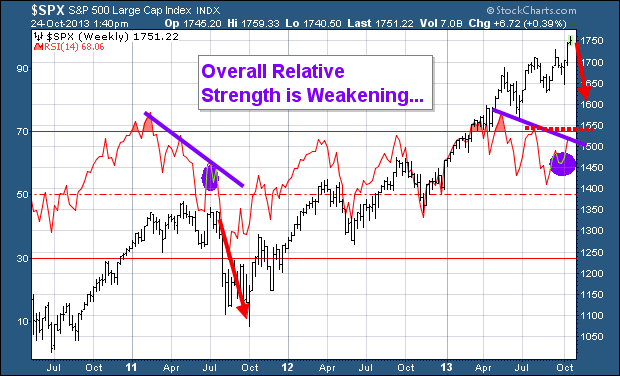
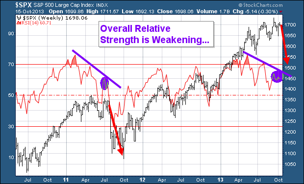
This chart has two important things I would like to point out. First is the fact that the RSI has being overbought twice in the past three years with the most recent one taking place a few months ago. The last time this took place the SP500 had a very strong correction.
The second insight the RSI is providing us with is the diverging price and relative strength as shown with the purple lines on the chart below. This is telling us that the power/momentum behind the market is slowing.
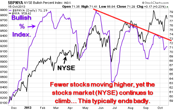
Daily Bullish Percent Index – Shows Negative Divergence
I always prefer to watch and analyze the NYSE as it’s the big board where all the HUGE money is flowing from traders and investors. The chart below clearly shows that less stocks are moving higher as seen with the purple bullish percent index line. With less stocks making new highs, yet the stock market continues to climb this is a warning sign that this bull market is slowly running out of steam.
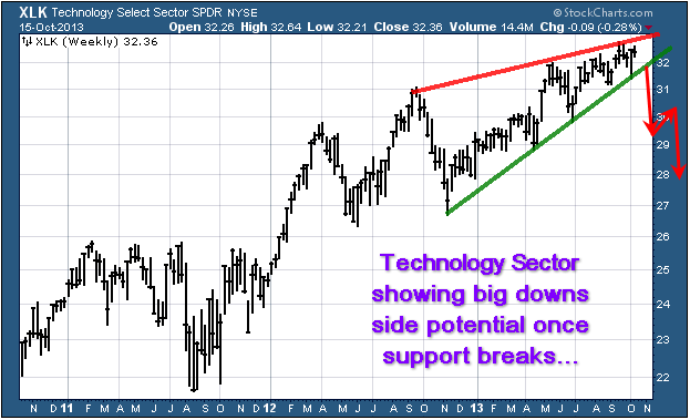
Technology & Financial Sector Are Rising But For How Long?
Two very powerful sectors are holding up well but once they start to breakdown from these chart patterns things could get ugly real quick. Our 3x ETF trading newsletter becomes very active in bear markets as the upside potential is much larger.
The XLK technology sector looks to be forming a bearish rising wedge. If/once it starts to slide it will have a strong impact on the broad market.
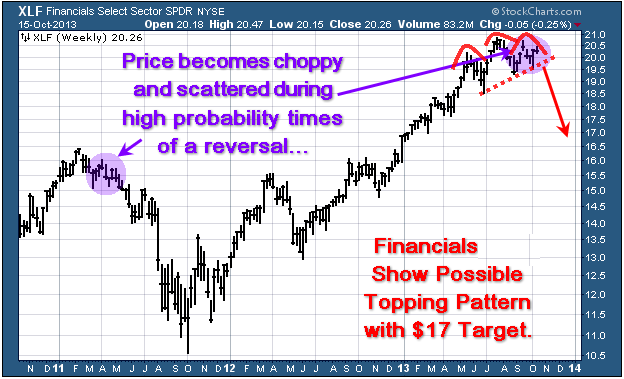
Financial Sector XLF
The recent price action of scattered trading ranges looks to be similar to the top we saw in 2011. If this is the case then we have bearish head & shoulders pattern with a rising neckline forming. Once price breaks through the neck line we should expect sharp drop in price.
This sector is heavily weighted in the SP500 so if it start to drop, expect the SP500 to fall with it.
Major Market Top Lurking…
The chart below pointing out the next bear market likely to take place is a scary looking chart to most individuals. But if you know what you are doing, they can provide more profits in a shorter period of time than a four year bull market.
If this market is starting to stall out and is in the process of forming a top. Keep in mind that market tops are a process. They take typically 3-6 months to form before a true breakdown occurs and the bear market starts. And until then, price will be choppy and difficult to trade.
Cautious Trading Conclusion:
In short, this report shows you some major divergences in the financial market. Remember, you do not really trade off divergences, as they are not good at timing. They are simply a warning sign telling us that something large is brewing and that risk is higher than normal.
There are few ETFs I like on various sectors and commodities that show some oversized upside potential in the coming weeks/months. Depending on what takes place in Washington this week will move the market and likely trigger some sharp moves. Until then, sitting tight is the safe play.
http://www.thegoldandoilguy.com/wp-content/uploads/2014/11/tgaoglogo.png00adminhttp://www.thegoldandoilguy.com/wp-content/uploads/2014/11/tgaoglogo.pngadmin2013-10-15 20:37:272014-03-04 14:45:49Why Investors Must Be Cautious At These Prices
While the indexes continue to sputter on news out of Washington, we continue to focus on the charts and trade with the trend and what we see.
Understandably, several concerned subscribers have e-mailed me to get my thoughts on how we would handle such news.
As usual, the media is playing with human emotions – Fear. As talked about before, fear in my opinion the most powerful emotion and force in the financial market. So when true fear hits the country it will be clear to see, but right now, investors are in no rush to sell their positions in stocks just yet.
If our leaders fail to come to some agreement in the next couple weeks the question many want to know is
How Will We Trade This Event/News?
The answer: we ignore it. Though we could reduce position sizes to be safe when the time comes on Oct 17th.
During most bull markets, there is typically a “wall of worry” to traders and investors climb. The details are different every time, but there are usually one or two major “risk factors” that investors worry about when the broad market is trending higher.
Traders and investors who focus on doom and gloom headlines are more than likely to be shaken out of their long positions…especially those who lack conviction in their trading system.
Conversely, I focus on individual price and volume action of leading sectors and ETFs.
Holding long positions through market corrections is never easy, but it is NOT our job to decide when a trend is over.
If we approach trading with a clear and objective mindset, the stock market will always tell us what to do, based on the price, cycles and volume action. If our ETF positions sell off to trigger our protective stops, we will simply be forced into 100% cash position.
The beauty of such a rule-based trading is that it removes some human emotion and guesswork from trading.
This increases our long-term trading success, and the added benefit of being calmer and stress-free, regardless of what is happening in the stock market.
Trading Plans…
If you are new to swing trading, or have had little success in the past with trading, it is a great idea to get in the habit of planning your trades (trading rules) and trading your plan.
You must continually try to identify all potential outcomes before entering a trade.
If you do, then you should not be surprised when price moves because you realize that anything is possible, and you have already accounted for it and used proper position management to protect capital and lock in partial gains.
Trading with rules allows you to prepare and worry before the trade takes place, so that you can focus on executing the plan when the time comes.
Above all, focus on the price, momentum and volume action, rather than the amount of profit or loss a trade is showing in your account.
If you focus on proven trading rules and execution, consistent trading profits will eventually and inevitably follow.
http://www.thegoldandoilguy.com/wp-content/uploads/2014/11/tgaoglogo.png00adminhttp://www.thegoldandoilguy.com/wp-content/uploads/2014/11/tgaoglogo.pngadmin2013-10-08 10:33:532014-03-04 14:38:06Indexes continue to sputter on news out of Washington
Watch Chris Vermeulen run through the markets in pre-market trading live and how he applies technical analysis to spot new trades, trends and market sentiment…
http://www.thegoldandoilguy.com/wp-content/uploads/2014/11/tgaoglogo.png00adminhttp://www.thegoldandoilguy.com/wp-content/uploads/2014/11/tgaoglogo.pngadmin2013-08-30 09:15:392013-08-30 09:15:39Learn How To Be A Technical Analyst in 14 Minutes
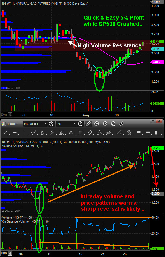
During the last couple weeks the SP500 index has been taking a beating leaving many traders left holding the bag at high prices.
Fortunately, I cover several different investments so we when one is not giving us a trade, another one should be.
Taking a look at the technical analyst trading charts below you will see how a simple reversal candle coupled with volume can generate low risk and highly effective trades that move in your favor quickly.
If you want to learn how to read and trade the charts like a pro, be sure to join my daily video analysis newsletter which is jam packed with trading education and tradable ideas each day.
http://www.thegoldandoilguy.com/wp-content/uploads/2014/11/tgaoglogo.png00adminhttp://www.thegoldandoilguy.com/wp-content/uploads/2014/11/tgaoglogo.pngadmin2013-08-29 10:33:562014-03-04 14:50:05Member’s Pocketed 5% on Natural Gas Bounce with Signature Candle & Volume Pattern