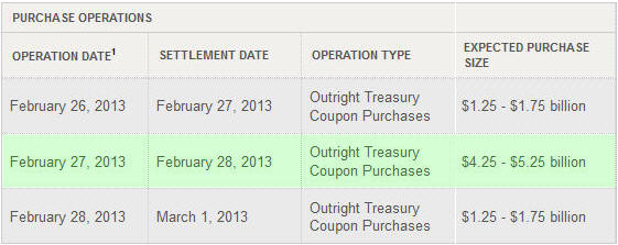
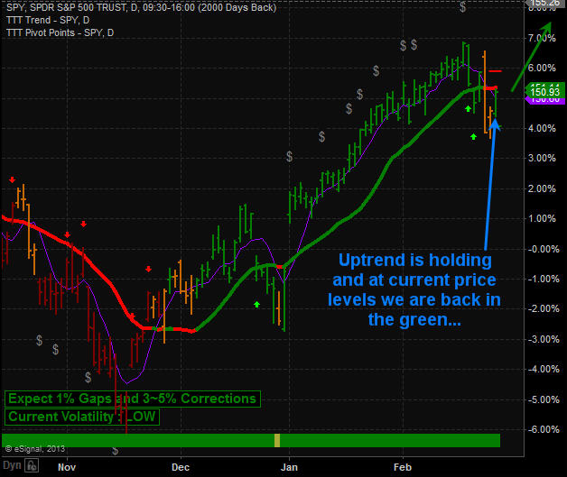
This week I talked about how the uptrend is to be the focus of trading positions until a down trend is actually confirmed via price and volume action. The SP500 was very close to reversing down this week but with the POMO’s (permanent open market operations) scheduled largest injection of money for February of over $5 billion dollars sent stocks soaring jamming stocks back up into its uptrend.
Take a look at the normal daily injections and then look at Feb 27th’s….
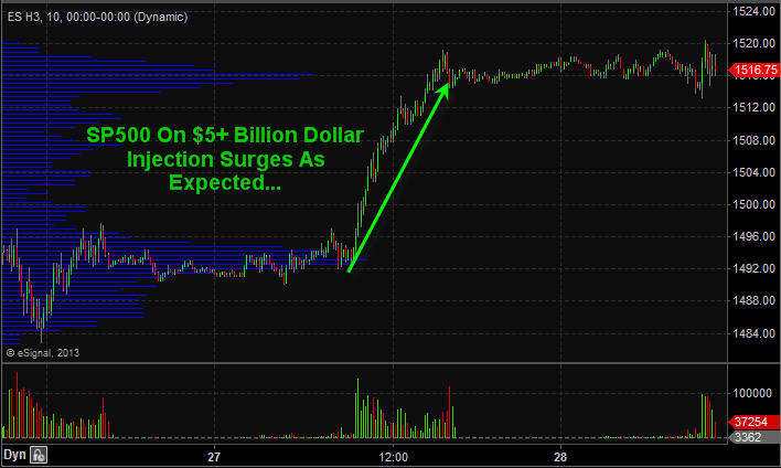
SP500 Futures 10 Minute Chart Zoomed Back 48 Hours…
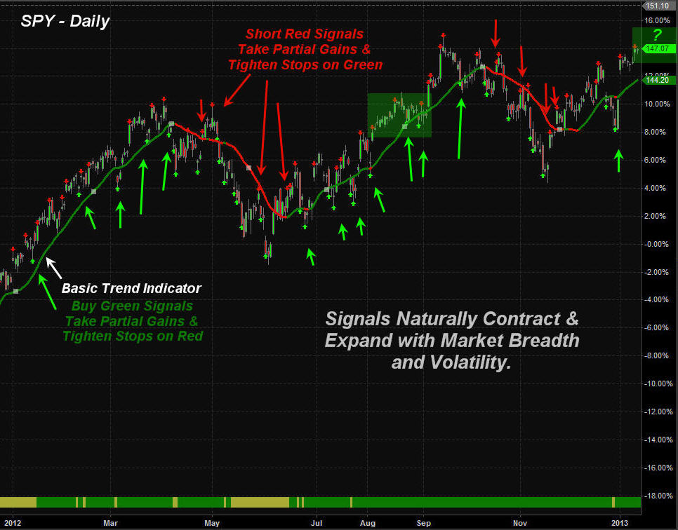
SP500 Trend – Green, Orange, Red candles indicate trend direction
Short Term Trading Conclusion:
Following the bigger underlying trend of the market along with the big money will keep you on the right side of the market more times than not. My trading strategy which is now programmed into my trading system clearly tells me the current market trend, entry signals, profit taking, stop adjustments and exit prices.
Creating a proven trading strategy which works in all market conditions and having it programmed to do 95% of the analysis for you keep my trading emotions in check, saves me time and money and keeps things simple which is the key for long term success. So keep your eye on the POMO’s injection schedule each month for days to focus on long day trades or entry points for swing trades.
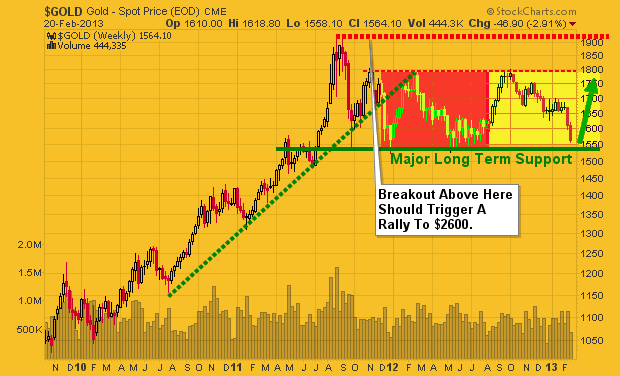
Since silver and gold topped in 2011 investors have been struggling with these positions hoping this cyclical bull market for metals continues. The simple truth is no one knows for sure if prices will continue and make new highs and those who say its a for sure thing we all know deep down is full of bull crap.
All investments move in cycles, waves or trends which ever you want to call it. The market has 4 simple yet distinct stages each require a completely different skill set and trading tactics to navigate.
Stage 1 – After a period of decline a stock consolidates at a contracted price range as buyers step into the market and fight for control over the exhausted sellers. Price action is neutral as sellers exit their positions and buyers begin to accumulate the stock.
Stage 2 – Upon gaining control of price movement, buyers overwhelm sellers and a stock enters a period of higher highs and higher lows. A bull market begins and the path of least resistance is higher. Traders should aggressively trade the long side, taking advantage of any pullback or dips in the stock’s price.
Stage 3 – After a prolonged increase in share price the buyers now become exhausted and the sellers again move in. This period of consolidation and distribution produces neutral price action and precedes a decline in the stock’s price.
Stage 4 – When the lows of Stage 3 are breached a stock enters a decline as sellers overwhelm buyers. A pattern of lower highs and lower lows emerges as a stock enters a bear market. A well-positioned trader would be aggressively trading the short side and taking advantage of the often quick declines in the stock’s price. More times than not all of stage 2 gains are given back in a short period of time. I do show some of my trade setups using these exact stages free here: https://stockcharts.com/public/1992897
Now that you know the stages and what it looks like its time to review the gold, silver and miners charts.
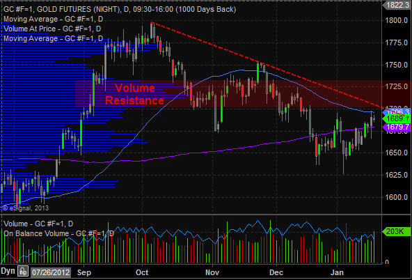
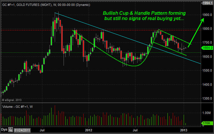
Gold Chart – Weekly
Gold has been in a bull market for several years but is starting to show its age in terms of the size of the price patterns, volume levels and extreme bullish sentiment. Back in 2011 a week before price topped we exited precious metals because the short term charts and volume levels were warning of a sharp drop. Since then I have not done many trades in either gold or silver because I do not like shorting in bull markets. Waiting for a bullish setup/price pattern before getting involved is my focus.
Gold has pulled back with a bullish 5 wave correction the last 5 months and at key support. While the long term charts are pointing to higher gold prices you must be aware that if gold and silver start to breakdown things will likely get ugly quickly. To be honest I do not care which way it goes, I just want it to either rally from support here and make new highs or breakdown and crash. Both will be very profitable if traded properly.
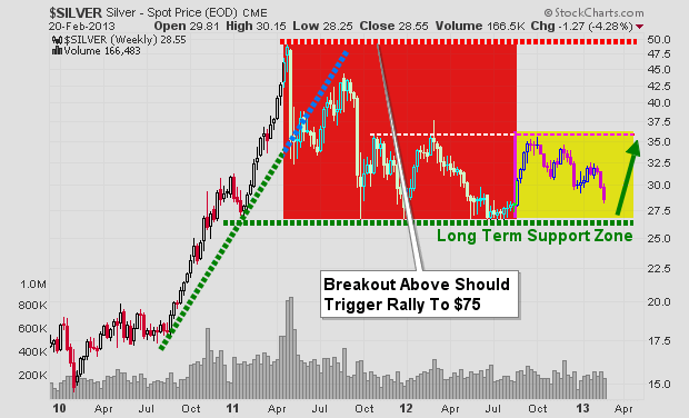
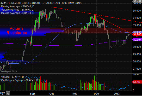
Silver Chart – Weekly
Silver has a very similar chart to that of its big sister (yellow gold). This shiny metal has the energy of a 3 year old making it a very volatile investment. I have touched on the topic of gold and silver being so called safe havens and if you have been reading my work for a while you know that any investment that can move 18-45% in value within 1 month is NOT a safe haven.
While it has done well in the past decade and boosted a lot of retirement accounts the day will come with these things collapse and most people holding them will give back most if not all the gains they had simply because people get attached to large positions and most do not know when to just exit a position.
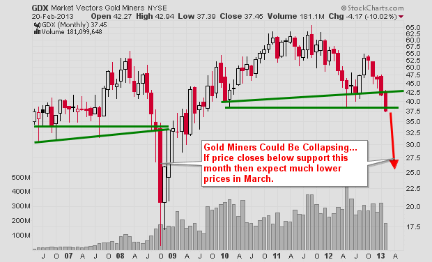
Gold Miners Chart – Monthly
This chart gives me cold sweats because I know how many people own gold mining stocks and I know how fast these things can move. If the price closed below the green support line the bottom could fall out and be very painful for those who get paralyzed by denial and do nothing but watch their accounts lose value week after week.
Precious Metals Investing Conclusion:
In short, this report is to show you the very basics of how investments move in stages. It is also to show a warning that precious metals are technically very close to a major breakdown which the big money players are watching closely. This thinly traded sector can move extremely fast when everyone rushes for the door.
Do not get me wrong, I am not saying a crash is about to happen, actually it’s the opposite. All I am doing is planning the idea in your subconscious so that if prices continue to move lower you will remember that these price levels and take action with your investments. Remember, you can always buy the investment back at any time again if the outlook changes in a week, month or year.
Get My FREE Weekly Gold, Silver and Mining Reports and Trade with the Stages: www.GoldAndOilGuy.com
Chris Vermeulen
http://www.thegoldandoilguy.com/wp-content/uploads/2014/11/tgaoglogo.png00adminhttp://www.thegoldandoilguy.com/wp-content/uploads/2014/11/tgaoglogo.pngadmin2013-02-27 20:43:072013-02-27 20:43:07Gold, Silver and Miners Remain Junk Grade Investments
Gold and silver along with their related miners have been under a lot of selling pressure the last few months. Prices have fallen far enough to make most traders and investors start to panic and close out their long term positions which is a bullish signal in my opinion.
My trading tactic for both swing trading and day trading thrive on entering and exiting positions when panic trading hits an investment. General rule of thumb is to buy when others are extremely fearful and cannot hold on to a losing position any longer. When they are selling I am usually slowly accumulating a long position.
Looking at the charts below of gold and silver you can see the strong selling over the past two weeks. When you get drops this sharp investors tend to focus on their account statements watching the value drop at an accelerated rate to the point where they ignore the charts and just liquidate everything they have to preserve their capital. A few weeks ago I posted my outlook on precious metals which seems to be unfolding as expected: http://www.thegoldandoilguy.com/precious-metals-miners-making-waves-and-new-trends/
Gold Bullion Weekly Chart:
The price and outlook of gold has not really changed much in the past year. It remains in a major bull market and has been taking a breather, nothing more. Stepping back and reviewing the weekly chart it’s clear that gold is nearing long term support. With panic selling hitting the gold market and long term support only $20 – $30 dollars away this investment starts to look really tasty.
But if price breaks below the $1540 level and closed down there on a weekly basis then all bets are off as this would trigger a wave of selling that would make the recent selling look insignificant. And the uptrend in gold would now be over.
Silver Bullion Weekly Chart:
Silver price is in the same boat as its big sister (Yellow Gold). Only difference is that silver has larger price swings of 2-3x more than gold. This is what attracts more traders and investors but unfortunately the masses do not know how to manage leveraged investments like this and end up losing their shirts.
A breakdown below the $26.11 price would likely trigger a sharp drop back down to the $17.50 level so be careful…
Gold Mining Stocks – Monthly Chart:
If you wanna see a scary chart then look at what could happen or is happening to gold miner stocks. This very could be happening as we speak and why I have been pounding the table for months no to get long gold, silver or miners until we see complete panic selling or a bullish basing pattern form on the charts. We have not seen either of these things take place although panic selling is slowly ramping up this week.
There will be some very frustrated gold bugs if they take another 33% hair cut in value… You can view some of my trading charts, setups and analysis free at my stockcharts.com list. Be sure to vote for me chartlist each day so I know its of value: https://stockcharts.com/public/1992897
Precious Metals Trend and Trading Conclusion:
In short, the precious metal sector remains in a cyclical bull market. That being said and looking at the daily charts the prices have been consolidating and are in a down trend currently. Until we see some type of bottoming pattern or price action form it is best to sit on the side lines and watch the emotional traders get caught up and do the wrong thing.
The next two weeks will be crucial for gold, silver and miner stocks. If metals cannot find support and close below the key support levels things could get really ugly fast. If you would like to receive my daily analysis and know what I am trading then check out my newsletter at: www.TheGoldAndOilGuy.com
Chris Vermeulen
http://www.thegoldandoilguy.com/wp-content/uploads/2014/11/tgaoglogo.png00adminhttp://www.thegoldandoilguy.com/wp-content/uploads/2014/11/tgaoglogo.pngadmin2013-02-21 06:11:282014-03-06 11:57:19Gold and Silver Nearing MAJOR Long Term Support
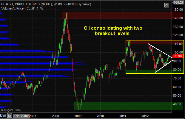
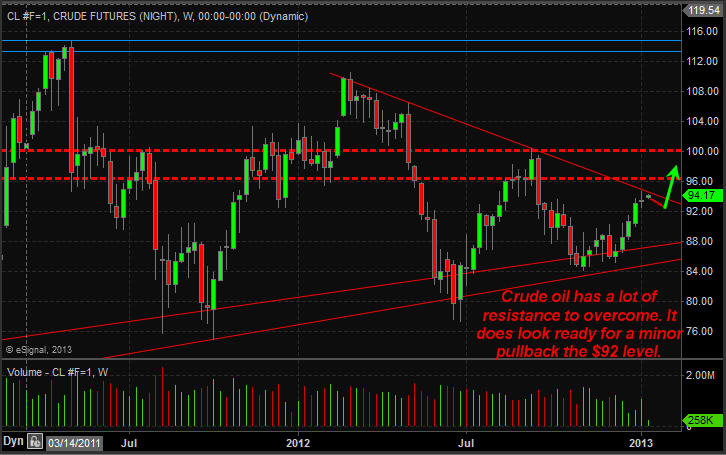
Crude oil has been trading ways for the past year between the 2011 high and low. The trading range through 2012 has been contracting with a series of lower highs and higher lows. This pennant formation because it is taking place after an uptrend is a bullish pattern with $110 and possibly even $140+ per barrel in the next 6-18 months.
If you look at the weekly investing chart of crude oil the key support and resistance levels area clearly marked. A breakout of the white pennant will trigger a move to the next support or resistance level. And judging from the positive economic numbers not only form the USA but globally the odds are increased for the $110+ price target to be reached sooner than later.
Crude Oil Price Chart – Weekly Investing
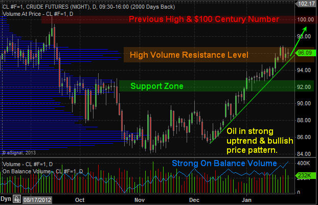
Crude Oil Price Chart – Daily short term Analysis & Target
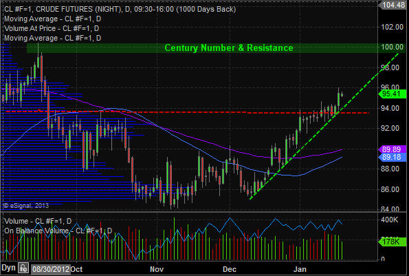
If we zoom into the daily chart and analyze price and volume you will notice the $100 per barrel level is potentially only 2-3 days way… But keep in mind whole numbers (decade & Century Numbers) naturally act as support and resistance levels. So when the $100 century price is reached there will be a wave of sellers with fat thumbs who will slam the price back down to the $96 and possibly back down to the $92 level before oil continues higher.
Utility Stocks – XLU – Weekly Investing Chart
The utility sector has done well and continues to look very bullish for 2013. This high dividend paying sector is liked by many and the price action speaks for its self… Keep in mind you can view my actual watchlist of stock and ETFs I trade in real-time with my analysis free: https://stockcharts.com/public/1992897
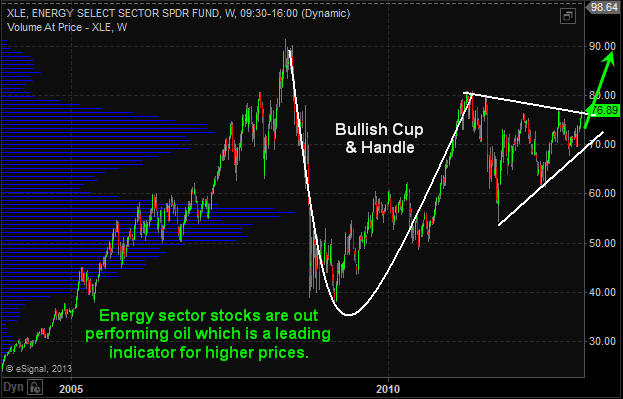
Energy Sector Weekly Investing Chart
Energy stocks which can be followed using the XLE exchange traded fund (ETF) typically leads the price of oil. Looking at energy stocks we can see that they are outperforming the price of crude oil and on the verge of breaking out of a large Cup & Handle pattern. If so then $90 is the next stop but prices may go much higher in the long run.
Once a breakout takes place on either the white or yellow lines on the first crude oil weekly chart we should see oil, energy and utility stocks start making some big moves. Depending on the direction of the breakout (Up or Down) it must be played in that direction to generate substantial profits obviously.
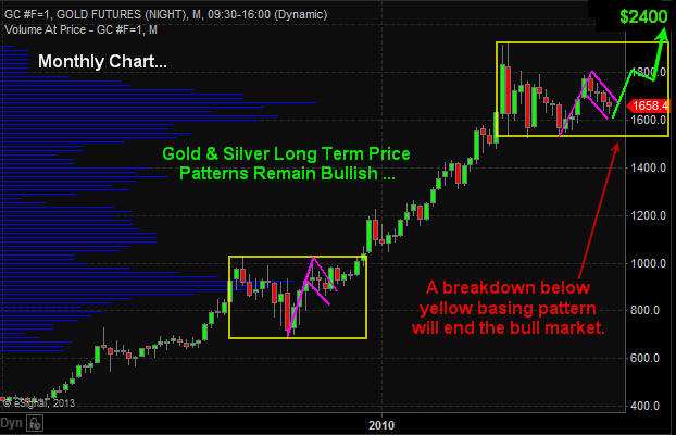
The precious metals sector has been dormant since both gold and silver topped in 2011. But the long term bull market remains intact. As long as we do not have the price of gold close below the lower yellow box on the monthly chart then technical speaking precious metals should continue much higher.
Large consolidation periods (yellow boxes) provide investors with great insight for investments looking forward 6-18 months upon a breakout in either direction (up or down). The issue with investing during these times is the passage of time. One can hold a position for months and sometimes years having their investments fluctuate adding extra stress to their life when they really do not need to.
Once a breakout takes place a powerful rally or decline will start putting an investors’ money to work within days of committing to that particular investment compared to money invested waiting months for the breakout and new capital gains to occur.
Gold Price Chart – Monthly
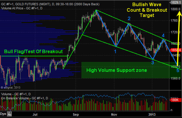
Gold Price Chart – Daily
The chart of gold continues to form a large bull flag pattern with a potential 3 or 5 wave correction. If price reverses this week and breaks above the upper resistance trend line then it will be a 3 (ABC) wave correction which is very bullish. But there is potential for a full 5 wave correction which is still bullish, but it just means we have another month or two before metals bottom.
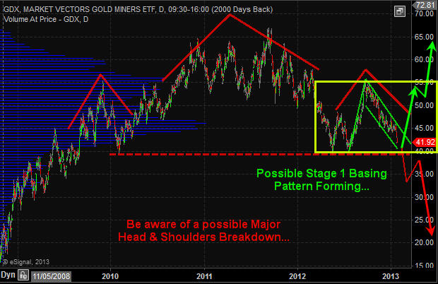
Gold Miner Stocks – GDX ETF Chart – Daily
Gold miners do not have the sexiest looking chart. It was formed a strong looking bull flag but has continues to correct and is not nearing a key support level. This level could act as a triple bottom (bullish) or if price breaks below then it would be breaking then neckline of a massive head and shoulders pattern which points to 50% decline. I remain bullish with the longer term gold trend until proven wrong.
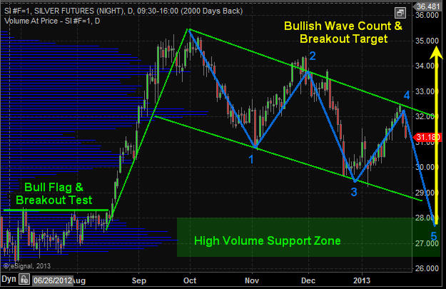
Silver Price Chart – Daily
Silver remains in a long term bull market much like the monthly chart of gold shown earlier in this report. Silver continues to work its way through a large bull flag pattern with a positive outlook at this time.
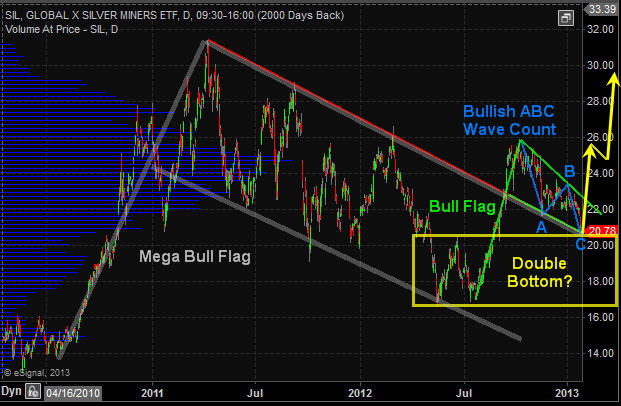
Silver Miner Stocks – SIL ETF – Daily Chart
Reviewing the precious metals sector it seems that silver miners have the sexiest looking chart. All price patterns are showing strength and are in proportion to one other. If this chart plays out to what technical analysis is pointing to then we could see the precious metals sector put in a bottom and rally within the next week or two. And if this is the case then silver miner stocks should provide the most opportunity going forward. Keep in mind you can view my actual watchlist of stock and ETFs I trade in real-time with my analysis free: https://stockcharts.com/public/1992897
Precious Metals Trading Conclusion:
In short, what you need to focus on is the yellow consolidation box on the monthly gold chart. A breaking in either direction will trigger a massive move that should last 6-18 months. Until then long term investors can simply sit back and watch the sector while they put their money to work in other active sectors.
From a short term traders point of view, that f mine. I am looking for a signs of a bottom on the daily chart to get my money working earlier to play the bounce/rally that takes place and actively managing the position until a breakout occurs. The charts overall are not that clear as to when a breakout will take place. Metals could start to rally next week or in a few months and all we can do is wait for a reversal to the upside before we get active.
Knowing the big picture trends and patterns at play along with major support and resistance levels (breakout levels) is crucial for success and piece of mind.
http://www.thegoldandoilguy.com/wp-content/uploads/2014/11/tgaoglogo.png00adminhttp://www.thegoldandoilguy.com/wp-content/uploads/2014/11/tgaoglogo.pngadmin2013-01-27 20:02:462014-03-06 12:04:37Precious Metals & Miners Making Waves and New Trends
US stock market is closed today for Martin Luther King, Jr. Day. I do not expect much price action to take place on the Canadian or futures market today.
Pre-Market Analysis Points:
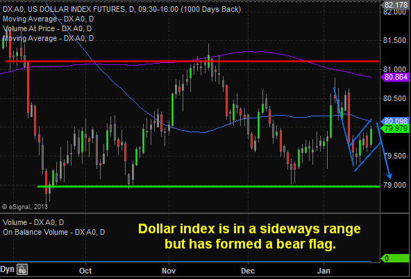
– Dollar index is giving mixed signals this week. Short term chart looks bullish for another couple of days but overall it is trading within a large bear flag and near resistance.
– Crude oil is trading lower by -0.50% but remains in a strong uptrend and bull flag. $97-$98 looks like the next upward thrust target.
– Natural gas is trading higher 0.87% touching our upside target of $3.60 this morning. It could keep climbing to $3.70 which is the next target but it looks as though its ready for a pause.
– Gold and Silver are trading flat. Last week they held up at resistance but have yet to breakout. They could do it this week but until we the trend shifts with volume to support the move and miners to also show strength I will remain on the sideline.
– Bonds are trading flat and giving off mixed signals much. The 60 minute chart is bullish with a bull flag, while the daily chart is bearish.
– SP500 index remains in a bull market grinding its way higher each week without a decent pausepullback to get long. Technically we could see a 3-4% pullback any day and the market would remain in an uptrend.
http://www.thegoldandoilguy.com/wp-content/uploads/2014/11/tgaoglogo.png00adminhttp://www.thegoldandoilguy.com/wp-content/uploads/2014/11/tgaoglogo.pngadmin2013-01-21 09:33:592013-01-21 09:33:59Weekly Metals, Oil, Dollar and Index Price Analysis
Dollar index 4 hour chart is forming a bear flag. Until the lower blue support line is broken the flag will continue higher.
Crude oil has a big pop yesterday as it continues up its support trend line. It looks as though it may take a run at the $100 per barrel level over the next 1-2 weeks.
Natural gas had bullish inventory numbers yesterday sending the price sharply higher. It tagged our $4.50 resistance price but could not close above it. This morning it is trading above that level and may confirm a breakout.
Gold continues in a clear down trend with high volume resistance, down trend line and a moving average holding it down. It seems everyone is turning bullish here on gold, but in my contrarian view that is signaling another short term top. Stick with the trend until proven wrong.
Silver is trading similar to gold. Still in a down trend but is much more volatile.
Bonds have been pullback since the December and have formed a falling channel. Price remains bearish which is actually bullish for the stock market.
SP500 index continues its uptrend but is trading at a 2% premium above my key support/trend moving average. The SP500 has the potential to drop 2-4% at any time and if so we will be looking to get long with the overall trend.
Morning Market Conclusion:
Each month on average the broad market provides a pullback that signals a broad market entry point. During an entry point you can get long the index, sectors or stocks, and trade options which have formed bullish chart/volume patterns. Unfortunately the last batch of signals that took place was just before the fiscal cliff which we passed on taking because price could have gone either way based on the outcome and the move was going to be big. When Risk is higher I tend to steer clear of entry points.
So now we just have to wait for the next broad market pullback to start building long positions in various ETFs.
Good Morning,
Yesterday’s trading session played out exactly as posted in the morning chart update. Today will be a different story from the looks of it as the dollar index looks to be putting in a bottom and that has the SP500 down 0.40% this morning. It may trigger our first entry point to let long stocks today.
Dollar Index:
SP500 Futures:
Natural gas has been holding up well the past two sessions and looks as though it is forming a cup and handle pattern at the $3.40 level. The first upside target would be $3.50 then $3.60.
Crude oil has been trading sideways/higher the past week but the on balance volume clearly shows sellers are unloading contracts at the $94 level. Yesterday I talked about how crude oil was walking a fine line up its support trend line and once that breaks look out! Price is holding up but be aware it could drop fast and hard any day here.
Gold and silver traded higher yesterday while the miners lagged. This is not a bullish sign for the metals. The trend remains down and we need a clean break before getting long.
Bonds continue to their march higher as expected and this type of price action points to lower stock prices. This morning stocks are set to gap sharply lower confirming money is rolling back into the safe haven (bonds) for protection from falling share prices.
Gold and gold miner stocks have underperformed in 2012 disappointing most traders. That being said it has traded in a large sideways range since September 2011 and remains stuck in this range as of this week. Investments trading sideways are not my preferred investment of choice because some commodities and stocks for that matter can trade sideways for years before making another bull market rally.
That being said in the last six months gold has started to show life that a new bull market may be starting. 2013 is starting to look as though gold, silver and precious metals miners could lead the market higher if they can break out of their basing patterns. Until we get more bullish price action I am not planning to get long.
Take a look at the gold ETF and Gold Miner charts:
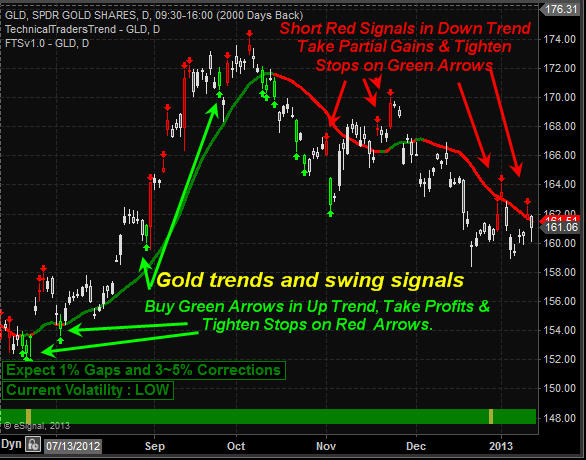
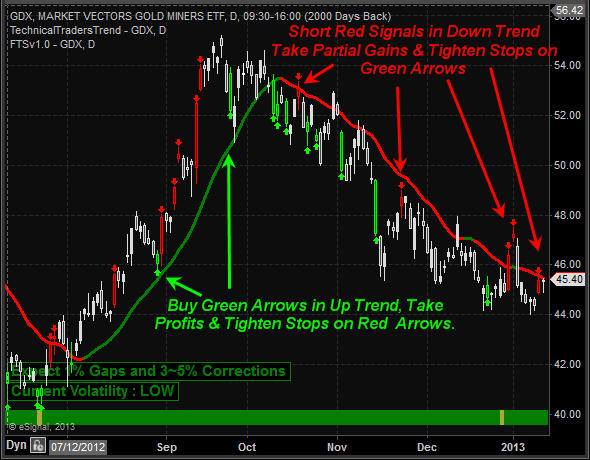
These daily charts show the trend (up/down) along with short term extreme overbought/oversold trading days. The key to long term success is to trade with the trend 90% of the time. Only years of experience will you know when it’s ok to break the rules and even then the odds are stacked against you.
Gold Weekly Chart:
Gold Daily Chart:
Gold Miners Daily Chart:
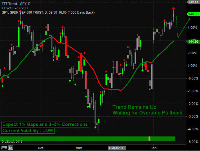
SP500 Stock Market Analysis:
The last five years I have been fine tuning my SP500 index trading with the use of cycles, sentiment, volume, momentum and the volatility index. Until just recently some of the data I use for generating these extreme overbought/oversold conditions were only available after the market closed. This made the high volatile trading sessions difficult to truly know if an extreme level was reached during the trading session. The exciting news is that a new data feed and a top notch programmer is allowing me to turning this once manual calculation of 17 data points taking me an average of 25 minutes to figure out into a system that generates signals in real time complete with profit taking signals, tend direction and a protective stop which self-adjusts depending on the market volatility and cycle stages.
Two other benefits are that during extremely high volatility levels and mixed cycles the system does not generate any signals. This allows us to avoid the large daily swings in price that typically shake even the most seasoned traders out of the market for repeated losing trades. Also during potential trend changes when cycles and volatility become choppy trading signals are not generated helping to avoid the volatility that takes place during reversals points when the bulls and bears are pushing each other around.
Below is a very basic version of the trend and signals for the SP500 index as it does not show profit taking, trend reversal stops or protective stops for individual swing trades yet, but it’s coming soon.
Crude Oil Weekly Chart:
Crude oil has been making a move higher in the past four weeks but it’s now testing resistance and the chart shows a high volume doji candle. This is pointing to a pause or pullback in price should take place.
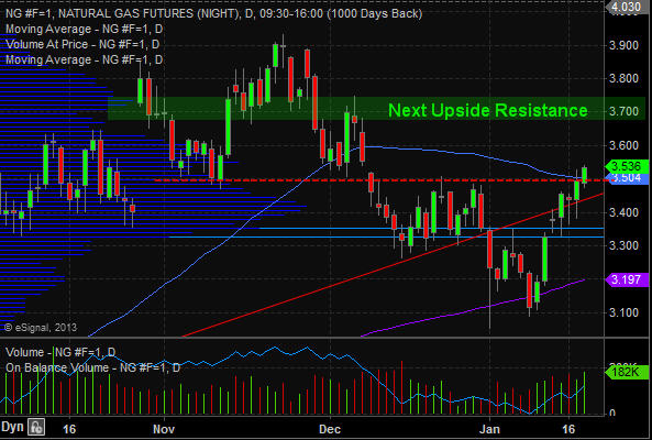
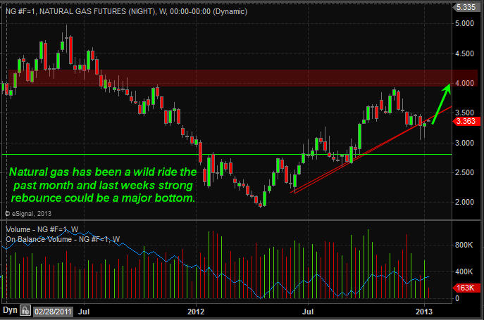
Natural Gas Weekly Chart:
Natural gas futures have been under pressure the past couple months but it may have put in a bottom last week. The daily and 60 minute charts show strong buyers stepping in here.
Weekend Trading Conclusion:
In short, gold and silver remain in a sideways/down trend on the daily chart. The weekly long term outlook is very bullish and once I start to see real buyers enter the market in terms of volume and price patterns I will start to accumulate a long position.
The stock market overall remains in an uptrend. We are waiting for a pause ro pullback before getting long the index. But that being said there are other sectors and commodities starting to look ripe for big moves. They are not there yet but getting closer each day.
Keep in mind that stocks, commodities and trading in general go in waves. There are times when you are busy with trades popping up left right and center and there are times when setups just do not happen. On my free stock charts watch list in November and December I posted 16 stocks and ETF setups and only one stock went south which happened to be a short trade (count trend trade). You can view my watch list here for more info: https://stockcharts.com/public/1992897
Crude oil is giving mixed signals and I am avoiding it until the daily chart gives us a bullish setup.
Natural gas weekly chart looks bullish but the current price is now trading at resistance. It must break this level before a full reversal can be confirmed.
If you would like to keep up to date on market trends and trade ideas be sure to join my newsletter at www.TheGoldAndOilGuy.com
Chris Vermeulen
http://www.thegoldandoilguy.com/wp-content/uploads/2014/11/tgaoglogo.png00adminhttp://www.thegoldandoilguy.com/wp-content/uploads/2014/11/tgaoglogo.pngadmin2013-01-13 22:58:202014-03-06 12:18:10Gold, Miners and SP500 Trends & Trading Signals
Today’s gap higher in stocks has many investors feeling really good about but will this rally last?
My to the point answer is “Yes” but there will be some bumps and navigating positions along the way.
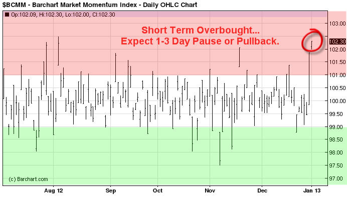
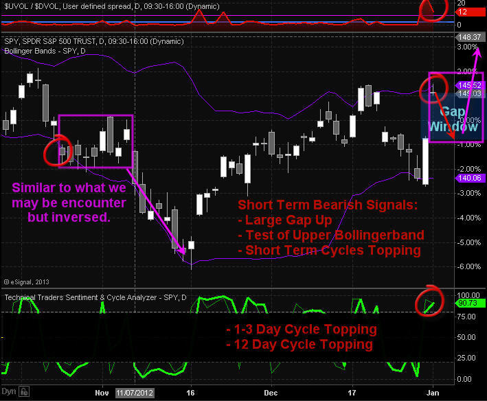
Looking at the charts below you will notice how stocks are trading up over 4% in two trading sessions and several indicators and technical resistance levels are now being tested. Naturally when several resistance levels across multiple time frames, cycles and indicators we must be open to the idea that stocks could pause or pullback for a few days before continuing higher.
Here is a quick snapshot of charts I follow closely to help determine short term overbought and oversold market conditions.
Momentum Extremes:
This chart helps me know when stocks are overbought or oversold. This trend can be follows using the 30 or 60 minute charts helping you spot short term tops and bottoms.
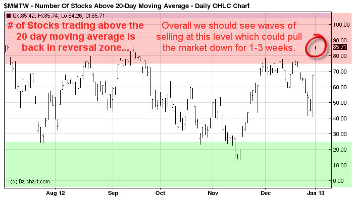
Stocks Trading Above 20 Day Moving Average:
This chart helps me time swing trades which last for 1-3 weeks in length and I use the daily chart to spot these reversals and trends.
Daily SP500 Index Chart:
This chart shows the big gap in price, test of upper bollingerband, momentum and swing trading cycles topping and 12 buyers to ever one seller on the NYSE which tells me everyone is running to buy everything they can today and that is a contrarian signal.
Trading Conclusion:
This strong bounce which started on Monday from a very oversold market condition does look as though it has some power behind it. And over the next 1-3 days we could see prices grind higher until this momentum stalls out. Once that happens we should see most of the gap filled. This will provide us with a lower entry price and reduce our downside risk for index, sector and commodity ETFs.
If you are a stock trader then be sure to checkout my partners stock trading website www.ActiveTradingPartners.com where his last two trades Dec 31 pocketed 12.3% with gold stocks ETF NUGT, and took more profits with PRLB Jan 2nd for a 9.2% gain.
This type of bounce and momentum can lead to a running correction which makes it impossible for traders to by on a dip. A running correction is when prices slow chop higher in a narrow range for some time then explode higher continuing its rally. This is when you just need to jump in trades and chase prices higher but we will not do that until I see signs of a running correction.
Today many of the major market moving stocks are testing resistance which means if they start to get sold the broad market will pullback with them.
http://www.thegoldandoilguy.com/wp-content/uploads/2014/11/tgaoglogo.png00adminhttp://www.thegoldandoilguy.com/wp-content/uploads/2014/11/tgaoglogo.pngadmin2013-01-02 12:31:412014-03-06 12:17:51The Fiscal Pop-N-Drop for Equities – Look Out