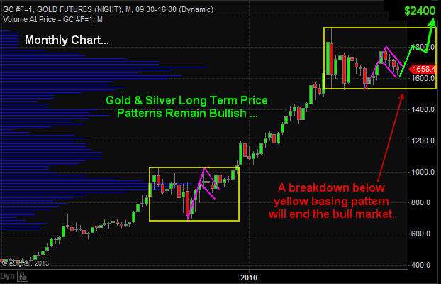
The precious metals sector has been dormant since both gold and silver topped in 2011. But the long term bull market remains intact. As long as we do not have the price of gold close below the lower yellow box on the monthly chart then technical speaking precious metals should continue much higher.

Large consolidation periods (yellow boxes) provide investors with great insight for investments looking forward 6-18 months upon a breakout in either direction (up or down). The issue with investing during these times is the passage of time. One can hold a position for months and sometimes years having their investments fluctuate adding extra stress to their life when they really do not need to.

Once a breakout takes place a powerful rally or decline will start putting an investors’ money to work within days of committing to that particular investment compared to money invested waiting months for the breakout and new capital gains to occur.

Gold Price Chart – Monthly

Gold Monthly Price Chart


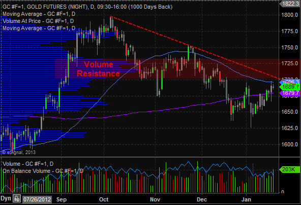
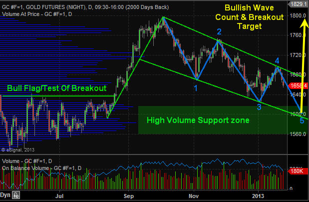
Gold Price Chart – Daily

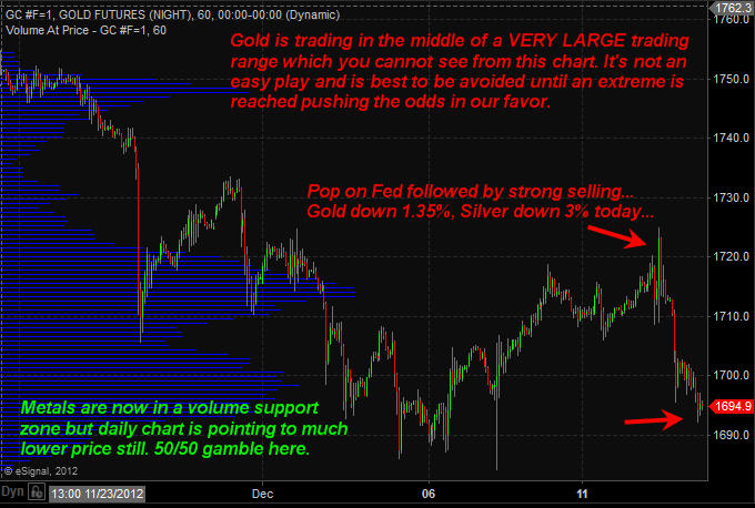
The chart of gold continues to form a large bull flag pattern with a potential 3 or 5 wave correction. If price reverses this week and breaks above the upper resistance trend line then it will be a 3 (ABC) wave correction which is very bullish. But there is potential for a full 5 wave correction which is still bullish, but it just means we have another month or two before metals bottom.

Gold Futures Trading Daily Chart


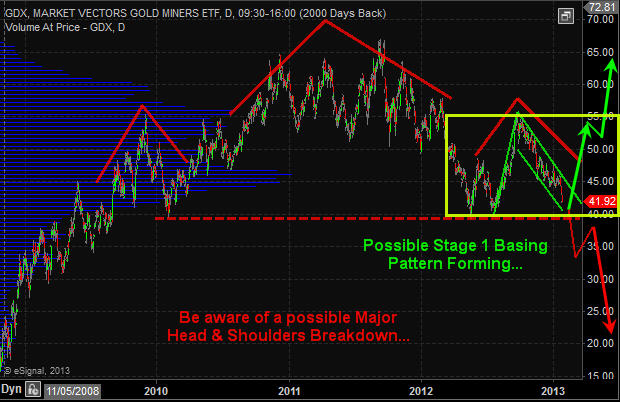
Gold Miner Stocks – GDX ETF Chart – Daily

Gold miners do not have the sexiest looking chart. It was formed a strong looking bull flag but has continues to correct and is not nearing a key support level. This level could act as a triple bottom (bullish) or if price breaks below then it would be breaking then neckline of a massive head and shoulders pattern which points to 50% decline. I remain bullish with the longer term gold trend until proven wrong.

GDX - Gold Miner ETF Trading


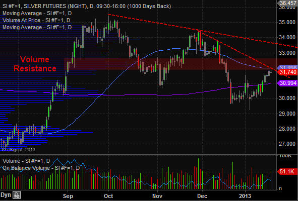
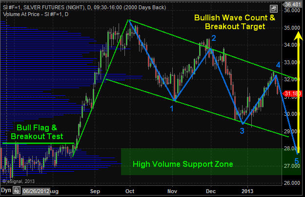
Silver Price Chart – Daily

Silver remains in a long term bull market much like the monthly chart of gold shown earlier in this report. Silver continues to work its way through a large bull flag pattern with a positive outlook at this time.

Silver Price Chart Daily


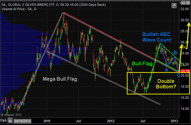
Silver Miner Stocks – SIL ETF – Daily Chart

Reviewing the precious metals sector it seems that silver miners have the sexiest looking chart. All price patterns are showing strength and are in proportion to one other. If this chart plays out to what technical analysis is pointing to then we could see the precious metals sector put in a bottom and rally within the next week or two. And if this is the case then silver miner stocks should provide the most opportunity going forward. Keep in mind you can view my actual watchlist of stock and ETFs I trade in real-time with my analysis free: https://stockcharts.com/public/1992897

SIL - Silver Miner ETF Trading


Precious Metals Trading Conclusion:

In short, what you need to focus on is the yellow consolidation box on the monthly gold chart. A breaking in either direction will trigger a massive move that should last 6-18 months. Until then long term investors can simply sit back and watch the sector while they put their money to work in other active sectors.

From a short term traders point of view, that f mine. I am looking for a signs of a bottom on the daily chart to get my money working earlier to play the bounce/rally that takes place and actively managing the position until a breakout occurs. The charts overall are not that clear as to when a breakout will take place. Metals could start to rally next week or in a few months and all we can do is wait for a reversal to the upside before we get active.

Knowing the big picture trends and patterns at play along with major support and resistance levels (breakout levels) is crucial for success and piece of mind.

Get my analysis, daily updates and trade alerts each day at www.TheGoldAndOilGuy.com

Chris Vermeulen

US stock market is closed today for Martin Luther King, Jr. Day. I do not expect much price action to take place on the Canadian or futures market today.

Pre-Market Analysis Points:
– Dollar index is giving mixed signals this week. Short term chart looks bullish for another couple of days but overall it is trading within a large bear flag and near resistance.

– Crude oil is trading lower by -0.50% but remains in a strong uptrend and bull flag. $97-$98 looks like the next upward thrust target.

– Natural gas is trading higher 0.87% touching our upside target of $3.60 this morning. It could keep climbing to $3.70 which is the next target but it looks as though its ready for a pause.

– Gold and Silver are trading flat. Last week they held up at resistance but have yet to breakout. They could do it this week but until we the trend shifts with volume to support the move and miners to also show strength I will remain on the sideline.

– Bonds are trading flat and giving off mixed signals much. The 60 minute chart is bullish with a bull flag, while the daily chart is bearish.

– SP500 index remains in a bull market grinding its way higher each week without a decent pausepullback to get long. Technically we could see a 3-4% pullback any day and the market would remain in an uptrend.

Chris Vermeulen – www.TheGoldAndOilGuy.com

Dollar index 4 hour chart is forming a bear flag. Until the lower blue support line is broken the flag will continue higher.

Jan18DX

Crude oil has a big pop yesterday as it continues up its support trend line. It looks as though it may take a run at the $100 per barrel level over the next 1-2 weeks.

Jan18CL

Natural gas had bullish inventory numbers yesterday sending the price sharply higher. It tagged our $4.50 resistance price but could not close above it. This morning it is trading above that level and may confirm a breakout.

Jan18NG

Gold continues in a clear down trend with high volume resistance, down trend line and a moving average holding it down. It seems everyone is turning bullish here on gold, but in my contrarian view that is signaling another short term top. Stick with the trend until proven wrong.

Jan18GC

Silver is trading similar to gold. Still in a down trend but is much more volatile.

Jan18SI

Bonds have been pullback since the December and have formed a falling channel. Price remains bearish which is actually bullish for the stock market.

Jan18ZB

SP500 index continues its uptrend but is trading at a 2% premium above my key support/trend moving average. The SP500 has the potential to drop 2-4% at any time and if so we will be looking to get long with the overall trend.

Jan18SPY


Morning Market Conclusion:

Each month on average the broad market provides a pullback that signals a broad market entry point. During an entry point you can get long the index, sectors or stocks, and trade options which have formed bullish chart/volume patterns. Unfortunately the last batch of signals that took place was just before the fiscal cliff which we passed on taking because price could have gone either way based on the outcome and the move was going to be big. When Risk is higher I tend to steer clear of entry points.

So now we just have to wait for the next broad market pullback to start building long positions in various ETFs.

Chris Vermeulen – www.TheGoldAndOilGuy.com

Good Morning,
Yesterday’s trading session played out exactly as posted in the morning chart update. Today will be a different story from the looks of it as the dollar index looks to be putting in a bottom and that has the SP500 down 0.40% this morning. It may trigger our first entry point to let long stocks today.

Dollar Index:

SP500 Futures:

Natural gas has been holding up well the past two sessions and looks as though it is forming a cup and handle pattern at the $3.40 level. The first upside target would be $3.50 then $3.60.

Crude oil has been trading sideways/higher the past week but the on balance volume clearly shows sellers are unloading contracts at the $94 level. Yesterday I talked about how crude oil was walking a fine line up its support trend line and once that breaks look out! Price is holding up but be aware it could drop fast and hard any day here.

Gold and silver traded higher yesterday while the miners lagged. This is not a bullish sign for the metals. The trend remains down and we need a clean break before getting long.

Bonds continue to their march higher as expected and this type of price action points to lower stock prices. This morning stocks are set to gap sharply lower confirming money is rolling back into the safe haven (bonds) for protection from falling share prices.

Be sure to follow my trades at www.TheGoldAndOilGuy.com and my free watchlist: https://stockcharts.com/public/1992897

Chris Vermeulen

Today’s gap higher in stocks has many investors feeling really good about but will this rally last?

My to the point answer is “Yes” but there will be some bumps and navigating positions along the way.

Looking at the charts below you will notice how stocks are trading up over 4% in two trading sessions and several indicators and technical resistance levels are now being tested. Naturally when several resistance levels across multiple time frames, cycles and indicators we must be open to the idea that stocks could pause or pullback for a few days before continuing higher.

Here is a quick snapshot of charts I follow closely to help determine short term overbought and oversold market conditions.

Momentum Extremes:

This chart helps me know when stocks are overbought or oversold. This trend can be follows using the 30 or 60 minute charts helping you spot short term tops and bottoms.

BroadMarketMomentum1

Stocks Trading Above 20 Day Moving Average:

This chart helps me time swing trades which last for 1-3 weeks in length and I use the daily chart to spot these reversals and trends.

SwingTradeOverbought2


Daily SP500 Index Chart:

This chart shows the big gap in price, test of upper bollingerband, momentum and swing trading cycles topping and 12 buyers to ever one seller on the NYSE which tells me everyone is running to buy everything they can today and that is a contrarian signal.

IndexChart3


Trading Conclusion:

This strong bounce which started on Monday from a very oversold market condition does look as though it has some power behind it. And over the next 1-3 days we could see prices grind higher until this momentum stalls out. Once that happens we should see most of the gap filled. This will provide us with a lower entry price and reduce our downside risk for index, sector and commodity ETFs.

If you are a stock trader then be sure to checkout my partners stock trading website www.ActiveTradingPartners.com where his last two trades Dec 31 pocketed 12.3% with gold stocks ETF NUGT, and took more profits with PRLB Jan 2nd for a 9.2% gain.

This type of bounce and momentum can lead to a running correction which makes it impossible for traders to by on a dip. A running correction is when prices slow chop higher in a narrow range for some time then explode higher continuing its rally. This is when you just need to jump in trades and chase prices higher but we will not do that until I see signs of a running correction.

Today many of the major market moving stocks are testing resistance which means if they start to get sold the broad market will pullback with them.

Follow All My Trades for 2013 – Start Today and Get 12 Months for only 6 Months: http://www.thegoldandoilguy.com/signup-newyear.php

Chris Vermeulen

With 2012 now behind us it’s time to start looking for some new long term investments which have big potential gains in the new year. Copper is one metal that has caught my eye.

The long term monthly chart of the copper ETF JJC shows a potential cup and handle pattern accompanied with bullish volume characteristics. Last year copper traded sideways in a narrowing range. This type of price action tends to bore traders and investors forcing them to look elsewhere for new to trades. The saying is “If the market doesn’t shake you out, it will wait you out”

You can see on the monthly chart that the interest in this commodity diminished. You can tell because of the sideways movement and declining volume. I like to focus on investments which are out of favor but are showing signs of another big trend starting. getting on the train before it leaves the station can make for a fun ride. I do post some of my trading ideas with my charts updating live each day here: https://stockcharts.com/public/1992897

Take a look at the charts, analysis and my best copper stock setup below:

JJC – Copper Total Return ETN Profile

Description: The index includes the contract in the Dow Jones-UBS Commodity Index Total Return that relates to a single commodity, copper (currently the Copper High Grade futures contract traded on the COMEX).

CopperMonthly


Copper Miner Stocks ETF COPX – Weekly Chart

This ETF holds a basket of copper mining stocks which is showing signs of a new trend starting. Take a look at the top holdings stocks and fund breakdown to get a feel for the exposure it provides.

COPX Top Ten Holdings

  1. Inmet Mining Corporation (IEMMF): 6.62%
  2. KGHM Polska Miedz SA (KGH): 5.24%
  3. Xstrata PLC (XTA): 5.04%
  4. Grupo Mexico, S.A.B. de C.V. (GMEXICO B): 4.89%
  5. Jiangxi Copper Company Limited H Shares (00358): 4.83%
  6. HudBay Minerals, Inc. (HBM): 4.82%
  7. Antofagasta PLC (ANTO): 4.78%
  8. Southern Copper Corporation (SCCO): 4.75%
  9. Lundin Mining Corp (LUNMF): 4.55%
  10. Kazakhmys PLC (KAZ): 4.55%

CopxInfo

DEc28Copx


Best Copper Stock Setup – LUNMF

After reviewing the main holdings in this fund I noticed one stock that looks ready to start a new bull market. Lundin Mining. shares look to be building a Stage 1 base and could break out and start to rally any week. Keep in mind 3/4 stocks move with the broad market so we do want the major indexes to find a bottom or at least trade sideways if we want copper stocks to start their run.

CopperMiner


Copper Futures, ETF and Stock Trading Conclusion:

Copper has lost its shine over the past 12 months but could start to make headline news in the near future. I like both COPX and LUNMF if we see further strength. If you would like to get more of these trading and investing ideas and alerts be sure to join my newsletter at: http://www.TheGoldAndOilGuy.com

Chris Vermeulen

Disclaimer:
I currently do not own a position in these investment but plan on buying them in the near future. This material should not be considered investment advice. Chris Vermeulen is not a registered investment advisor. Under no circumstances should any content from this website, article, video, seminar or email from Chris Vermeulen (TheGoldAndOilGuy.com) be used or interpreted as a recommendation to buy or sell any type of security or commodity contract. This material is not a solicitation for a trading approach to financial markets. Any investment decisions must in all cases be made by the reader or by his or her registered investment advisor. This information is for educational purposes only.

Coffee prices have fallen more than 50% since 2010 which can be seen through the coffee exchange traded fund symbol: JO. This investment seeks to replicate the returns that are potentially available through an unleveraged investment in coffee futures contracts as well as the rate of interest that could be earned on cash collateral invested in specified Treasury Bills.

Weekly, Hourly and Seasonal chart of JO Coffee Exchange Traded Fund

The top weekly chart shows my price targets for 2013 while the lower hourly chart shows strong on balance volume meaning big money is slowly building a long position in coffee. The small white chart is the seasonal chart of coffee futures showing prices historically rise from Jan – March, then a correction followed by another rally in to May.

Coffee prices are still in a down trend but it looks as though the end is near and if played properly it could provide up to 100% return on your capital in 2013.

Dec28JO


Coffee Futures Monthly Long Term Chart

This chart gives you a bird’s eye view on where coffee prices are trading in the big picture scheme of things.

CoffeeLongTermMonthly


JO Coffee ETF VS. SBUX Starbucks Share Price:

Lower coffee bean prices has helped lift share prices of coffee companies like Starbucks: SBUX, Coffee Holdings Co.: JVA, Coffee Roasters Inc.: GMCR, and PEET’s Coffee: PEET. But cheap coffee may not be around that much longer and the lower earnings for coffee brewers may be closer than most may think.

Follow my Live Trading Charts Here Free: https://stockcharts.com/public/1992897

CoffeeBrewer


2013 Caffeine Conclusion:

In short, I have been watching coffee prices for a bottoming pattern for months and I now feel it is getting really close to a bottom and it could be a great trade and investment in the new year. As for companies like Starbucks it will likely not have much of an affect on the bottom line until the second half of the year though it is something to keep an eye on during earning seasons.

If you want my trading and investing ideas each week along with trade alerts for ideas like this then join my newsletter today: http://www.TheGoldAndOilGuy.com

Chris Vermeulen

Chris Vermeulen – www.TheGoldAndOilGuy.com

We all want new and exciting electronic gizmos and gadgets for the holiday season. Unfortunately they have the tendency to lose almost all their value within weeks because of newer versions etc… but what if you just got a lump of dirty old coal in your stocking, how would you feel?

The only individuals who would appreciate a dirty gift like that would be those forward looking investors who see major opportunities before they become the next big movers and headline news.

Knowing how to spot Stage 1 patterns is one of the most important bits of information you need to know as an investor. This one pattern is how I found RIMM which now up 100% in the past 30 days, ANR up 30% in two weeks, FSLR up 20% in 20 days and the list goes one. My main focus is on ETFs because of lower risk they provide but very powerful when applied to individual stocks.

Coal and coal stocks have been out of favor for almost two years now. But these unwanted and hated shares may soon be owned by the masses, or at least by traders and investors. A few weeks ago to I talked about the four stages all investments go through and which patters you must be able to spot in order to make huge money investing while having very limited downside risk.

You can read about them here where I used Apple and Research In Motion shares as my example: http://www.thegoldandoilguy.com/collapse-of-apple-rise-of-the-blackberries-stock-market-cycle/

In summary, Trade with the BIG BOARD and only focusing on buying stocks, ETFs etc… as they are coming out of a Stage 1 Accumulation Basing Pattern. This puts the odds greatly in your favor for not only winning the majority of your trades but to generate above average returns.

The BIG BOARD – NYSE – Weekly Major Stock Market Trend

The New York Stock Exchange is the big board. This chart formed a reversal candle last week which points to lower prices. Its likely we see a 1-2 week dip before buyers step back in. Until then individual stocks should pause or form mini bull flags until the sellers are finished and buyers step back into risk on assets (equities).

NYSEWeekly

Coal Sector ETF Showing Stage 1 Basing Pattern

Coal stocks have been bouncing bottom for some time and if you did not review the Stages Report using the link above then do so now so you know what to expect in detail.

KOL coal exchange traded fund is a basket of coal companies and is starting to show signs of a new bull market. A breakout and close above $26.00 should trigger strong buying with the potential of a 21% gain before it hits my first price target. This could go way past that but one target at a time folks.

Naturally I would like to see a bull flag or pause in KOL over the next couple weeks, then look to get long using the pivot low of that pause/bull flag as my protective stop. I’m not jumping in here as the broad market looks ready to correct and ¾ stocks follow the big board which will pull KOL down.

KOLBase


ANR – My Top Coal Stock Pick

I pointed out ANR at $7.50 at the beginning of December to followers as it was the best looking coal stock I could find. The two key indicators “Price” and “Volume” were clearly pointing to higher prices and the potential gain even if it was just played up to the Stage 1 Resistance Level still netted a 30% move. Crazy part is that there is the potential for a 100% rally to my first price target. Follow my free ideas here live: https://stockcharts.com/public/1992897

ANRCoal


You want Gizmos or Coal in You’re Stocking???

In short, I really like the coal sector for the first quarter of 2013. I’m not too worried about the fiscal cliff as it’s not the end of the world and the US along with most other countries are all bankrupt together in my opinion. New rules and ideas will be implemented and life and business will continue… I am not to worried.

I am expecting stocks to continue sideways or higher into May at which time a serious correction could take place. But not to worry as we take things one week at time and will be adjusting my outlook accordingly.

Get My Trade Ideas & Alerts Delivered To Your Inbox: www.TheGoldAndOilGuy.com

Chris Vermeulen

Yesterday’s price action was very bearish yet again and we are patiently waiting for a counter trend pullback to happen. While three are some good looking plays out there I really do not want to get long until the market clears the air with a bout or three of strong selling. Remember 3:4 stocks follow the market and the odds of picking a commodity or ETF that bucks the trend is unlikely. If you are interested in powerful stocks & ETFs the buck the trend check out my FREE Trading Ideas live Go Here: https://stockcharts.com/public/1992897

SP500 / Broad Stock Market:

We have seen a bug run up in stocks this month and things are looking a little long in the teeth. A large number of stocks are trading above their upper Bollinger band and the broad market is testing that key resistance level also. Typically when a Bollinger band is reached we see price reverse for a couple days at minimum.

While the equities market is in a new uptrend as seen by the moving averages I pullback seems imminient. The last two days has formed reversal candles and are pointing to lower prices.

Dec12SPY


Dollar Index Hourly Chart:

This chart shows a possible bottom forming in the dollar pointing to a 3-8 day pullback in stocks.

Dec13DXBottom


Gold Futures Hourly Chart:

Dec13Metals


Natural Gas Hourly Chart:

Dec13NatGas


Morning Trading Conclusion:

Looking at the charts on several different time frames, not all shown here, technical analysis shows a pullback in stocks is highly likely. This is what we are currently positioned for.

The US dollars downward momentum is slowing and if it can find a bid today it should trigger strong selling in both stocks and commodities. Gold and silver are down sharply along with miners.

We have been watching natural gas for a few months and know that it has been trading inverse to what stocks do. This bodes well for a bounce in natural gas if stocks start a sell off. That being said, natural gas is trading at a key tipping point that could spark a very fast and hard drop. This knife can fall at a speed that will take a slice out of your trading account if not traded and managed properly (tiny position and use of a stop). I actually like natural gas the more it moves down and could issue a buy alert on it today or this week. I would like to see volume decline at this level showing the momentum is slowing…

Get My ETF Trade Alerts Now: www.TheGoldAndOilGuy.com

Chris Vermeulen

Chris Vermeulen www.TheGoldAndOilGuy.com

Over the past week I have been keeping my eye on several key sectors and stocks for potentially large end of year rallies to lock in more gains before 2013.

My recent calls have been RIMM (up 54%), AAPL (up 5%), FB (up 8%) so it’s been a great month thus far. That being said there are three other plays that look amazing and one of them is the utilities sector.

Looking back 30 years clearly utilities have a tendency to rally going into year end. What makes this setup so exciting is that the Obama tax for 2013 has caused many investors to lock in capital gains along with dividend gains so the utility sector has recently been beaten.

I always like to cheer for the underdogs because they can make large moves quickly and this season its utility stocks.

30 Year Seasonality – Utilities Stocks

Utility Stocks Seasonality


Utility Sector ETFs:

In the graph below I show the main utility ETFs for trading. Simple analysis clearly shows the selling momentum is slowing and where price should go if it can breakout above the red dotted resistance line. Exchange traded funds XLU, FXU, IDU, and DBU are the funds I found to be setting up.

Utility Sector ETFs


Utilities Sector Trading Conclusion:

While I feel utilities are about start moving higher it is important to mention that the broad market is setting up for a 1-3 day pullback. If the stock market does pullback this week then we should see utilities pullback also. What I am looking for is a minor pullback in XLU with price holding up above $34 while the stock market pulls back.

If you would like to get my simple yet profitable ETF & Stock Trading Ideas then join my newsletter today: www.TheGoldAndOilGuy.com

Chris Vermeulen

Add to SocialTrade