April 28th, 2010

It’s been an interesting week with Spain being downgraded as Europe debt crisis widens. This has investors looking at the US dollar in a new light thinking that maybe it’s not that bad of an investment after all. This sent the US Dollar higher along with the price of gold so far this week.

The past 7 days we have seen both the US Dollar and Gold rise together which is not something that happens often. With financial crisis’s popping up around the world I think the US dollar and gold will continue to strengthen (with corrections along the way). I think it will take another 12-24 months before another wave if issues arise in the financial markets and until then we just continue to focus mainly on buying the dips and corrections with the occasional short play in the larger corrections.

USD, Gold And SP500 – Daily Performance Chart
Gold Dollar SPX ETF Trading

SP500 – Daily Chart

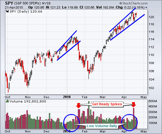
On April 14th we saw an extreme level of selling which sent the broad market sharply lower. This sell off was followed by value buyers pushing the prices back up to new 2010 highs.

Well this week we have seen the same extreme selling volume and the question we all want to know is will there be buyers this time around?
ES Mini & SPY ETF Trading

ETF & Futures Trading Conclusion:

Gold is in a bull market but it was setup for another round of selling but this Spain issue has been a pain. If we had another downward word move on gold to the $1115 – 1120 area it would have washed out the majority of gold bulls resetting it’s self up for a big rally.

The Europe debt crisis has thrown a twist into the picture helping boost the price of gold. Gold could still head lower washing out the weak positions but the picture is fuzzy. Silver did not react much to this news as it’s not really seen as the safe haven gold or the US Dollar are.

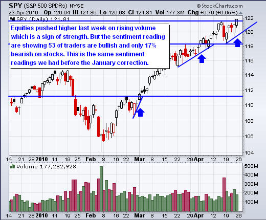
As for stock picks and the broad market, it looks and feels like we are about to start a correction. But this week we saw fear in the market again with the VIX and selling volume surging higher to levels which have triggered temporary bottoms in the past. The problem I see here is that some key price levels have been taken out, so the odds are pointing to lower prices in the near future. But Tuesdays panic selling has pushed the market into an oversold condition so we should see a drift upwards for 1-4 days before sellers get active again as they want to sell and short the market at premium prices.

In short, precious metals are not giving any clear price action to take advantage of yet, and the SP500 looks like it’s on its last legs before heading lower for a meaningful correction which should provide a short setup and then a nice long setup once it bottoms out.

If you would like to receive my ETF & Futures Trading Signals check out my website: www.TheTechnicalTraders.com

Chris Vermeulen

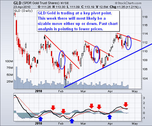
In my last report I showed some cycles for the price of gold and how they were starting to roll over which would in turn put some selling pressure on both gold and silver this week.

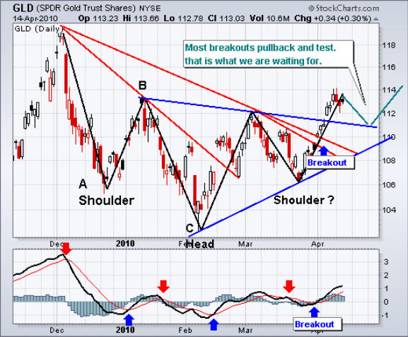
Last Monday we saw gold and silver open higher but both were met with selling for the entire trading session. Since then gold and silver have been drifting higher on light volume with some occasional waves of selling on higher volume. It looks as though gold and silver have started a 5-14 day pause or pullback.

.

GLD – Gold Exchange Traded Fund

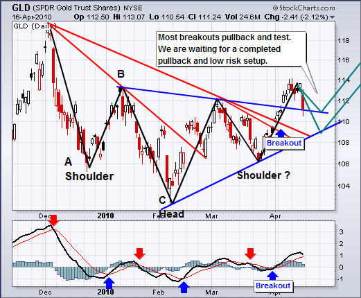
You can see from the chart below that the price of GLD looks to have bottomed after completing several typical price patterns from the breakdown we saw in December. The recent 4 months have provided a solid looking chart which should help gold take another run at the $1500 mark in the coming months.

.

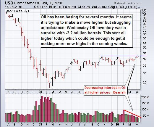
USO Oil Fund

.

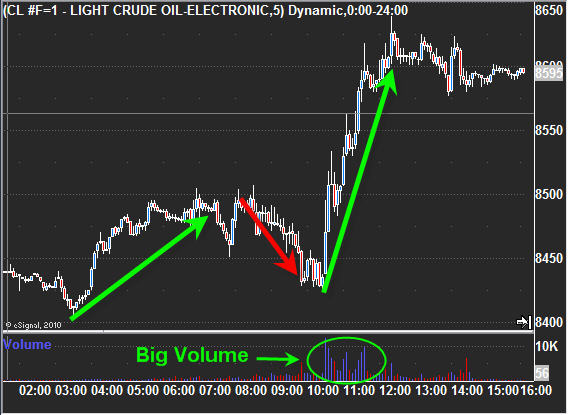
Crude Oil Futures – 120 minute chart of April 14, 2010

As the saying goes, buy on rumor (expectations) sell on the news. Well the price of oil moved up in the early morning anticipating the news (inventory numbers) at 10:30am ET would be in line with estimates. Then we saw profit taking started 2 hours before the number came out which is normal to see. But traders forecasted 1.4 million barrels as the number but the number came out at -2.2 million which was a big surprise for everyone. This sent oil sharply higher providing traders who caught the breaking news with an easy money trade. This type of action does not happen often so it’s a great little bonus for day traders.

.

Mid-Week Trading Conclusion:

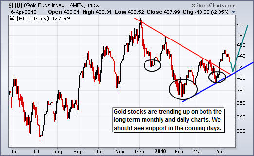
In short, metals have had a nice run recently and the charts are pointing to a short breather before the next upward thrust.

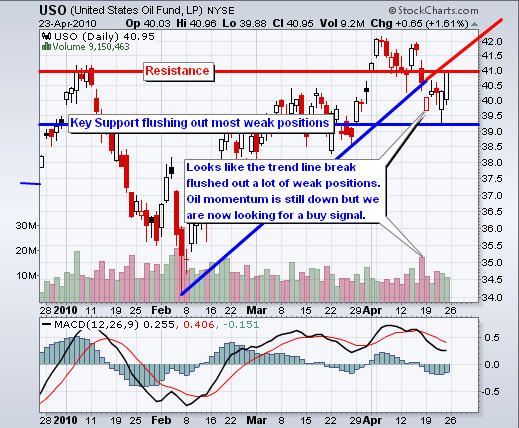
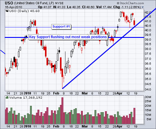
Oil is holding up strong on the daily chart and with today’s extra boost in price, its looking like it may want to start a new leg higher if the momentum carries over for a few more days.

We saw the major indexes surge higher on rising volume indicating buyers are in a panic to buy in fear of missing more gains. There really is no reason to be buying at these prices other than trading off emotions in fear of missing more upside. The problem for these traders is that money is made by those who buy dips in the bull markets. Buying over extended rallies is a dangerous game, especially with the market as overbought as this one. The trend is our friend and if we do get a 1-2 day pullback in stocks we could take small position to buy on a dip.

If you would like to receive my ETF Trading Signals please visit my website: www.TheGoldAndOilGuy.com

Chris Vermeulen
.

.

.

Also, I have been following Neil at http://www.traderreview.net . He’s an ex-broker, gone rogue and running his own newsletter advisory for several years now. And now, his free commentary even gives away currency analysis.

With his free DAILY newsletter, he gives away commentary and insight that most people pay for.

I’d highly recommend you sign up for his free newsletter right now, and you’ll automatically get the report, “What Your Broker Doesn’t Want You to Know”  part of his old broker training. S super fun entertaining read. His daily newsletter has a wealth of information.

April 7th 2010
This week has been playing out as expected with prices grinding their way higher and lots of sharp intraday sell offs and rallies which is indicative of a market getting toppy.

Seems like the masses feel as though they are getting left behind which is why we are starting to see the panic buying in the market (new money buying at these lofty overbought prices).

Each time there is a new intraday or daily high on the major indexes there is a renewed bullishness created as breakout traders and novice traders buy into the market hoping for the next surge in price. It is these volume surges of new money entering the market which the big guys (smart money) are selling into. You can see it clear as day light on the intraday charts as new money gets sucked into the market new high and then 2 minutes later larger waves of selling hit the bids. I did explain and show a chart of how this looks to members of the FuturesTradingSignals.com today.

We have some very exciting times ahead and it’s just a matter of letting the market unfold over time as we take advantage of these carefully measured low risk setups.

On to the charts….

GLD ETF Trading – Gold Exchange Trading Fund

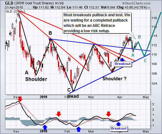
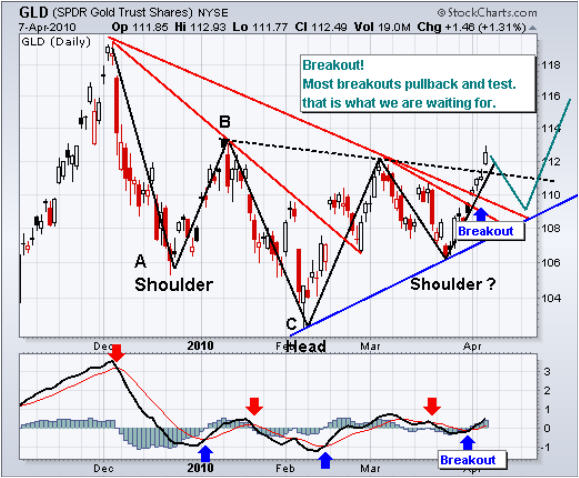
You can see how this chart has evolved from pattern to pattern as it bottomed over time.

Today we had a breakout and I expect to see a pullback which is normal when prices gap up and breakout of a pattern. An entry point would be considered on a pullback if the proper criteria are met.

ETF Trading Newsletter

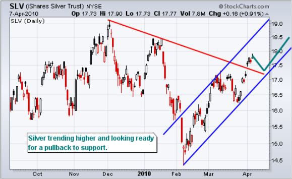
SLV ETF Trading – Exchange Traded Fund

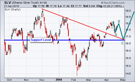
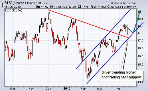
Silver has always been much more volatile than gold which is why the pullback early this year was so strong and why the recent rally has also covered so much ground. As you can see silver has broke out above resistance but is now looking overbought. A pullback in precious metals is expected, or a pause at least.

SLV ETF Trader Newsletter

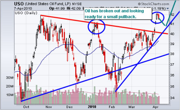
USO Crude Oil Fund

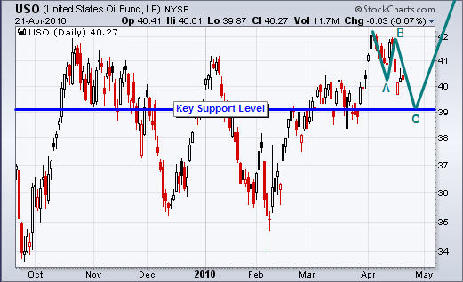
Oil has made a nice move higher the past week but I feel it will pullback also in the coming days for a breather. There are a couple sizable gaps to fill all the way back down to $40.50.

USO Fund Trading Newsletter

UNG Natural Gas Fund

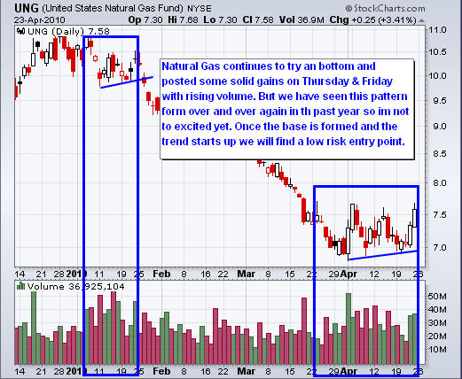
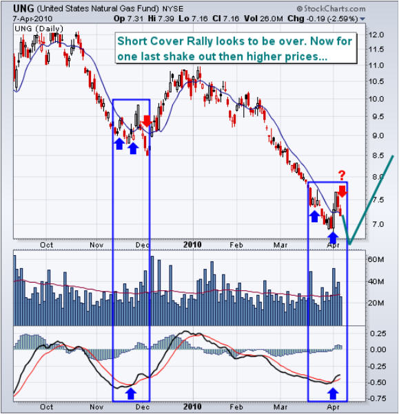
This natural gas chart looks very interesting. In the chart I am comparing the 2009 low to today’s price action.

From looking at the chart, natural gas is way oversold and in dire need of a relief rally. As you can see the sharp rallies which occurred just before both the 2009 and the current possible bottom look identical. This type of price action is very common to see.

Let me explain: When an investment is this over sold, meaning it has sold lower for weeks if not months, then there is a large growing number of traders looking to pick a bottom. Once these traders see prices start to move higher they all jump in thinking its “The Bottom”. Some times it is but more times than not it’s just a suckers rally.

General rule is, if everyone can see it, then its most likely not going to happen.. this is also part of the reason the major indexes keep going up. It looks like a great short and a tone of traders are in cash waiting to take advantage of the drop. But the market will keep pushing higher until fear its not going to pullback. That’s when the new money buys back in fueling the GRIND higher.

Anyways, so after all the bottom pickers jump on the train and there are not any more buyers and the price tends to drift lower scaring these traders back out of the position. Eventually a new low is made and everyone is shaken out of the investment. The crazy part is that just as they get out, the price usually turns around and does exactly what they new was going to happen –Go Up.

Most traders have the direction correct, it’s just their timing is off. My general rule is when I see something I wait another bar, sometimes I keep saying that to my self after each new bar until I am confident in the predicted move or price I can get into the position at.

UNG Fund Trader Newsletter

Mid-Week Trading Conclusion:

In short, the bull market continues to grind its way higher. Unfortunately we cannot do much until there is some type of correction because buying way up here after a 2 month rally is outside of my comfort zone.

I foresee a 3-5% correction starting any day now so I am keeping my gunpowder dry.

Check out my ETF Trading Signals at www.TheGoldAndOilGuy.com

Chris Vermeulen
March 28th 2010
Last week the general market continued to grind its way higher for yet another week. Overall I feel the market is very much over bought. We all know the market can stay in extreme overbought levels for extended periods of time making it very difficult to pick tops.

This is the reason I do not try to pick tops, but rather wait for a top to form before putting my money to work. While a bottom can be made in 1 day, tops tend to take days and some times months to complete.

.

A few things really stood out to me when looking back on last week’s price action.

1. Gold (GLD Fund) was only up 0.29% for the week while the gold mining stocks (GDX Fund) was down over 3.5%. This strong divergence really has me concerned about the price of gold in the near term. Gold stocks generally lead gold and if they are down 10x more than gold last week, we better watch out…
2. The US Dollar broke out and started to rally posting a gain of 1% for the week. It is definitely weird to see gold move higher when the US dollar is rising…

.

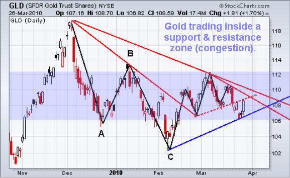
Gold GLD Daily Chart

Gold has been trading sideways/down since December. I see this large 5 month pullback as a bull flag and expect to see much higher prices for gold long term. But I don’t count my eggs before they hatch, so I continue to focus on the daily and intraday chart patterns for low risk trading opportunities.

Friday we saw gold close very strong for the day. It looks very much like a reversal candle but with the price trading under the mini head & shoulders neck line and with the US Dollar in rally mode again, I don’t think the stars are aligned enough for me to put money to work just yet.

Gold is currently trading in a major congestion zone. Until there is a breakout of this zone, I think setups will not be very accurate.
Gold ETF Trading Newsletter

.

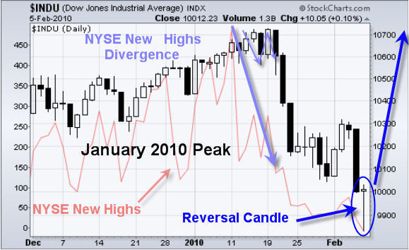
Dow Jones Industrial Average vs. NYSE New Highs Divergence – JANUARY

This chart shows the January 2010 peak in the stock market. As you can see prices became choppy with strong up and down movements before we saw the sharp drop.

Also note the NYSE new highs line. As the market became choppy new highs began to drop quickly. This indicated the market internals were weakening and led to an 8% drop over the next couple weeks.
Stock Market Top Signal

.

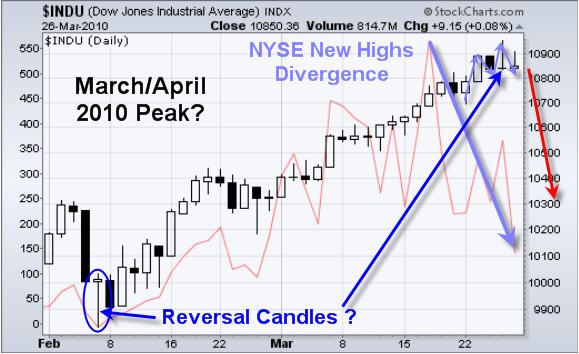
Dow Jones Industrial Average vs. NYSE New Highs Divergence – MARCH

This chart in my opinion looks much the same as January. You can see the Reversal candle from the February lows and the strong rally to the current price, as of Friday.

Notice how the market is getting choppy. Also last Thursday the Dow gave us a reversal candle. But this time the reversal candle is to the down side.

Also note the NYSE New Highs line. It has dropped sharply indicating the market internals are weakening once again.

This is what trading is all about… finding things that are out of whack and waiting for a low risk setup in order to make a profit.
Stock Market Top Training

.

Weekend Trading Conclusion:

In short, the stock market is over bought and about to roll over. I do understand that this grind higher could last another week or so, which is why I am focusing on short/quick intraday movements like Friday’s SP500 Intraday Low Risk Setup, and not buying etf funds to hold for a few weeks. Most of you know I do not chase prices higher simply because down side risk increased when buying into an over extended rally.

I feel gold, silver and oil will move together and at this time, I don’t like their charts for trading. With any luck we could get some setups this week, but not counting anything just yet.

If you would like to receive my Real-Time Low Risk ETF Trading Signals please checkout my website: www.TheGoldAndOilGuy.com

Chris Vermeulen
I think many of you will find this article interesting as I show several different indicators which point to an imminent correction for stocks and precious metals.

Last Wednesday’s report I showed how the current price of the index was almost identical to the January peak from where prices dropped nearly 10%. The report was called “28 Day Sector Rotation, Commodity & Index”. We did get the first sign of toppy market last Friday with the sharp one day sell off as I expected.

Today, one week later we are now that much closer to a 3-8% drop which is shown in the charts below. It’s important to remember that bottoms tend to happen quickly while a market topping is more of a process which is why so many people take big losses trying tip a top.

The market will continue to move up even when it is way overbought. It’s only when extreme levels are reached that tops can try to be played.

.

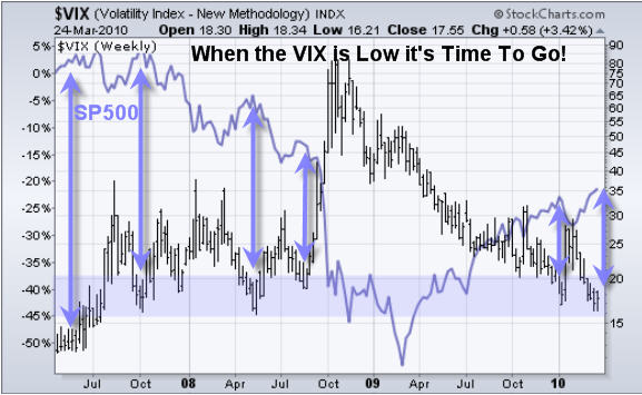
The Volatility Index – Measures Fear & Complacency in the Market

While the VIX is not something I follow on a daily basis it is important to keep an eye on it. When extreme low levels are reached we know the market (John Dow traders) are feeling confident and buying up everything they can get their hands on.

I like to trade with the trend but when extreme levels are reached I start looking for a low risk setup to the short side (profit in a falling market) using leveraged ETFs.

As you can see from the chart of the VIX and SP500 below, each time the VIX tested the support level the market made a top. Again the VIX is not a great timing tool but it helps me decide which trading strategy I should focus on (swing or day trading) and if I should be looking to buy or selling the market.

.

NYSE New Highs-Lows Index

If a chart is worth a thousand words then this chart is worth 2000. It cannot get any simpler that the NYSE new high-low index.

The green line is the SP500 index which is straight forward. The Red line is the number of stocks on the NYSE which have reached a new high.

How strong is the market if is keeps going up while the underlying stocks are getting weaker? Something has got to give and it will most likely be to the down side.

.

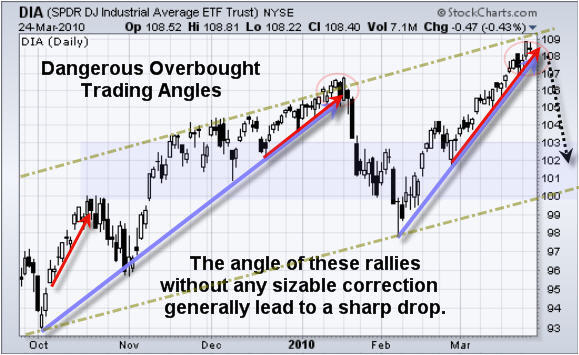
Dow Jones Industrial Average – Daily Trend Chart

This chart adds another layer of clarity. You can see what happened last January when everyone was buying stocks thinking life is good, trading is easy. As my trading buddy David Banister from ActiveTradingPartners.com always says “Buy when the Cry, Sell when they Yell”and that’s what I am looking to do.

Today the Russell 2000 index (small cap stocks) sold down very hard. These stocks tend to lead the market both up and down. So the red flag is up and I am just waiting for the market to show me its hand so we can catch the next big move.

Coles Notes on Chart:
• Market is over bought and in dire need of a pullback
• The length of this steady rally is much longer than a normal rally
• The rate as which prices are rising is much to steep to be maintained
• The market is trading at the parallel trend line
• VIX is tell us people are buying and not worrying about any possible drop
• NYSE divergence is screaming Overbought…

.

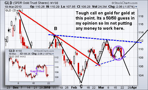
GLD Gold Fund Trading

Gold is still in a major bull market but the recent price action from Dec up until now has been down as gold consolidates the large rally from 2009.

Looking at the chart below you can see the mini Head & Shoulders pattern. The neckline has now been broken and prices are falling. I almost had a buy signal for gold two days ago with the small move up and the candle closing above the previous days high. But because the price was still under the neckline (resistance) I decided to stand aside and live another day.

.

Mid-Week Gold Newsletter Conclusion:

In short, the market looks very strong but from a technical point of view it’s about to die of exhaustion in my opinion.

Gold, silver and oil I figure will move together which is sideways or down.

I am keeping a very close eye on things hoping prices unfold in a manor which will allow us to spot a low risk setup in the coming days as I would like to catch this drop if it happen. With any luck we could make 10-15% within a couple days using a leveraged ETF.

If you would like to get my Real-Time ETF Trading Signals please check out my website: www.TheGoldAndOilGuy.com

Get my FREE Weekly Reports:

Chris Vermeulen

March 21, 2010
Last week was nothing special as stock market continued to drift higher on light volume and the Volatility Index (VIX) reaching a new multi year low. This mix of higher prices on light volume, multi year lows in the VIX and an overbought market paints a clear picture to a market technician – Be Ready for a Pullback!

Last Wednesday I sent out a report covering sector rotation comparing the price performance of these sectors from the January peak with last weeks price action. It was very interesting and it pointed to a sharp sell off Thursday or Friday

Here is last Wednesday’s report if you are interested: http://www.thegoldandoilguy.com/articles/28-day-sector-rotation-commodity-index-update/

.

GLD Gold ETF Daily & 60 Minute Chart

Last week gold gap higher then traded sideways for a few days. I will admit it was very tempting to buy into the move but I stuck with my trading strategy which is to not chase moves which gap in my direction.

Gaps are known to get filled about 70% of the time. What that means in this situation is that the price will most likely sell back down to fill that gap before trying to move higher.

All that said the problem I see now on the daily chart is the possibility of the mini Head & Shoulders pattern breaking down. If gold moves any lower then I would expect a sharp pullback. The measured move would equal a pullback to the $104 area on the GLD chart and the $1070 level for spot gold.

.

SLV Silver ETF Trading Chart

The silver chart looks much different than gold’s but in reality they are trading in a similar situation. If silver moves any lower then sellers will flood the market and take the price down to the next support level. But if we get a bounce then it should surge and rally almost a $1 per ounce from this point.

Only time will tell as we let this trade unfold with a stop at $16.52.

.

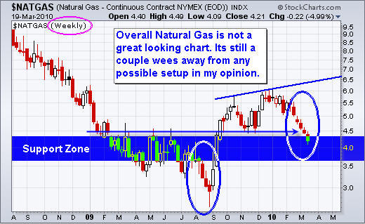
Natural Gas – Weekly Trading Chart

Natural gas has been selling down for almost 2 months. The chart is starting to show a possible buy point if all goes well in the next few weeks.

What I like about this chart is that we saw a break of a support level and heavy selling which tells me the general herd is getting shaken of their long positions. This extended sell off is now entering a support zone and could provide us with a low risk setup in the next 2-3 weeks.

.

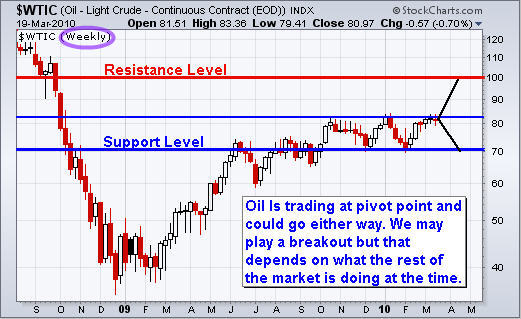
Crude Oil – Weekly Trading Chart

Oil is trading similar to gold and silver. It is trading at a key pivot point and could go either way quickly. I will be keeping my eye on the daily and 60 minute charts for a possible low risk entry point.

.

Weekend Stock & Commodity Trading Conclusion:

In short, the overall market is trading at level were there is not much to we can do. Day traders are able to take advantage of this price action but not swing traders.

I feel the major indexes have another 1-2 down day left in them before a bounce, but it’s more difficult to gauge the momentum with a cool down period in the middle of it all (the weekend).

The market is on the edge of some exciting moves as I can feel something brewing. With any luck there could be some great opportunities in the coming days.

If you would like to receive my Free Weekly Trading Reports checkout my website: www.GoldAndOilGuy.com

Chris Vermeulen
March 17th 2010
Earlier this week I noticed a pattern in the market throughout an entire trading session that has inspired me to write a short piece on sector rotation.

On Tuesday March 16th, my quote screen was flashing green as sectors reached new intraday highs or 52 week highs. The interesting part was that every sector that was flashing green happened to be in sectors that strengthen at the end of a bull market cycle or strong rally. This would include basic materials, staples, services, utilities and financial.

Today I investigated the different sectors and came across some interesting numbers between the January market peak and this week’s price action as I show in the charts below.

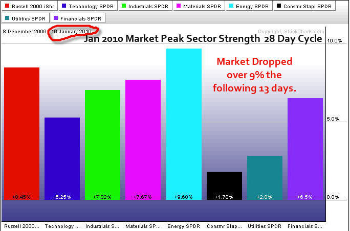
JANUARY – ETF Sector Rotation Trading – 28 Day Cycle
I may not explain this well but try to follow me here 🙂
Just before the market rolled over and lost over 9% last January, all the proper bull market sectors were very strong during the previous 28 days. This is normal and a strong sign that market participants were bullish on the overall market.

But the market was overbought; trading volume was light indicating that not many people are willing to buy at these lofty prices. And the VIX (volatility index) had reached an extreme low (a level that has triggered large sell offs in the past). All this means one thing to me. And that is, trade with caution and tighten your protective stops.

General rule, if everyone is buying all the hot stocks at these over bought levels then you can’t help but think its time for the market to roll over and shake them all out.

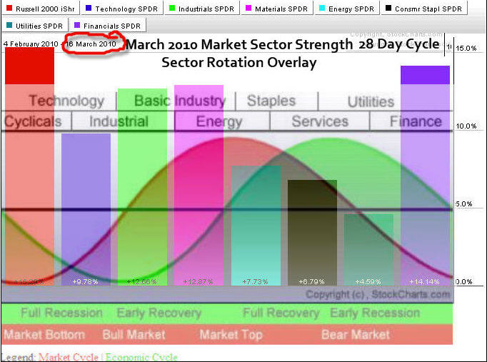
MARCH – ETF Sector Rotation Trading –28 Day Cycle
The chart of March shows where the sectors have finished over the past 28 days. Notice how similar the sectors have appreciated in price…

I have overlaid John Murphy’s sector rotation image to show which sectors are strongest in a bull market.

Now the interesting part is that it appears to be the setup as in January. My quote system is flashing new highs for the bear market cycle sectors which are the one which have not performed well (Stapes, Services & Utilities) and I have to think the market is about to take a breather or do a swan dive.

Don’t get me wrong, I am not saying we are on the verge of a bear market. I actually think the market is strong and will trade sideways in a large range for most of this year or just continue to trend up.
What I am saying is that these sectors go in and out of favor during smaller market cycles and that can be very useful information.

Sector Rotation Explained
You can learn more about sector rotation from this detailed course How to Profit From Sector Rotation Using ETFs. This course explains how different sectors are stronger during different points within the economic cycle. The chart above shows the relationships and which of the various sectors should strengthen from the economy. The financial Market Cycle leads the Economic Cycle because traders try to anticipate the economy.

Market Update & Trading Conclusion:
Stock Indexes: The market in my opinion is way over bought on the daily chart and needs a breather. Volume is light, VIX is at the same level we saw in January just before the top and the bullish sectors are firing on all pistons. You won’t catch me buying up here. Any type of pullback will most likely be sharp and there is no need to put money to work right now.

Precious Metals: Gold and silver had a nice pop this week off of a support level. I did not have a low risk setup as momentum was not on my side at the time of the pop. Also the large gap up on GLD makes me nervous as gaps tend to get filled. I am just waiting for something to unfold which looks to be a few days away still.

Oil: It has popped higher also and is trading at resistance. As I mentioned in Sundays report, if the USD dollar completes this breakdown then we will see commodities and stocks surge to higher prices and most likely post a nice multi month rally.

Natural Gas: We are seeing natural gas prices dip below support, shaking out traders who had their protective stops set just beneath the previous low. Natural gas is a silent killer as it will shake even the best traders out of the market. I feel natural gas is over sold and ready for a bounce but until I get a low risk setup I remain on the side lines.

If you would like to receive my Free Technical Trading Reports please opt-in to my free newsletter here:
Chris Vermeulen
www.TheGoldAndOilGuy.com