Last week was an incredible week for trading the intraday charts. With rising volume and volatility prices began to move up or down for extended periods of time allowing traders to profit from these powerful short term price swings.

During times like these traders using the daily charts for their guide found the market very difficult to time because of the whipsaw action each day. In this case, it is definitely best to stay clear of the market until the dust settles. But for a trader who watches the intraday charts, this is when serious money is made on a daily and consistent basis.

Most traders avoid using intraday charts because they either:

1. Think it’s day trading and do not want to sit in front of the computer all day
2. Do not understand how to trade in these “intraday” time frames.

Intraday trading is one of the most over looked yet most profitable trading strategies, in my opinion. One of the reasons I like/love it so much is the fact that it provides high probability setups on a weekly basis and trades generally last 2 -36 hours. Also, this strategy carries very low risk simply because you are in cash most of the time, putting your money to work only when high probability setups form.

If you are an active trader you should have been making money hand over fist last week. Below are close up shots of my charts:

My eSignal Trading Platform

This is my main trading screen which allows me to see the entire market. This, to me, is like a dashboard of an airplane. Each mini intraday chart is like a gauge hinting to what the plane in doing (horizon indicator, fuel, air speed etc.) My custom dashboards quickly allow me know if the market is heading up or down, what speed it is moving measured by volume and momentum, and if all pistons are firing which sector is really moving.

My Custom Dashboard

Quotes for every index and sector
Top Row: 60 minute charts with volume of: DIA, SPY, QQQQ and NYSE
Second Row: 60 min chart of NYSE TRIN, NYSE Adv/Dec, 60min Gold, 60min Oil
Bottom Row: 120 minute chart of the US Dollar, Interactive Brokers Trade Window

In short, I can see waves of money flowing in and out of each sector. These views give me a strong sense as to the strength of momentum. From these observations I determine whether the setup is favorable for shorting into light volume rallies, shorting into resistance levels or buying oversold sell offs in up trends.

Also, the chart patterns on the 60, 240 and 480 minutes charts are so powerful and accurate that you only need 2-3 trades a week in order to make decent money.

I would like to note that I do have 4 larger charts with different time frames allowing me to really get a feel for a trade before I commit money. These charts are Weekly, Daily, 240 minute and the 60 minute chart.

If you want to see some exciting daily charts of gold, sp500, oil and silver check out my weekend report: http://www.thegoldandoilguy.com/articles/gold-sp500-psychology-they-bail-we-buy/

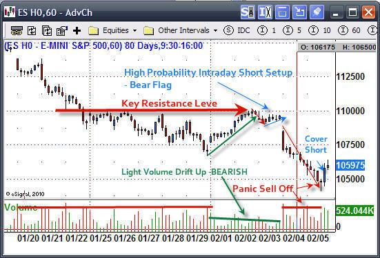
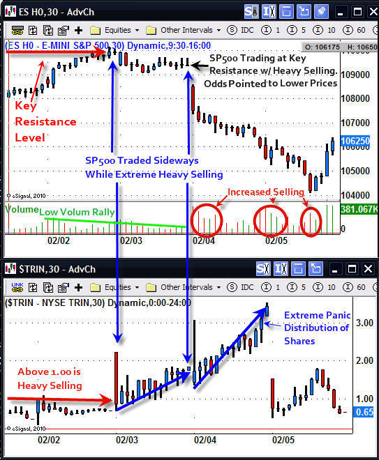
SP500 Day Trading Futures Signal – 30 Minute Chart

The SP500 ES mini contract, or you could have traded the SPY exchange traded fund, provided an excellent intraday short trade last Wednesday.

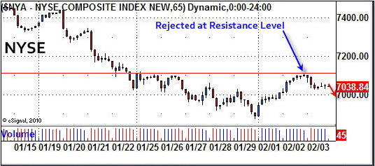
All the indexes (NYSE, NASDAQ, SP500, DOW) drifted higher on light volume. While you can play the long side of these low volume rallies I prefer to stay in cash and wait for another short setup. Trading with the short term trend (240, 480minute charts) is crucial. Counter trend plays tend to be weak and short lived.

In short, the SP500 drifted into a resistance level on light volume and the NYSE TRIN indicator was rising in a very strong way. The combined information of price, volume and the TRIN indicator were screaming – short the market.

When the TRIN is above 1.00 it means the majority of the trades being executed on high volume NYSE stocks are sell orders. You don’t see the TRIN rise this high without the market selling off as it did on Feb 3rd. But when it does, Bombs Away – time to go short!

The next day the index crashed with panic selling across the board. The NYSE had over 30 sell orders for every 1 buy order. Now that is panic selling and, coincidentally, exactly as has happened at each bottom formed throughout 2009.

Intraday Trading SP500 – 60 Minute Chart

This chart clearly shows the high probability setup which took a few days to form. A short position was taken during the small bear flag pattern. My short position was covered on the break of a new high formed on heavy buying volume.

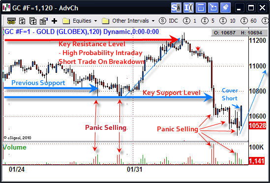
Intraday Trading Gold Futures – 120 Minute Chart

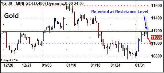
Gold had virtually the same setup as the SP500.

Intraday Trading Gold & SP500 Futures or ETF’s Conclusion:

As you can see intraday trading is nothing like what most people think it is. Trading using the 60, 240 and 480 minute charts really opens one’s eyes, allowing a panoramic view of the price action the market has to offer.

As most of you know, my goal is to trade low-risk, high-probability setups. And, the less time my money has to be in the market, the better.

If you are interested in getting more Intraday Analysis and Setups for ETF’s, futures and CFD’s be sure to join my free newsletter for Trading Futures and ETF’s:

Chris Vermeulen
www.TheTechnicalTraders.com

Feb 2nd, 2010
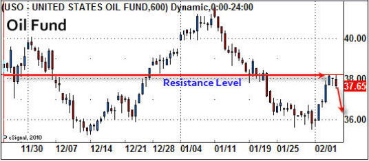
We are seeing the market follow through from yesterdays strong rally with the Dow, SP500 and NYSE break the previous highs seen on the hourly charts. We now have a higher and high and waiting for a pullback for a higher low. This would complete the trend reversal and this is also the definition of an uptrend. There is a little more room for stocks and metals to move up today before trading deep into the next short term resistance level.

DOW & SP500 Hourly Charts

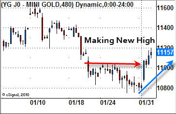
Gold Hourly Chart
Gold and silver have put a in the same move as the indexes mentioned above. I figure we will get a pause here for a couple days as the metals try to push up through this resistance level.

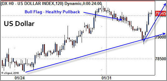
US Dollar Hourly Chart
The US Dollar has formed a very nice bull flag and is trading at support. This has me thinking that the majority of index and metals bounce is finished, for now anyways. The dollar should start to bounce in the coming hours which will put pressure downside on metals and large cap stocks.

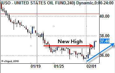
USO Oil Hourly Chart
Oil has put in a solid bounce as it moves above its previous high set on the hourly chart as it also tries to reverse to the upside.

Quick Wrap-Up
It looks as though the downward trend is starting to reverse back up. During transition periods like this is when things generally get even more choppy. I am on alert for new setups in commodities and ETF’s as this could be a possible bottom.

Get my Trading Reports Via Email Real-Time:

Chris Vermeulen
www.TheTechnicalTraders.com

Jan 31, 2010
The past two months have been tough on the precious metals sector. We saw precious metals lead the market higher all of last year until December 2009 when prices plummeted as the US Dollar started to bounce. The continued rise in stocks indicated an extreme overbought condition and alerted us that a sharp pullback was going to take place.

Many traders including myself were surprised that the broad market did not sell down with the metals. In December the market looked and felt ready for a sharp pullback but new money continued to flow into stocks, pushing the market higher. This slow and steady grind higher was very frustrating to watch because the market was making new highs day after day while obviously needing to take a breather at any time.

It’s this grind higher that sucks in the last retail buyers before prices collapse, unfortunately leaving many holding overpriced securities and commodities for sale another day.

Since gold lead the market up last year it should be the first to correct and also pullback quicker and deeper than its followers (stock market). This is what we are seeing now which I explain below using charts.

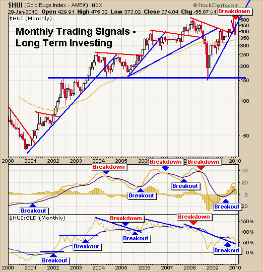
HUI – Gold Stock Index – Monthly Gold Trading Chart
I use this exact month chart for helping to time long term trends for gold and gold stocks. It looks as though we have temporarily formed a double top with this current breakdown. It will most likely take several months to repair the damage done to this chart and possibly more than a year.

There are two options for this chart:
1 – It will form a bullish flag or pennant then continue its move higher.

2 – Or will continue to slide, indicating sellers are in control and that we are looking at a multi year trading range as the market digests the 10 year rally in gold.

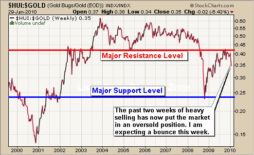
The HUI:GOLD Ratio – Weekly Gold Trading Chart
This chart goes up if gold stocks are out performing the price of gold and down if they are underperforming. From 2001 – 2006 the chart looked very bullish but as time went on the ratio really started to look weaker and weaker.

The 2008 meltdown crushed precious metal stocks and the recent rally back up to resistance looks very bearish. It looks like a large bear market rally (test of breakdown level). This also goes for the monthly chart above. I cannot say either chart is looking bullish anymore. Things really depend on how strong the next bounce/rally is so we can gauge the strength behind the move (dead cat bounce, or legitimate rally).

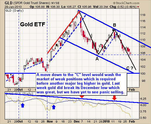
Gold GLD ETF – Daily GLD Trading Chart
The next three charts really pull things together in my opinion in terms of how much selling is left in the market on the daily chart time frame.

Here I have drawn on a daily chart showing what I figure will unfold over time. This is the same pattern that I have been talking about since early December. I love trading ABC retrace patterns because of their accuracy and follow through on trend reversals.

In short, if we see gold break this support level then traders are going to panic out of the market sending the GLD fund towards the $101-$103 level. This panic selling is exactly what is needed if we want to see gold continue a sustainable and strong bull market rally higher.

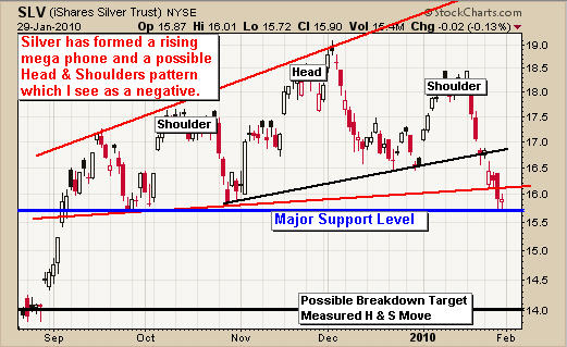
Silver SLV ETF – Silver Trading Chart
Silver has been a little more difficult to trade as the chart clearly shows the choppy price action. I feel that if silver breaks this level of support we should expect to see $14-$14.50 quickly.

US Dollar Trading – Daily Dollar Trading Chart
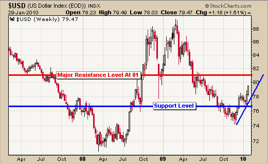
This chart pulls the above GLD and SLV charts together. Both gold and silver have more room to fall before reaching a major support level. Knowing that and looking at this chart of the Dollar you can see the Dollar has approximately the same amount of room to rally.

So in a perfect trading scenario, the dollar will continue to climb for a few more days to reach resistance and in return that will push gold and silver down for a few more days.

Precious Metals Trading Conclusion:
I think this week will be a pivotal one. I can see the dollar moving higher sending precious metals and stocks down enough to shake traders out of their long positions in gold, silver and stocks. Once the sentiment turns bearish we will begin looking for an oversold speculative trade and possibly a low risk trend trade setup.

As for the energy sector, both crude oil and natural gas look weak and I continue to patiently await a low risk setup for each.

If you would like to get my Gold Newsletter please join here:

Chris Vermeulen
www.GoldAndOilGuy.com

Jan 29th, 2010
I thought I would put this more detailed report on finding and trading low risk setups for gold, silver, oil indexes etc…. In short it does not matter what time frame you trade with or if you trade exchange traded funds, futures contracts or CFD’s (contract of difference).

This type of trading setup works for virtually every investment but I mainly focus on trading: Gold Futures, Gold ETFs, Gold CFD’s, and the SP500 & Dow 30 futures, ETF’s and CFD’s as I find they are very accurate and profitable.

Obviously swing traders who watch the daily chart will have few trades because it takes weeks and months for these low risk patterns to form. This is the reason I am using short term intraday charts and using a setup from yesterday (Thursday) for demonstrating my trading setups.

My Short Trading Setup – Rough Guideline
1. Trend on 2hour and 1hour charts are down
2. Increased volume during sell offs, and light volume on rallies/rising prices
3. Entry is best at Fibonacci retracement level which is also at a previous resistance level.
4. Set Stop just above the resistance level you are expecting the current price to stop at. Exit if this top is penetrated and wait for a new opportunity.
5. Cover half of your position just before the investment reaches the first level of support to lock in gains and reduce overall risk.
6. Once the price of the investment starts to make a new short term high exit the balance of the position. Shown in the charts below.

DIA – Dow 30 Index Fund
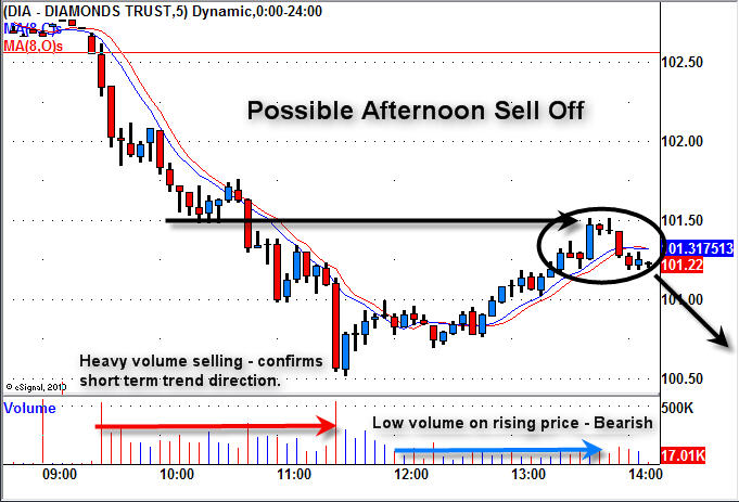
This is a chart I sent to members on Thursday pointing out the market weakness. We had a nice sell off in the morning and the price drifted up on light volume later in the afternoon. This low volume drift is crucial to recognize as it tells you the general public is buying. This is what Big Money likes to see. After they crush the market with their large sell orders in the morning they take a break allowing regular retail traders/investors move the market back up before the big sellers start dumping shares again.

So, I am looking to short at a resistance level in hope the big sellers step back in.

DIA – Dow 30 Index Fund – End of Day
This chart quickly shows the two intraday setups for shorting at resistance levels. Both trades worked out well but wait until you see the results of trading with futures or CFD’s shown later.

Anyways, the first short was a great play but we did not see the big sellers step in, which led to a reversal and the price continued to move higher taking us out for a small profit.

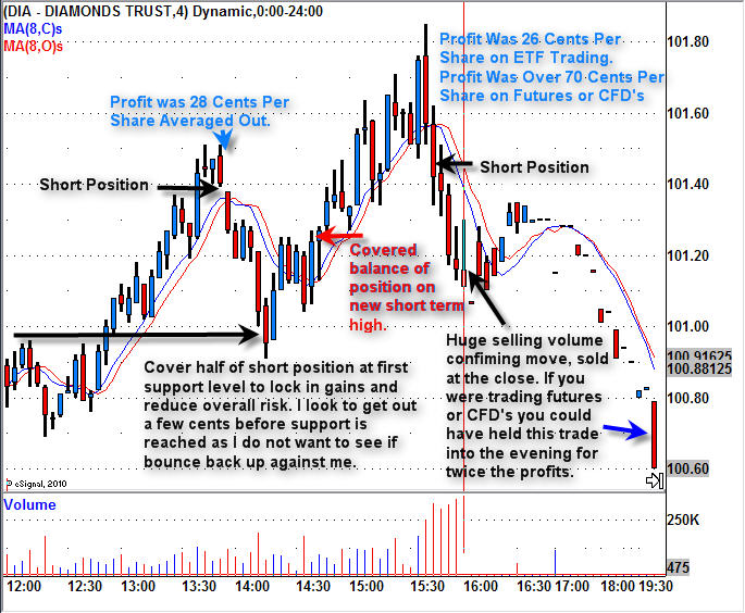
The second short had huge selling volume indicating sellers were back in control. This play we held into the close. The next chart shows how this is done.

DIA – Dow 30 Index Fund – Step By Step Play
The chart is a little small to see but it explains and shows how these low risk setups should have been traded according to my trading strategy to maximize gains while minimizing risk.

Dow 30 Futures & CFD Day Trading Signals/Setups
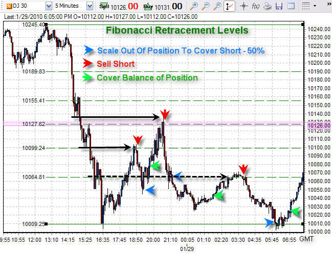
This is the same Dow 30 index but is zoomed out so we can take advantage of the 24 hour price action which the futures market trades.

Here I show the Fibonacci retracement levels which happen to be at resistance levels from earlier that day.

During regular trading hours the trades were the same as the DIA etf above, but with futures trading you can traded 24 hours a day. So with the last ETF trade I talked about earlier we only made 28 cents profit per share, but with futures we could have held this position until it fully matured netting a total gain of 40 cents per share. This is 42% more profit simply by trading with futures or CFD’s.

To make things more exciting there happened to be another fantastic trade after dinner making us another 45 cent move. These gains may not sound like much but it equals $1000 – $3000 in profits depending on what you are trading ETF’s, Futures contracts, or CFD’s.

End of the Week Trading Education and Wrap Up:
Overall this week was nothing short of awesome!
The overall market is trying to hold up but sellers continue to pull it lower. Unless there is a strong rally into the close on Friday I figure Monday will gap down because the daily charts are very scary looking. This is what makes the general public panic out as it flushes out the remaining sellers, just before the market makes a sizable bounce and possible rally to new highs.

If you are interested in getting more intraday analysis and setups be sure to join my free newsletter for Day Trading:

Chris Vermeulen
www.TheTechnicalTraders.com
The stock indexes have been trading very choppy making it difficult for swing/trend traders. It’s during times like this when seasoned traders rise above the herd of average traders.

If you only trade one strategy like swing trading or trend trading then you are likely finding it difficult to make money right now. On the other hand, day traders are having a blast right now as they take advantage of the powerful intraday rallies and sell offs.

I personally like swing trading but during times like this, when I know it will not work, I have to switch my strategy to day trading and focus on the 60 minute and 5 minute charts.

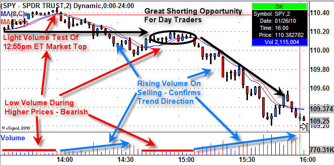
SP500 Index Fund – Intraday Setup
I posted this chart earlier this week and I want to be sure everyone takes something away from this chart as I believe it shows a perfect low risk setup for shorting the market, or you could buy a reverse fund which goes up as the market moves down.

At first glance this chart is noisy, but if you simply focus on the all the different color analysis separately you will notice how simple trading can be and what you should be looking for.

Red Analysis:
1. Overall market trend is down so we are looking for a short trade, signs of weakness.
2. First we see a light volume test of the previous high set earlier in the day. The low volume indicates there are not many participants in the move up and that is a weak sign.
3. Between 14:30- 15:30 we notice the price start to drift higher on very light volume. Also, the price moved up into a resistance level. This to me is a perfect setup.
4. You would sell short or buy a reverse index fund at this point hoping for the market to start selling. You could also wait until it started to drop before taking a position but when a chart looks this good I try to get in at the highest price possible.

Blue Analysis:
1. The price starts to drop forming several small bear flags going into 14:30 before bouncing. Also note the volume began to rise as more selling was happening. This tells us that trading activity is predominately selling and that we should also focus on shorting when the time is right.
2. Again, the price starts to drop forming several small bear flags going from 15:00 – 15:45 before bouncing. Also note the volume began to rise as more sellers took part in this short term trend.

Black Analysis:

1. This shows more or less the resistance level, area to short the index and the nice trend down.

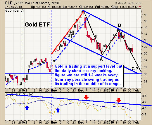
Gold GLD ETF Trading
Gold has been under selling pressure since early December. That powerful drop and the chart pattern it has formed will generally resolves itself after an ABC retrace pattern. I have drawn this on the chart which is what I think will happen in the near term. This daily chart of GLD ETF has a small 4 day bear flag and bearish reversal candle which is pointing to lower prices in the near term.

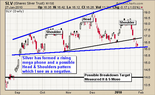
Silver SLV ETF Trading
Silver has a funky looking chart. It has formed a large megaphone pattern and possible head & shoulders pattern. Both are bearish and if we use the Head & Shoulders to calculate where silver could end up trading if it continues to break down, then $14.00 would be a level to look for a bounce.

Natural Gas UNG Fund
The natural gas fund UNG has been in a down trend for over a year and the recent drop looks to be the start of another sell off. This could possibly form a reverse head & shoulders pattern with this drop moving UNG down to the $8.75 – $9.00 area. We will have to wait and watch things unfold for now.


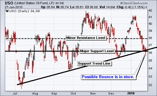
Crude Oil USO Fund

USO looks to be trading at support. I am inclined to patiently wait another session before possibly taking a position.

Mid-Week Trading Conclusion:
In short, I feel the overall market could bounce including stocks and possibly commodities, but the selling is not over yet in my opinion. The drop we have seen in the past week is the half way mark. So this bounce would be the starting of an ABC retrace for stock indexes. During choppy times I like to be sitting in cash and or day trading for short term profits.

Precious metals do look oversold and ready for a small bounce or sideways move; I do think they will head lower. Too many traders are still holding on to their gold positions and until a large number of them get scared out of their positions, we will not see gold rocket higher.

Natural gas looks like it’s about to head much lower this week while oil looks ready for a solid bounce off support.

We continue to wait for new low risk setups as different investment scenarios unfold.

Get my Free Weekly ETF Trading Reports at www.GoldAndOilGuy.com

Chris Vermeulen

It was a heart pounding week on Wall Street as traders and investors locked in profits during 2010’s first round of earnings season. While it is normal to see selling of shares after good news hits the market, last weeks melt down was over exaggerated and for good reasons.

In short, we expected good earnings and that is why the markets have been crawling higher the past couple months (buy on rumor, sell on news). But what made last weeks sell off so strong was the fact the market was way overbought on the short term time frame and looking ready for a correction already. So we saw twice the selling pressure crammed into one week.

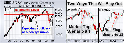
Looking back at a 12 year chart of the Dow Jones Industrial Average we can see the market is now trading at a major resistance level. There are two scenarios the market will likely follow in the coming 12 months. And it could take a year for each of these scenarios to unfold.

Scenario #1 – The market could top then start heading lower to test the 2009 March low. I don’t want this but it could still happen. Topping is a process. Unlike most bottoms which happen very quickly, tops tend to drag out much longer. In this case I figure we are looking at 4-12 month time frame for the market to truly roll over and confirm that we are in a major bear market again.

Scenario #2 – If the market holds up relatively well and forms a bull flag then we can expect to see higher prices in the future. If this happens it will take 4-12 months to unfold also.

Both scenarios have characteristics associated with them, so as the market progresses I will update on the market internals which will help tell us if the underlying market is holding up well or deteriorating. Only time will tell and we will play it one candle at a time.

Dow Jones Industrial Average – What Is Next?


Gold Stocks – Rockets or Rocks?

The gold stock index closed below its support trend line which held up for over a year. This is not a good sign for gold or gold stocks but there is light at the end of the tunnel.

Simple technical analysis is telling us to be cautious at these price levels. If we zoom way out on the charts the current price level and chart patterns on these charts scare me. The gold stock/Gold ratio chart is trading under resistance and the HUI (gold stock index) is trading near the 2008 high. What I do not like is the technical breakdown on the HUI monthly chart. You can see the trend line break on the chart with my small zoomed in picture.

The good news is that everything looks to be extremely over sold on the 60 minute charts so I am expecting a bounce across the entire market for a 1-5 day dead cat bounce. Friday we did see gold stocks move up strong off their lows out performing the price of gold. This is positive for gold and stocks. Depending on how that unfolds we could take a short term momentum play to profit from a possible leg lower.

Precious Metals ETF Daily Charts – Gold & Silver

Gold and silver lost some shine last week as they plunged towards their next support level. A bounce is expected but then I feel we are heading lower and this will likely shake out the majority of traders before starting another rally higher.

On Jan 13th I posted a report indicating gold and silver were headed lower because of the recent price action as silver and gold both had a Pop & Drop chart pattern with heavy selling volume on the 60 minute chart: http://www.thegoldandoilguy.com/articles/commodity-gold-futures-trading/

Energy Fund Trading – USO & UNG


I am really starting to like USO for an oversold bounce off support. I would like to see the market reaction on Monday before we do anything. With everything closing near their lows on Friday, panic selling from fear may creep into the minds of traders and investors.

Natural Gas fund looks to be setting up a bull flag. It will be interesting to watch this progress.

Commodity and Stock Market Index Trading Conclusion:

This month looks and feels like last Jan – March, but reversed. The market is now getting choppy as the bulls and bears fight for direction making is difficult to swing trade. Times like these are best for intraday traders, not swing traders. Trading tops is actually much more difficult than trading a bottoming market in my opinion so I will be picky with trade setups. My number one goal is to preserve capital and avoid choppy market conditions as part of managing risk.

Final trading thoughts, I look for the broad market to get a possible bounce this week, but I feel lower prices are still to come. The USO oil fund looks prime for the picking and that could be our next trade.

If you would like to receive my Free ETF Trading Newsletter visit my website:

Chris Vermeulen
ETF Trading Gold Newsletter

Jan 22, 2010
It’s been a crazy week for stock and futures traders as the market moved up and down like a yo-yo, finally closing down sharply on the week.

Earlier this week I posted a report showing the Volatility Index (VIX) and how it was then trading at an extreme low level which triggered the sharp market corrections. Since that post the VIX has now risen over 30% as traders start selling positions to lock in gains.

Take a quick look at the Volatility Index chart:


Chart of S&P500 Daily Price Action

Since the low in the volatility index a few days ago we have seen the S&P500 drop over 3.4%. This sharp sell off in equities and ES futures has happened in a very short period of time making the overall market oversold when looking at short time frame of the daily chart. With the market oversold and also trading near a support level I expect we could get a weak bounce lasting 1-5 days before rolling over for another wave of selling.

There are several reasons I feel this will happen:
1. Experience from seeing setups/patterns like this across many different indexes and investment vehicles leads me to believe distribution of shares are now starting to flood the market.

2. The market sentiment surveys are still extremely bullish. What does this mean? Well if almost everyone is bullish, then who is left to buy?

3. As the good old saying goes “Buy the Rumor, Sell the News”. With earning season starting I cannot help but think everyone (smart money) will be selling into the good earnings news as dumb money buys into stocks as they meet or beat earnings. This inflow of dumb money is exactly what the big guys need to unload massive amounts of shares at a premium. Also I would like to point out that earning estimates have been very low that past year which I think has been on purpose for the institutions. This makes it very easy for companies to beat estimates each quarter giving the warm cozy feeling to retail investors (us, the small guys)

4. Also Chares Biderman on Bloomberg pointed out the other day that the market looks to be manipulated by the feds as virtually all the gains have been produced after hours in the futures market.

Chares Biderman Video
The United States in my opinion is much more corrupt than most people think and I don’t really want to get into this rather large and interesting debate at the moment. But Charles Biderman has some very interesting points which fall in line with my thinking about how much of what is happening is really natural and what is completely manipulated in the past 10 months of rising market prices.

Must Watch 5 Minute Video

Quick Technical Chart Update on Gold
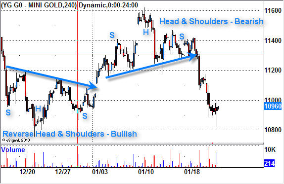
I thought this chart may be of interest to some of you as it shows two perfect textbook plays on the 4hr gold futures trading chart.

As you can see the first pattern is a reverse head & shoulders pattern. This is bullish and a breakout above the neckline would signal a buy point. Now if we use basic technical analysis with this pattern we can measure the potential move up by looking reverse head and shoulders pattern. You take the low of the upside down head $1075, and go straight up to the neckline at $1117. That is a total of $42. So if we add that $42 to the breakout point above the neckline then we can have a price target of $1117 + $42 = $1159.

As we can see the price of gold over the next couple days rallied to the $1160 level. Trading is not that easy but that is how it works in general. The hard part is knowing how to manage your trade and I scale out of positions as the price matures reaching short term resistance levels and by adjusting my stops accordingly to lock in maximum gains while minimizing downside risk.

A couple days later the same chart formed a regular Head & Shoulders and has since moved its potential measured move. I m not expecting a weak bounce in gold as with the overall stock market, but I am still not sure that the selling is over.
4 Hour Gold Trend

The “Weak’end Trading Conclusion:
In short, the market was turned upside down this week. Those who follow me should be in cash or mostly in cash as this drop was anticipated a few days ago.

Trading during fast moving markets is much tougher for swing traders as pivot points for indexes and commodities tend to happen during the intraday or during futures trading at night. High volatility like this is fantastic for active traders who focus on shorter time frames like the 4hr and 60minute charts, as opposed to trading just the daily chart and entering and exiting positions at the open and close each day.

I continue to watch the market and plan on providing some of these short term setups on the 4 hr chart using both the GLD etf gold fund and the YG Gold futures mini contract.

If you are interested in Trading Gold Futures and other contracts please join my Free Futures Trading Newsletter:

Chris Vermeulen

Jan 20th, 2010

For the past few weeks I have been expecting the market to correct. By looking at the price action on the weekly and daily charts we can see that there has not been any real pullback since November and that is important to note. Without regular market corrections stocks start to become over bought meaning everyone has/is buying them and no real sellers have jumped off the trend. So when the price in an over bought market starts to slide lower we generally see everyone rush to hit their sell buttons. This is what causes the high volume breakdowns similar to the GLD (Gold) breakdown last December.

Another way of getting a feel for the market to know if it is over bought is to look at market sentiment for bulls vs. bears (buyers vs. sellers). Currently almost everyone is bullish and with this high of a reading we must start protecting our positions by tightening stops and/or get ready to play the coming correction with a short term trading strategy.

We can add another level of analysis to assist our understanding of the market if we look at the 60 minute charts of the SPY & IBM.

The chart below of the SPY (SP500) clearly shows we are in choppy times. With the majority of investors buying up stocks left, right and center because they are bullish on both the economy and individual companies, we have continued to see the index crawl higher. This has been going on for almost 3 months now but the more recent price action in the SPY chart clearly shows there are some BIG sellers unloading positions into this buying pressure. When the big sellers slow their selling we see the price drift back up until selling kicks back in. This is a warning signal for lower prices in the coming days.

The IBM chart shows a perfect example of the ‘Buy on the Rumor – Sell on the News’ saying we all know. The share price of IBM ran up into their earning news as traders know IBM is great for beating estimates. Once the great news came out which actually beat the estimates, the price sold off. This is happening everywhere with stocks.

In short, the market looks top heavy and has also rallied into earning season. These two points really have me on edge for taking a long trade at the moment.
SPY Index Trend

Gold Stocks and the Dollar

The HUI (Gold Stock Index) has been on fire the past 10 months. Both gold and gold stocks have been leading the market higher. But the past month we have seen gold stocks under perform the SP500 and as of today are testing a key support level. Only time will tell if it bounces or breaks, so keep a close eye on your positions.

I use the UUP etf of the US Dollar to show the price action of today’s price move. The US Dollar is now above a key resistance level and has started to move higher. If the Dollar continues higher commodities across the board will have downward pressure. This could trigger a large sell off in the gold and gold stocks which I think are still over bought using a short term time frame.
HUI Gold Stock Trading

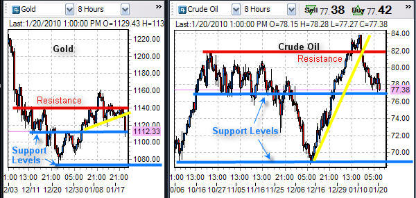
Gold & Oil Futures Trends

The trend of gold and oil has been down the past few days. Gold broke down in the past 24 hours in overnight trading which triggered a wave of selling when the US market opened.

Gold and oil are currently trading between key support and resistance levels. I am looking for gold to drift back up to the $1130 level where I will look for a short setup as the current price action is not bearish on the intraday charts.

Oil is still bullish so I am not really looking to short it at this time. I will wait for another low risk buy signal.
Crude Oil and Gold Futures Trading

Commodity Trading Conclusion:

I feel the broad market could be ready for a large correction ranging from 5-10%. I am calling it a correction as I want to stay positive thinking. But it could be the start of a major market top. Market tops tend to be a process and take several months to roll over. So let’s focus on protecting our money and wait for a pullback that will allow us to load up with some great positions in the coming weeks.

Patience is how money is made in the market. Waiting for the market to come to you is vital for success. Also having the patience to let winners run by scaling out (selling a portion) of a position when the price reaches a support or resistance level makes it easier to let them run. Each time you sell some of a position you are locking in a profit and lowering your risk for the balance of that trade.

If you would like to receive my Free Weekly Gold Reports please visit my website:

Chris Vermeulen
www.GoldAndOilGuy.com
Jan 18th, 2010

Whether you are trading stocks, ETFs or futures, technical analysis is the preferred choice for short term traders. Technical analysis in short is the study of price and volume movements on charts. It can be used for studying charts in any time frame whether you are a 1 minute chartist or a long term investor using monthly charts.

Using technical analysis in my opinion really opens the door for a trader to lower his/her overall risk when investing money. I always like to know if the investments I am watching are trading near a critical price level (support or resistance). During these times you can take positions that have very clear entry and exit points for trading. Also it puts the odds in your favor when a position is entered in the same direction of the underlying trend.

Price action is how we make money in the market, so I strictly follow price and volume when trading as they are the least lagging indicator on what the market it doing.

I have put together a few charts using commodity ETFs to show you what I am seeing in the market and what we should expect to see in the coming days.

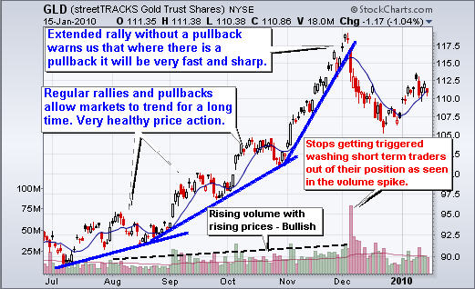
GLD ETF Trader – Daily Trend Chart

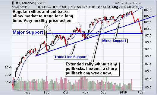
The gold trading chart below shows two different types of trends. The initial timeframe of the chart illustrates what I call a Normal Trend. This is a series of higher highs and lows.

This type of trend allows an investment to continue profitably for a very long period of time. For example a daily chart like the one below can continue to trend like this for 6-8 months. The reason for this is because price appreciation is increasing at a rate which investors are comfortable with. Also, the pullbacks cleanse the investment vehicle of weak traders every few weeks allowing fresh money to enter at higher price.

Now if you look at the later timeframe of this rally we observe a rally phase I call an Extended Rally. An extended rally is when price appreciates without any pullbacks.

You can make a fortune with this trend very quickly, but you must realize that reversals are fast and sharp. And that, we observe, is how GLD performed in December. While some call December’s price drop a pullback, I call it a technical breakdown. The sharp price reversal and heavy volume associated with this type of move generally provides excellent short term momentum trades. A lot of damage is done to the investment on a heavy volume breakdown taking weeks for a recovering to occur.

Normal trend rally, extended rally, predictably fast and sharp technical breakdown followed by weeks of recovery.
Trade GLD ETF

DIA Exchange Traded Fund – Daily Trend Trading

The DIA exchange traded fund shows a very similar chart as gold above. First we have a nice Normal Trend that then evolved into an Extended Trend. The trend for the DIA index fund is not nearly as steep at the gold chart, so it could trend a little longer. But once the price breaks down, everyone is going to be selling out to lock in gains and cut losses before new positions are entered.

I have several tools and stats I use for helping me in timing turning points. Some are great short term indicators only predicting 1-2 days out like following small cap stocks, or gold stocks in relation to the broad index, and others are long term things like cycles, volume analysis, market internals and the volatility index.

My point here is to keep everyone alert and ready to take profits if we see things start to roll over. Friday there was BIG selling volume across the board – so don’t blink now.
Trading DIA ETF

Silver & Gold ETF Trading – Daily Charts

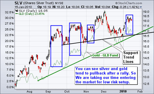
Below is the chart of the silver ETF SLV and I overlaid the GLD gold fund in green so you can see how they move in sync. The blue boxes on the chart show the pattern that I think is forming and what to expect in the coming days.

From looking at gold in both other currencies and with respect to gold stocks which have been underperforming, I feel we are going to see lower prices still. At the moment I am neutral on silver and gold for the short term time frame (daily & 60 minute charts).
Exchange Traded Fund for Silver

USO Crude Oil Fund – Daily Trend Chart

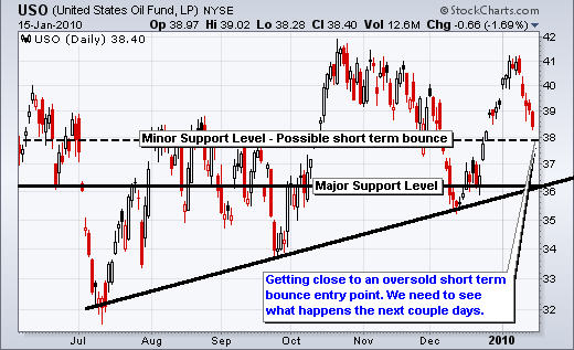
Oil has slid lower the past 5 sessions and is now nearing a support level. This has me looking for an oversold bounce with the potential to rally much higher. I am keeping an eye on this for any possible low risk setup.
USO Oil fund Trader

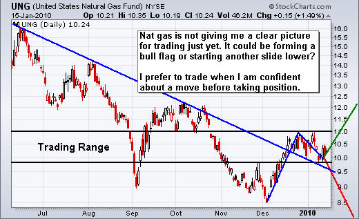
UNG Natural Gas Fund – Daily Trading Chart

While UNG is not a great intermediate and long term fund to invest in, I do find it trades very nicely for intraday and short swing trades. I am neutral on natural gas for the time being. It could go either way from here and I’m not willing to take on a 50/50 probability trade. Let’s wait for something exciting to form.
Natural Gas UNG Trader

Commodity Trading Conclusion:
In short, gold and silver have been underperforming the market recently which is not what we want to see. They have led the market higher all year but are now taking a breather.

The way I see gold, silver, oil and natural gas is that they are trading below their recent highs and still have more room to fall before landing on a solid support level.

The stock market is now over extended and looks ready for a sharp correction. If this happens we will see commodities drop and test lower prices also.

There is not much we can do right now other than protect our current long positions by tightening our stops. Depending on the strength of the breakdown, there could be a great opportunity for short term traders (60 minute chart traders) to make some quick money. I expect a sell off which will last 3-5 days at the least.

If you would like to receive my Free Technical Trading Newsletter for ETFS  and Futures please visit my website: www.TheGoldAndOilGuy.com

Chris Vermeulen