Investors and traders around the world continually search to find or increase their edge in the financial markets to boost profits. The next few months are going to be critical for investors because the number seven is now in play for the stock market.

What does this mean?

In magical lore seven is a magical number., While all numbers are ascribed certain properties and energies, seven is a number of power, a lucky number, a number of psychic and mystical powers, of secrecy and the search for truth.

Seven is used 735 times in the bible and if you total up all words including “sevenfold” and “seventh” there is a total of 860 references.

The origin of seven’s power lies in the lunar cycle. The moon has four phases lasts about seven days. The Sumerians gave the week seven days. Life cycles on earth also have phases demarcated by seven, and there are seven years to each stage of human growth, seven colors to the rainbow, seven notes in the musical scale, seven petitions in the Lord’s Prayer, and seven deadly sins.

More importantly for investors the number seven and multiples of seven have a powerful influence on money. The US stock market is now trading in the seventh year window and it should not be taken lightly.

While I could go into a lot more detail about how I use seven in my algorithmic trading strategy to swing trade the S&P 500 index. This article focuses on the investing outlook.

See this video about seven… http://youtu.be/W8B14NSIWc8

I am fortunate enough that I have been trading since 1997 and have seen the how the stock market cycles affect human behavior and businesses specifically the financial newsletter industry which I have been involved in since the first day my trading career.

The stock market appears to be nearing a critical turning point that will change the lives and behaviors of investors for years to come.

The good news is that I have experienced four of these turning points and human behavior shifts in my career before and we currently entering the fifth turning point. I feel obligated to share this valuable insight with those of you who read my work. The next major market move could have a dramatic impact on your wealth and retirement years.


Insight on Investor Behavior and Business

Being heavily involved in the financial newsletter industry I have not only seen but survived several of these major cycles which forced many newsletters to go out of business. The cycles at play here are the market trend and the behavior of traders and investors.

The combined forces of these two cycles are what cleanse the newsletter industry of poor quality services. It becomes almost impossible to obtain new clients without word of mouth/referrals from happy users and if the quality of the newsletter is poor, eventually they lack enough users to make it feasible to operate. Unfortunately it’s the brutal truth, and over the last couple years I am seeing newsletters and even to top trading magazines that have been around for decades closing their doors.

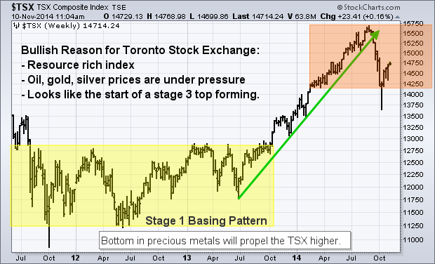
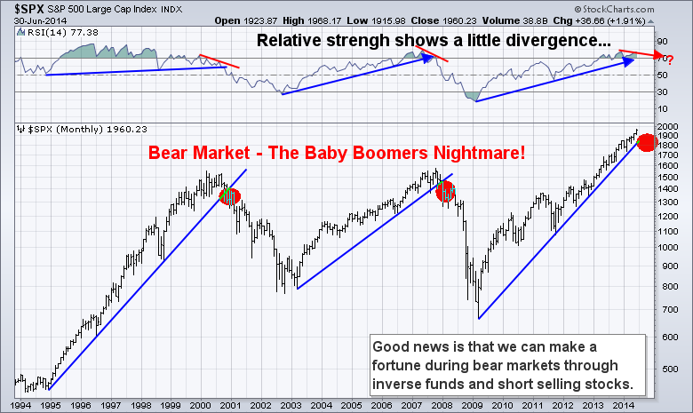
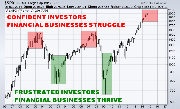
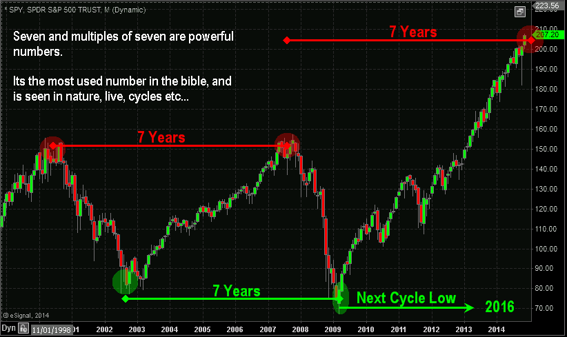
The business cycle can easily be explained by observing the chart below of the SP500 index. In short, when the stock market has been rising for six or more months investors start to become confident in that they can make money on their own. And in fact they can if they buy and hold during a bull market.

But what happens as the market continues to rise for many years is that more and more investors and traders realize they can make money on their own.  The longer the uptrend remains intact the less will need the help of a trading and investing newsletter making it difficult to get new customers in this highly competitive industry.

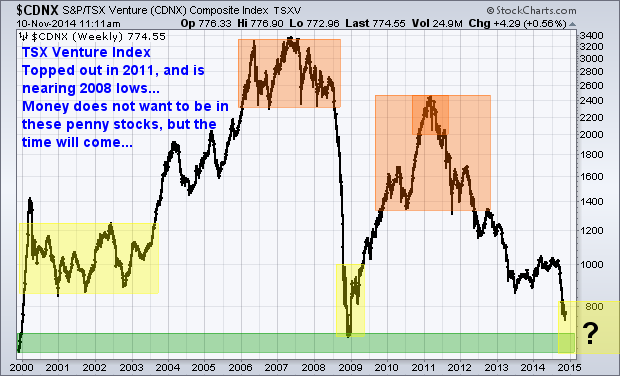
Currently investors are behaving almost identical to what I saw during 1999 – 2001, from 2006 – 2007, and now 2014 – 2015 market tops.

Did you notice anything with those market tops? They are 7 years apart…

Let’s now take a look at the best times in the business cycle where traders and investors are in desperate need of help and start subscribing to multiple paid financial newsletter services. The strongest times for business took place during 2002 – 2003, and again in 2008 – 2010. This is when investor not only lost most of their wealth, but their faith in how they invest, who they invest with, and the stock market as a whole.

Did you notice any there also? They are 7 years apart also…

spx-7


Investors 7 Year Financial Outlook

Those of you who follow me know that I do not pick market tops or bottoms. Rather I focus on identifying trends and cycles in the market and only trade and invest with the active confirmed trend.

You also know that trying to pick market tops and bottoms is a suckers game and a sure fire way to lose a lot of money and build a serious complex that the market is manipulated, not tradable, and that it may be time for you to give up on trading all together.

Well, I am here to say that the market is tradable, and can generate traders and investors a boat load of money once you understand how and why it moves. Most importantly you need to understand money/position management and be patient for consistent long term gains.

Take a look at the chart below for a clear visual of 7 year cycle highs and lows at play.

 seven


While I do not invest based on this major seven year cycle I do actively trade a smaller market cycle which provides roughly 35 – 65 trades per year. This strategy allows me to profit during these major bull markets and also during the multi-year bear markets when the majority of investors are losing boat loads of their hard earned money.

The reason I do not invest in the seven year cycle is because the market can still have 30+% price swings within bull and bear markets and that type of volatility is beyond what I am comfortable with. Also because I can actively invest with my automated trading system so I don’t need to lift a finger or watch the stock market each day, week or month.

I hope you found this report useful in some way, and I ask that you share it with others.

Chris Vermeulen
www.TheGoldAndOilGuy.com

Looking back to 2007 (seven years ago) we have seen the price of crude oil perform incredible price swings. No matter the time frame in which we observe price when an extreme price spike takes place due to news/event, statistics show that half if not all the event driven price spike will eventually be negated in the future.

The perfect example of this is the rubber band affect. If you pull an elastic band in one direction, eventually when it breaks or it’s released, the band will retrace back to the norm and then go in the opposite direction. You can see this on the chart from 2008 high of nearly $150 to the 2009 low of $40. Price then lost is momentum and has been somewhat range bound from 2011 – 2014 right in the middle at $95 per barrel.

Observing the price chart of oil below there are many technical indicators and patterns at play. The first important pattern to identify is the series of higher lows shown with the green trend line sloping upwards.

A rising trend line that has multiple pivot lows (bounces up the trend line) the price of oil creates what I call a perfect storm for waterfall type selloff. This is exactly what we have seen over the past 3 months.

Each time one of the pivot lows are breached, the stop loss orders are triggered for investors. This causes a flood of sell orders forcing price lower to fall below the next pivot low etc… This may look and sound easy to trade, but keep in mind this is a monthly chart, and short term traders are not trading this long term time frame. Only investors would be focusing on a move that would take months to a year to unfold.

The second key indicator to look at is the 61.8% Fibonacci retracement level. This level typically acts as a support level for a small bounce usually. Because the 61.8% level is also in alignment with a previous consolidation, and a pivot low, both which have been highlighted on the chart, I suspect a bounce around the $65 level should take place.

The final potential bottom could take place near the 2009 low. It is a long way away but anything is possible and what we think is most unlikely to happen is exactly what the market does sometimes.

crudeoil


Crude Oil Conclusion:

In short, I think what crude oil is doing is healthy and needed for several reasons. If I let my bias/option shine through, I feel the big oil and gas companies have been taking advantage of us with their ridiculously high gas prices over the last seven years.

The multi-billion dollar, cash rich corporations need a little wakeup call.  And the hair cut in their share price should be great for investors. This allows them to build or re-enter new positions at a better price with a higher dividend yield.

I will be watching the hourly and daily charts for a bottoming/bounce formation in the next week. But any bounce could be short lived as sellers appear to be aggressive still.

Receive my personal trade alerts via email and SMS text alerts at www.TheGoldAndOilGuy.com with a 50% Black Friday Offer Today

Chris Vermeulen

Since July of 2014 the big cap stocks have continued to make new highs as investors dump more and more money into the stock market. Overall bullishness on the stock market is now at extremely high levels which typically happen before a major stock market correction and sometimes start a full blown bear market.

While the average investor continues to become more and more bullish, the market breadth/health has been rapidly deteriorating. Unless you are market savvy you would not know how weak the market actually is and this always leads to strong losses and drawdowns for the uninformed investor.

What we know and most do not about this rising market, is that the big cap stocks in the SP500 index appear to be holding the overall market up and masking the weakness. So as investors become more bullish at these lofty levels putting more money into generic funds that push the SP500 higher, we see strong selling and unwinding of the more leveraged position like small cap stocks.

Over the past couple years the SP500 has formed a series of bullish corrections and running corrections. But the current formation is that of a bearish mega phone pattern and these typically point to lower prices.

SP500 BIG CAP STOCKS:

spy1


THE BOLD STOCKS:

I have always liked to follow the NYSE index because its a basket of 1900 stocks with 1500 of them being U.S companies. Its breadth/strength makes it a much better indicator of the market performance than the more narrow indexes with less stocks.

While this index remains in a bull market, it only looks as though it’s a few months away from a possible reversal and confirmation of a new bear market.

nyse


THE UGLY:

If you have ever read Stan Weinstein’s book then you know he followed GM share price closely. He believed that what GM did, the stock market would follow, to some extent. GM was/is an early leader of the US economy and stock prices in general.

The chart below paints a clear picture of the Stage 1 Accumulation in 2011- 2012, and also of the Stage 3 Distribution phase in 2013 – 2014. GM shares have traded down literally from the first week of the year and have now broken below critical support. Things could get interesting…

GM1


MY TRADING CONCLUSION:

In short, I remain bullish on the stock market with both my short term and investing outlook but I am very cautious and have closed out several large positions recently. Cash is king and I plan to protect, rather than invest my nest egg when risk is higher than normal.

Short term trading where trades only last 3-10 days is the way to go at this stage of the game. Some recent winning ETF trades with my ETF newsletter www.TheGoldAndOilGuy.com have been in SCO, a quick bounce trade in UCO, REM, and our current trade as of last week EEM.

The majority of my investment capital is traded with my automated trading system. It trades the S&P500 index directly in my brokerage account catching these 3-10 day swings in the market saving me time while reducing my emotional attachment to the market.

blackfriday1

Chris Vermeulen

Last week I met with a local professional trader who specialized in trading only Canadian stocks. While he mainly trades the 75 large cap stocks on the TSX which have the liquidity requirements he needs, he also trades penny stocks on occasion.

When he pulled up the TSX Venture index and reviewed our outlooks, we both came to a similar conclusion on what to expect moving forward.

We all know what happens to boats when the tide goes down… This index shows very clearly why most penny stocks have been losing value the last three years. Money has and continues to flow out of these equities and if fighting this major trend it will likely cause you frustration and financial pain.

See my gold forecast and charts from a year ago: Click Here

Overall gold and silver mining stocks are now entering a key long term investment level, but don’t jump the gun and buy yet…

Knowing that most of the largest moves based on percent happen during the last 10% of the trend, we must expect micro-cap stock prices will be extremely volatile for many months. Another 30-60% hair cut could still be ahead.

tsxjunior


Canadian Equities Market:

The TSX Composite is heavily resource-weighted and this market has lagged its counterparts around the world in the last year. This year the Canadian index played catch-up as seen in the chart below and was the strongest index in 2014 until this recent correction.

These equities may hold up well when the US market starts to top/correct. This is because the TSX’s is heavily weighted in late-cycle stocks (resources), it’s not unusual for the Canadian market to lag in the early stages of a bull market in the USA, catch up in the late stages, and then outperform toward the end.

tsx1

Trading & Investing Conclusion:

In short, I think 2015 will be the start of a new micro-cap stock bull market. Sure it could take more than a year to base and start to rally, but the time will come when ridiculous amounts of money will be made in this corner of the market.

We all hear stories about how a couple thousand dollars in a particular stock would now be worth $250,000, $1,000,000 etc… well times like that will happen again. But we must wait and watch for this perfect storm to unfold.

Starting in Dec/Jan I will start sharing my top 12 micro gold and silver stocks along with my trades/positions in them as I take them.

Be sure to join my gold newsletter at: www.TheGoldAndOilGuy.com

Chris Vermeulen

If you have been paying close attention to the stock market, market internals/breadth, and bonds for the past three months, you’ve likely come to the same conclusion that I have.

The US stock market is showing signs of severe weakness with the market breadth and leading indicators pointing to a sharp correction for stock prices.

With fewer stocks trading above their 50 and 200 day moving averages each week, while the broad market S&P 500 index continues to rising, this bearish divergence is a red flag for long term investors.

When a handful of large-cap stocks are the only things propelling the stock market higher while the majority of small-cap stocks are falling you should keep new position sizes smaller than normal and start moving your protective stops up to lock in gains/reduce losses in case the market rolls over sooner than later.

Small cap stocks are typically a leading indicator of the broad market. The Russell 2000 index is what investors should keep a close eye on because it’s the index of small-cap stocks. Since March of this year, the Russell 2000 been trading sideways and actually making new lows. This tells us that big-money speculative traders are rotating out of the stock market and into other investments like high dividend paying stocks, blue chips, and likely bonds.

Looking at the chart below I have overlaid the S&P 500 index and the price of bonds. History has a way of repeating itself; although it may never feel the same and the economy may be different, price action of investments have the tendency to repeat.

In 2011 we saw the stock market and bonds form specific patterns. These patterns clearly show that money was rotating out of the stock market and into bonds. During times of uncertainty in the stocks market money has the tendency to move into bonds, as they are known as a safe haven. Bonds tend to reverse before the stock market does, so if you have never tracked the price chart of bonds before, then you should start.

SPXvsBONDS

From late 2013 until now bonds and the stock market have repeated the same price patterns from 2011. If history is going to repeat itself, which the technical and statistical analysis is also favoring, we should see the stock market correct 18% to 30% in the near future. If this happens bonds will rally to new highs.

It’s important to realize the chart above is weekly. Each candle represents five trading days, and four candles represents one month. So while this chart points to an imminent selloff from a visual standpoint, keep in mind this could take 2 to 3 months to unfold or longer. The market always has a way of dragging things out. If the market can’t shake you out, it will wait you out.

So if you are short the market or planning to short the market be very cautious as it could be choppy for the next several weeks and possibly months before price truly breaks down and we see price freefall.

To get my pre-market video analysis each day, and trade alerts visit: www.TheGoldAndOilGuy.com

Chris Vermeulen

In July I showed talked about the Russell 2K index and how it was underperforming the broad market. I went on to explain what it likely meant was in store for the US stock market this fall. The outlook was negative, just in case you were wondering…

This week I want to talk about two different sectors that have often lead the broad market in rallies and corrections over the years. These sectors have underperformed the broad market much like that of small cap stocks, and this does not bode well for investors going into fall.

In the analysis below I use Bollinger bands and trendlines. Using only these tools keeps the charts clean and easy to understand. In short, once a trenline has been broken that is the first early warning that a trend may be coming to an end. The second is the break of a Bollinger band.

A combination of these can be taken as a trend reversal and likely the start of a multi week or month correction. This will depend on the chart time frame you are reviewing though. I use a similar method to identify trends with my automated futures trading system.


INTERNET INDEX FUND ANALYSIS

fdn-chart


SOCIAL MEDIA INDEX FUND ANALYSIS

Futures Trading System

If you are wondering what exactly these two charts are pointing to… let me share my outlook.

Because we have seen the support trend lines broken to the downside this month, and the fact that price has pushed more than 2 standard deviations from its norm, the odds favor more downside is to come.

From years of experience trading price patterns and breakouts I know that when price breaks to the downs side and triggers fear among its investors it is typically your best time to sell short so you can profit from the falling prices. Fear is the most powerful force in the stock market and it must be traded much differently than when prices are rising.

Although I feel the broad market is still within its uptrend, these two underperforming sectors may just continue to sell lower. Obviously once the broad market rolls over, these sectors should fall even faster to the downside but until then, they could chop around and grind their way down.

Like My Simple Analysis & Tips? Join My Free Newsletter at www.GoldAndOilGuy.com

Want My Trades Automatically Trade for You? www.AlgoTrades.net

Chris Vermeulen

I will be honest, it has been a long time since I have been excited about gold, but I am starting to like gold once again. I had grown too bored to care what gold did. With the bull market top in 2011, and four years later price continues to founder can you blame me?

Let me start out by painting a picture for you. This is my technical analysis overlaid on the price of gold. This simply gives you a visual of were the price of gold is trading.

But first, if you have not yet seen this “Gold in the USA” infographic you must check it out… it shows the history of gold in a visual format, and you will likely learn something from it – Click Here

GOLD HOLDS LONG-TERM BEARISH PATTERN

Gold peaked around 1900 in September 2011 and quickly fell to the 1550 area. The metal then consolidated for 18 months before it broke support. The sharp decline triggered a drop in price to $1200 in April 2013. Since then gold has been in another consolidation, which is a bearish continuation pattern.

The lower highs in 2013 and 2014 reflect weakening demand and increasing selling pressure at lower price levels. A break down in price below support would trigger further weakness and a drop to roughly $900 oz. If you want more of a bearish visual; see my August gold report – Click Here

gold technicals forecast

GOLD’S BULLISH OUTLOOK SIGNS OF A BOTTOM

SIGN #1: Gold is technically still in a down trend but it may be quietly forming a bottom. This is how bull markets often start. First it declines in value to a point which breaks the most steadfast bulls. And it does this by relentlessly losing value for an extended period of time. If the market doesn’t shake you out, it will wear you out!

Gold is no longer talked about by the majority of participants, nor is it talked about every day in the media. Simply put, everyone is bored of the low price and sideways trading the past couple of years.

SIGN #2: The key to front running the next rally in gold is to watch the price of gold stocks. They typically lead gold. So when gold stocks start outperforming the price of gold along with the HUI gold stock index we can expect the price of gold to follow a few days or weeks later.

Gold stocks as a whole have not yet started to outperform gold. But if we look at the HUI/Gold ratio it is at extreme levels. This is the same level we saw in 2001 before gold and gold stocks rocketed higher for several years. The ratio is not something you should trade off of, but it’s a good confirmation indicator that gold stocks are priced fairly.

SIGN #3: Looking at what the price of gold has done over the past 40 years 12 months before interest rates have been increased is very interesting and not something many traders know.

With interest rates expected to rise in 2015 this is a statistic that should be reviewed. Numbers do not lie and historical charts show the price of gold rising an average of 20% within the year before interest rates rise. And in case you happen to miss the first 6 months of the move, do not worry. Most of the rally takes place just 6 months before rates go up.

SIGN #4: September is the strongest month for gold each year when looking at the 32 year seasonal chart. The odds favor higher prices this month. Likely not enough to spark a new bull market, but may build a base in the price.

gold seasonal

GOLD FORECAST AND CONCLUSION:

One day these weeks gold will breakout down from this consolidation pattern or breakout and rally from this basing pattern. Which way is the question we are all wondering.

Anyone who clearly states gold has bottomed and to buy is taking a stab at being a hero and to say what the masses want to hear. Sure, it sounds great, but it’s BS.

From a price and technical standpoint gold remains bearish or neutral at best. Until price clearly breaks out from this range you should trade with caution and small position sizes.

However, when/if gold starts to rally it is likely best to jump on the train rather than wait for a pause or pullback in price after the breakout. It may just keep on rising until $1550 is reached.

Watch My Daily Gold Video Analysis at www.TheGoldAndOilGuy.com

Automated Investing System for the Average Trader: www.AlgoTrades.net

Chris Vermeulen

By now it is no secret that equity markets continue to deliver solid gains for 2014. In fact, all of the major U.S. domestic stock market indexes are higher for the year. U.S. equities have benefited from an accommodating Federal Reserve, massive corporate stock buy-back plans, and solid earnings growth. The bullish trend which began in early 2009 has pushed equity indexes to several all-time highs.

However, when we focus our attention on 2014 one index is showing major relative out performance. The Nasdaq Composite and the Nasdaq 100 indexes have blown away every other major index in terms of overall returns in 2014. The chart shown below illustrates the returns of each major U.S. equity index year-to-date.

Chart1

As can be seen above, when looking at the corresponding ETF for each major index, the Nasdaq 100 (QQQ) is running away from every other major index in terms of performance. As a contrarian trader, I am of the opinion that now may be an excellent time to consider looking for a possible short position to hedge against the bullish trend.

The equity markets in the United States are becoming frothy and prices are at the very least fair valued if not overvalued depending on which methods are used to calculate current prices. When we consider the major out performance in the Nasdaq 100 Index, it would only make sense that if we see downside in the future we could capture some big potential profits.

As an option trader who focuses primarily on probabilities for trade executions using a variety of implied volatility calculations and Delta assumptions, the following observations regarding the Nasdaq 100 Cash Index (NDX) were derived based on data points on Friday, August 29th.

Based on the September NDX option expiration date, the current skew in the NDX option data is to the downside. In fact, as I am typing this NDX is trading around 4,075. A 2 standard deviation move to the upside (90%) is around the 4,200 call strike and the same measurement to the downside is around the 3,900 put strike.

Chart2

When looking at the same data based on the October NDX option expiration date, the current skew in the NDX option data demonstrates more aggressive downside Skew in October versus September. A 2    standard deviation move in the October series to the upside (90%) is around the 4,275 call strike and the same measurement to the downside is around the 3,755 put strike.

Chart3

While I realize this is somewhat technical, the main premise is that the option market in the Nasdaq 100 Cash Index (NDX) is skewed toward more potential downside risk. This data lead me to place a new trade earlier this week which was next short the Nasdaq 100 Cash Index (NDX) using an October Call Credit Spread as a trade structure.

Recent results for the service have been very strong for the options alert service. The last 4 trades have produced a 13.95% winner in Matador Resources (MTDR), a 17.05% winner in the S&P 500 Cash Index (SPX), a small 1% loss in the Nasdaq 100 (QQQ), and a 21.95% in the Russell 2000 Cash Index  (RUT). The options newsletter service is priced super affordable at just $29.99 per month with new trade alerts sent out almost daily.

Ultimately time will tell if the skew in the NDX proves to work. For now, I like the near 75% probability of success that the NDX Call Credit Spread is offering with a nearly 20% potential return. In the future readers can expect a recap of this trade. Happy Trading!

Chris Vermeulen
www.thetechnicaltraders.com/options/

Everyone has been calling for a bottom in Gold the last year. But the fact is that gold and gold stocks are still clearly in a bear market. Just look at the 200 day moving averages. The previous trends were down and prices have been moving sideways for the past year.

A lot of newsletter and analysts are calling a bottom. Technically it’s just a consolidation pattern. Consolidation patterns are a continuation pattern, meaning if the previous trend was down, which it was from 2011 till now, the odds favor price will continue lower after this consolidation.

goldbear

If this consolidation does happen to be the bottom then we can classify it as a stage I base. Gold and gold stocks will start a new bull market, but price needs to break to the upside of this consolidation pattern. Until it breaks to the upside, it is still in a down trend.

Gold topped out over three years ago. And I am in no rush to try to pick a bottom and be a hero here. I’m just going to continue waiting on the sidelines until price confirms either a new bull market has started or for price to breakdown and we get another leg lower.


Oil Outlook

Taking a look at the big picture of crude oil the chart looks bearish. It too has been trading in a range since 2011 and the price is nearing the apex of a consolidation pattern.

oilbear

It’s important to know that a pennant formation which is what crude oil has formed are the most predictable when price breaks out of the pattern within the first 1/3rd of the formation.

The longer price consolidates and gets squeezed into the narrowing apex of the pennant pattern, the more unreliable. The trend breakout will be, and it becomes at best a 50/50 bet.

Crude oil’s previous trend was up, but it’s been consolidating for such a long time that price is now squeezed into the apex. This negates that bias for the previous trend to hold true so we have no idea which why it will breakout but when it does expect an explosive move.

A breakdown in crude oil will send price to the $70 or $75 per barrel range, and that will hammer on the Canadian dollar also. I can see $1 USD being equivalent to $1.20 Canadian in a year.

My Gold and Oil Conclusion

Looking at the US dollar, it has been rising partly due to the euro falling. This strong dollar will put a downward pressure on commodities overall.

Automated Trading System

Gold and oil have not been that exciting for investors since 2011 when they topped out, but both are setting up for massive moves that should last month, if not year or more. Once these new trends emerge expect to see them in the headline news every hour.

It does not matter which way these commodities breakout of the consolidation patterns. With the dollar continuing to rise and the bearish chart patterns for both gold and oil there is a good chance much lower prices are ahead.

This will catch most investor’s off guard. It’s human nature to try to predict tops and bottoms in the market. But this is why most investors get caught on the wrong side of the market. The market always has a way of catching the majority of people on the wrong side of a position.

I am happily sitting in cash with some of my investment capital waiting for gold and oil to breakout of these large patterns. I would not be surprised if we see $900 gold, gold stocks like the gold bugs index $HUI to be at $150, and $70 per barrel for crude oil. I am not saying this is what I want, but you should be mentally prepared so you can get back into cash position and so you can take advantage of falling prices with me.

Big money will be made on the next price movements in these commodities. Whether we have to go long the market or short sell the market. Either way, we can make money. So don’t be a hero and try to pick a top or bottom, just wait for confirmed breakout then invest with the trend.

Would you like my trade alerts CLICK HERE

Want my SP500 trades executed for you in your brokerage account CLICK HERE

Charting your way to financial freedom,

Chris Vermeulen

One thing I have talked about several times which cannot be understated is that is the tendency for investors to believe that complex trading ideas and automated trading systems are better than simple, logical ones.

At first thought this notion is completely understandable. After all, if an idea is fairly simple, how could it possibly be “a secret” and investors not using it yet?

Successful trading and investing is not about how good you look or how impressive you sound in videos. It’s about what, when and how you do it. It does not matter if you are placing the trades yourself or  using an automated trading system. What, when and how the investment is traded is all that matters.

It’s known that highly intelligent people struggle with the markets because they believe intelligence will improve their trading results. The reality is, they do not thing simple trade setups and strategies that look like they will make easy money, will work. Why? Because they think that the market is complex and thus trades should not be simple to spot and time, therefore the simple ideas should not work.

In all fairness “simple trading” is not really that simple. Successful trading requires the right kind of simplicity, in the right amount at just the right time. This is what creates the highly profitable investors and automated trading systems.

Why The Short Traders Are Losing Money This Week:
They are fighting a bull market which is still pointing to higher prices.

Take a look at the chart below of the SP500 futures index. You will notice the bars are color coded; this is done by my automated trading system which identifies the market trend which trades should be trading in line with.

The stock market remains in a full blown bull market. Investors should remain long for time being. On the other hand active investors should be trading with the current market trend which is shown on the chart.

Market corrections within a bull market are sharp and short lived. As an active investor you will be lucky to catch one or two short trades during these pullbacks before the uptrend is retaken.

It is important to know that eventually one of these bull market corrections will be the straw that breaks the camel’s back, and kick starts a new bear market. This his why I always move to cash and look to short each of these corrections. We just never know WHEN a full blown bear market will start. If you are holding your positions through these corrections and think you’re a great investor, just wait until the market does actually breakdown and most of your gains are gone before you realize it. I will admit, its very easy to get lazy with investments after years of rising prices. Laziness and a the lack of a trading strategy for a falling market is what causes 99% of investors to lose their money.

I believe in trading defensively. Sure it’s more work, takes time to follow, and there are extra trading commission fees, but its a  small price to pay to keep the majority of your gains.

Automated Trading Systems & Corrections


SP500 Monthly Big Picture Analysis

Here is the big picture and trend of the SP500 index. Simple fact is, eventually things are going to get really ugly. By stepping back and looking at this chart, it’s clear the market must still fall substantially in value to break below its critical support trend line and before we can confirm a true bear market is in place.

Do you want to see your nest egg drop 20-30% before you decide to exit? Or do you want to profit from this initial correction when it does happen, and make even more money when the stock market drops for a year or two after taking your account to new all-time highs.

Automated Trading Systems Big Picture

Keep It Simple Conclusion: Automated Trading Systems?

The good news is that if you keep things simple by following the intermediate trend, like the color coded chart above, you can keep making money as the market rises to ridiculous new highs, and avoid market corrections, and possibly even profit from them.

In my next article I will show you a simple trading strategy that I have used for many years to time stock market bottoms and tops for swing trading. Best part is that the data I use is available online for free.

One final note, there are automated trading systems that does all this for you. I also use it and have it trade my own investment capital for me. You can learn more about it and join my mailing list here:http://www.algotrades.net/automated-trading-system-2/

Chris Vermeulen