Investors around the globe are concerned with the economic outlook, not only with the United States but with virtually every country. This has caused not only investors but banks and countries to start buying gold & silver in order to be protected incase of a currency melt down in the coming years. The price of gold continues to rise because investors are not selling gold, instead holding it for long term gains/profits.

While the majority is concerned about the eroding economy, we have seen the opposite in the financial market. Gold and equities have risen… That being said the volume in the market remains light simply because the average investor is no longer putting money into the market for long term growth. Instead individuals are now focusing on saving and paying down debt.

That being said we all know light volume market conditions allow Wall Street powerhouses to bid the market up. Not to mention with quantitative easing taking place I’m sure that has also helped the market of late. While we don’t know for sure that QE is taking place as we speak, the sharp drop in the dollar and strong move up in gold are pricing this into the market.

Let’s take a look at some charts…

HUI – Gold Stock Index

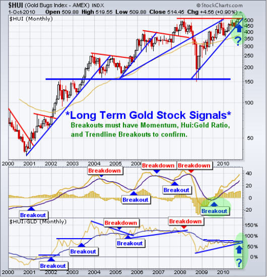
This long term monthly chart of the HUI index provides valuable trading signals for both gold stocks and gold bullion. As you can see below this index is trading at a key resistance level after forming a bullish 3 year Cup & Handle pattern. The next 1-2 months for the precious metals sector will be interesting as it tries to break above key resistance. I would really like to see the HUI:GLD ratio break to the upside to confirm if the breakout occurs.

SPY – Daily Long Term Trend

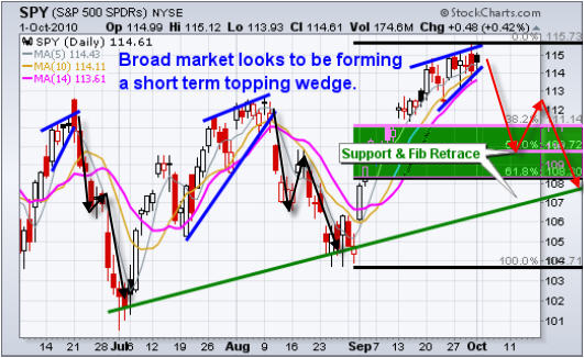
The broad market looks to be forming a short term topping wedge. If this is to occurI expect it to take several weeks to play out. Looking at the chart if we use Fibonacci retracements along with trend line support we can get a feel for where this pullback should correct to.

That being said the broad market breadth and internals seem to be holding up indicating higher prices over the long run. While the short term price action is overbought and I expect a pullback to form, my analysis is pointing to higher prices as we go into year end.

UUP – US Dollar Daily Price Action

Although the majority of investors have a bearish outlook on the economy, we have seen a large price appreciation in equities and precious metals. This is largely due to the fact that the US dollar is quickly getting devalued. Simply put, as the dollar drops, it helps boost commodities and stock prices.

While a rising stock market is great to see, at some point the dollar will become so cheap that it will start to have a very negative affect on the US economy, commodities and stocks. Being from Canada it has always been more expensive to take holidays in the United States, and I remember paying $1.50-$1.70 for every $1 green back. But now the dollar is almost at par making holidays very affordable. The big question/concern is when will they ease off on the printing? At the rate which they are printing the greenback will be at par with peso… well not that extreme but you get the point Eh!

Weekend Market Conclusion:

As we all know the market has a way of making sure the majority of traders miss major turning points. The saying is, “If the market doesn’t shake you out, it will wear you out” and it seems we are getting the later…

The never ending grind higher in precious metals has not had any big shakeouts, rather its wearing out any short positions before rolling over to take a breather. As for the stock market, we are getting much of the same thing as the market grinds higher day after wearing out the shorts before rolling over.

That being said, there is more at work here than just regular market movements. With the light volume in the market we know there is price manipulation and QE (quantitative Easing) which is helping to boost prices and exaggerate market movements.

I’d like you to have my ETF Trade Alerts for Low Risk Setups! Get them here: http://www.thegoldandoilguy.com/specialoffer/signup.html

Let the volatility and volume return!

Chris Vermeulen

Wednesday the market didn’t tell us anything new. The equities market is still over extended on the daily chart but the market is refusing to break down. Each time there has been seen selling in the market over the past two weeks, the market recovers. Equities and the dollar have been trading with an inverse relationship and it seems to drop every in value each selling pressure enters the market, which naturally lifts stocks.

That being said, sellers are starting to come into the market at these elevated levels and it’s just a matter of time before we see a healthy pullback/correction. The past 10 session volatility has been creeping up as equities try to sell off. There will be a point when a falling dollar is not bullish for stocks but until then it looks like printing of money will continue devaluing of the dollar to help lift the stock market. Some type of pullback is needed if this trend is to continue and the markets can only be held up for so long.

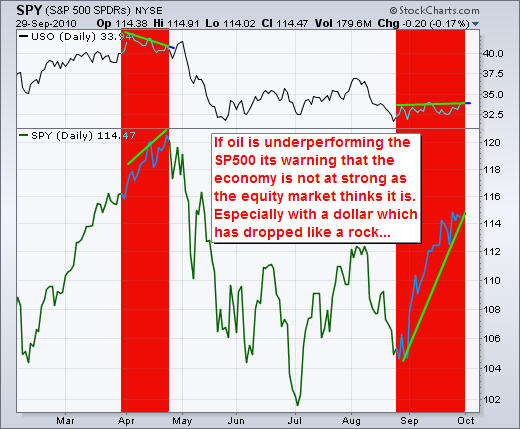
Below is a chart of the USO oil fund and the SPY index fund. Crude has a tendency to provide an early warning sign for the strength of the economy. As you can see from the April top, oil started to decline well before the equities market did. This indicated a slow down was coming.

The recent equities rally which started in late August has been strong. But take a look at the price of oil. It has traded very flat during that time indicating the economy has not really picked up, nor does it indicate any growth in the coming months. This rally just may be coming to an end shortly.

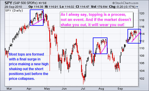
This daily chart of the SP500 fund shows similar topping patterns. This looks to be the last straw for the SP500. Most tops occur with a gap higher or early morning rally reaching new highs, only to see a sharp sell off by the end of the session which generates a reversal day. From the looks of this chart that could happen any day.

In short, volume overall in the market remains light which is why we continue to see higher prices. Light volume typically gives the stock market a positive bias while Sell offs require strong volume to move lower. That being said every dip in the equities market which has been close to a breakdown seems to get lifted back up by a falling dollar, but that can only happen for so long because one the volume steps back into the market the masses will be in control again.

You can get my ETF and Commodity Trading Signals if you become a subscriber of my newsletter. These free reports will continue to come on a weekly basis; however, instead of covering 3-5 investments at a time, I’ll be covering only 1. Newsletter subscribers will be getting more analysis that’s actionable. I’ve also decided to add video analysis as it allows me to get more info across to you quicker and is more educational, and I’ll be covering more of the market to include currencies, bonds and sectors. Before everyone’s emails were answered personally, but now my focus is on building a strong group of traders and they will receive direct personal responses regarding trade ideas and analysis going forward. Due to more analysis and that I want to keep the service personal the price of the service will be going up Oct 1st, so join today.

I also wanted to point out two very powerful trading tools provided by a couple well known traders which you should take a look at.

1. Todd Mitchell is giving away his “Volume Breakout Strategy” at no cost whatsoever! – Get the FreeVolueme Breakout Course – Click Here

2. Mark Skousen has a very interesting video on a unique opportunity in the market. The video is a little long but really interesting. – Just click here to get all the details

Let the volatility and volume return!

Chris Vermeulen
www.TheGoldAndOilGuy.com

Get More Free Reports and Trade Ideas Here for Free: FREE SIGN-UP

After a fierce equities rally on Friday, which I figured would happen, just not that strong; I have to wonder if there is some event or major decision in the works we don’t know about?

Friday’s rally could be something simpler like window dressing by the funds. This is when the funds buy up all the top performing stocks for month end reporting. They do this so that their investors think they are on the ball and know what they are doing. Window dressing will end Monday and from there we could see some profit taking (selling) start. But for all we know Obama could be extending the tax cuts for everyone or cutting payroll taxes etc…

It would only take one of these events to trigger a sharp up move in the market and that could be what Friday’s move was anticipating. That being said volume has remained light and during low volume session the market has a tendency to move higher. Sell offs in the market require strong volume to pull the market down, so until volume picks up there could still be higher prices just around the corner.

Let’s take a look at some charts…

SPY – SP500 60 Minute Intraday Chart

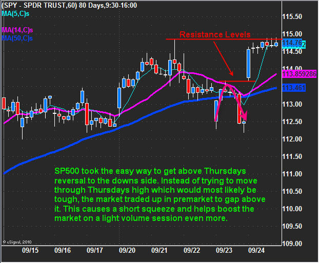
Last week we saw the market reverse to the down side with a strong end of say sell off. That set the tone for some follow through selling and for any bounces to be sold into. That being said, the market always has a way of surprising traders and it did just that on Friday gapping above Thursday’s reversal high causing shorts to cover and the typical end of week light volume drift to help hold prices up.

NYSE Market Internals – 15 Minute Chart

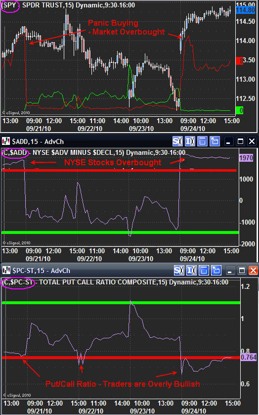
I like to follow some market internals to help understand if investors are becoming fearful or greedy. It also helps me gauge if the market is over bought or oversold on any given day.

These three charts below show some interesting data.
Top Chart – This indicator shows me if the majority of shares traded are bought or sold. When the red line spikes up and trades above 5 then I know the majority of traders are buying over covering their shorts. I call this panic buying because traders are buying in fear that the market will continue higher and they will miss the train. When everyone is buying you know a pullback is most likely to occur.

Middle Chart – This is the NYSE advance/decline line. When this indicator is below -1500 then the market is over sold and bottom pickers/value buyers will step in and nibble at stocks. But when this indicator is trading over 1500 then you know the market is overbought and there should be some profit taking starting any time soon.

Bottom Chart – This is the put/call ratio and this tells us how many people are buying calls vs put options. When this indicator is below 0.80 level more traders are bullish and buying leverage. My theory is if they are buying leverage for higher prices, then they have already bought all their stocks and now want to add some leverage for more profits. When I see the majority of traders bullish then I an sure to tighten my stops (if long) as top my be forming.

Putting the charts together – When each of these charts are trading in the red zone know I must be cautious for any long positions because the market just may be starting to top. Or a short term correction may occur.

UUP – US Dollar Daily Chart

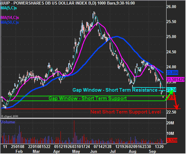
The US dollar has been under some serious pressure with all the talk about quantitative easing (printing money). Obviously the more the Fed’s print the less value the dollar will have. The chart below shows a green gap window which I think once it is filled should put the dollar in a oversold condition for a short term swing trade bounce before heading back down. A bounce in the dollar will put pressure on equities, gold and oil.

GLD – Gold Daily Chart

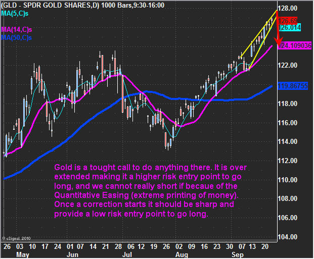
Gold continues to grind its way up. This move is looking very long in the teeth and pullback will most likely be sharp.

Weekend Trading Conclusion:

In short, equities and gold continue to grind their way higher while the US dollar continues its grind lower. When I say the market is grinding I am implying the market is over extended and a reversal any day should occur.

Financial stocks like Goldman (GS) which typically leads the market has been strongly underperforming over the past week. Insiders were selling GS very strongly which is strange and makes me wonder what’s up there? With the financial stocks underperforming it sure looks like a market reversal is just around the corner.

If Friday’s rally was simply window dressing by the funds then it should end on Monday and with any luck we will see a sharp reversal to the down side early this week.

You can get my ETF and Commodity Trading Signals if you become a subscriber of my newsletter. These free reports will continue to come on a weekly basis; however, instead of covering 3-5 investments at a time, I’ll be covering only 1. Newsletter subscribers will be getting more analysis that’s actionable. I’ve also decided to add video analysis as it allows me toe get more into across to you quicker and is more educational, and I’ll be covering more of the market to include currencies, bonds and sectors. Before everyone’s emails were answered personally, but now my focus is on building a strong group of traders and they will receive direct personal responses regarding trade ideas and analysis going forward.

Let the volatility and volume return!

Chris Vermeulen
www.TheGoldAndOilGuy.com

Get More Free Reports and Trade Ideas Here for Free: FREE SIGN-UP

Sept 23, 2010
It’s been a wild ride the past few days. Now, thanks to comments from Obama and FOMC, it seems like everyone is waiting to see what the market will do from this pivotal point onward.

Since the market topped in April and has since been trading sideways in this rather large range, everyone has small positions at work but waiting for a decisive move before fully committing to one side. There could be a few opportunities in the coming days using bonds, the dollar and the SP500 if all goes well which I explain below.

Lets take a look at the charts…

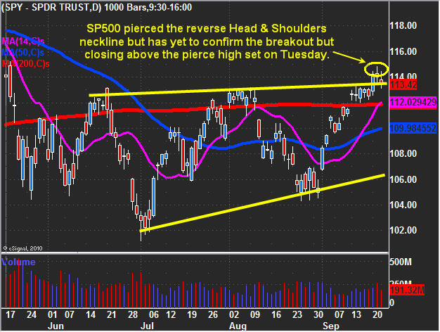
SP500 – SPY ETF, Daily Chart

There has been a lot of talk about a sharp rally if the SP500 could break the 1130 level or the neckline everyone is talking about. Well this week Obama was on TV and the market rallied into that, then again after. I don’t really thing investors or traders were buying things up as he said the same boring stuff he always says without anything new. I feel there could have been another force at work, which we can discus another time .

Anyways, the market pierced those resistance levels and I’m sure a ton of traders have switch their view on the market from bearish to bullish. While I prefer to trade with the trend I can’t help but feel this market is still range bound, which is why I am still bearish at these shakeout levels. The SP500 did break resistance BUT the following candle did not close above the breakout candles high to confirm the move.

That said, the market is now trading back down at support and the next couple of days I’m sure will shed some like on the direction.

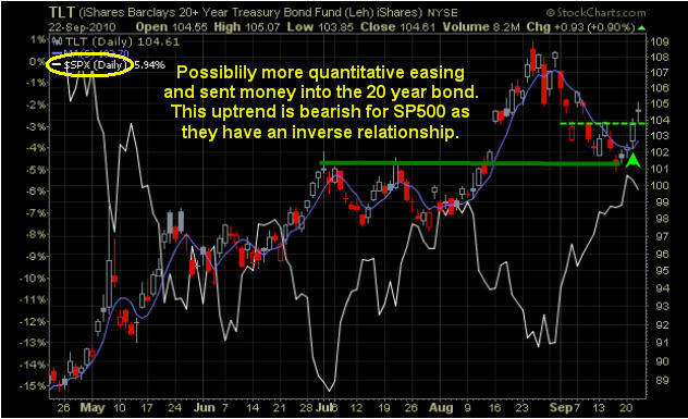
20 Year Bonds – TLT Fund, Daily Chart

We have seen the bond price pullback in a bull flag formation. It touched support before bouncing to break short term resistance as it looks to have started another rally. The chart below overlays both the candlesticks of the bond price and the SP500 which is the white line. You will notice they have an inverse relationship. If bond prices continue to rally then lower SP500 could start to rollover.

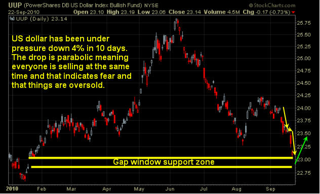
US Dollar – UUP Fund, Daily Chart

The dollar has fallen sharply the past 10 trading session and it looks to be oversold for a couple reasons. The past couple days the price has dropped straight down and gapped lower. This recent drop has reached a gap window which will act as support and could provide a tradable bounce in the coming days depending how things unfold.

Mid-Week Market Analysis Conclusion:

In short, the SP500 is flirting with resistance and has yet to confirm the breakout. Bond prices look to be headed higher which will makes me think equities could start to sell off any day now… It’s also important to note that the big banks GS and JPM shares have been under pressure and they tend to lead the broad market. Another point to add is the fact the oil has not rallied even though the dollar dropped like a rock? What happens if the dollar bounces? Could oil finally start its next leg down?

Gold and silver continue their steady grind up. The price action reminds me of the 2009 Nov –Dec move. Once that train de-rails its going to have a sharp correction…

You can get my ETF and Commodity Trading Signals if you become a subscriber of my newsletter. These free reports will continue to come on a weekly basis; however, instead of covering 3-5 investments at a time, I’ll be covering only 1. Newsletter subscribers will be getting more analysis that’s actionable. I’ve also decided to add video analysis as it allows me toe get more into across to you quicker and is more educational, and I’ll be covering more of the market to include currencies, bonds and sectors. Before everyone’s emails were answered personally, but now my focus is on building a strong group of traders and they will receive direct personal responses regarding trade ideas and analysis going forward.

Let the volatility and volume return!

Chris Vermeulen
www.TheGoldAndOilGuy.com

Get More Free Reports and Trade Ideas Here for Free: FREE SIGN-UP

Sunday Sept 20th,
I think it’s safe to say that everyone knows the markets are manipulated… but during options expiry week we tend to see prices move beyond key resistance and support levels during times of light volume which triggers/shakes traders out of their positions.

Trading during low volume sessions Pre/Post holidays for swing traders or between 11:30am – 3:00pm ET for day traders tends have increased volatility and false breakouts. This happens because the market markets for individual stocks can slowly walk the prices up and down beyond short term support and resistance levels simply because there is a lack of participation in the market.

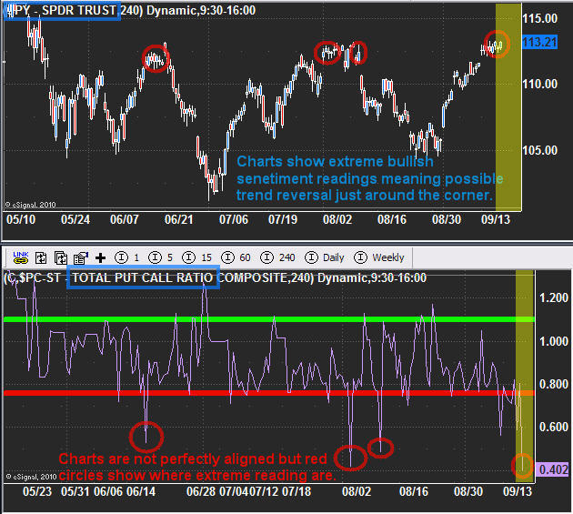
SP500 4 Hour Candlestick Chart

That being said, the chart below of the SPY (SP500 ETF) shows that last Thursday, (the day before Friday options expiry) the put call ratio was showing extreme bullishness. I also mentioned that we should expect a pop of 0.5 -2% in the next 24 hours as big guys will try to shake everyone out of their short positions (put options).

The put/call ratio indicator at the bottom of this chart is a contrarian indicator. When it shows that everyone has jumped to the bullish side, the big money knows its about time to change the direction so they can cash in at premium price levels.

SP500 60 Minute OptionsX Chart of the Week

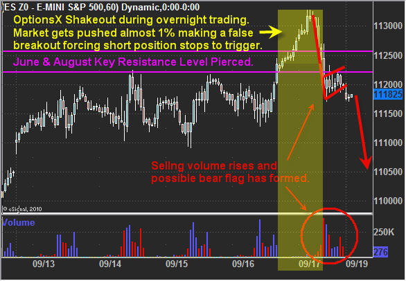
If you look at the volume at the bottom of the chart you will see there are times where this virtually zero volume trades. The yellow high lighted section shows the overnight price surge which is very easy for the big guys to push higher as everyone sleeps.

Here is what they are doing. The light volume makes it easy to manipulate so they push it higher until key resistance is broken, then everyone who was short and had a protective stop in place will have their order executed. As the price rises, more and more stops get triggered. Also, with the rising number of traders becoming bullish from the previous session have buy orders to go long if key resistance is broken. This causes a virtually automated rally to unfold, but once the orders/buying dries up, the big guys start selling their positions at premium prices, pushing the price all the way back down to where the market closed the previous day.

In short, the big guys shook the majority of traders out of their positions Thursday night and pocketed a ridiculous amount of money. Crazy part is 99% of the public don’t even know this type of thing is happening while they sleep.

SP500 OptionsX Intraday Price Action

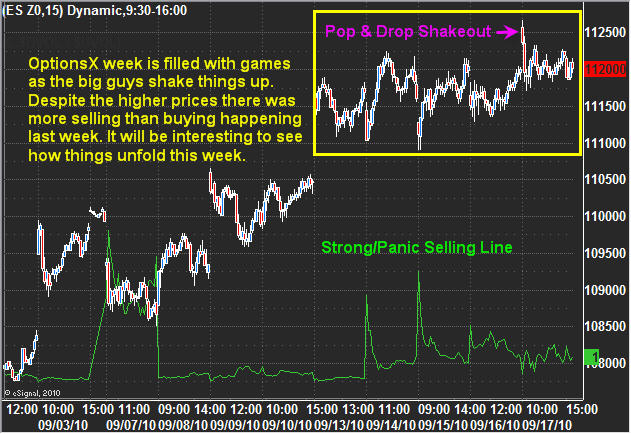
I thought I would show this chart as it shows the selling pressure in the market. What I find interesting about this chart is the fact there was more selling volume during options expiry week, but the prices continued to move higher.

From watching the market internals I saw the majority of traders go from bearish to bullish by the end of the week, and this really gave the big guys a huge advantage in my opinion. Each session selling volume took control with the big guys unloading bu the low volume afternoons naturally brought prices up again as more and more traders became bullish each session. This happened all week and Thursday night it looks as though they let the price rise allowing the key resistance level to be broken which caused a surge of buying which they could selling into. So what’s next…

SP500 / Broad Market Trading Conclusion:

In short, the market looks toppy and if all goes well, last weeks overnight shakeout just may have been a top. This week will start off slow and most likely with light volume until Wednesday. During light volume times, keep trading positions smaller than normal and remember there is a neutral/upward bias associated with light volume.

You can get my ETF and Commodity Trading Signals if you become a subscriber of my newsletter. These free reports will continue to come on a weekly basis; however, instead of covering 2-4 investments at a time, I’ll only be covering only one. Newsletter subscribers will be getting more analysis that’s actionable. I’ve also decided to add video analysis per customer’s request, and I’ll be covering more of the market to include currencies, bonds and sectors. Before everyone’s emails were answered personally, but now my focus is on building a strong group of newsletter traders and they will receive direct personal responses regarding trade ideas and analysis going forward.
Let the volatility and volume return!

Chris Vermeulen
www.TheGoldAndOilGuy.com

Get More Free Reports and Trade Ideas Here for Free: FREE SIGN-UP

We are at the tail of another light volume choppy options expiry week and a big move is brewing… So I thought I would do a mid-week update on what I think is about to unfold in the coming days.

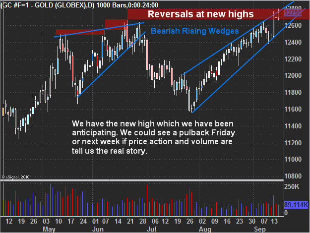
First off I will touch on gold. Everyone is in love with this shiny metal. But as I mentioned last week I think we are nearing a sharp correction. Previously I pointed out that we needed gold to make a new high to the $1275- 1285 area before everyone piles in and gets married to it, only then will the market reverse… Remember the market is out to take money from the masses and the gold trade is getting a little crowded in my opinion.

There are fundamentals which can be taken into account… but when has any investment moved perfectly inline with the underlying fundaments? I’ve seen investments lead fundaments by years, and other times lag the fundamentals by years, not to mention manipulation… but that’s a whole different subject. That being said I don’t hold gold long term for the simple reason I don’t believe much in the buy and hold strategy, nor do I like to watch investments go much more than a few percent against me… I would rather sit in cash jumping in and out when things look ripe for the picking.

Ok let’s jump into the analysis…

Gold Futures Price – Daily Chart

As you can see gold is forming another rising bearish wedge. The last one lead to a $100 drop in gold earlier this year. The part that I find exciting is that this recent run up has been on relatively light volume and without any decent pullbacks along the way. What does that mean? It means fewer people are willing to pay top dollar for it and the big money is riding this train up until they feel its getting exhausted then they will start unloading large amounts at a premium. We also just saw another new high on Thursday which happened on light volume tells me this rally just may have the herd all rounded up before the slaughter.

Silver Futures Price – 15 Minute Intraday Chart

While I don’t trade silver as much as gold due to the added volatility/whipsaw action, this intraday chart is starting to show signs of weakness with a rising bearish wedge today. This is just an intraday chart but these short term patterns tend to lead the longer term charts pointing out exhaustion is starting to creep into the market. Both gold and silver could still have a blow off top and shot up, which is why I have been saying to stay long metals (if you have a position) and to keep raising stop as it could continue higher for some time if a new wave of buyers step in.

Crude Oil – 4 Hour Chart

Oil has been choppy recently making it difficult to get a good read off the chart. Currently it is testing support and looks to be forming a possible right shoulder. It could have some good potential to the down side if we get a neckline break. I’m keeping my eye on it for another low risk entry point.

SP500 ETF – Daily Chart

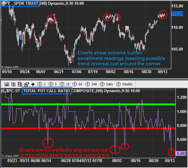
This chart clearly shows some extreme bullish sentiment levels in the market. The bottom indicator is the total put/call ratio and when it is below 0.80 in an environment like this, it means there are too many people bullish on the market. So with todays spike low its easy to tell that the majority of traders/investors are bullish as they buy all the call options they can.

That being said, we generally get a serious shake out before the market reverses. What I mean by that, we should see the market gap substantially higher or spike up intraday as key resistance is broken. This forces all the shorts to cover their positions just before the market rolls over and sells back down. That’s what I am looking for to take action.

Mid-Week Trading Conclusion:

In short, gold and silver are looking and feeling toppy here. While I am bullish on them long term, we could see sharp pullback which could take months to regain these prices. I am not short metals yet but very close to taking a short counter trend trade.

Oil continues to looks bearish but is taking a long time to play out. This is a 4 hour chart and if we do get this neckline breakdown, it would still take 1-2 months to pay off. That being said, it looks like it will go lower.

SP500, I think the chart gets the point across. The important part to know is that it should go another 0.5% – 2% higher before it goes lower as that would make for a perfect pop & drop reversal pattern which I will alert members to when the time comes to short.

You can get my ETF and Commodity Trading Signals if you become a subscriber of my newsletter. These free reports will continue to come on a weekly basis; however, instead of covering 2-4 investments at a time, I’ll be covering only 1. Newsletter subscribers will be getting more analysis that’s actionable. I’ve also decided to add video analysis per customer’s request, and I’ll be covering more of the market to include currencies, bonds and sectors. Before everyone’s emails were answered personally, but now my focus is on building a strong group of traders and they will receive direct personal responses regarding trade ideas and analysis going forward.

Let the volatility and volume return!

Chris Vermeulen
www.TheGoldAndOilGuy.com

Get More Free Reports and Trade Ideas Here for Free: FREE SIGN-UP

Sunday Sept 12
Precious metals soar as investors flock to gold and silver. But are they looking deep enough to truly understand the current trends at hand?

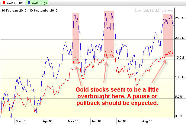
When reviewing the metals sector I like to look at it from different angles to get a solid understanding of the patterns and trend forming. I follow multiple time frames along with monitoring the gold mining stocks. Gold stocks tend to lead the price of gold bullion and when its out performing the price of gold substantially by 10% or more you should be expecting a pause or pullback in both gold stocks and gold bullion prices temporarily.

Below are a few charts showing the long and short term trends for gold.

Gold Bullion Price – Weekly Trend Chart

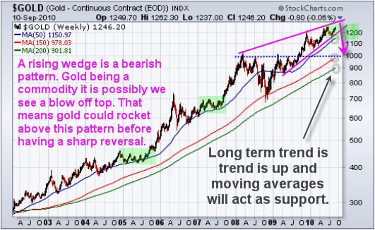
Gold continues to be in a strong up trend. The occasional test of support at the major moving averages can provide great long term points for adding to a position. The 50 period average is one which is tested frequently.

Looking at the weekly chart does give me a red flag for the intermediate price of gold. While the trend is clearly up I can’t help but notice the rising wedge which is a bearish pattern. During an uptrend we want to see bull flags and pennants, not a grind higher forming a narrowing range. This grind higher could unfold much similar to the price action of 2005 and 2007 instead of a correction but I am leaning more towards a sharp correction because more people are bullish on gold now then they were during the June top.

For those looking at gold as a long term investment/currency can be patient and wait for a pullback to a major moving average before adding to your position then you would lower your overall risk for this position. You will understand after reviewing the following charts.

GLD – Gold Bullion ETF – Daily Chart

(This fund moves identical to spot gold price so even though I am showing you GLD fund, the spot gold chart is doing the exact same thing.) As you can see below the price of gold is trading at resistance and becoming choppy. Buying gold at resistance does not make much sense to me. There is a very good chance gold will move lower in the coming weeks providing a better price for long term investors to add to their positions. For example, if you waited for the weekly chart to pullback to the 50 period moving average that would be like buying this GLD fund at $113, which is an 8% discount.

Gold continues to hold up within its channel but this week we could see fireworks if the price breaks below the blue support channels.

Gold:Gold Stocks Comparison – Daily Chart

This chart shows the performance of gold vs gold stocks from the Feb 2010 lows. The blue line is the performance of gold stocks while the red line shows gold’s performance. It’s obvious that when everyone is bullish on gold they buy the highly leverages gold investments in order to take full advantage of the upcoming move. This is much like reading the put/call ratio for trading the SP500 and it measures the bullishness of the precious metals sector.

When gold equities are strongly out performing gold bullion you should be thinking about raising your stops, taking partial profits and or hedging your long term position until the sector stabilizes is not trading at a premium.

Precious Metals Sector Trading Conclusion:

In short, Gold is in a strong up trend and will remain in one for a long time. Commodities have higher percentage of going parabolic. That means there’s a small chance that gold continues to move up quicker and quicker surging hundreds of dollars in a very short period of time. That being said, it’s not very likely, and from a technical point of view those buying gold now are paying a premium in my opinion.

Being a patient trader is not easy, but waiting for low risk entry points is very rewarding on many different levels when done correctly.

Get my detailed ANALISYS and TRADES for Oil, US dollar, Treasury notes, the broad market, and Sectors. Be sure to join my ETF Trading Service at: http://www.thegoldandoilguy.com/specialoffer/signup.html

Chris Vermeulen
Get More Free Reports and Trade Ideas Here for Free: FREE SIGN-UP

Wed Sept 8th, 2010
I am going to step out on a limb in this report and cover what I think to be an intermediate top in the precious metals sector. Everyone I speak with and from the hundreds of emails I get I would say the vast majority are bullish on gold and silver. That being said, I feel we are 3-8 days away from a pop and drop in the price of gold.

Below are my explanation and charts of what I think is unfolding.

HUI – Gold Bugs Index

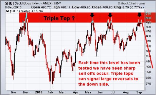
This chart tracks a basket of gold companies and can be used as a leading indicator for gold bullion at times. This index tends to lead the price of gold before rallies and also during declines. I have seen this lead by a few hours and even up to 7 days. I find it out perform when gold is about to rally, and under perform when gold is topping or about to start another move down.

It looks as though we are forming a triple top which also happens to be at a previous 2009 resistance level. Each time this level has been reached sellers take control and send the market sharply lower. There have been several long upper wicks formed in the past few sessions telling me that buyers are pushing the price up, but sellers hit the sell button pulling the market right back down. If this triple tops plays out, I would expect a multi month correction to take place.

UUP – US Dollar ETF

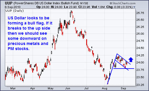
The US Dollar looks to have found support at the March/April lows and has put in a very solid rally. If the chart pattern is correct then it looks as though the dollar will breakout to the upside and run to $24.75 area. The relationship between the dollar and the precious metals sector is generally inverse, meaning if the dollar rallies both gold and stocks should fall.

GLD – Gold Bullion ETF

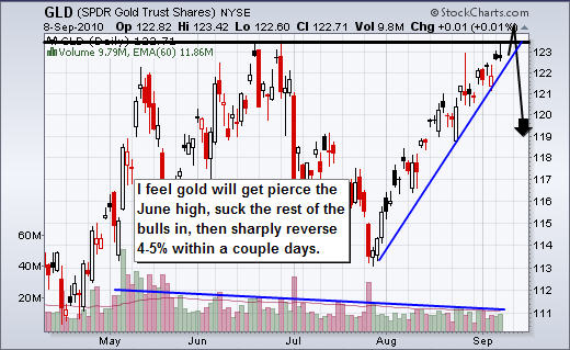
The chart of gold has identical patterns no matter if it’s this ETF or spot gold price. So this analysis goes for both ETF and gold bullion prices. Anyways, the past two times gold rallied for this length of time without any sizable pauses we saw the price of gold drop $70 per ounce, and $140 per ounce which is equivalent to $7-$10 drop on this GLD fund which is a decent size move.

The chart is screaming of a nasty correction to occur any day now. With gold testing the June highs I feel its only days away. What I am looking for is a pierce of the June high. That will suck in the rest of the bulls as they jump on the band, and cause all the shorts to cover their positions. This causes a pop, and once buying starts to dry up, the big money will start to sell down the price to trigger the stops and start a multi day waterfall sell off.

With the declining volume as the price grinds its way higher it tells me fewer individuals want to buy in at these high prices. Once the price starts to slide it will cause the stops to triggered. And because there have not been any substantial pullbacks along the way, there is a larger number of stops sitting in the market waiting to get hit.

Mid-Week Precious Metals Trading Report:

In short, I feel precious metals are on the verge of a sharp correction which may only last a few days, but the drop will be substantial. I still think we could see a few more up days or sideways session before this happens as the June high for gold bullion should be penetrated before the market truly reverses back down.

Anyone long gold, silver or PM stocks should be thinking of tightening their stops and for the gold bugs to mentally prepare them selves for a correction.

I hope my bi-weekly trend reports helps shed some light on the market for you. My trading alerts and frequent updates are reserved only for subscribers, so if you would like more trading analysis, updates and trades please join me at: www.TheGoldAndOilGuy.com

Chris Vermeulen
Get More Free Reports and Trade Ideas Here for Free: FREE SIGN-UP

Thursday Sept 2nd, 2010
Wednesday was a big session with better than expected manufacturing surging the market 3%. In this article I will do a quick technical take on the current situation for the SP500 and gold as they are both trading at a key resistance level. also its important to know what type of price action we will get in the next 1-2 days so you can have your profit targets or protective stops in place depending on which side of the market you are currently playing.

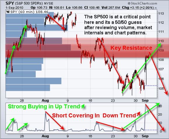
SPY – SP500 Exchange Traded Fund – 60 Minute Chart

The market is currently in a down trend which means bounces get sold. But if you take a look at the buying volume ratio at the bottom of the chart you will notice that in an uptrend buying surges are the beginning of a rally, and during a downtrend buying surges are the end of a rally. I also want to mention that a lot of volume traded at this current level which you can see on the volume by price bars on the chart. This means there will be a lot of sellers to overcome before breaking to the upside.

The situation the market is at now makes things difficult to tell if this bounce will get sold, or if its just the starting of a rally. There are several arguments for each side but the one which I think has the most influence is the buying volume. It was very strong on this current bounce. It feels more like a rally but we will not know for sure for a couple days…

That being said, if the SP500 moves up Thursday then I would consider the market to be in an uptrend and exiting any short positions is a smart play. But if this bounce is sold and the market drops, then the 3% rally on Wednesday could all be given back and then some.

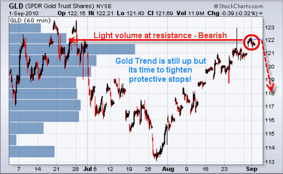
GLD Gold Exchange Traded Fund – 60 Minute Chart

Gold has continued to grind its way up to the previous top. Problem is the volume has been very light and that tells me there is not much demand for gold at these elevated prices. While we are still long gold it is crucial to have your protective stop in place so we lock in as much profit as possible for when the sharp selling spike happens.

Mid-Week Technical Take:

In short, the market feels like its trying to reverse back up but at this time its still in a down trend and trading under a key resistance level. This means trading with the trend and selling the bounces is still the play. That being said today’s strong volume makes this bounce suspect. Keeping positions small and setting a protective stop should be done as a safety precaution. The next couple days will shed some light for sure…

As for gold, I am still bullish but expecting our protective stops to be triggered any day now, which means we get paid and can mark another successful trade down on the scoreboard.

I’d like you to have my ETF Trade Alerts for Low Risk Setups! Get them here: http://www.thegoldandoilguy.com/specialoffer/signup.html

Chris Vermeulen
Get More Free Reports and Trade Ideas Here for Free: FREE SIGN-UP

Sunday Aug 29th, 2010
Last week was a relatively strong week for stocks and commodities. Although the SP500 closed slightly lower on the week the price action Friday was strong. The recent pop in commodities has everyone feeling good and bullish again and we all know how the market works… When everyone is feeling good the market has a way of shaking things up.

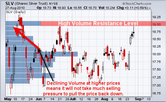
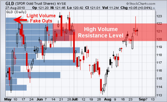
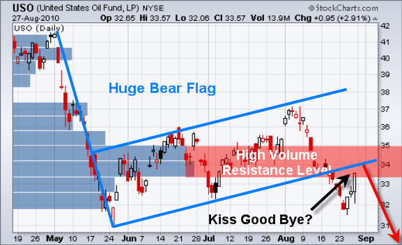
Below are a few charts showing heavy volume resistance levels that will most likely cause the broad market & commodities to pullback or trade sideways for a few days as buyers and sellers play tug-o-war.

SLV – Silver Bullion ETF Trading

Silver had a very nice pop last week but if you step back and look the recent price action you can see that it’s still trading below the previous major bounce from back in June. It looks as though silver is a little over extended as large percentage moves tend to give back 25-50% of the mover shortly after.

Take a look at the price by volume bar. It shows there has been heavy volume traded at that $19.00 level and the previous time it was reached sellers stepped back in pulling silver down.

GLD – Gold Bullion ETF Trading

Gold is trading deep into the resistance level and struggling to hold up. Last week we went long GLD after the bullish engulfing candle and took profits near the high two days later on Thursday’s price. Although gold is trading at resistance the intraday price action remains somewhat bullish/neutral for the time being.

USO – Oil ETF Trading

The oil ETF broke down from its large multi-month bear flag and is now bouncing up to test that breakdown/resistance level. This could be a possible kiss good bye. I will keep my eye on this commodity as it could provide us with a great shorting opportunity in the coming days.

SPY – SP500 ETF Trading

The equities market has been tried to bottom all week and Friday’s price action looks strong. While the chart looks strong the market internals are telling me the opposite. Last week we saw a gap down and Friday that gap window was filled. With heavy volume resistance just above the current price the odds are pointing to lower prices.

Weekend Equities and Commodities ETF Trading Report:

In short, it looks as though everything is trading just under or at resistance levels. That means sellers will start to enter the market and cause prices to stall (trade sideways/choppy) and or reverse lower.

That being said, with Friday’s strong close for oil and the sp500 I am expecting a gap higher in the morning because traders will review those charts this weekend and enter the market Monday feeling bullish.

If you would like to get my ETF Trade Alerts for Low Risk Setups checkout my service at: www.TheGoldAndOilGuy.com/specialoffer/signup.html

Chris Vermeulen