It has been a year since the price of gold bullion topped out and even longer for silver. Many traders and investors have been patiently waiting for this long term consolidation pattern to breakout and trigger the rally for precious metals and miner stocks. Most of gold bullion is used for investment purposes. As a result, it rises when there is economic weakness and investors lose confidence in the fiat currency of a country.
With continuing economic weakness in the United States it will almost certainly lead the Federal Reserve to act in way that is more powerful than Operation Twist which is the selling of short term securities to buy those with a longer term. Based on the most recent data, economic growth in the United States is falling as the unemployment rate rises. A recent statement by the Federal Reserve was unusually clear in calling for greater action in the future.
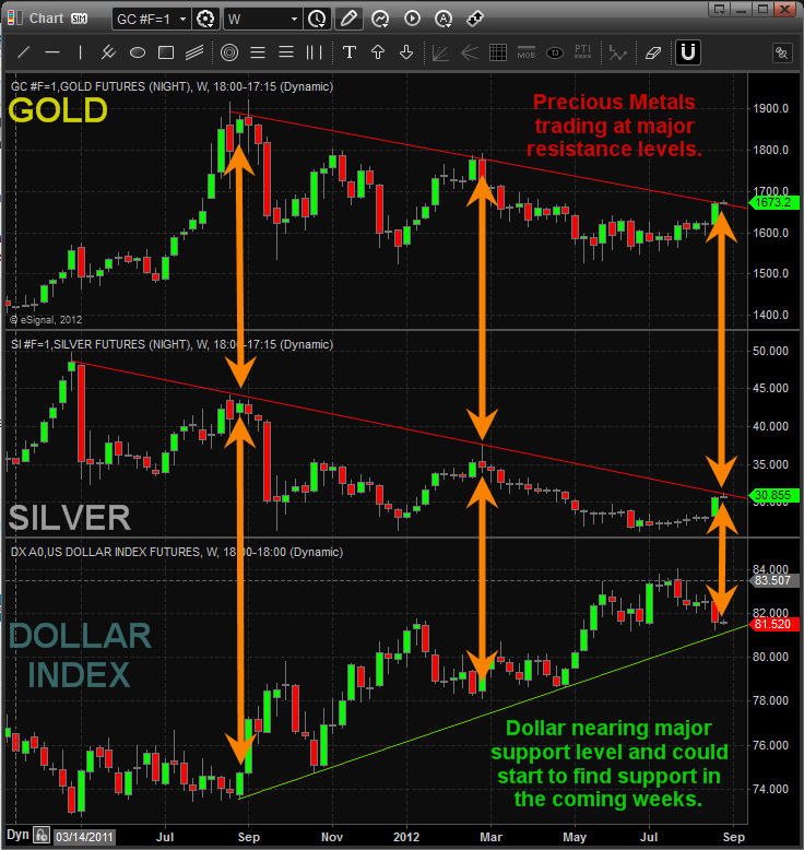
Gold, Silver and Dollar Weekly Price Chart:
Take a look at the weekly charts below which compare gold and silver to the US Dollar index. You will notice how major resistance for metals lines up with major support for the dollar. As this time metals are still in consolidation mode (down trend) and the dollar is in an uptrend.
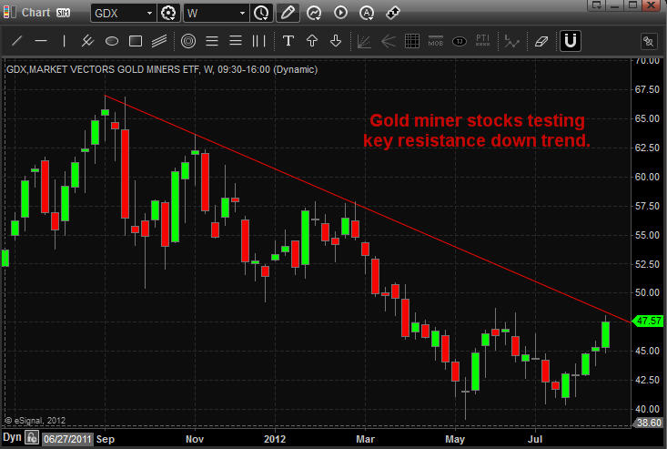
Gold Miners ETF Weekly Chart:
Gold miners have been under pressure for a long time and while they make money they have refused to boost dividends. That being said I feel the time is coming where gold miner companies breakout and rally then start to raise dividends in shortly after to really get share prices higher.
Overall I feel a rally is nearing in metals that will lead to major gains. It may start this week or it still could be a couple months down the road. But when it happens there should be some solid profits to be had. I continue to keep my eye on this sector for when they technically breakout and start an uptrend.
If you would like to get my weekly analysis on precious metals and the board market be sure to join my free newsletter at www.TheGoldAndOilGuy.com
Chris Vermeulen
http://www.thegoldandoilguy.com/wp-content/uploads/2014/11/tgaoglogo.png00adminhttp://www.thegoldandoilguy.com/wp-content/uploads/2014/11/tgaoglogo.pngadmin2012-08-27 08:57:592014-03-06 07:32:17The Precious Metals MAJOR Breakout Part II
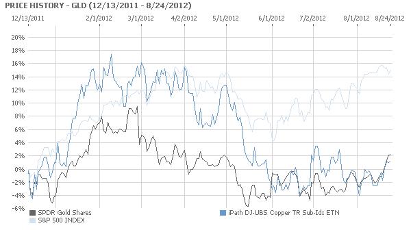
There should be an inverse relationship between gold (NYSEARCA: GLD) and copper (NYSEARCA: JJC).
Most of gold is used for investment purposes. As a result, it rises when there is economic weakness and investors lose confidence in the fiat currency of a country. Most of copper is used for industrial purposes. Therefore, the price of The Red Metal should increase when economies are booming, as there is a greater demand for it from the factories operating at full throttle and for the buildings being constructed.
Gold Bullion Prices
As the chart below evinces, the inverse relationship between the exchange traded for gold, SPDR Gold Shares, and the exchange traded fund for copper, iPath Copper, has broken down due to traders positioning themselves for the introduction of Quantitative Easing 3 when Federal Reserve Chairman Ben Bernanke speaks at Jackson Hole this Friday.
Continuing economic weakness in the United States will almost certainly lead the Federal Reserve to act in way that is more powerful than Operation Twist, the selling of short term securities to buy those with a longer term. Based on the most recent data, economic growth in the United States is falling as the unemployment rate is rising. A recent statement by the Federal Reserve was unusually clear in calling for greater action.
Both the JJC and the GLD have risen together as traders expect more economic stimulus from the United States Government. This will weaken the US Dollar and raise the price of commodities, as happened with Quantitative Easing 2. During the period of Quantitative Easing 2, from November 2010 to June 11, the US Dollar fell in value and the GLD and the JJC soared, along with other commodity prices, particularly oil. This pattern is being repeated as traders are preparing for the initiation of Quantitative Easing 3 when Bernanke speaks Friday, or at the next Federal Open Market Committee meeting.
Gold Spot Price Chart
TheTechnicalTraders Analysis & Trade Idea Delivered To Your INBOX!
http://www.thegoldandoilguy.com/wp-content/uploads/2014/11/tgaoglogo.png00adminhttp://www.thegoldandoilguy.com/wp-content/uploads/2014/11/tgaoglogo.pngadmin2012-08-27 08:23:092014-03-06 07:44:53Gold and Copper Rising Due to QE3 Hopes
One of the hallmarks of an options trader is the ability to reach into his trading tool bag and pull out different trading vehicles in order to accommodate the current market situation.
With few exceptions, a major component of any strategy our trader would select includes selling option premium. Premium sales usually are selected in out-of-the-money strikes where the time (extrinsic) premium constitutes 100% of the price received.
Examples of pure premium sales would include being short naked puts or calls. Another version of option premium sales would include credit spreads and iron condors wherein premium sales are combined with selling options.
It is important to remember that the time, or extrinsic premium of an option is directly related to time to expiration and implied volatility in the current 0% interest rate environment.
This current week of the options cycle is particularly difficult for two reasons. The first reason is the result of the fact that the September monthly expiration is one of four annual five week monthly options cycles. Remember that there are twelve monthly option expiration cycles, a clearly obvious fact for those possessing a calendar. What is not immediately obvious is that since there are 52 weeks in a year, four monthly cycles must contain five instead of four weeks.
Now remember from our previous discussions that the time decay of option premium is not linear. As illustrated below, time premium decay accelerates relentlessly into the closing bell at an ever accelerating pace.
Implied Volatility Option Trading
From a practical level, the extra week of time in our five week cycle gives us an extra week of relatively sluggish decay before the accelerating decay begins to erode time premium significantly. Each week of the option cycle has particular characteristics; living in the fifth week of a five week cycle is like watching paint dry for traders depending on theta decay to benefit their positions.
The next factor that exists in our current cycle is the unusually low implied volatility that is routinely encountered across a wide variety of underlying assets. Let us look at the measure of implied volatility of the Russell 2000 index, the RVX. This measure is similar to the more frequently encountered measure of volatility for the SPX, the VIX.
As can be seen in the weekly candle chart of this volatility measure, implied volatility is at multi-year lows.
Option Trader Newsletter
I consider the implied volatility to be the “stealth” component of options trading. It has impacts far greater than expected for traders and for this reason must be carefully analyzed in both a historic and current time frame for each trade considered.
In order to provide a practical example of the impact of the variable of implied volatility, let us consider how it affects a common “bread and butter” trade for most option traders. The trade is a “high probability” iron condor and consists of the combination of an out-of-the-money call credit spread and an out-of-the-money put credit spread.
The trade under discussion will be opened today and has fifty seven days to expiration. The high probability of its success derives from selecting the short options for the spread having a current delta below 10. This essentially means that these short options have a greater than 90% probability of expiring out-of-the-money. The trade therefore has a probability of being profitable in excess of 80%.
For purposes of illustration, I want to allow the magic of trade modeling to look at this trade under two different implied volatility scenarios. Displayed below is the comparison between the actual available trade today and the trade that would be possible if the volatility of the calls alone were at recent historic mean levels. I have purposely not used extreme values for the implied volatility in order to emphasize the impact of this routinely underestimated factor.
Implied Volatility P&L Graph
The curves above represent the expiration P&L graphs of the same trade taken at more normal volatility levels (the higher curve) and current volatility levels (the lower curve). The benchmark for comparison I have used is the annualized yield. The seemingly small modification of increasing implied volatility of the calls alone doubles the annualized trade yield from 80% to 160%!
I am a realist and understand that if we wish to trade, we must live in the world we are presented. The point of today’s missive is to call attention to the fact that what seem to be minor factors of trivial impact can have huge results on overall trading results.
This material should not be considered investment advice. J.W. Jones is not a registered investment advisor. Under no circumstances should any content from this article or the OptionsTradingSignals.com website be used or interpreted as a recommendation to buy or sell any type of security or commodity contract. This material is not a solicitation for a trading approach to financial markets. Any investment decisions must in all cases be made by the reader or by his or her registered investment advisor. This information is for educational purposes only.
http://www.thegoldandoilguy.com/wp-content/uploads/2014/11/tgaoglogo.png00adminhttp://www.thegoldandoilguy.com/wp-content/uploads/2014/11/tgaoglogo.pngadmin2012-08-23 20:29:232014-03-06 07:51:36Monitoring Implied Volatility is Critical for Option Traders
One of the top stories in the financial markets in 2012 has to be the stagnation in the price of gold at around $1600 an ounce, which is down approximately 17% from its peak at $1920.30. Those bullish on the yellow metal have been disappointed in gold’s performance while those bearish on the shiny metal have reveled in its stagnation, saying that gold’s status as a safe haven is over.
What is behind gold’s sluggish performance in 2012? There are several reasons, but one of the key fundamental reasons has been the lack of demand from traditionally the largest buyer of gold on the planet – India (although China will surpass it this year). India bought only 181.3 tons in the second quarter of 2012, a 2-year low, according to the London-based World Gold Council.
There are several factors at play as to why Indian demand for gold has fallen. One reason is the sharp drop in the value of its currency, the rupee, which is down by 25% versus the U.S. dollar this year. This decline has kept gold prices high in relative terms while the actual dollar value of gold was falling. Perhaps even more important has been the ‘war’ declared on gold by its central bank which has blamed all of the country’s economic ills on Indian citizens’ traditional buying of gold. In an attempt to slow down gold and silver imports, the Indian government has imposed new taxes on the purchase of these precious metals.
But even though demand for the precious metal is way down in India, the situation still offers hope for gold bulls. Why? Because we’ve been here before – in 2009 to be exact. In early 2009, the Indian economy and rupee tanked. Gold demand almost completely dried up. According to precious metals consultancy GFMS, Indian demand for gold in the first quarter of 2009 collapsed by 77%. For the full year GFMS said Indian consumption dropped by 19%.
Now with the Indian economy slowing to its weakest growth rate in nearly a decade and the rupee falling, we are seeing a replay of 2009. The monsoon season has been poor, hitting farmers – among the biggest buyers of gold – hard. Gold prices have hit a record high in rupee terms, and India is expected to purchase, as forecast by the World Gold Council, only 750 tons of gold, down 25% from 2011 levels. Meanwhile, the WGC forecasts that China will buy 850 tons of gold this year.
Investors should pay heed to the clues that recent history is giving us. The drop in Indian demand is simply a cyclical phenomenon due to the lousy state of the Indian economy. It will recover eventually. And when it does, look out for the fireworks from renewed Indian demand for gold added to the Chinese demand. In 2010, as pent-up demand for gold was unleashed, Indian gold consumption soared 74% to a record high of 1,006 tons according to GFMS.
Gold bulls surely hope we see something similar in 2013 and that is exactly what I talked about last week based around gold miner stocks and also what Dave Banister’s recent gold forecast was about at TheMarketTrendForecast.com sees in 2013.
Gold Chart Showing 2009 Collapse and Outcome and Current Gold Price Analysis:
Gold Forecast - India Gold demand
Gold Trading & Investing Conclusion:
In short, gold and gold stocks have a lot of work to do before they truly breakout into the next major leg higher. I feel we are nearing that point and they may have bottomed already. Starting a small long position to scale in I think is a safe play. But I would only add more once the trend actually turns up and shows strength in terms of price and volume action.
If you would like to get my weekly analysis on precious metals and the board market be sure to join my free newsletter at www.TheGoldAndOilGuy.com
Chris Vermeulen
http://www.thegoldandoilguy.com/wp-content/uploads/2014/11/tgaoglogo.png00adminhttp://www.thegoldandoilguy.com/wp-content/uploads/2014/11/tgaoglogo.pngadmin2012-08-20 12:07:082014-03-06 07:57:48Gold Price and Indian Demand Shifting Trends
It is an endless debate for investors interested in gold. Should they buy a direct play on the gold price, either gold bullion itself or even so-called paper gold with an ETF such as the SPDR Gold Shares (NYSEArca: GLD)? Or should they invest into gold equities, particularly the larger, higher quality gold mining companies?
Recent history suggests the answer is gold itself. According to Citigroup, physical gold has outperformed global gold equities 120% percent of the time over the past 5 years. Stocks of the bigger gold mining firms seem to react adversely to bad news (which is normal), but the problem is they react with no more than a yawn to good news. These type of stocks are contained in the Market Vectors Gold Miners ETF (NYSEArca: GDX).
Gold Mining Stocks ETF - GDX
Evidence of this trend can been see in the latest news to hit the industry…the slowdown in expansion as recently signaled by the world’s largest gold producer, Barrick Gold (NYSE: ABX). The company’s stock has fallen by more than 30 percent over the last year due to cost overruns at major projects. The latest blowup in costs of up to $3 billion occurred in its estimate for development of its flagship Pascua-Lama project on the border of Chile and Argentina. The project may now cost up to $8 billion.
In addition, Barrick decided to shelve the $6 billion Cerro Casale in Chile and the $6.7 billion Donlin Gold project in Alaska. Barrick is not alone in its thinking among the major gold producers. The CEO of Agnico-Eagle Mines (NYSE: AEM), Sean Boyd, recently said “The era of gold mega-projects may be fading. The industry is moving into an era of cash flow generation, yields and capital discipline.”
Fair enough. But are gold mining companies’ management walking the walk about yields or just talking the talk? Last year, many of the larger miners made major announcements that they would be focusing on boosting their dividends to shareholders in attempt to attract new stockholders away from exchange traded vehicles such as GLD, which have siphoned demand away from gold equities. Barrick, for example, did boost its dividend payout by a quarter from the previous level. Newmont Mining (NYSE: NEM), which has also cut back on expansion plans, has pledged to link its dividend payout to the price of gold bullion.
So in effect, the managements at the bigger gold mining companies (which are having difficulties growing) are trying to move away from attracting growth-only investors to enticing investors that may be interested in high dividend yields. This is a logical move.
But rising costs at mining projects may put a crimp into the plans of gold mining companies’ as they may not have the cash to raise dividends much. And they have done a poor job of raising dividends for their shareholders to date. In 2011 the dividend yields for gold producers globally was less than half the average for the mining sector as a whole at a mere 1.3 percent. Their yields are below that of the base metal mining sector and the energy sector.
It seems like management for these precious metal companies have the similar emotional response shareholders have when they are in a winning position. When the investor’s brain has experienced a winning streak and is happy it automatically goes into preservation/protection mode. What does this mean? It means management is going to tight up their spending to stay cash rich as they do not want to give back the gains during a time of increased uncertainty. Smaller bets/investments are what the investor’s brain is hard wired to do which is not always the right thing to do…
Looks like there is still a lot work to be done by gold mining companies’ to improve returns to their shareholders. But with all that set aside it is important to realize that when physical gold truly starts another major rally. These gold stocks will outperform the price of gold bullion drastically for first few months.
Gold Stock Rally
Gold Miner Trading Conclusion:
In short, last weeks special report on gold about how gold has been forming a major launch pad for higher prices over the past year. Gold bullion has held up well while gold miner stocks have given up over 30% of their gains. If/when gold starts another rally I do feel gold miner stocks will be the main play for quick big gains during the first month or two of a breakout. The increased price in gold could and value of the mining companies reserves could be enough to get management to start paying their investors a decent dividend which in turn would fuel gold miner shares higher.
Both gold and silver bullion prices remain in a down trend on the daily chart but are trying to form a base to rally from which may start any day now. Keep your eye on precious metals going into year end.
If you would like to get my weekly analysis on precious metals and the board market be sure to join my free newsletter at www.TheGoldAndOilGuy.com
Chris Vermeulen
http://www.thegoldandoilguy.com/wp-content/uploads/2014/11/tgaoglogo.png00adminhttp://www.thegoldandoilguy.com/wp-content/uploads/2014/11/tgaoglogo.pngadmin2012-08-13 20:35:502014-03-06 08:05:03Gold Mining Stocks Continue to Disappoint But Not For Long
While the exchange traded funds for gold (NYSEARCA: GLD TRADING – GLD QUOTE) and copper (NYSEARCA: JJC) fell today due to investors expressing disappoint at the modest response of the Federal Reserve to declining economic growth, it was silver (NYSEARCA: SLV Trading, SLV Quote) that was off the most.
SPDR Gold Shares (GLD) fell in trading today by 0.89%. IPath Dow Jones Copper (JJC) dropped 1.89%. Plunging the deepest was iShares Silver Trust (SLV), off by 2.14%.
SLV Bullion Trust
Traders were hoping for more aggressive action by Federal Reserve Chairman Ben Bernanke. But that will not come until after the November elections in the United States. Remember that Quantitative Easing 2 did not begin until November 2010, though it was announced at the Jackson Hole economic policy summit in August of 2010.
Silver is in what would seem to be the “sweet spot” between gold and copper. Almost all of gold is used for investment or decorative purposes. Almost all of The Red Metal goes for industrial needs. For silver, it comes almost down right in the middle between commercial and a commodity for investments or jewelry. The charts below show the trading relationship for each of the exchange traded funds when paired against each other.
JJC Copper ETF Trading
Even though silver has a much higher industrial usage, the SLV moves along with the GLD. As a result, it soared during Quantitative Easing 2. Obviously, the charts reveal that most of the trading is from speculators as the JJC should move in an inverse relationship with the GLD. That is due to gold being used almost entirely for non-industrial end uses while copper is used almost industrial for industrial uses.
Up slightly for the week as traders thought more dramatic economic stimulus efforts would result from the Federal Open Market Committee meeting other than an extension until the end of the year for Operation Twist, the SLV is down for the last month, quarter, six months and 52 weeks of market action. Year to date, the SLV is off by 1.48%.
For the last year, however, the SLV is down 33.35%. Volume was up today, with the SLV below its 20-day, 50-day and 200-day moving averages. In the most obvious trend, it is trading much lower under its 200-day day moving average at 11.67% down than underneath the 20-day moving average, beneath it by only 0.17%. The only move worth noting in the technical indicators for silver were the long engulfing green bodies last week after Treasury Secretary Geithner’s gloomy testimony on The Hill and more bad economic news from the US peaked buying as traders thought Quantitative Easing 3 was coming.
SLV ETF Trading
If traders long on silver are looking for help from Bernanke, it will not be coming until after the November election, though it could be announced when he speaks later this month at Jackson Hole.
Chris Vermeulen
http://www.thegoldandoilguy.com/wp-content/uploads/2014/11/tgaoglogo.png00adminhttp://www.thegoldandoilguy.com/wp-content/uploads/2014/11/tgaoglogo.pngadmin2012-08-02 07:34:512014-03-06 08:09:39Silver Suffers The Most From Bernanke And What Is Next