Sunday Sept 12
Precious metals soar as investors flock to gold and silver. But are they looking deep enough to truly understand the current trends at hand?

When reviewing the metals sector I like to look at it from different angles to get a solid understanding of the patterns and trend forming. I follow multiple time frames along with monitoring the gold mining stocks. Gold stocks tend to lead the price of gold bullion and when its out performing the price of gold substantially by 10% or more you should be expecting a pause or pullback in both gold stocks and gold bullion prices temporarily.

Below are a few charts showing the long and short term trends for gold.

Gold Bullion Price – Weekly Trend Chart

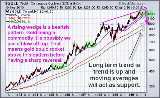
Gold continues to be in a strong up trend. The occasional test of support at the major moving averages can provide great long term points for adding to a position. The 50 period average is one which is tested frequently.

Looking at the weekly chart does give me a red flag for the intermediate price of gold. While the trend is clearly up I can’t help but notice the rising wedge which is a bearish pattern. During an uptrend we want to see bull flags and pennants, not a grind higher forming a narrowing range. This grind higher could unfold much similar to the price action of 2005 and 2007 instead of a correction but I am leaning more towards a sharp correction because more people are bullish on gold now then they were during the June top.

For those looking at gold as a long term investment/currency can be patient and wait for a pullback to a major moving average before adding to your position then you would lower your overall risk for this position. You will understand after reviewing the following charts.

GLD – Gold Bullion ETF – Daily Chart

(This fund moves identical to spot gold price so even though I am showing you GLD fund, the spot gold chart is doing the exact same thing.) As you can see below the price of gold is trading at resistance and becoming choppy. Buying gold at resistance does not make much sense to me. There is a very good chance gold will move lower in the coming weeks providing a better price for long term investors to add to their positions. For example, if you waited for the weekly chart to pullback to the 50 period moving average that would be like buying this GLD fund at $113, which is an 8% discount.

Gold continues to hold up within its channel but this week we could see fireworks if the price breaks below the blue support channels.

Gold:Gold Stocks Comparison – Daily Chart

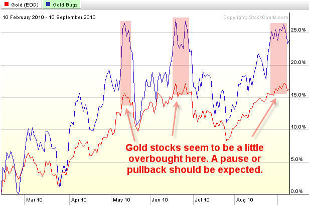
This chart shows the performance of gold vs gold stocks from the Feb 2010 lows. The blue line is the performance of gold stocks while the red line shows gold’s performance. It’s obvious that when everyone is bullish on gold they buy the highly leverages gold investments in order to take full advantage of the upcoming move. This is much like reading the put/call ratio for trading the SP500 and it measures the bullishness of the precious metals sector.

When gold equities are strongly out performing gold bullion you should be thinking about raising your stops, taking partial profits and or hedging your long term position until the sector stabilizes is not trading at a premium.

Precious Metals Sector Trading Conclusion:

In short, Gold is in a strong up trend and will remain in one for a long time. Commodities have higher percentage of going parabolic. That means there’s a small chance that gold continues to move up quicker and quicker surging hundreds of dollars in a very short period of time. That being said, it’s not very likely, and from a technical point of view those buying gold now are paying a premium in my opinion.

Being a patient trader is not easy, but waiting for low risk entry points is very rewarding on many different levels when done correctly.

Get my detailed ANALISYS and TRADES for Oil, US dollar, Treasury notes, the broad market, and Sectors. Be sure to join my ETF Trading Service at: http://www.thegoldandoilguy.com/specialoffer/signup.html

Chris Vermeulen

Get More Free Reports and Trade Ideas Here for Free: FREE SIGN-UP

Wed Sept 8th, 2010
I am going to step out on a limb in this report and cover what I think to be an intermediate top in the precious metals sector. Everyone I speak with and from the hundreds of emails I get I would say the vast majority are bullish on gold and silver. That being said, I feel we are 3-8 days away from a pop and drop in the price of gold.

Below are my explanation and charts of what I think is unfolding.

HUI – Gold Bugs Index

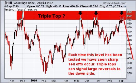
This chart tracks a basket of gold companies and can be used as a leading indicator for gold bullion at times. This index tends to lead the price of gold before rallies and also during declines. I have seen this lead by a few hours and even up to 7 days. I find it out perform when gold is about to rally, and under perform when gold is topping or about to start another move down.

It looks as though we are forming a triple top which also happens to be at a previous 2009 resistance level. Each time this level has been reached sellers take control and send the market sharply lower. There have been several long upper wicks formed in the past few sessions telling me that buyers are pushing the price up, but sellers hit the sell button pulling the market right back down. If this triple tops plays out, I would expect a multi month correction to take place.

UUP – US Dollar ETF

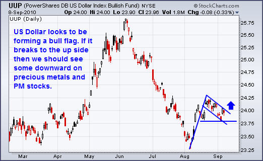
The US Dollar looks to have found support at the March/April lows and has put in a very solid rally. If the chart pattern is correct then it looks as though the dollar will breakout to the upside and run to $24.75 area. The relationship between the dollar and the precious metals sector is generally inverse, meaning if the dollar rallies both gold and stocks should fall.

GLD – Gold Bullion ETF

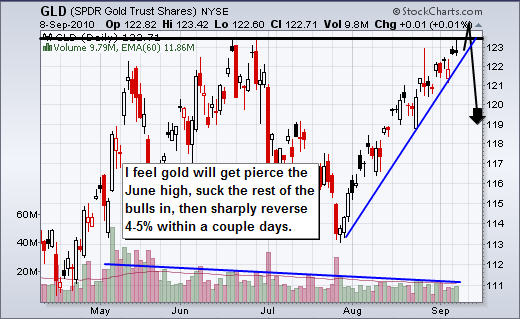
The chart of gold has identical patterns no matter if it’s this ETF or spot gold price. So this analysis goes for both ETF and gold bullion prices. Anyways, the past two times gold rallied for this length of time without any sizable pauses we saw the price of gold drop $70 per ounce, and $140 per ounce which is equivalent to $7-$10 drop on this GLD fund which is a decent size move.

The chart is screaming of a nasty correction to occur any day now. With gold testing the June highs I feel its only days away. What I am looking for is a pierce of the June high. That will suck in the rest of the bulls as they jump on the band, and cause all the shorts to cover their positions. This causes a pop, and once buying starts to dry up, the big money will start to sell down the price to trigger the stops and start a multi day waterfall sell off.

With the declining volume as the price grinds its way higher it tells me fewer individuals want to buy in at these high prices. Once the price starts to slide it will cause the stops to triggered. And because there have not been any substantial pullbacks along the way, there is a larger number of stops sitting in the market waiting to get hit.

Mid-Week Precious Metals Trading Report:

In short, I feel precious metals are on the verge of a sharp correction which may only last a few days, but the drop will be substantial. I still think we could see a few more up days or sideways session before this happens as the June high for gold bullion should be penetrated before the market truly reverses back down.

Anyone long gold, silver or PM stocks should be thinking of tightening their stops and for the gold bugs to mentally prepare them selves for a correction.

I hope my bi-weekly trend reports helps shed some light on the market for you. My trading alerts and frequent updates are reserved only for subscribers, so if you would like more trading analysis, updates and trades please join me at: www.TheGoldAndOilGuy.com

Chris Vermeulen

Get More Free Reports and Trade Ideas Here for Free: FREE SIGN-UP

Thursday Sept 2nd, 2010
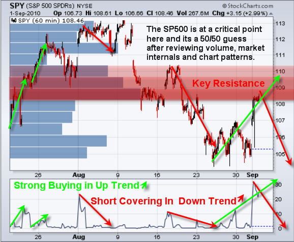
Wednesday was a big session with better than expected manufacturing surging the market 3%. In this article I will do a quick technical take on the current situation for the SP500 and gold as they are both trading at a key resistance level. also its important to know what type of price action we will get in the next 1-2 days so you can have your profit targets or protective stops in place depending on which side of the market you are currently playing.

SPY – SP500 Exchange Traded Fund – 60 Minute Chart

The market is currently in a down trend which means bounces get sold. But if you take a look at the buying volume ratio at the bottom of the chart you will notice that in an uptrend buying surges are the beginning of a rally, and during a downtrend buying surges are the end of a rally. I also want to mention that a lot of volume traded at this current level which you can see on the volume by price bars on the chart. This means there will be a lot of sellers to overcome before breaking to the upside.

The situation the market is at now makes things difficult to tell if this bounce will get sold, or if its just the starting of a rally. There are several arguments for each side but the one which I think has the most influence is the buying volume. It was very strong on this current bounce. It feels more like a rally but we will not know for sure for a couple days…

That being said, if the SP500 moves up Thursday then I would consider the market to be in an uptrend and exiting any short positions is a smart play. But if this bounce is sold and the market drops, then the 3% rally on Wednesday could all be given back and then some.

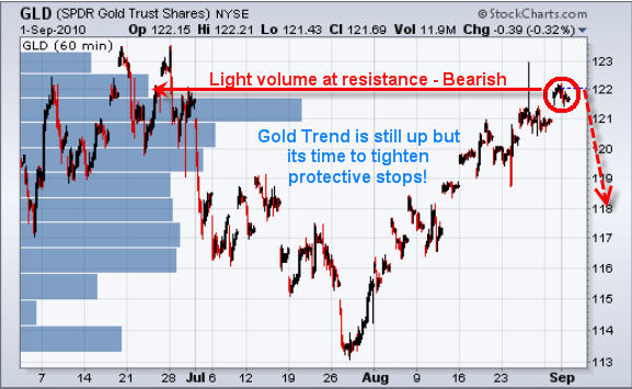
GLD Gold Exchange Traded Fund – 60 Minute Chart

Gold has continued to grind its way up to the previous top. Problem is the volume has been very light and that tells me there is not much demand for gold at these elevated prices. While we are still long gold it is crucial to have your protective stop in place so we lock in as much profit as possible for when the sharp selling spike happens.

Mid-Week Technical Take:

In short, the market feels like its trying to reverse back up but at this time its still in a down trend and trading under a key resistance level. This means trading with the trend and selling the bounces is still the play. That being said today’s strong volume makes this bounce suspect. Keeping positions small and setting a protective stop should be done as a safety precaution. The next couple days will shed some light for sure…

As for gold, I am still bullish but expecting our protective stops to be triggered any day now, which means we get paid and can mark another successful trade down on the scoreboard.

I’d like you to have my ETF Trade Alerts for Low Risk Setups! Get them here: http://www.thegoldandoilguy.com/specialoffer/signup.html

Chris Vermeulen
Get More Free Reports and Trade Ideas Here for Free: FREE SIGN-UP

Sunday Aug 29th, 2010
Last week was a relatively strong week for stocks and commodities. Although the SP500 closed slightly lower on the week the price action Friday was strong. The recent pop in commodities has everyone feeling good and bullish again and we all know how the market works… When everyone is feeling good the market has a way of shaking things up.

Below are a few charts showing heavy volume resistance levels that will most likely cause the broad market & commodities to pullback or trade sideways for a few days as buyers and sellers play tug-o-war.

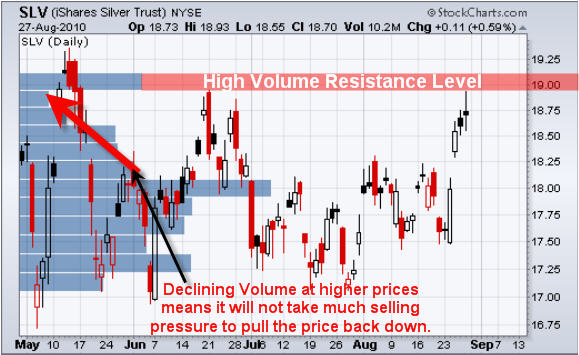
SLV – Silver Bullion ETF Trading

Silver had a very nice pop last week but if you step back and look the recent price action you can see that it’s still trading below the previous major bounce from back in June. It looks as though silver is a little over extended as large percentage moves tend to give back 25-50% of the mover shortly after.

Take a look at the price by volume bar. It shows there has been heavy volume traded at that $19.00 level and the previous time it was reached sellers stepped back in pulling silver down.

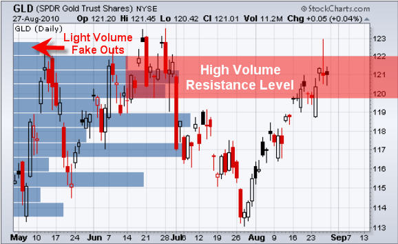
GLD – Gold Bullion ETF Trading

Gold is trading deep into the resistance level and struggling to hold up. Last week we went long GLD after the bullish engulfing candle and took profits near the high two days later on Thursday’s price. Although gold is trading at resistance the intraday price action remains somewhat bullish/neutral for the time being.

USO – Oil ETF Trading

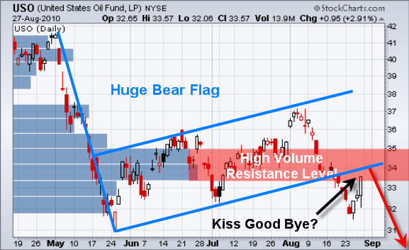
The oil ETF broke down from its large multi-month bear flag and is now bouncing up to test that breakdown/resistance level. This could be a possible kiss good bye. I will keep my eye on this commodity as it could provide us with a great shorting opportunity in the coming days.

SPY – SP500 ETF Trading

The equities market has been tried to bottom all week and Friday’s price action looks strong. While the chart looks strong the market internals are telling me the opposite. Last week we saw a gap down and Friday that gap window was filled. With heavy volume resistance just above the current price the odds are pointing to lower prices.

Weekend Equities and Commodities ETF Trading Report:

In short, it looks as though everything is trading just under or at resistance levels. That means sellers will start to enter the market and cause prices to stall (trade sideways/choppy) and or reverse lower.

That being said, with Friday’s strong close for oil and the sp500 I am expecting a gap higher in the morning because traders will review those charts this weekend and enter the market Monday feeling bullish.

If you would like to get my ETF Trade Alerts for Low Risk Setups checkout my service at: www.TheGoldAndOilGuy.com/specialoffer/signup.html

Chris Vermeulen

Wed Aug 25th
Understanding the key differences between both gold and silver’s risk/volatility levels plays a large part in how I choose a low risk trade setup. Those of you who follow me already know the GLD etf is my favorite trading vehicle as it provides me with low risk trading setups along with a very high win rate.

Ok, let’s jump into to comparing gold and silver as trading instruments. I get the same questions from new traders all the time and I think these two questions will help clear them up.

The questions are:

1. Why don’t you give silver (SLV) trading analysis/signals?
2. Why don’t you trade silver?

My answer to the questions are simple and the chart below displays my view.

The gold (GLD) signals I provide work with silver so you can just trade silver when I have gold long or short trade. This is the reason I don’t provide much silver analysis because it’s duplicate info.

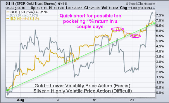
The chart below shows how gold and silver trade together when it comes to rallies and sell offs. But notice how volatile silver is while gold had a nice slow and steady trend upwards… Gold’s low volatility trending characteristics is what I love about it. Silver on the other hand is all over the place making it easy to have protective stops triggered before the majority of the trend is over. The silver charts almost always look terrible (tough to read for a direction). I really don’t like getting shaken out of a winning trade…

The pink circles show a quick short trade we did this week catching a quick 1% drop. The short trade was for FuturesTradingSignals where we capture 1-3 day extreme market sentiment shifts.

GLD – Gold ETF Trading Chart

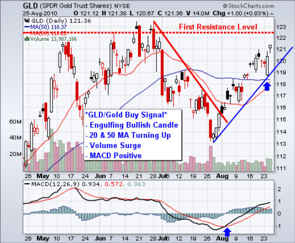
The chart below shows several points as to why gold/silver was screaming BUY ME on Tuesday afternoon. The two things that carry 90% of the strength in my opinion are the candlestick pattern (Bullish Engulfing) and the volume surge. Those two things when seeing on virtually any time frame are a good indication to go long for 1-3 candlesticks minimum.

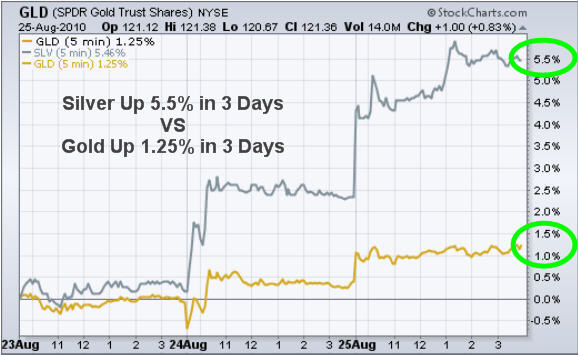
Gold VS Silver – 5 Minute 3 Day Chart

This chart clearly shows the power of trading a more volatile commodity with silver being the one. This week’s buy signal in gold is dwarfed by the performance of silver. Silver has always shined more in my opinion but when it comes to trading… It tougher than it looks to trade because of the wild whipsaw action it makes on a regular basis.

Gold and Silver Trading Conclusion:

In short, gold is the safe haven when it comes to actively trading. I do trade silver here and there but the size of my position is much smaller because of the difficulty level and volatility associated with it. I will not that I do trade gold and silver futures at times but for this report I focused on ETF’s.

If you want to get my Trading Analysis and ETF Trading Alerts Join My Newsletter: www.TheGoldAndOilGuy.com

Chris Vermeulen
GET THESE FREE EDUCATIONAL REPORTS EACH WEEK

Prices continue to churn as traders and investors try to figure if they want their hard earned dollar in cash or investments. The market is very jittery simply because no one wants to get caught on the wrong side of the market if it makes another 30-40% move, which is why we are seeing money rotate in and out each with very little commitment and follow through. Until a major trend looks to be in place most investors will not me holding many positions over night or through the weekend.

Here are a couple charts on what I think is most likely to happen in gold and the sp500.

GLD – Gold ETF Daily Chart

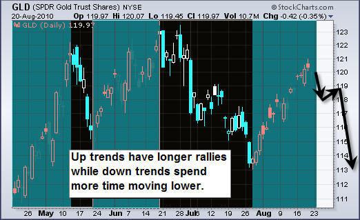
Last week we saw gold move higher by 1% but I cannot help but think a sharp sell off is only days away from being triggered. Either we get a another pop into resistance which would eventually trigger a wave of sellers and cause a sharp drop or the price of gold will drift lower to eventually break a key support level and trigger stop orders. Once the stops start to get triggered I would expect follow through selling for a couple days which will pull the price of GLD back down to the $113-116 area.

Also there is a possible head and shoulders pattern forming on this chart which is not picture perfect one but, it’s important to be aware as a neckline break could trigger massive selling and pull GLD down to the $100 area. But that would not unfold for several weeks if not months.

SPY – SP500 ETF

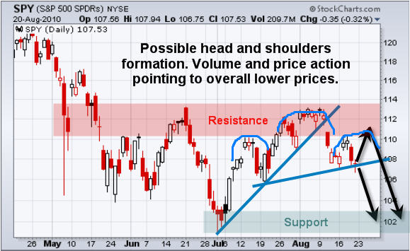
SP500 broke down from the support trendline two week ago and has since been trying to bounce. Last week we did see a two day pop but was given back Thursday. As you can see there is a possible mini head & shoulders pattern forming and the current price is testing the neckline. A breakdown below this should trigger a move to the $102 level.

Weekend Trading Conclusion:

In short, the market is trading at a key support level and this week should be exciting. Looking at several large cap stocks I am seeing bear flags on a large percentage of charts. Seeing these forming makes me think lower prices are just around the corner.

It looks like low risk trading setups are about to start popping up across the board and if we get a powerful trend going into the year end there will be some good money made for those on the proper side.

Receive My Free Weekly Trend Trading Reports and Market Updates at: www.TheGoldAndOilGuy.com

Chris Vermeulen
Trading commodities and indexes through the use of exchange traded funds sure keeps things simple for an average trader. These funds allow individual investors to buy and sell things like gold, silver, oil, the sp500 and other investments which where not available only few months ago like “wheat” for example.

One of the nice things with ETFs is that is allows everyone to follow the price of a commodity or index using any charting website and can even apply indicators to help spot key support and resistance levels using volume by price analysis. There is no need for a expensive data feeds, charting programs and you don’t have to worry about contract expiration.

Below are a few charts of the trend and my short term forecast.

GLD – Gold Bullion ETF

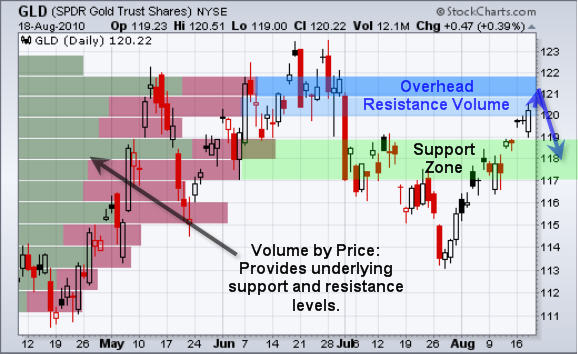
As you can see gold broke out of its support zone this week and popped into the next resistance level. This is very typical price action in the stock market. It is important to look at the price charts like an apartment building. It’s nothing but a bunch of floors and ceilings.

How it works; if a ball breaks though a floor it will naturally fall to the next floor and bounce. The same for if a ball breaks through a ceiling, it will hit the next ceiling then bounce back down. This is essentially how the market moves.

SLV – Silver ETF

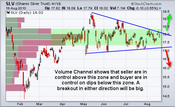
Silver is forming a large pennant and nearing its apex. With the amount of volume traded within this large volume channel I would expect a sharp breakout once a direction is made.

USO – Oil Traded Fund

Crude oil had a funky day. Early Wednesday morning in pre-market trading we saw virtually every investment drop at the same time which was strange. Anyways the US dollar dropped sharply and oil when down also. Normally as the dollar drops oil rockets higher but that was not the case today.

Currently oil is trading between two trendlines and is trying to hold up. If we get a breakdown then we could see a sharp drop in oil over the next 1-2 weeks.

SPY- SP500 ETF Trading Fund

The SP500 is trading within a high volume channel, similar to silver. Once a breakout in either direction is made I would expect a sizable move lasting a few w

Mid-Week Commodity and Index ETF Report:

In short, the market looks bearish for the short term of 5-10 trading sessions. This is because everything looks to be trading near resistance levels. That naturally brings sellers out of the woodwork putting pressure on prices.

Silver and gold stocks tend to lead the metals sector on breakouts so it will be important to keep an eye on them as we near a possible breakout or breakdown in the metals. If you see SLV or GDX ETFs out performing the GLD gold fund by 2-3x then I would expect to see gold move higher later that session or the following day.

The US dollar trend usually helps to identify if oil will have downward pressure or not. Also energy stocks tend to lead the price of oil by a few hours and some times a day. I keep an eye on XLE energy etf for a feel of how the energy stocks are doing and also UUP US dollar fund.

As for equities tech, financials and the Russell 2K (small cap stock) tend to lead the way for the broad market. Watching XLK, XLF and IWM help to confirm breakouts.

If you would like to Get My Trading Analysis and Alerts please join my free newsletter at: www.TheGoldAndOilGuy.com

Chris Vermeulen
Sunday Aug 15
Last week was exciting as investments rocketed higher or tank… We saw Gold and the US Dollar pop while oil and equities dropped sharply with heavy volume.

Just to recap, Wednesday the market went into free-fall mode sending traders and investors running for the door. This was obvious from looking at the large percent drop coupled with heavy selling. That day the NYSE showed panic selling with 37 shares sold for every 1 share purchased meaning pure panic. In my Wednesday night report “How to Take Advantage of Panic Selling for SP500 and Gold ” I explained how to read these extreme market conditions and what to expect the following sessions.

Currently the price of gold, oil, spx are trading somewhat at the opposite extremes seen last week. Below are a few charts explaining the situations:

GLD – Gold ETF Trading Signals

This 60 minute chart shows gold getting hit hard on Wednesday morning. Investors and traders around the globe were closing out positions and moving to cash. This high volume dumping of positions pulled virtually all investments lower and was the first tip-off that the market was in panic mode.

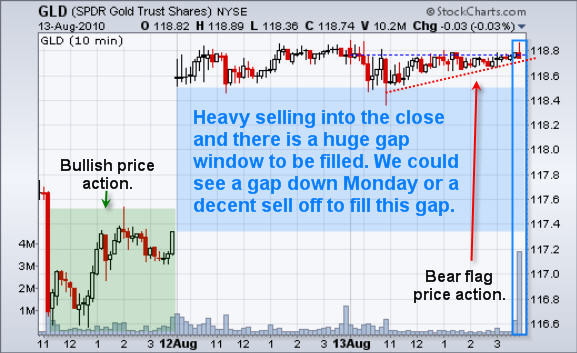
One the dust settled and investor’s regrouped we saw money surge back into gold creating a nice pop the following day. Problem I see is that gold is now trading at a key resistance level when reviewing the daily chart. And if you take a look at the 60 minute chart below you can see the price of gold sold down in the morning on August 13th and drifted up into the close on Friday forming a bearish wedge. Also there was some very strong selling just before the market closed which is also a concern.

USO – Oil Traded Fund

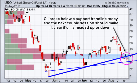
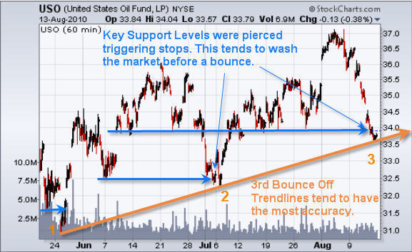
Both times oil has fallen we have seen the price pierce key support levels where the bulls would have the majority of their stops placed. The intraday pierce causes the stops to be triggered washing the market of long positions while the smart money loads up accumulating everyone’s sell orders . This is something which happens with virtually every type of investment and the main reason traders get shaken out just before the market goes in their direction. Anyways, running of the stops is something I will cover in a future report.

Looking at the chart below you can see oil trading at trendline support. Each time the key support levels (blue arrows) have been pierced the market has rocketed higher. Just from looking at the chart from August 9th forward you can see that this move down is overextended and visually looks ready for a pause or bounce in the coming days.

*Trading Tidbit – When trading trendlines it is important to try and play the third test. Reason being is that the first two pullbacks create the trendline and the third test is when active traders generally jump on board causing a sizable bounce. Each test of a trendline it becomes weaker and the probability of a breakdown is more likely.*

SPY – SP500 ETF Trading Fund

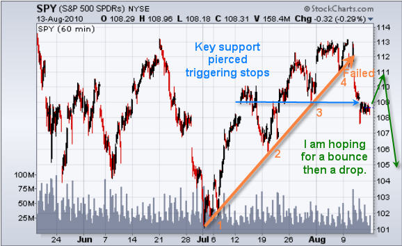
The SP500 chart shows last week’s breakdown on the 5th test of the trendline. The market is oversold here and ready for a bounce which I hope we get this week. My concern is that the downward momentum is to strong and a bounce will be negated.

US Dollar Index

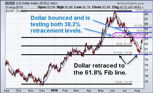
US dollar put in a huge bounce last week after testing is 61.8% Fib retracement level from the 2009 December low. The strong bounce has pushed the dollar up to a key resistance level which happens to be 38.2% Fib retracement level from both the December up trend and the recent sell off. I figure this will hold the dollar down for a few days easing the pressure on oil and equities.

Weekend Gold, Oil, SPX and Dollar Trading Conclusion:

In short, I feel there will be a relief bounce in oil and equities while the dollar and gold will have some profit taking and trade sideways or down at the beginning of the week. After that it looks as though stocks and oil will head lower while the dollar and gold rally.

If you would like to receive my Trading Analysis and Signals Complete with Entry, Targets and Protective Stops please visit my website at: www.TheGoldAndOilGuy.com

Chris Vermeulen

JOIN MY FREE NEWSLETTER AND STAY AHEAD OF THE MARKET

Did you close out any long positions today? Well if not then you are one of a few!

Today (Wednesday) the market gapped down 1.5% at the opening bell which set a very negative tone for the session. Volume was screaming as protective stops triggered and traders close out positions before prices fell much further. This gap seemed to have caught several traders off guard but those of you who follow my newsletter knew something big was brewing and to keep positions very small.

Just before the close on Tuesday I had a buy signal for the SP500 which was generated from the extreme readings on the market internals. After watching the market chop around and get squeezed into the apex of the rising wedge the past 3 weeks I knew something big was about to happen and I did not want to get everyone involved because I felt a large gap was about to happen and the odds were 50/50. Instead we passed on the technical buy signal and waited to see what would happen Wednesday.

Below are a few charts showing one of my extreme reading indicators I use which helps me to identify possible short term bottoms.

SP500 – SPY Exchange Traded Fund

This daily chart of the SPY etf clearly shows that when we see panic selling in the NYSE which I consider 15+ sell orders to each buy order to be PANIC SELLING. This is shown using the purple indicator at the bottom of the chart. Today there was an average of 37 sell orders to every buy order which tells me the majority of traders are closing out all their long positions.

In an uptrend this indicator works very well and can help time a bottom within 1-4 days. As you can see on the chart below we just had a huge sell off and everyone seemed to be exiting their positions. This panic selling tends to carry over for a couple sessions until the majority of traders around the globe are finished selling.

The problem with this indicator is that in a down trend we tend to get these panic selling spikes regularly which means this time it may not work out because of the trendline break today which I think has officially changed the trend from up to down. Because of this possible down trend starting I feel its best to wait and see if it’s a dead cat bounce or if there are real buyers behind it, then we will take action to go long or short the market.

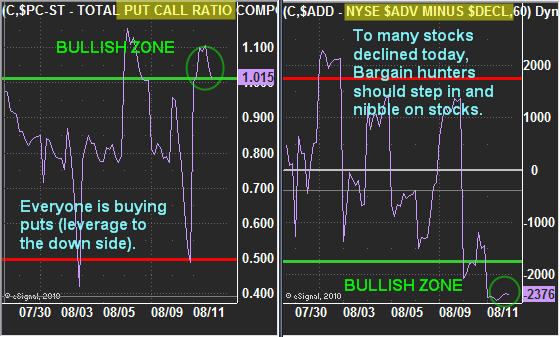
Market Internals – Put/Call Ratio & NYSE Advance/Decline Line – 60 Min Charts

Here are two charts which are currently at extreme levels. This typically means we a bounce should occur the following day or a gap higher. If you did not know there was a strong trendline breakdown today you most likely would have taking a small long position into the close.

The Put/Call ratio when above 1.00 means more people are buying put options, meaning they are leveraging themselves to make money if the market drops. As a contrarian indicator, if everyone is buying leverage to the down side then they should have sold their long positions already. That would mean most of the selling has already taken place in the market thus it should have some upward bias in the near term.

On the other side you can see the NYSE A/D line which shows how many stocks on the NYSE are advancing and how many have moved lower. When this indicator is below -1750 then we know the market is oversold on a short term basis and there should be some upward bias in the near future.

Now Lets Take A Look At Gold

Gold was left on the side of the road today as traders and investors focused on the equities market. I was actually a little surprised that it didn’t make a big move today because the US Dollar rocketed higher for the entire session. Anyone who has been watching gold closely already knows that gold is doing its own thing now… Some days it moves with the dollar, other days it does not… its become much more random than it used to be.

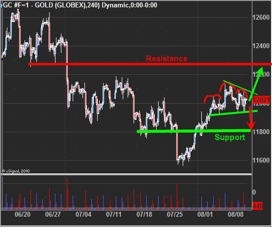
Anyways it looks to be forming two patterns… first one is a bull flag. If a breakout to the upside occurs that would send gold to the $1230-40 level.

The second pattern is a mini head and shoulders pattern which would send gold down to the $1180 area if the neck line is violated. It is a very tough call for gold.

Mid-Week Technical Traders Update:

In short, it’s going to take a day or two before we get a feel for the SP500 as we wait to see if it bounces with volume behind it. I personally would like a bounce so we can short it. It is unfortunate how the market broke down today. We were so close to getting a really good setup in either direction but the FOMC meeting shook things up and caused the large gap which in turn made a large group of traders miss that beautiful drop… It’s frustrating when you wait for something only to have a piece of news mess things up. That’s just part of trading though.

As for gold, I feel it’s a 50/50 trade and could go either way so I am not going to take a position right now. I’m just going to wait for the market to tip its hand a little more before I jump.

I hope you found this information useful. If you would like to receive these trading reports, updates and ETF alerts be sure to visit my service at: www.TheGoldAndOilGuy.com

Chris Vermeulen
GET THESE REPORTS IN YOUR INBOX

J.W. Jones
As discussed in the first article, “The Hidden Potential of Learning How to Trade SPX and Gold Options” I pointed out that there are several fundamental principles that must be mastered before profits can be attained when trading options. Novice traders typically skip the discussion about “The Greeks” and skim over volatility only to watch their precious trading capital disappear.

As promised, this article and future articles are going to discuss the Greeks as they relate to options trading in a way that hopefully everyone reading this can understand. While there are more than ten Greek symbols that directly relate to option pricing, an option trader must be able to clearly articulate and understand 4 of the ancient Greek symbols and one English invention. (Vega is not a true Greek symbol-Look it up!)

The five core Greek symbols which are critical in order to understand are as follows, in no particular order: Delta, Theta, Vega, Gamma, & Rho. Most veteran option traders have a sound understanding of Delta, Theta, Vega, & Gamma. Rho is not nearly as well known, but anyone who has ever studied econometrics, option pricing models, or has studied applied finance know all too well the importance of Rho. For inquiring minds, Rho measures sensitivity to current interest rates.

Today’s article is going to focus on the Greek symbol Theta. By now many readers may wonder why I continually capitalize the Greek symbols, and the reason is because they are that critical. The technical definition of Theta derived directly from Wikipedia when applied to options is as follows:

THETA – T, measures the sensitivity of the value of the derivative to the passage of time: the “time decay.”

Time decay (Theta decay) is of critical importance when an option trader is attempting to quantify and/or mitigate risk. There are two parts factored into the price of an option contract: extrinsic value (a major component of extrinsic value is Theta; the other is implied volatility) and intrinsic value which would be the amount of money a trader would gain if they exercised an option right away. A great many authors who opine about options get caught up using terminology like intrinsic and extrinsic value which only serves to confuse most novice option traders even more. I refuse to use those words in my writing as I find them to be cumbersome and option trading can be made much more difficult than it needs to be.

Theta and time decay are synonyms when discussing options. An easy way to remember their congruence is that the word time starts with a “T” as does Theta. If a trader owns calls or puts outside of any type of spread, they are totally exposed to time decay (Theta) and as an option contract gets closer to expiration, the time value of the contract diminishes. This accompanied with failure to account for implied volatility (to be discussed in the future) are the fundamental reasons why so many people lose money when trading options.

Just as theta can be an option trader’s worst enemy, it can also be used as a profit engine. If an option trader sells an option contract to open the position, that option trader is using theta as a method to profit or as a way to reduce the cost of a spread. While this article will not spend a ton of time discussing various option spread techniques, in the future we will discuss them in detail. At this point, we are only attempting to understand that Theta represents the time decay priced into an option.

It is also critical to understand that Theta (time decay) is not linear in the time course of the life of an option and accelerates rapidly the final two weeks before an option expires. The rapid time decay the final two weeks before expiration presents a multitude of ways to drive profitability, but it also can represent unparalleled risk. While this article is just an introduction to Theta, the next article later this week will continue the time decay discussion.

Since we are discussing Theta, I thought it would make sense to discuss a trade I took last week which utilized Theta as the profit engine. Recently a variety of underlying indices, stocks, and ETF’s have options that expire weekly. Weekly expiration expedites Theta and gives option traders additional vehicles to produce profits.

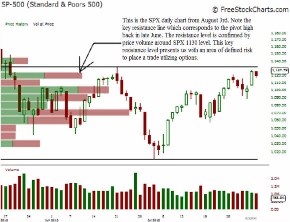
While most equity or futures traders might shy away from a chart like this, an option trader has the unique ability to place a high probability trade. I believed that the market would stall around the SPX 1130 area so I looked for a trade which would utilize the SPX weekly options. The SPX weeklies expire based on the Friday SPX open. With the SPX trading around 1124, I put on a call credit spread which used time decay as the primary profit engine.

The setup I used involved selling an 1150 SPX call and buying an 1175 SPX call, which is also known as a vertical credit spread. I received $100 (1.00) for the 1150 SPX call and purchased the 1175 call for $20 (0.20). The $80 dollar profit represents the maximum gain per contract sold. As an example, if I placed this trade utilizing five contracts per side I would have a maximum gain of $400 dollars. The probability of success at the time when I placed this trade was around 78% based on a log normal distribution of the price of the underlying.

Immediately after placing the trade I utilized a contingent stop order that would close my trade entirely if the SPX reached the 1135.17 area. Essentially, my maximum loss not including commissions was limited to around $60 dollars per contract with a maximum gain of around $80 per contract assuming we did not get a big gap open.

Essentially, if the SPX stayed below 1135.17 for two days and opened on Friday below the 1150 level my trade would reach maximum profitability. This is a trade I actually placed on Tuesday afternoon, however I exited the position before the close on Thursday due to the impending jobs report which was set to come out Friday morning. I was able to collect over 60% of the premium sold per contract ($80) which came to about $45-50 per side. At $1,000 dollars risked based on my stop level, the trade would have produced a net gain of around $750 dollars in less than 3 days.

Hopefully this basic example illustrates the potential profits options can produce if they are traded appropriately with risk clearly defined while having hard stops in place. This trade produced a nice profit, however it was susceptible to a gap open, thus I maintained a relatively small position to mitigate my overall risk profile. As always, a trader must see potential risks from all angles and utilize proper money management principles when determining how much capital to risk. In closing, I will leave you with the insightful muse of famed trader Jesse Livermore, “A loss never troubles me after I take it.”

If you would like to continue Learning about the Hidden Potential Pptions Trading Can Provide please join my FREE Newsletter: www.OptionsTradingSignals.com

J.W. Jones is an independent options trader using multiple forms of analysis to guide his option trading strategies. Jones has an extensive background in portfolio analysis and analytics as well as risk analysis. J.W. strives to reach traders that are missing opportunities trading options and commits to writing content which is not only educational, but entertaining as well. Regular readers will develop the knowledge and skills to trade options competently over time. Jones focuses on writing spreads in situations where risk is clearly defined and high potential returns can be realized.

LEARN MORE ON OPTIONS AND GET NOTIFIED ABOUT UPCOMING TRADING SERVICE