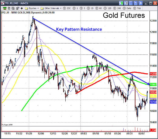
Over the past month the gold and silver markets have taken a good drubbing. Silver has dropped from 19.50 to 15.00 and gold from 1227 to 1044 as the US Dollar has finally rallied after a long drawn out correction.

Since the advent of ETF’s market players have been able to invest in gold and silver for the first time without using Futures and investors have made the gold and silver ETF’s a very popular way of investing in the precious metals. The advantages of ETF’s are many versus buying a futures contract. Investors can hold them for the long haul, there is no contract switching every few months, investors can buy as much or as little as they want and there is no need to worry about a leveraged position. But are there any disadvantages to ETF’s versus a futures contract?

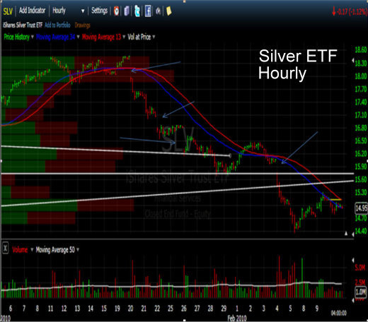
The chart below is the silver ETF with the symbol (SLV). Because the precious metals are a global commodity and one that has been in the spotlight lately, like most commodities they trade on a world wide scale 22-24 hours per day. Since ETF’s only trade during stock market hours there can be drastic changes to price when local markets open up the following day.
1SilverETF.jpg

The arrows I’ve drawn show how the price of silver has been vulnerable to severe price drops on the open of trade in these stocks. The recent severe correction in silver is an excellent example of how prices can open much lower than the previous day’s close. Technicians call them price gaps when they appear on a chart pattern. Investors who are using the ETF’s to be long the metals call them EQUITY gaps because of the drop in price that occur affect their bottom line.

When investors awake to learn that gold or silver is down heavy overseas, the natural tendency for short term traders is to bail out on the open for fear of losing more money than they already have. Since these ETF’s have been closed for trading about 16 hours previously, big price changes can and do happen.

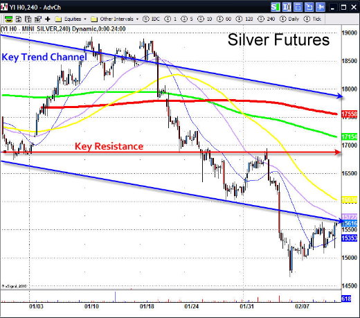
Now let’s look at a futures chart of silver. The chart below is a 1000 ounce silver futures contract.
2Silverfutures.jpg

Notice how there is only one price gap on the entire chart since the top price in January. That is because this contract trades 22 hours per day and price gaps only reflect the changes that occur from about 5 PM to 7:20 PM EST time. The remainder of the time the market is open somewhere in the world and the globex market is linked to all of them. Therefore an investor can avoid nasty drops in price over night by choosing to trade a futures contract.

Futures contracts are not for everyone as the mini contract has 1000 ounces as a minimum and most be rolled over every three months or so to a new contract. Most of the time there is a few cents difference in price as well and this is called a premium. For someone who is buying 1000 shares of the silver ETF and is an in and out short term trader might want to consider trading futures. The commissions can be much cheaper if you have the right broker charging under $3.00 commissions to trade a 1000 ounce contract which only requires a minimum margin of $1600 to trade $16,000 dollars worth of silver and the cost to fund an account is as low as $5000 dollars to open.

Probably the best advantage is that trading on these contracts begins on Sunday evening (in USA), a full 14 hours before the ETF’s open up for New York trading. On weeks such as we’ve seen this can be a marked advantage, especially when a severe correction begins to develop as the markets reopen from a weekend or Holiday.

Another advantage is the ease of which one can short these contracts. Unlike ETF’s one can short a contract just as fast and as easy as going long. It only requires a click of the button.

What about disadvantages?
Trading in futures is a leveraged game and while the gains can be magnified, so can the losses. However, if you’re already trading 1000 shares of SLV there is no difference. If you’ve never traded futures before it can be at times more emotional. Probably the biggest advantage is the ability to trade with ease and this can cause the user to overtrade and therefore accumulate more losses if you don’t have a game plan.

What about liquidity?
I’ve traded these contracts and have never ever had a problem getting in and getting out. However once in a while these contracts can fluctuate a bit more in after hours when trading is thin. I’ve seen 10-20 cent price rises after the market closes only to pullback to its original price before the markets close for those few hours a day in which there is no trading.

If you’ve been frustrated with your silver ETF when it opens down 50 cents in the morning you might want to look into trading a futures contract instead. But be sure to read up on futures and possibly try a demo trading package so as to get used to the ebb and flow and psychology of trading futures versus ETF’s. They are not for everyone, but for those who are disciplined and experienced traders; futures can offer advantages that the ETF counterparts don’t.

While we are on the subject, let’s take a look at the silver chart from a technical standpoint.

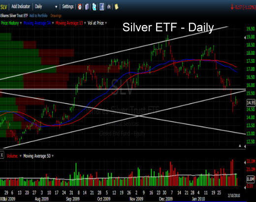
The chart below shows that silver has suffered some technical damage on the charts that should have technicians concerned.

Over the past 14 months silver has been in an uptrend defined by a parallel channel that has recently been broken on the downside and it has done so on heavy volume. As you can see by the chart, silver’s Friday lows were comparable to prices from April 2009, almost a full year ago. The correction from December has wiped out almost a year’s worth of gain in two short months. The break of the lower channel line confirms this downside momentum and has considerably weakened the technical picture.
3SilverTrading.jpg

We can see how the 16 dollar area was a key support level and when it got taken out a lot of stop loss orders were probably lying underneath that target area. Investors who had bought last spring saw all of their gains taken away in a few short months and the panic selling that ensued can be witnessed by looking at the volume spike.

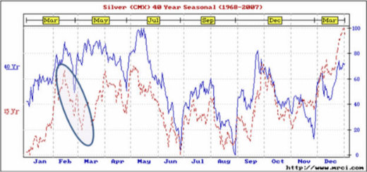
Investors should not be totally surprised. The January/February period for the precious metals tend to form tops in price from which late winter corrections are born and from which spring or summer bottoms are formed. This pattern has been more often than not the modus operandi during the bull market run of the past 9 years.
We can see by the seasonal chart below that this time period is usually met with a sell-off that lasts unto month end. Readers of my past articles have been shown the following chart before in other updates.

As we have stated in the past, the month of February is not usually a good time to be in precious metals and this month’s action confirms that very well.
4SilverSeasonal.jpg

What about Gold ?
5GoldETF.jpg

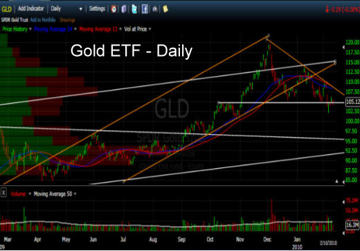
The chart above shows that gold recently took out a very important support area. For a few months the 1075 area in gold and the 105 area in the gold ETF (GLD) has been a key point technicians have been focused on. Last week’s rout finally took that area out. We can see that last week’s lows were below that line and that gold is trying to now climb back above it and maintain price in order to regain its support area. The important thing about a channel or support line is not whether it is penetrated by price but what price does immediately afterward. For the moment gold is trying to make its mind up as to whether it will forge forward here or breakdown to the next support area on the chart.

The next major channel line on our chart is all the way down at the 95 area on the chart. However, if we look at the September high and the October low during this rally we can make a case for support at the 100 area. For gold this would equate to the 975-980 area in spot gold. So at this current moment we remain neutral in the precious metals waiting for gold to make its decision on the next leg it is to embark on. Let’s look at the short term pattern by zooming in on the 60 minute chart of the April Gold Futures contract.
6GoldFutures.jpg

Ever since the December peak at 1227 the gold market has been in a correction that has shaved off about 180 dollars from peak to bottom. We can see that each attempted rally above the moving averages has ended up in failure. Last week, spot gold touched the 1143 area, just 10 dollars shy of the original breakout point of 1033. This return move to the point of breakout is not a rare occurrence in the commodity world and there are myriad examples of such a move before the “big” one came after the breakout. The 1044 area is also the place where India made their large purchase of gold last fall and from which the news launched the market much higher when it was announced they had purchased 200 tons of the precious metal.

Thus there are two key areas for gold to watch for. First a move back above the support shelf of 1075-1090 in gold would at least put gold back in a neutral pattern instead of a downtrend. Then if gold can above the 1100-1110 area it would provide impetus for a potential test of the highs at 1125 and 1163.

In summary, the February time frame is usually a weak time for gold and usually leads to a spring rally. The early peak in December opens up the potential for gold to attempt a March or April rally. In the meantime, one would be wise to watch the current areas of support.

1075-1090 – previous support area we need to get back above.

1010-1033 – The 200 day moving average and the original breakout point.

975-980 – The first support area of the last up leg in price that began in September.

Finally let’s look at the crude oil market.
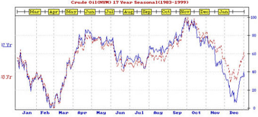
7OilSeasonal.jpg

In my past few updates I have advocated that a great play is to sell some precious metal holdings in early winter and raise some cash into the spring. Not only is this good due to the seasonal tendencies of gold to correct but it allows one to begin to deploy some of that cash into the crude oil market in late February. As you can see the oil market is usually much more seasonal in trend and that time of the year is approaching.

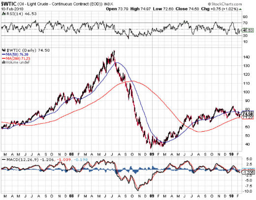
As you can see below, the crude oil chart shows price from March2007, 2008 and 2009. All three times oil turned out to be a great buy. The current pullback from the 83 area got as low as 71 before reversing this week and price is right at the 200 and 50 day averages. Thus the 200 day average is one place we should be on watch for as support. We are close enough now that we should be on guard for a seasonal low. Should there be a selloff as in the precious metals; the 58-60 area would offer a good chance at a seasonal bottom. If the rally has already begun the 200 day average or more importantly about 5 dollars below it would be a good support area.
8OilFutures.jpg

We are constantly watching for low risk set-ups to get our subscribers into plays like this. Feel free to check this website for my past reports. They have advocated the same strategy as I have in this article. Why not drop by our website and see what we might have for low risk entry opportunities as we await the potential seasonal trend changes and position ourselves to take advantage of them.

Deciphering the SP500 Trend
The SP 500 and the markets topped one day after my Jan 18th forecast to our subscribers that the market had met all conditions for an interim top. This followed my Feb 25th, 2009 forecast for a huge bull market rally which we rode with aggressive stock trading. I am now forecasting an ABC correction likely lasting 3-5 months into June. We have adjusted our trading plans from individual stocks to Leveraged ETF’s to take advantage of the increase in volatility. Our ETF trading is designed to work in high volatility bull or bear cycles and has a 90% historical accuracy rate with profits typically within 24-48 hours of entry. The market moves in very clear herding behavioral patterns, and we identify those early and trade accordingly at David Banister. Here are his latest views, and you can read more at www.activetradingpartners.com/articles

If you would like to receive our Free Weekly Trading Charts and Analysis please visit our website at: www.TheTechnicalTraders.com

Chris Vermeulen

Last week ended on a positive note with stocks and commodities pushing higher into Friday’s close. The market overall is looking very unstable here and this week I figure there will be some big price movement.

Below are the charts on the DIA, GLD, SLV, UNG and USO funds so you can get a feel for the trend and additionally what I am looking for this week with respect to prices.

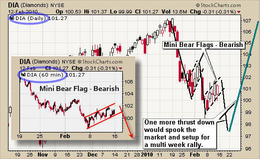
DIA – Daily & 60 Minute Chart
The Dow, along with the other indexes, has formed a bear flag and can be seen on the daily and 60 minute intraday charts below. This price pattern is a negative one and points to lower prices in the coming week.

If we get one more thrust down I figure it will spook the rest of the weak hands which in turn is a setup for a very nice multi week rally. If this flag turns into a rally then we will simply wait for a pullback and buy when there is a low risk setup.

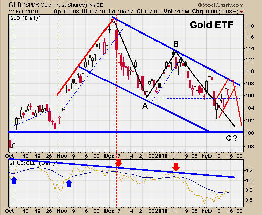
GLD – Daily Chart
Gold has been doing much the same as the over stock indexes and I feel the same will happen here. We could see price rise for another day or two as it tests our blue resistance level before heading lower.

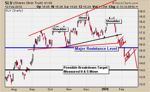
SLV – Daily Silver Chart
Silver has formed an interesting pattern the past few months and has now broken down. Silver’s chart continues to look weak as it drifts up to test resistance with a bear flag pattern that points to lower prices in the coming days, much the same as gold.

UNG – Daily Natural Gas Chart
Sorry for all the lines on this chart. It looks like a mess, I know, but it does show a possible trend change in UNG.

The trend has been down for over a year but now it looks as though it’s forming a reverse head & shoulders pattern and possible bull flag. These two patterns point to much higher prices in the coming months.

Natural Gas seasonally rallies in mid February into mid April. So this could be something we could catch for a multi month play. I may provide a stock to trade this rally in gas in addition to the ETF fund in the coming days or weeks, when ever this play unfolds.

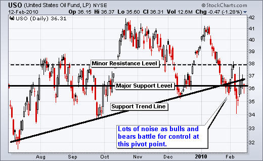
USO – Daily Crude Oil Chart
Oil has been selling down very strong for the past 6 weeks but it is now trading at a key pivot point. Oil looks as though it’s trying to bottom here and in the next 1-2 weeks I think the energy sector will provide some great trades.

Weekend Trading Conclusion:
Overall, the market and metals bottomed last week or they have another leg down which I expect would happen this week if that’s the case. The charts are pointing to lower prices still. If the market does rally then we will simply watch the breaking and buy the pullback in 1-2 weeks once there is a low risk setup.

I hope everyone had a great weekend and valentines day. My daughter Mirabelle was born this weekend on Feb 14th (Valentines Day). Everyone is healthy and happy!

You can get my weekly trading report sent via email to your inbox if you visit my website: www.TheGoldAndOilGuy.com

Chris Vermeulen
Everyone is wondering if gold, silver and the indexes have bottomed after last week’s heavy selling. To put things into perspective there were over 30 sell orders for every 1 buy order at the NYSE. That is pure panic and to confirm extreme fear, several of my broker buddies said last week was crazy with clients demanding to liquidate their positions ASAP to be 100% in cash.

This type of sentiment and price movement warns us of a possible market bottom. I am getting the feeling that traders and investors have been expecting this sharp drop I don’t see or feel a large amount of fear in the marketplace. Last Thursday and Friday war crazy but I think we need one more drop to really shake things up before a bottom is set.

Below are some charts showing where the market currently stands and what the charts are pointing to.

GLD Gold ETF Trading – Daily Chart

Gold is clearly trending down on the daily chart. One more thrust down should shake things up enough to trigger the next rally.

SLV Silver ETF Trading – Daily Chart

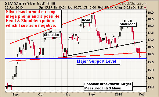
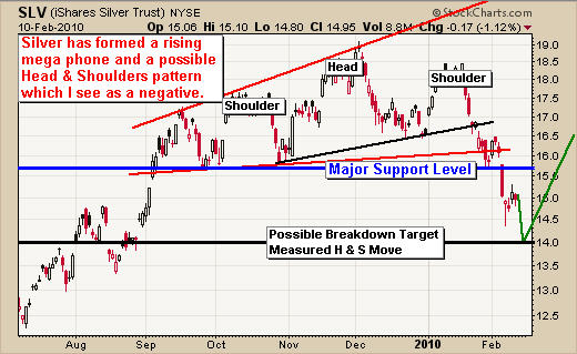
Silver has formed a Head & Shoulders pattern and has broken through multiple support levels. A measured move to the down side would be $14 for silver which could happen in the coming days.

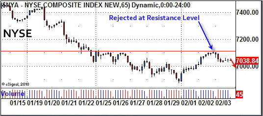
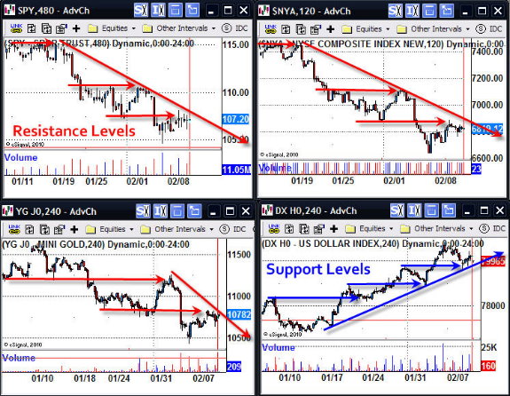
SP500, NYSE, GOLD Futures, US Dollar Index – Intraday Charts

These charts clearly show the price action of the past month. As you can see the trend of stocks and gold are down with consolidations (pauses). This is the exact reason why you must trade with the trend and not do counter trend trades. Bounces are more like sideway movements making it very difficult to try and play bounces in a down trend.

If you focus on selling at key resistance levels then moves tend to be much more profitable. That being said, we did go long last Friday because of the extreme oversold market level. I was expecting a follow through Monday or Tuesday which has yet to happen. We have now moved our stops to break even or better to eliminate our down side risk.

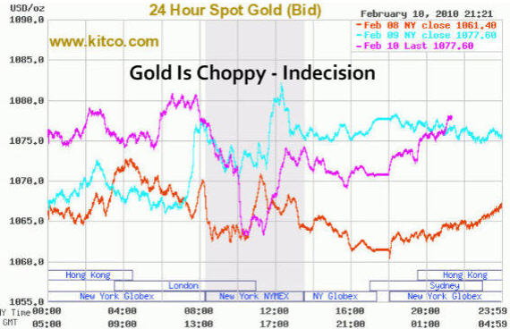
Spot Gold 24Hr Trading Chart

This chart says it all. The market and gold is very volatile making it difficult to trade right now. Bulls and bears are battling it out. Only time will tell!

Stocks & Commodity Trading Conclusion:

In short, it’s been a slow week without any real exciting moves. Thursday and Friday could be interesting if traders exit their positions going into the long weekend in order to protect themselves from any surprise economic news.

From the looks of gold, silver and the indexes I sense selling could be just around the corner. We are currently long a few positions with our stops are break even or better in hopes for a pop and rally going into the holiday weekend but only time will tell.

My wife and I have our first child due on Saturday so I may disappear for 1-2 days in the coming week as we welcome our little princess into this new and exciting world.

If you would like to receive my trading reports directly to your inbox please visit my website at:

Chris Vermeulen
www.TheGoldAndOilGuy.com

Understanding market psychology is crucial for a trader’s success. But so many people get caught up in the daily market volatility, media coverage and “noise” of the trading environment, it’s almost impossible to not think and trade in agreement with the majority of traders.

However, effective technical analysis allows us to use trends, patterns and other indicators to evaluate the market’s current psychological state. Fortunately, this analysis can both enable us to independently forecast whether the market is heading in an upward or downward trend and do so against the grain of the majority.

It takes a disciplined trader to be able to watch and listen to the market doing one thing, filter out the noise, then do the opposite – all in a controlled manor. To this day I still find myself fighting the herd mentality at times and that is when I step away from the computer and regroup.

I have a simple rule that has saved me thousands over the years. I would rather miss a trade and learn what caused me to get confused, then to take a loss.

Rule # 1 – When in Doubt, Stay Out!


There are two types of traders:

1. Herd Mentality Trader – Someone who trades off fear and greed buying near tops and panic selling out at the bottom with the masses.
2. Black Sheep Trader – A trader who stand out from the masses and trades opposite to the “herd” during extreme levels.

Last weeks market action really allowed us to see which way the masses were moving. The extremely high selling volume and sharp price decline notified us that the market was trading off FEAR. And, last Thursday we actually saw PANIC which tells us the balance of the market (retail investors, John Doe’s, The “Herd”) were exiting their positions.

When we see this happen, it’s generally a good time to start scaling into long positions, as most of the down side has already happened.

I have been talking about an ABC retrace pattern for the indexes and gold for some time and last week we got just that. An ABC retrace is when we have 3 waves which are, down, small up, then another leg down.
In short this wave breaks the uptrend of higher highs and lows, as it forms a lower low telling novice traders to sell and go short. This is what causes the high volume and sharp sell offs.

Below are a few charts showing the 2009 July lows and where we are now, February 2010:

SP500 – Daily Trading Chart

Gold – Daily Trading Chart

Silver – Daily Trading Chart

Oil – Daily Trading Chart

Intraday Price Action – If you want to see some exciting intraday trading charts check out the setups last week: http://www.thegoldandoilguy.com/articles/how-to-trade-intraday-gold-and-sp500/

Market Psychology Trading Conclusion:
Most get involved with the stock market because it looks like something they can quickly learn and start making money from home. But it doesn’t take long before they quickly realize there is more to trading than meets the eye.

While trading looks easy from a glance, in actuality I think its one of the toughest jobs out there.

Why? Well, this is what you are up against:
1. You are trying to predict something that is unpredictable
2. You are trading against millions of other highly skilled traders
3. You are trading against automated computers with complex algorithms
4. You are trading with your hard earned money which causes fear and greed
5. You must accept losing trades as that is part of the business
6. You must trade with a proven trading strategy and follow the system
7. You must understand money management and apply it to every trade
8. You must truly love the market cause it will break you down mentally

I don’t want to say you must be a contrarian, but in reality you must do the opposite of the masses during times of extreme price behavior.

These extremes happen on a daily basis when trading intraday charts and every 4-6 weeks when looking at daily charts. The toughest part is to pull the trigger when emotions are flying high in the market and you are looking to do the opposite. It takes several trades before you even start to get comfortable doing this.

I hope this helps shed some light on market psychology.

If you would like to Receive My Gold Trading Newsletter and Analysis please visit my website:

Chris Vermeulen
www.GoldAndOilGuy.com

Last week was an incredible week for trading the intraday charts. With rising volume and volatility prices began to move up or down for extended periods of time allowing traders to profit from these powerful short term price swings.

During times like these traders using the daily charts for their guide found the market very difficult to time because of the whipsaw action each day. In this case, it is definitely best to stay clear of the market until the dust settles. But for a trader who watches the intraday charts, this is when serious money is made on a daily and consistent basis.

Most traders avoid using intraday charts because they either:

1. Think it’s day trading and do not want to sit in front of the computer all day
2. Do not understand how to trade in these “intraday” time frames.

Intraday trading is one of the most over looked yet most profitable trading strategies, in my opinion. One of the reasons I like/love it so much is the fact that it provides high probability setups on a weekly basis and trades generally last 2 -36 hours. Also, this strategy carries very low risk simply because you are in cash most of the time, putting your money to work only when high probability setups form.

If you are an active trader you should have been making money hand over fist last week. Below are close up shots of my charts:

My eSignal Trading Platform

This is my main trading screen which allows me to see the entire market. This, to me, is like a dashboard of an airplane. Each mini intraday chart is like a gauge hinting to what the plane in doing (horizon indicator, fuel, air speed etc.) My custom dashboards quickly allow me know if the market is heading up or down, what speed it is moving measured by volume and momentum, and if all pistons are firing which sector is really moving.

My Custom Dashboard

Quotes for every index and sector
Top Row: 60 minute charts with volume of: DIA, SPY, QQQQ and NYSE
Second Row: 60 min chart of NYSE TRIN, NYSE Adv/Dec, 60min Gold, 60min Oil
Bottom Row: 120 minute chart of the US Dollar, Interactive Brokers Trade Window

In short, I can see waves of money flowing in and out of each sector. These views give me a strong sense as to the strength of momentum. From these observations I determine whether the setup is favorable for shorting into light volume rallies, shorting into resistance levels or buying oversold sell offs in up trends.

Also, the chart patterns on the 60, 240 and 480 minutes charts are so powerful and accurate that you only need 2-3 trades a week in order to make decent money.

I would like to note that I do have 4 larger charts with different time frames allowing me to really get a feel for a trade before I commit money. These charts are Weekly, Daily, 240 minute and the 60 minute chart.

If you want to see some exciting daily charts of gold, sp500, oil and silver check out my weekend report: http://www.thegoldandoilguy.com/articles/gold-sp500-psychology-they-bail-we-buy/

SP500 Day Trading Futures Signal – 30 Minute Chart

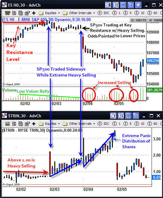
The SP500 ES mini contract, or you could have traded the SPY exchange traded fund, provided an excellent intraday short trade last Wednesday.

All the indexes (NYSE, NASDAQ, SP500, DOW) drifted higher on light volume. While you can play the long side of these low volume rallies I prefer to stay in cash and wait for another short setup. Trading with the short term trend (240, 480minute charts) is crucial. Counter trend plays tend to be weak and short lived.

In short, the SP500 drifted into a resistance level on light volume and the NYSE TRIN indicator was rising in a very strong way. The combined information of price, volume and the TRIN indicator were screaming – short the market.

When the TRIN is above 1.00 it means the majority of the trades being executed on high volume NYSE stocks are sell orders. You don’t see the TRIN rise this high without the market selling off as it did on Feb 3rd. But when it does, Bombs Away – time to go short!

The next day the index crashed with panic selling across the board. The NYSE had over 30 sell orders for every 1 buy order. Now that is panic selling and, coincidentally, exactly as has happened at each bottom formed throughout 2009.

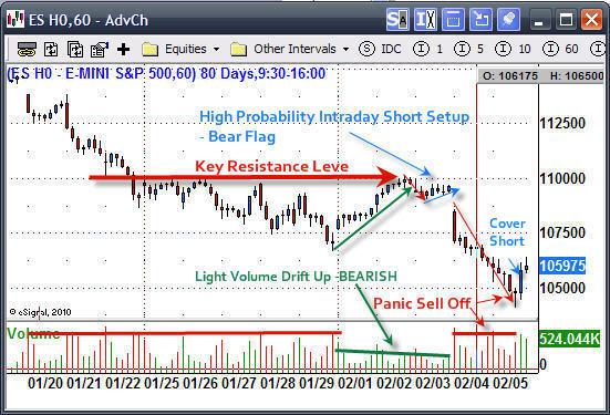
Intraday Trading SP500 – 60 Minute Chart

This chart clearly shows the high probability setup which took a few days to form. A short position was taken during the small bear flag pattern. My short position was covered on the break of a new high formed on heavy buying volume.

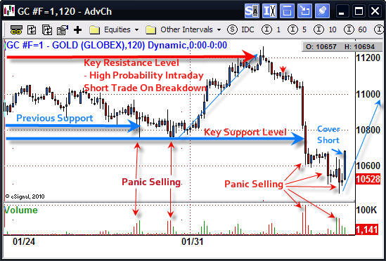
Intraday Trading Gold Futures – 120 Minute Chart

Gold had virtually the same setup as the SP500.

Intraday Trading Gold & SP500 Futures or ETF’s Conclusion:

As you can see intraday trading is nothing like what most people think it is. Trading using the 60, 240 and 480 minute charts really opens one’s eyes, allowing a panoramic view of the price action the market has to offer.

As most of you know, my goal is to trade low-risk, high-probability setups. And, the less time my money has to be in the market, the better.

If you are interested in getting more Intraday Analysis and Setups for ETF’s, futures and CFD’s be sure to join my free newsletter for Trading Futures and ETF’s:

Chris Vermeulen
www.TheTechnicalTraders.com

Feb 2nd, 2010
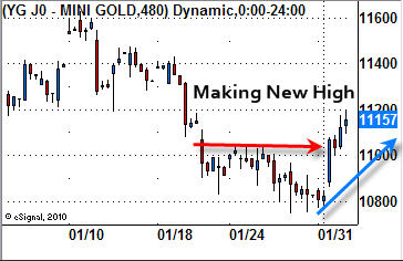
We are seeing the market follow through from yesterdays strong rally with the Dow, SP500 and NYSE break the previous highs seen on the hourly charts. We now have a higher and high and waiting for a pullback for a higher low. This would complete the trend reversal and this is also the definition of an uptrend. There is a little more room for stocks and metals to move up today before trading deep into the next short term resistance level.

DOW & SP500 Hourly Charts

Gold Hourly Chart
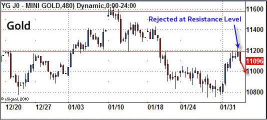
Gold and silver have put a in the same move as the indexes mentioned above. I figure we will get a pause here for a couple days as the metals try to push up through this resistance level.

US Dollar Hourly Chart
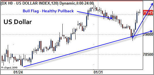
The US Dollar has formed a very nice bull flag and is trading at support. This has me thinking that the majority of index and metals bounce is finished, for now anyways. The dollar should start to bounce in the coming hours which will put pressure downside on metals and large cap stocks.

USO Oil Hourly Chart
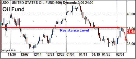
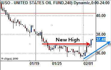
Oil has put in a solid bounce as it moves above its previous high set on the hourly chart as it also tries to reverse to the upside.

Quick Wrap-Up
It looks as though the downward trend is starting to reverse back up. During transition periods like this is when things generally get even more choppy. I am on alert for new setups in commodities and ETF’s as this could be a possible bottom.

Get my Trading Reports Via Email Real-Time:

Chris Vermeulen
www.TheTechnicalTraders.com

Jan 31, 2010
The past two months have been tough on the precious metals sector. We saw precious metals lead the market higher all of last year until December 2009 when prices plummeted as the US Dollar started to bounce. The continued rise in stocks indicated an extreme overbought condition and alerted us that a sharp pullback was going to take place.

Many traders including myself were surprised that the broad market did not sell down with the metals. In December the market looked and felt ready for a sharp pullback but new money continued to flow into stocks, pushing the market higher. This slow and steady grind higher was very frustrating to watch because the market was making new highs day after day while obviously needing to take a breather at any time.

It’s this grind higher that sucks in the last retail buyers before prices collapse, unfortunately leaving many holding overpriced securities and commodities for sale another day.

Since gold lead the market up last year it should be the first to correct and also pullback quicker and deeper than its followers (stock market). This is what we are seeing now which I explain below using charts.

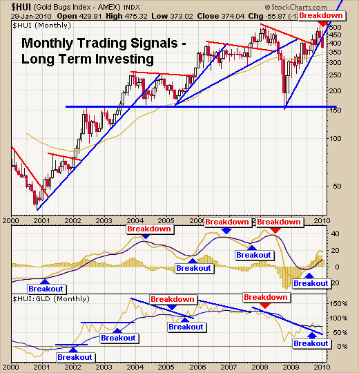
HUI – Gold Stock Index – Monthly Gold Trading Chart
I use this exact month chart for helping to time long term trends for gold and gold stocks. It looks as though we have temporarily formed a double top with this current breakdown. It will most likely take several months to repair the damage done to this chart and possibly more than a year.

There are two options for this chart:
1 – It will form a bullish flag or pennant then continue its move higher.

2 – Or will continue to slide, indicating sellers are in control and that we are looking at a multi year trading range as the market digests the 10 year rally in gold.

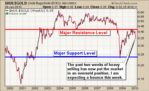
The HUI:GOLD Ratio – Weekly Gold Trading Chart
This chart goes up if gold stocks are out performing the price of gold and down if they are underperforming. From 2001 – 2006 the chart looked very bullish but as time went on the ratio really started to look weaker and weaker.

The 2008 meltdown crushed precious metal stocks and the recent rally back up to resistance looks very bearish. It looks like a large bear market rally (test of breakdown level). This also goes for the monthly chart above. I cannot say either chart is looking bullish anymore. Things really depend on how strong the next bounce/rally is so we can gauge the strength behind the move (dead cat bounce, or legitimate rally).

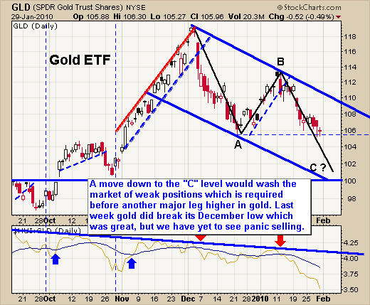
Gold GLD ETF – Daily GLD Trading Chart
The next three charts really pull things together in my opinion in terms of how much selling is left in the market on the daily chart time frame.

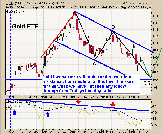
Here I have drawn on a daily chart showing what I figure will unfold over time. This is the same pattern that I have been talking about since early December. I love trading ABC retrace patterns because of their accuracy and follow through on trend reversals.

In short, if we see gold break this support level then traders are going to panic out of the market sending the GLD fund towards the $101-$103 level. This panic selling is exactly what is needed if we want to see gold continue a sustainable and strong bull market rally higher.

Silver SLV ETF – Silver Trading Chart
Silver has been a little more difficult to trade as the chart clearly shows the choppy price action. I feel that if silver breaks this level of support we should expect to see $14-$14.50 quickly.

US Dollar Trading – Daily Dollar Trading Chart
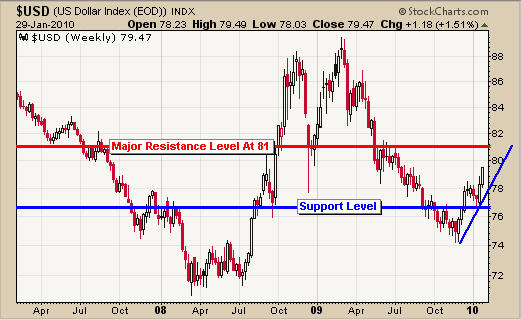
This chart pulls the above GLD and SLV charts together. Both gold and silver have more room to fall before reaching a major support level. Knowing that and looking at this chart of the Dollar you can see the Dollar has approximately the same amount of room to rally.

So in a perfect trading scenario, the dollar will continue to climb for a few more days to reach resistance and in return that will push gold and silver down for a few more days.

Precious Metals Trading Conclusion:
I think this week will be a pivotal one. I can see the dollar moving higher sending precious metals and stocks down enough to shake traders out of their long positions in gold, silver and stocks. Once the sentiment turns bearish we will begin looking for an oversold speculative trade and possibly a low risk trend trade setup.

As for the energy sector, both crude oil and natural gas look weak and I continue to patiently await a low risk setup for each.

If you would like to get my Gold Newsletter please join here:

Chris Vermeulen
www.GoldAndOilGuy.com

Jan 29th, 2010
I thought I would put this more detailed report on finding and trading low risk setups for gold, silver, oil indexes etc…. In short it does not matter what time frame you trade with or if you trade exchange traded funds, futures contracts or CFD’s (contract of difference).

This type of trading setup works for virtually every investment but I mainly focus on trading: Gold Futures, Gold ETFs, Gold CFD’s, and the SP500 & Dow 30 futures, ETF’s and CFD’s as I find they are very accurate and profitable.

Obviously swing traders who watch the daily chart will have few trades because it takes weeks and months for these low risk patterns to form. This is the reason I am using short term intraday charts and using a setup from yesterday (Thursday) for demonstrating my trading setups.

My Short Trading Setup – Rough Guideline
1. Trend on 2hour and 1hour charts are down
2. Increased volume during sell offs, and light volume on rallies/rising prices
3. Entry is best at Fibonacci retracement level which is also at a previous resistance level.
4. Set Stop just above the resistance level you are expecting the current price to stop at. Exit if this top is penetrated and wait for a new opportunity.
5. Cover half of your position just before the investment reaches the first level of support to lock in gains and reduce overall risk.
6. Once the price of the investment starts to make a new short term high exit the balance of the position. Shown in the charts below.

DIA – Dow 30 Index Fund
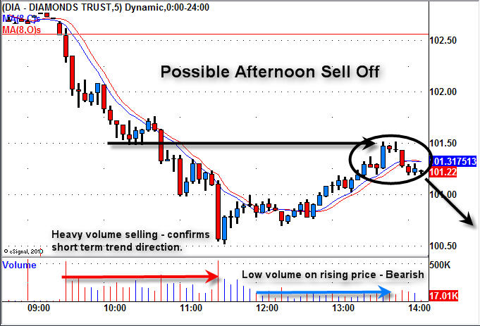
This is a chart I sent to members on Thursday pointing out the market weakness. We had a nice sell off in the morning and the price drifted up on light volume later in the afternoon. This low volume drift is crucial to recognize as it tells you the general public is buying. This is what Big Money likes to see. After they crush the market with their large sell orders in the morning they take a break allowing regular retail traders/investors move the market back up before the big sellers start dumping shares again.

So, I am looking to short at a resistance level in hope the big sellers step back in.

DIA – Dow 30 Index Fund – End of Day
This chart quickly shows the two intraday setups for shorting at resistance levels. Both trades worked out well but wait until you see the results of trading with futures or CFD’s shown later.

Anyways, the first short was a great play but we did not see the big sellers step in, which led to a reversal and the price continued to move higher taking us out for a small profit.

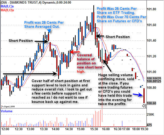
The second short had huge selling volume indicating sellers were back in control. This play we held into the close. The next chart shows how this is done.

DIA – Dow 30 Index Fund – Step By Step Play
The chart is a little small to see but it explains and shows how these low risk setups should have been traded according to my trading strategy to maximize gains while minimizing risk.

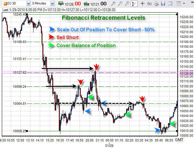
Dow 30 Futures & CFD Day Trading Signals/Setups
This is the same Dow 30 index but is zoomed out so we can take advantage of the 24 hour price action which the futures market trades.

Here I show the Fibonacci retracement levels which happen to be at resistance levels from earlier that day.

During regular trading hours the trades were the same as the DIA etf above, but with futures trading you can traded 24 hours a day. So with the last ETF trade I talked about earlier we only made 28 cents profit per share, but with futures we could have held this position until it fully matured netting a total gain of 40 cents per share. This is 42% more profit simply by trading with futures or CFD’s.

To make things more exciting there happened to be another fantastic trade after dinner making us another 45 cent move. These gains may not sound like much but it equals $1000 – $3000 in profits depending on what you are trading ETF’s, Futures contracts, or CFD’s.

End of the Week Trading Education and Wrap Up:
Overall this week was nothing short of awesome!
The overall market is trying to hold up but sellers continue to pull it lower. Unless there is a strong rally into the close on Friday I figure Monday will gap down because the daily charts are very scary looking. This is what makes the general public panic out as it flushes out the remaining sellers, just before the market makes a sizable bounce and possible rally to new highs.

If you are interested in getting more intraday analysis and setups be sure to join my free newsletter for Day Trading:

Chris Vermeulen
www.TheTechnicalTraders.com