March 17th 2010
Earlier this week I noticed a pattern in the market throughout an entire trading session that has inspired me to write a short piece on sector rotation.

On Tuesday March 16th, my quote screen was flashing green as sectors reached new intraday highs or 52 week highs. The interesting part was that every sector that was flashing green happened to be in sectors that strengthen at the end of a bull market cycle or strong rally. This would include basic materials, staples, services, utilities and financial.

Today I investigated the different sectors and came across some interesting numbers between the January market peak and this week’s price action as I show in the charts below.

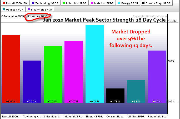
JANUARY – ETF Sector Rotation Trading – 28 Day Cycle
I may not explain this well but try to follow me here 🙂
Just before the market rolled over and lost over 9% last January, all the proper bull market sectors were very strong during the previous 28 days. This is normal and a strong sign that market participants were bullish on the overall market.

But the market was overbought; trading volume was light indicating that not many people are willing to buy at these lofty prices. And the VIX (volatility index) had reached an extreme low (a level that has triggered large sell offs in the past). All this means one thing to me. And that is, trade with caution and tighten your protective stops.

General rule, if everyone is buying all the hot stocks at these over bought levels then you can’t help but think its time for the market to roll over and shake them all out.

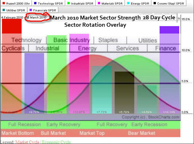
MARCH – ETF Sector Rotation Trading –28 Day Cycle
The chart of March shows where the sectors have finished over the past 28 days. Notice how similar the sectors have appreciated in price…

I have overlaid John Murphy’s sector rotation image to show which sectors are strongest in a bull market.

Now the interesting part is that it appears to be the setup as in January. My quote system is flashing new highs for the bear market cycle sectors which are the one which have not performed well (Stapes, Services & Utilities) and I have to think the market is about to take a breather or do a swan dive.

Don’t get me wrong, I am not saying we are on the verge of a bear market. I actually think the market is strong and will trade sideways in a large range for most of this year or just continue to trend up.
What I am saying is that these sectors go in and out of favor during smaller market cycles and that can be very useful information.

Sector Rotation Explained
You can learn more about sector rotation from this detailed course How to Profit From Sector Rotation Using ETFs. This course explains how different sectors are stronger during different points within the economic cycle. The chart above shows the relationships and which of the various sectors should strengthen from the economy. The financial Market Cycle leads the Economic Cycle because traders try to anticipate the economy.

Market Update & Trading Conclusion:
Stock Indexes: The market in my opinion is way over bought on the daily chart and needs a breather. Volume is light, VIX is at the same level we saw in January just before the top and the bullish sectors are firing on all pistons. You won’t catch me buying up here. Any type of pullback will most likely be sharp and there is no need to put money to work right now.

Precious Metals: Gold and silver had a nice pop this week off of a support level. I did not have a low risk setup as momentum was not on my side at the time of the pop. Also the large gap up on GLD makes me nervous as gaps tend to get filled. I am just waiting for something to unfold which looks to be a few days away still.

Oil: It has popped higher also and is trading at resistance. As I mentioned in Sundays report, if the USD dollar completes this breakdown then we will see commodities and stocks surge to higher prices and most likely post a nice multi month rally.

Natural Gas: We are seeing natural gas prices dip below support, shaking out traders who had their protective stops set just beneath the previous low. Natural gas is a silent killer as it will shake even the best traders out of the market. I feel natural gas is over sold and ready for a bounce but until I get a low risk setup I remain on the side lines.

If you would like to receive my Free Technical Trading Reports please opt-in to my free newsletter here:
Chris Vermeulen
www.TheGoldAndOilGuy.com

March 14, 2010
Last weeks price action unfolded just as we expected. Money poured into stocks with the focus being on small cap, banks and technology stocks. The fact that these sectors are showing strength while utilities, health care and consumer staples lag is a good sign that investors are once again taking risks in the market.

Because investors and traders are bullish on the stock market again the money flow into the safe havens like Gold and Silver decrease. I believe this is the reason stocks moved up last week while precious metals drifted lower.

Below are three charts (Dollar, Gold and Silver) showing what I think is most likely to happen in the coming week or two.

.

US Dollar Index – Daily Chart

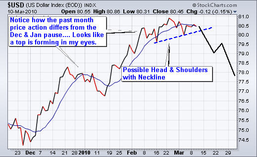
The US Dollar has put in a very nice bounce/rally since the low in November 2009. Last month the dollar finally reached a key resistance level of 81. I have been talking about this major resistance level since January as the Dollar would find it difficult to break above this level.

Take a look at the daily chart below. You can see a head & shoulders pattern and a neckline which appears to have broken late Friday afternoon. There is a strong chance we could see 78 reached which is the measured move down. If we get follow through selling this week then I would expect 78 to be touched within 5-10 days.

.

GLD & SLV ETF Trading Charts

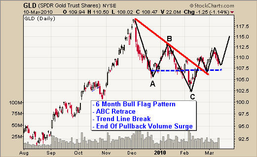
Precious metals have been moving very well for us recently. From looking at the charts using technical analysis we were able to catch the Feb. 5th low and also the Feb. 25th low on a several ETF’s.

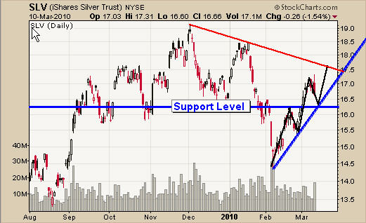
As you can see from the GLD and SLV charts, both metals are now in an uptrend showing bullish chart patterns and trading at support. If we see the US Dollar break down next week then be ready to go long gold, silver and stocks.

.

Precious Metals, Stocks and the Dollar Trading Conclusion:

As a technical analyst the above charts are pointing to higher prices in the coming day’s which is exciting for us all. BUT when things are this perfect looking we must be very cautious as the market has way to suck people into setups like this and spit them out a couple days later for a nasty loss.

Understanding how the market moves is crucial for avoiding and/or minimizing losses when trades go against us. That is why I continue to wait for my signature low risk setup before putting any money to work.

My focus is to take the least amount of trades possible each year, only focusing on the best of the best setups. My low risk setups require downside risk to be under 3% for the investment of choice when the broad market shows signs of strength, as well. I use several different types of analysis to confirm if a setup has a high probability of winning and those which do are the trades I take along with my subscribers.

It is very important to wait for the market to confirm a move higher before taking a position with this type of setup. The market could go either way quickly and jumping the gun is not a safe bet.

Get My Precious Metals and Index ETF Trading Alerts: www.TheGoldAndOilGuy.com
Chris Vermeulen

March 13 2010
Last week was an exciting one for intra-day traders who follow the spot gold and major stock indexes. Actually, since early November 2009 the market has been performing very well for us day traders.

As we all know the market is consistently changing its price patterns and momentum from up, sideways to down, which in turn affects everyone’s trading results for any given month.

For swing/position traders who trade using the daily charts they will find some months will favor trend trading strategies, while other months favor short term range bound strategies, and other months that just are not good for trading at all like last November and December.

During extremely choppy market conditions such as we saw last November and December, the market was up an down like a yo-yo. Swing/position traders had a tough time making money, and speaking for myself, once the market gets like that I patiently sit in cash or hold very small positions.

The good news is that when the market become choppy and swing traders are having a tough time making money (which is fast intra-day up and down movements), day traders come out of the wood work like fire ants. There are crazy amounts of money made and lost during high volume intraday trend reversals and pattern breakouts.

Day Trading Spot Gold – YG J0 Gold Mini Futures Contract
Here is a quick video I did of my trade in gold on March 9th. This video shows a trade using the 5 minute spot gold chart profiting $6.00 per ounce with minimal downside risk. Depending on what you use to trade gold – Futures Contract, ETF or CFD – you could have profited $600-$2,400 in less than 2 hours.

This is the second video I have ever done so it’s nothing fancy by any means. It will take me a few more videos to get a good understanding of them as I do plan on doing weekly videos in the coming weeks and will be sure to make them more exciting.

Gold Day Trade
Click Link if you cannot see the video below: http://www.youtube.com/watch?v=JHSc6JORyew&feature=player_embedded


Day Trading the Index – DIA Exchange Traded Fund

If you watched the gold video above you will see how I day traded spot gold in the morning and why I used futures as my investment vehicle. That being said, anyone could have traded the GLD or DGP gold etfs.

Only a couple hours later I saw a great Head & Shoulders pattern on the broad market indexes. Taking a step back, my chart analysis has been telling me to look for a reversal pattern on the broad market as I feel it is over bought, and I still do…

So when I saw gold roll over then a reversal pattern on the Dow Jones Index, I decided to take a short position. Also, I noticed the price reverse down off the right shoulder.

This time, I traded the DIA etf just because it is where I saw the pattern develop first and because I have a thing for DIA (I just like trading it).

So once the price reversed down off the right shoulder with the long red candle I went short at $106.07 with a first target at $105.85 to sell half of my position, and then move my stop to break even on the balance of my position. I ended up pocketing just over 25 cents per share in gains which does not sound like much but because day traders get 4:1 and some brokers allow 10:1 leverage you can trade large amounts of shares for these quick trades.

Trading the DIA I focus on 500 or 1000 shares per trade depending on how I feel about the trade. This particular trade I did 1000 shares pocketing $250 profit within 70 minutes.

*Trading Tip*
If you see a Head & Shoulders pattern with a neckline angled up (see chart below), then you should focus on trying to short the top of the right hand shoulder (the first reversal candle). The key here is to be short before the index (or any investment) breaks the neckline.

Once a neckline is broken a large surge of sellers should rush in as everyone jumps out of their long position. Also, this is the point when aggressive traders start taking a short in order to take advantage of the breakdown and price depreciation.

So if you see a right shoulder drifting higher into resistance with that bearish looking flag, be ready to short once you see selling volume pick up and a drop in price.


Day Trading Spot Gold and the Indexes Conclusion:

Well I hope this short report helps you to take advantage of the market using different trading strategies and time frames. Every day and week is different and I jump around from trading 60 minutes charts, 4 hour, daily and the occasional 5 minute charts like the ones above.

I try to stay away from the 5 minute charts simply because they move so fast, and the shorter the time frame the smaller the potential. But some days favor it so I just take what the market gives me and that’s all we can do.

On another note, if you are interested in my new high-end trading service that trades all the setups in real-time, I will be launching this service with my personal trades and analysis for you to trade alongside me!

You will receive all my intraday and swing trade alerts for indexes and commodities allowing you to trade which ever vehicle you want – whether it’s an ETF, Leveraged ETF, Futures Contract or CFD. This way your timing is accurate, your downside risk is carefully calculated and you can trade which every investment you are comfortable with

There will be a 24/7 chat room allowing us to trade around the clock when setups arise. Also, members can swap ideas, ask me questions, make new trading buddies etc… There is even a squawk box feature! I can and will talk live with audio to everyone in the chat room for important news, trades alerts or questions.

All trade alerts are instantly posted in the members area, chat-room and sent via email making it one of the most powerful trading services I have ever seen available online.

If you are interested please fill out the form to be notified for this service which will start the last week of March or the first week of April. It will have limited availability to keep it personal.

Get Notified Of Launch.

Chris Vermeulen
www.TheTechnicalTraders.com

March 13 2010
Last weeks price action unfolded just as we expected. Money poured into stocks with the focus being on small cap, banks and technology stocks. The fact that these sectors are showing strength while utilities, health care and consumer staples lag is a good sign that investors are once again taking risks in the market.

Because investors and traders are bullish on the stock market again the money flow into the safe havens like precious metals and energy has decreased. I believe this is the reason stocks moved up last week while precious metals drifted lower.

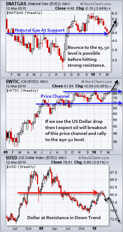
Below are weekly charts (Natural Gas, Crude Oil and the Dollar) showing what I think is most likely to happen in the next few weeks and what should fuel the fire.

Natural Gas – Weekly Chart
Natural has been out of favor for the past 3 months with most of the selling happening recently as seen on the chart. In my opinion natural gas is over sold and about ready for a bounce.

The price of NG is now trading at a key support level but until the selling momentum stops and reverses back up I would steer clear of this commodity play. Natural gas is known for taking peoples money time and time again so trade this commodity very carefully.

Crude Oil – Weekly Chart
Crude oil has been trading in a channel for several months and is now testing the upper level. If we see the US Dollar drop in the coming weeks then I expect oil to surge higher along with natural gas. If oil breaks out then I expect to see the $90 level reached within a month.

US Dollar Index – Daily Chart
The US Dollar has put in a very nice bounce/rally since the low in November 2009. Last month the dollar finally reached a key resistance level of 81. I have been talking about this major resistance level since January as the Dollar would find it difficult to break above this level.

There is a strong chance we could see 78 reached which is the measured move down. If we get follow through selling next week then I would expect 78 to be reached within 1-2 weeks and over the next few months we could very well test the 2008 low of 72.50.

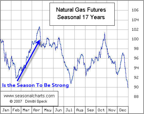
Natural Gas – It’s the Season
Natural gas’ seasonal price action shows that the price tends to strengthen between February and April. So with NG at support and we are in March you can guess what I’m thinking… higher prices are where the odds are pointing.

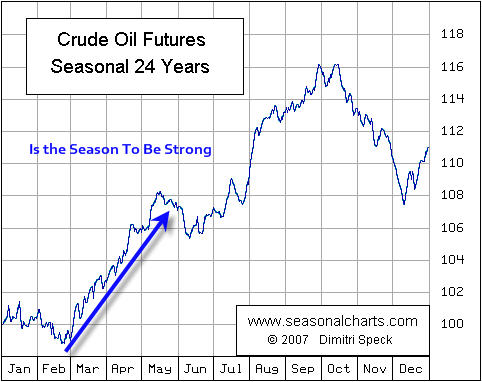
Crude Oil – It’s the Season
It’s the same story as natural gas above….
Higher prices seem to be where the best odds are.


Energy Trading Conclusion:

As a technical analyst the above charts are pointing to higher prices in the coming weeks for natural gas and crude oil, which is exciting for us all. BUT when things are this perfect looking we must be very cautious as the market has way to suck traders into these “perfect setups” and spit us out a couple days later for a nasty loss.

Understanding how the market moves is crucial for avoiding and/or minimizing losses when trades go against us. That is why I continue to wait for my signature low risk setup before putting any money to work.

My focus is to take the least amount of trades possible each year, only focusing on the best of the best setups. My low risk setups require risk downside risk to be under 3% for the investment of choice. and the broad market needs to be showing signs of strength as well. I use several different types of analysis to confirm if a setup has a high probability of winning and those which do are the trades I take along with my subscribers.

It is very important to wait for the market to confirm a move higher before taking a position when there is this type of setup. The market could go either way quickly and jumping the gun is not a safe bet.

If you would like to receive my Free energy Trading Reports fill out the form below:


First Name:
Email:


Chris Vermeulen
www.GoldAndOilGuy.com
March 11th 2010
So far this week has been pretty slow. Large cap stocks continue to lag the market which can be observed by looking at the Dow Jones Industrial Average which still has room to move higher before breaking the January high.

One important thing to note is that volume has picked up this week considerably – particularly on the SP500 and OEX. It’s difficult to say if this volume is a good sign or not.

A lot of stocks and sectors are trading near their January high and this gives traders a reason to unload shares. On the flip side, the several sectors and indexes have broken their January high and this triggers a surge in volume as breakout traders try to take advantage of the new high and momentum. So you can see how the surge of volume is not a useful indicator right now.

Here are some charts of what I think we could see in the coming weeks.

US Dollar Index – Daily Trading Chart
I follow the US dollar index very closely simply because it affects the prices of stocks and commodities. I used a line chart below in order to take out the daily candle stick noise which made it very difficult for our eyes to pick up this pattern.

The chart shows a possible head & shoulders pattern and if that is the case then we should see the dollar start to slide lower. In turn, this would boost stocks and commodities. This is the fuel that I think could really move the market sharply higher in the coming weeks.

GLD Gold ETF – Daily Trading Chart
The price of gold looks to be setup for a nice bounce off support and the timing could just work out if the US Dollar starts to drop over the next few days. There could be a low risk setup just around the corner.

SLV Silver ETF – Daily Trading Chart
Silver has held up well but today’s reversal candle to the downside scares me a little. The odds are that silver will carry this strong momentum selling down for another 1-2 days. Again, with any luck, it will test support and the US Dollar will start to slide lower.

Crude Oil – Daily Trading Chart
Oil has had a great run the past month but as you can see it’s currently trading at the top of a large trading range. I would like to see a sideways move before it takes another run at the $84 level, but the 7 day bull flag that formed two weeks ago may have been enough to maintain the upward momentum. Again, if the Dollar drops we will see oil rally.

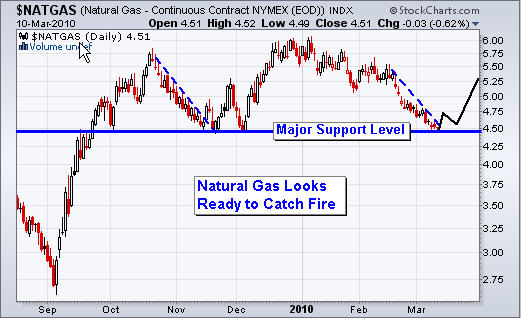
Natural Gas – Daily Trading Chart
This chart is actually very attractive looking. Even if you do not understand how to read charts I think it’s safe to say this one is a no brainer.

I will be closely watching for a potential low risk setup in the coming days.

Mid-Week Trading Conclusion:
In short, stocks and indexes are trading at resistance levels with many of them making new highs and that is great to see.

A lot of things are trading in limbo waiting to see what the US Dollar is going to do. Several months ago I posted some charts showing that 81 would be a key resistance level for the dollar. If it broke above that then 84 would be the next key level to watch. So we just have to wait and see… the hardest part of trading is the waiting.

Gold, silver, oil and natural gas all look like they could continue higher in the next few days if things unfold that quickly. But the market always finds a way to drag out moves so we could still be a 2-3 weeks away.

I hope this report helps give you an idea of where things are at in the market.

If you would like to receive my Free Trading Reports and Analysis be sure to visit my website:


First Name:
Email:


Chris Vermeulen
www.GoldAndOilGuy.com
Last week was exciting as we saw stocks and gold close above the February highs which confirms we are in a new up trend. The question everyone is wondering is:
.

How far will this market go before rolling over?

This is a tough question but we can get a good feeling about the risk and if it’s worth putting money to work or not at this point. Here are my quick points and thoughts about the stocks indexes at the current price (March 5th closing price).
• The market is extremely overbought on the hourly and daily charts. Buying here is just chasing prices around, and that is a net losing game.
• Small Cap stocks have been on fire making a new higher for the year. This is very bullish but again buying here carries too much risk because after such a sharp price appreciation, we can see it all be given back just as quick.
• Volume over the past three weeks has been below average and when I see higher prices on declining volume I expect prices to drop very quickly once the thrust upwards ends.
.

Stock Market Indexes – 21 Trading Days
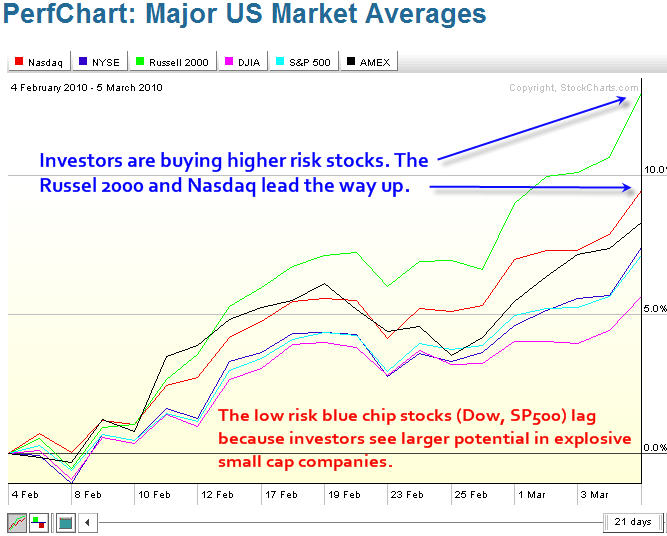
Here is a simple chart showing the past 21 trading sessions. It compares the Nasdaq, NYSE, Russell 2000, Dow Jones, SP500, and Amex indexes.

As you can see the Russell 2000 (small cap stocks) and Nasdaq (tech stocks) have been on fire the past couple weeks while the solid large cap stocks lag.

.
Are The Small Caps Stocks Telling Us Something?
Its means investors and traders are confident enough to buy higher risk companies. This is good for the overall market because small cap stocks tend to lead the market in both up and down trends. What has me concerned is the low volume rally, which I don’t like.

One thing to note is that small cap stocks tend to do well during times when the US Dollar is rising. This is because they are not multinational dealing with currency exchange. So this small cap stock rally has me wondering if the US Dollar is about to continue its up trend or if investors really are comfortable with buying riskier stocks?

.
.

GLD Gold ETF – Daily Chart
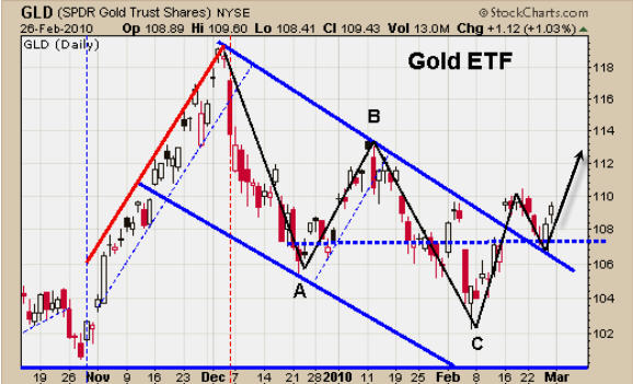
Gold gained some ground last week but the majority of the money seemed to flow into small cap stocks. But take a look at this bullish chart.

This is a text book bull flag pattern complete with and ABC retrace, trend line break, and reversal candle off of a support zone. I am bullish on gold long term but think we could see prices rise a couple percent from here but will trend sideways/down for the next 2-3 weeks to digest the recent move up.

.
.

US Dollar Index – Weekly Chart
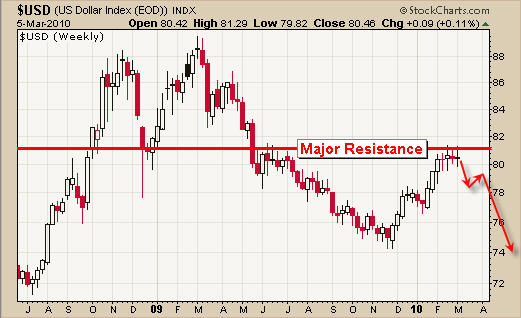
I have posted this chart several times in the past few months with 83 being a key resistance level. The dollar’s recent price action is very bullish and it is flagging just under this key resistance level. I feel the price is heading lower from here but only time will tell. A breakout to the upside will put a lot of pressure stocks and precious metals.

.
.

Weekend Trading Conclusion:
Last weeks strong rally into the close will most likely carry over into Monday and possibly Tuesday. The reason being is simply because retail traders and investors (John Doe’s) get excited when they see higher prices, thus it attracts more money into the market.

In short, I feel the market is overbought. All indexes are trading at resistance other than the Russell 2K index, and volume is below average. I am going to wait and see how things unfold this week before thinking about getting committed to any more long positions. If anything I will be looking to short the market using the intraday charts for a quick trade. Again low volume rallies that are overbought tend to snap back very quick on an intraday time frame providing a 1-4 hour trade.

Get My Free Weekly Trading Reports:

Chris Vermeulen
www.TheTechnicalTraders.com

March 3th
It’s been a great year for trading!
So far February, last week and this week have being absolutely amazing for both swing traders and intraday traders.

On February 5th we had extreme panic selling with nearly 35 sell orders for every 1 buy order on the NYSE. That extreme panic and dumping of shares was the day we jumped into the market and we nailed the bottom.

As my trading buddy David Banister from ActiveTradingPartners would say “Buy When They Cry!” and that is exactly what subscribers did. Since then our gold, silver and the index funds have been moving up nicely.

I would like to note that there were several more technical reasons why we jumped into the market that day but I won’t get into the nitty-gritty cause this mid-week update would be a trading book…

.

Explanation of What happened Last Week & This Week
Ok this may get a little confusing but try to stick with me here…

If you recall last Wednesday’s mid-week report which was called “Gold, Silver & Stock Indices on the Verge of Rolling Over”, I talked about how I was bearish on the overall market. This report has a bunch of detailed charts explaining what was most likely to happen next and some trading.

Well, the market played out just as we had expected. The market dropped 1.35% in over night trading and the following trading session providing intraday traders using ETF’s, Futures or CFD’s a net profit between 1.35% to over 100% return within 17 hours of entering a trade depending on which trading vehicle you used. Check out how this trade was executed by reading my report titled “How To Use Multiple Time Frames For Setups” which I send out the next day. Understanding how to trade using different time frames is a must for all traders and this report shows you how.

.

Now here is the part that has thrown a lot of traders off
Just to recap, I posted an extremely bearish report saying the sky is falling on Wednesday. Thursday morning the market moved down as expected, and then late Thursday afternoon I sent out a trade alerts to buy a bunch of precious metal and stock etfs.

I understand why emails flooded my inbox that afternoon…. Everyone wanted to know how I can say the market is falling then turn around and buy the very next day.

It’s actually a really simple answer. “I don’t fall in love with my positions” and “I re-evaluate the market after each new candlestick on the chart”.

Trading is not an easy task, that we all know. The market tests and bends my brain to the limit on a regular basis and if one cannot control their emotions and stick with a set of trading rules, then you will eventually lose all your money.

I have placed thousands of trades in my lifetime and pulling the trigger to get in and out of a position does not phase me anymore. But the problem is most people don’t want to exit a losing trade because then they are proven wrong and most people hate being wrong. If that’s what you are feeling, then you need fix it or get out of trading.

My general rule is “when in doubt, get out”. I would rather watch a trade move without me knowing I had it right, than be stuck in a losing trade, saying to myself, “Why the hell did I get into this trade?”

.

Re-Evaluating the Market or Your Investment
After each new candle is formed on a chart it is crucial to re-evaluate the charts. In other words if your main focus is to trade the daily chart then you better re-evaluate the strength of the chart each day and also check the 1 hour intraday chart for possible bullish or bearish patterns.

On the other hand, if you are an intraday trader focusing on trading the 1 hour chart, then you better be evaluating things every hour, and also check the 5 or 10 minute charts for patterns to keep an eye on price and volume action.

.

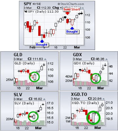
Below are daily charts of some ETF’s I trade showing how we have been trading the market. You can see February 25th the market reversed to the upside and that is when we went long again as prices formed an outside reversal candle and these funds have been moving higher ever since.

.

Mid-Week Trading Conclusion:

In short, it’s been a great start to the year with the market performing within its regular trading patterns between fear and greed.

I believe 2010 is going to be very tough for individuals who do not fully understand the market and how to manage risk. I figure the market is about to top in the next week or so then start to head lower. 2010 will most likely trade in a large sideways range for 8-10 months and maybe even longer. Being able to spot market reversals and trade them actively is were the money is this year. No grand slams, just a bunch of single base hits.

I would like to see the market rally and makes new highs but I am ready for what ever the market dishes out in the coming months.

I hope this report helped you to understand that trading is an active sport and being able to change directions one day to another is just part of the game.


If you are interested in my Trading Alert Service for ETFs check out TheGoldAndOilGuy
at www.TheTechnicalTraders.com

On another note, if you would like to trade all the setups I do in real-time I will be launching a service where I provide all my personal trades and analysis for your to follow along in real-time. Members will receive all my intraday and swing trade alerts for indexes and commodities Futures allowing you to trade which ever vehicle you want whether it’s an ETF, Leveraged ETF, Futures Contract or CFD. This way your timing is accurate and you can trade which ever investment you are comfortable trading with.

There will be a 24/7 chatroom allowing us to trade around the clock when setups arise. Also, members can swap ideas, ask me questions, make new trading buddies etc… There is even a squawk box feature! I can talk live with audio to everyone in the chatroom to the site can hear me for important news or trades alerts.

All trade alerts are instantly posted in the members area, chat-room and sent via email making it one of the most powerful trading services I have seen available online.

If you are interested please fill out the form to be notified for this service which will start the last week of March or the first week of April. It will have limited availability to keep it personal:

Chris Vermeulen

Three weeks ago on February 5th, we saw an extremely high level of fear in the market with selling vs. buying volume at a 9:1 ratio. We note that in 2009 this extreme level of fear occurred at the bottom of each significant pullback.

Since this panic selling low in February 2010 we have seen stocks and commodities work their way higher, which we expected. Overall the broad market looks as though it’s trying to make a move higher.

Below are some ETF charts of gold, silver, oil and the indexes.


Gold lead the market higher in 2009 and also lead the market lower in December of 2009. It looks as though gold could be starting a new trend higher.

You can see the clean breakout of the down channel and then a test of the channel at support. This type of price action also forms an inverse head and shoulders pattern for those who like trading patterns. ? This is very bullish price action.

SLV Silver ETF – Daily Trading Chart
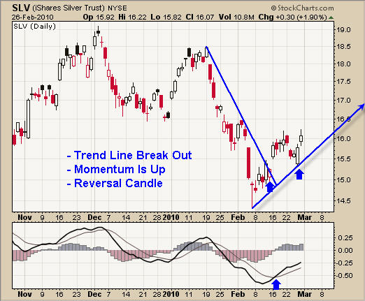
Silver has much of the same chart features as gold, but is slightly skewed. This is not particularly surprising though, as silver virtually always behaves with less defined chart patterns due to its characteristically funky price action.

USO Oil Fund – Daily Trading Chart
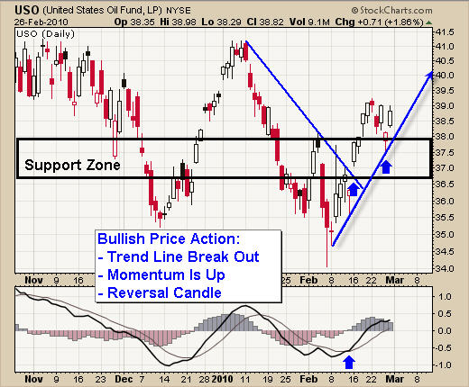
As with gold and silver, oil’s trading chart has formed a pivot low also, but the trend line is much steeper than what I am looking for. I prefer a flatter trend line as price growth is more sustainable.

As you can see in on the USO chart, back in December price rallied at almost the same angle as is currently the case, and then notice what happened. Once the momentum died out the price dropped straight back down. I call steep trends like this a Parabolic Rally.

Scroll up and look at the first chart (GLD) and observe the parabolic rally going into December. It too suffered a sharp drop straight back down when momentum died out.

Stock Indexes – SP500, Dow Jones, Russell 2000
Last week the market sold down the first half of the week, then bounced back up forming a possible pivot low. The daily chart for these indexes look virtually the same as the GLD, SLV and USO charts above for the past 5 trading sessions.

But, one little thing has me concerned….
When looking at the 5 minute intraday charts (posted below) you can see at the very last minute before the market closed HUGE selling volume flooded the ETFs. The market ended up losing all of its gain for the day.

With any luck this was just end-of-the-month hedge, mutual fund, etc. portfolio rebalancing. But I am somewhat concerned that more of this selling could step back into the market Monday or Tuesday.

Weekend Trading Conclusion:
Overall, last week started on a negative note but ended strong after forming a reversal pattern.

It looks as though stocks and commodities have formed an ABC retrace pattern and are now ready to move higher.

How much higher you ask?

Well, I believe 2010 is going to be a traders market. I envision an 8-12 month sideways consolidation (large bull flag) forming. If this materializes then buying on over sold dips, as we did on Feb 5th, and scaling out on strength at resistance levels will be our goal in the coming months.

A bunch of 4-8% trades is what I’m figuring, but with leveraged etfs we can double and triple those type of returns. Now that is something to anticipate with delighted optimism!

If you would like to receive my free weekly trading reports please visit TheGoldAndOilGuy at: www.TheTechnicalTraders.com

Chris Vermeulen

A couple months ago I started providing more of my intraday charts in hopes to educate traders on current market conditions so they feel like they are “in the zone” for trading. It’s crucial to understand the intraday moves and volume levels if you want to be consistently profitable trader. It doesn’t matter whether you are day trading or swing trading, you must be following daily and intraday charts.

I have been getting a few subscribers asking me: “Why I jump around from time frame to time frame so much?”

It’s a great question as some days I’m using the 60 minute charts, another day the 2 hour chart, and another the daily chart etc… well I hope to answer this question within this education report.

Get My Free Trading Charts

Trading Time Frames & Their Characteristics

Length of Trades – The longer the time frame you are trading the longer the trade will last on average. For example, if you are swing trading using the daily chart most trades will last 2-20 days, but if you are trading the 60 minute chart, then a trade may only last a few hours. Knowing this allows you to be more or less active depending on the market conditions or the amount of time you are available to trade.

Risk Levels/Draw Downs – The longer the time frame the more potential risk/draw down you will have. For example, when trading the daily chart you may set your protective stop below the previous days low. Depending on the investment, that could be $1-$50 per share or contract. Now compare this to someone trading the 5 minute intraday chart playing volume breakouts to generate quick gains. This person’s risk/draw down may only be 5-50 cents per share or contract.

This is the main reason why short term intraday traders play with larger amounts of money. Simply because their risk is so much lower, they can put more on the line for quick profits. On the flip side, swing traders should be trading much smaller positions to compensate for the increased risk.

.

.

Individual Personalities

Every trader sees the market in a completely different way because each of our brains process chart patterns and time frames differently. This is exactly what creates the market, everyone buy and selling at different times creating liquidity and the random chart movements.

The hardest part about trading in my opinion is figuring out what type of trading personality you have? It took me a few years to actually figure this out, but now I know exactly what type of trading strategies I’m good at and which time frames I prefer trading.

Myself, I like swing trading because it does not require a lot of time to follow the market, and trades last several days and sometimes weeks. But I also like to take advantage of the market when volatility rises and the market becomes choppy because this is when intraday trading becomes most profitable, in my opinion.

Personally I do not want to trade every day because it’s a ton of work and stressful. Rather, I prefer to sit back and cherry pick, only taking positions when I see a perfect setup. This way my win/loss ratio is very high, and I do not need to worry about finding trades every day or week.

Quick Note: When I am trading the intraday charts my focus is to find setups on the 60 minute, 2 hour, 4 hour an 8 hour charts. The reason behind this is that these longer intraday time frames provide very accurate trades and each trade lasts a few hours and sometimes a few days. Trading shorter time frames like the 5 minute chart is torture because you end up trading all day every day and to be honest that’s a lot of work and not fun at all.

.

.

So here are some charts showing you how different time frames show you different patterns, insight and setups:

SP500 Mini Futures contract – Daily Chart
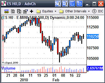
Looking at the past 7-8 days we don’t really see anything exciting to trade as far as chart patterns go. So we sit and wait for something to unfold in a few days if we are lucky.

.

.

SP500 Mini Futures – 2 Hour Intraday Trading Chart
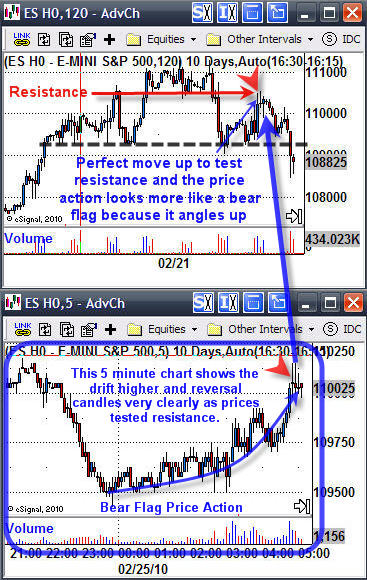
What do you see? WOW a big fat head and shoulders pattern which indicates we should see lower prices.

Traders should have been looking to go short when the price was trading at this resistance level and the 5 minute chart confirmed resistance with the long upper candle wicks (reversal candles) shown in the charts below.

Important Note: When entering this trade, we did not know for sure it was going to be a head & shoulders pattern, but there was a high probability of it happening because of the previous couple day’s price action.

Notice how the left shoulder rallied up and got slammed by sellers, then the next rally (the head) also got slammed by sellers. This price action is bearish as institutions, hedge funds etc… dump positions once they have attained their profit goals for certain investments.

The next rally (right shoulder) drifted up slowly to test the previous resistance level. But look at how the price moved higher…. It drifted higher, which is bearish.

So, if buyers were still in control then we would have seen the price shoot straight back to resistance on big volume then form a mini bull flag (drift sideways) as it digests the resistance level before moving higher. It’s this price action here that was screaming at me to go short.

.

.

SP500 Mini – 60 Minute Intraday Trading Chart
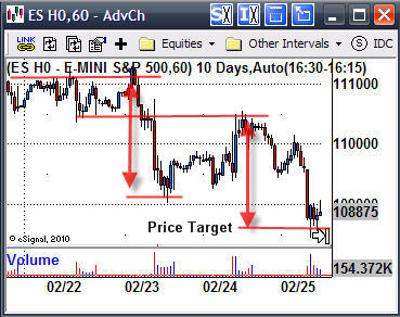
The 60 minute chart helps me to clearly measure how much potential there is for this trade. If you understand technical analysis you will know how to calculate a measured move. It’s simple really.

Take the previous move and add it to the where you think the price is headed. I’ve shown it in the chart below.

.

.

Trading Time Frames Conclusion:
Well there you have it. I hope this report answers some basic trading questions.

If you would like to learn and trade at the same time I will be launching a service where I provide all my personal trades and analysis for your to follow along in real-time. Members will receive all my intraday and swing trade alerts for indexes and commodities Futures allowing you to trade which ever vehicle you want whether it’s an ETF, Leveraged ETF, Futures Contract or CFD. This way your timing is accurate and you can trade which ever investment you are comfortable trading with.

There will be a 24/7 chat-room allowing us to trade around the clock when setups arise. Also, members can swap ideas, ask me questions, make new trading buddies etc… There is even a squawk box feature! When I talk everyone logged into the site can hear me for important news or trades alerts.

All trade alerts are instantly posted in the members area, chat-room and sent via email making it one of the most powerful trading services I have seen available online.

If you are interested please fill out the form to be notified for this service. It will have limited availability:

Get Notified Of Launch

Chris Vermeulen
http://www.TheTechnicalTraders.com/

Disclaimer: I currently do not have a position in the ES futures contract.

This week has been playing out as we expected. Last week we saw the market rally on light volume into a resistance zone on the daily chart. Light volume rallies are always a warning sign, much like the “Calm before a Storm”.

The way I look at bearish price action:

The First Heavy Selling Volume Day – I see this as large institution selling massive amounts of investments (stocks & commodities) because prices have risen enough for them to book profits OR they know something we don’t and they are getting out before the majority of traders find out.

Light Volume Rally/Drift Higher – After a heavy volume sell off we tend to see prices drift higher on light volume. This is when the institutions stop dumping investments and allow the retail investors (Un-educated Traders) to buy the market back up.

Bear Market Trend – In a down trend we see these two phases enter and exit the market. These patterns happen on every time frame from tick charts to yearly charts. Trends vary in length from 1-2 cycles and sometimes 10-20 cycles and more…

Current Market Conditions

So far this week we have seen the market sell down on increasing volume which is bearish and is pointing to lower prices. On Wednesday we saw prices move up on light volume with volatility rising into the close with a short wave of selling. This was indicating to me that sellers were starting to enter the market again.

The daily chart below clearly shows the heavy selling and drift higher on declining volume. The market is now trading deep into a resistance zone and looking ready to drop.

SP500 Intraday 2 Hour Candle Charts

You can see the same selling patterns repeat themselves. Since the Feb 5th bottom we have been forming a much larger bear flag which makes me think a BIG drop is only days away.

SP500 Trend Trading Conclusion:

Both stocks and precious metals are trading with the same chart patterns and volume levels. So if you are wondering about gold, silver and oil, I am seeing a similar scenario playing out for them also.

The reason I keep bringing these bearish patterns up in my reports is because once you master trading in a down market then you can make money during some of the fasted moving times in the market. I have always preferred shorting the market because prices drop much quicker then they rise. So profits are made quickly.

Also, if the broad market does eventually roll over later this year, and I am not saying it is, but “IF” it does, then you will feel somewhat comfortable with the positions we will be taking.

If you would like to receive these Free Bi-Weekly Trading Reports please visit my service for TheGoldAndOilGuy at: www.TheTechnicalTraders.com

Chris Vermeulen