
Cash Is King, Not Gold, Not Bonds
Exactly one month ago, on February 20th, the SP500 made an all-time high and reversed its trend to the downside. What a wild ride the last month has been across virtually all asset classes.
Out of all the major indexes, commodities, and currencies, only one asset and trade moved higher. It’s no surprise given the title that cash or the US Dollar is the asset of choice having rallied over 9% while everything else fell with bonds down 22.75%, stocks 30%-40%, gold miners 58%, and crude down 62%.
My team and I have talked about this rotation to safety into USA/US Dollar) since the lows back in 2018. During the recent stock and commodity price crash, we have seen where investors are dumping their money. It’s not gold, it’s not bonds, but the US Currency. Stocks and commodities are being sold around the globe, and that money is buying up the US dollar.
US DOLLAR RISES ABOVE THE REST
PROOF THE GREENBACK IS STILL THE #1 CURRENCY WORLD WIDE

DAILY S&P 500 INDEX – SUPPORT, BOTTOMING SIGNAL, AND RESISTANCE
The 30+% correction in the ST&P 500 index has been an extraordinary event. Those who have proven trading strategies and abide strictly to position, and risk management rules have been able to not only avoid the market crash but profit and reach new account highs. While those who trade for the thrill, expect oversized gains regularly, and who don’t have a clear trading plan or position management are suffering from the recent selloff.
Last night I watched a great video talking about performance and the winning mindset that both traders and top athletes share. The different ways someone can trade profitably in the markets is fascinating. If you want to be inspired to be a better person and trader, take a look at this video by Real Vision with Dr. Gio Valiante.
Ok, so let us jump into the charts. As a technical analysis and trader since 1997, I have been through a couple of bull/bear market cycles. I have a good pulse on the market and timing key turning points for short-term swing traders and long-term investors.
As you will see from the chart below, I keep things easy for you to see visually and get the idea of what to expect moving forward. The green line is a very significant long term support level on the S&P 500 index. Knowing that price has fallen straight down to this level gives us a much higher chance of a bounce at a minimum.
Trade Tip: The faster the price moves to a critical support or resistance level, the higher the chance you will have a bounce back from that level for a candlestick or three.
The pink arrow on the chart points towards a candlestick pattern, which I call Tweezers. These should be seen as a possible reversal signal.
Lastly, is the red resistance zone. I know it’s a huge range, but at this point, it’s the area we will zero in on once/if price starts to near that level.

30 MINUTE S&P 500 TRADING CHART
This chart is the 30-minute chart of the index and only shows regular trading hours between 9:30 am ET and 4 pm ET. While this is only 1/3rd of the trading day for futures, it is when the majority of contracts/shares are traded, so that is my main focus for analysis.
Since 2001 I have been building and refining my trading strategies to make them somewhat automated. This chart below shows my trend colored chart, which is the basis of my trading for almost all asset classes. What the S&P 500 does directly relates to how I trade or avoid other asset classes.
Recently, we created a market gauge showing you visually where the market is within its 30-50 day price cycle.
When the trend changed, and the bars turned orange on Feb 25th subscribers, and I closed our equities position because they were now out of favor. This allowed us to avoid the market crash through trend analysis, and from our trailing stop order.

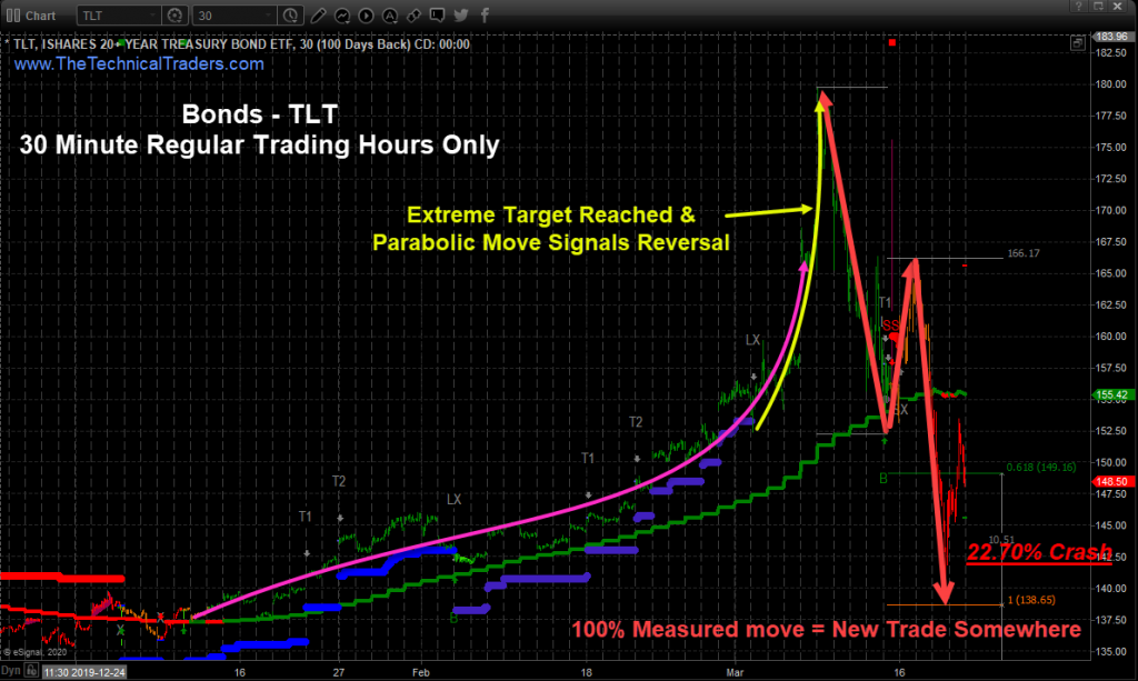
FIRST WAVE OF SAFETY WAS IN BONDS
The two charts below of bonds show the same trend and trades but share some different trading tips.
The first 30-minute chart shows a pink line, which was our trend trade. The strategy is to look for large patterns, wait for a trend change, and then take advantage of the new trend. This trade we entered mid-January.
The key points from this chart are to know when the price goes parabolic in any direction and with huge price gaps, know its time to start scaling out of a trade, or close it.

BONDS DAILY CHART – SPOT LARGE PATTERN, TRADE THE BREAKOUT
The second point is that you must have a trading plan and actively manage your trade by moving up protective stop orders, so when price corrects, you are taken out of the trade automatically.
This daily chart of bonds shows the large bullish chart pattern (bull flag). I waited for price to breakout, the trend to turn green, and then entered the trade using Fibonacci extensions for price targets, which I have found are the absolute best way to spot our price targets. If bonds were to rally to the 100% measured move, we would close the trade, and that is what happened exactly.
A few things took place at that price level, which has the charts screaming at me to sell. First, the 100% target was reached. The second was that price was going parabolic with a 10% gap higher above my target, and volume was extremely high, meaning everyone, including their grandmother, were buying bonds. If everyone is buying the same thing, its time to move on to a new chart.

GOLD AND GOLD MINERS AS A SAFE HAVEN
While subscribers of my ETF trading signals and I profited on GDXJ as an early safe-haven trade exiting our position at the high tick of the day before it reversed and fell 58%, most traders I know still hold their gold miner’s positions.
For most of us, it is tough to sell a winning trade, and it is even harder to sell a losing trade. And knowing most trades will turn into a losing trade if you hold them long enough, the odds are clearly stacked against you as a trader.
This pullback in metals and miners, which turned into something much larger than I ever expected, is a huge shock to most people. The reality is history shows during extreme volatility/fear both gold and bonds collapse, and it is nothing new or unexpected.
In fact, I posted a warning that both will fall two days before they topped and collapsed in this special report.

CONCLUDING THOUGHTS:
In short, we are experiencing some unprecedented price swings in the financial system, but other than extra-large market selloffs, and rallies the charts are still moving and telling us the same things for trading and investing.
There are times when the markets are untradable as a swing trader, which is has been the last 15 days because of how them market has been moving. It is a fantastic time for day traders, but with some sectors moving 10-25% a day back to back like the gold miners or crude oil, it is high-risk trading (gambling) right now.
With all that said, my inter-market analysis is pointing to some tradable price action potentially starting next week. The potential is larger than normal because price volatility remains elevated, meaning 10-20% moves over a week or two are expected.
Visit my ETF Wealth Building Newsletter and if you like what I offer, and ride my coattails as I navigate these financial markets and build wealth while others lose nearly everything they own during the next financial crisis.
Chris Vermeulen
www.TheTechnicalTraders.com


