Is a deleveraging event about to unfold in the stock market?
As 2018 draws to a close and the global equities markets continue to find pricing and valuation pressures driving prices lower, a few questions come to mind for all investors/traders – Is a deleveraging event about to unfold? What will it look like if it does happen and how can I protect my investments from such an event? This research article is going to help you answer those questions and should help to resolve any lingering questions you may have regarding the true nature of this market rotation and volatility.
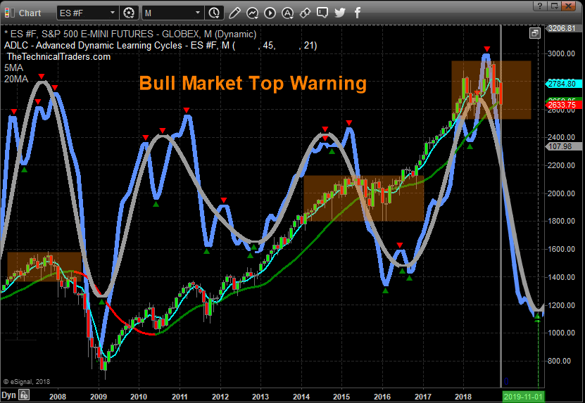
Our research team at www.TheTechnicalTraders.com has been digging through the data and charts in an attempt to identify key elements of this recent price move. We are starting with our Monthly Adaptive Dynamic Learning Cycles chart of the ES (E-mini S&P). As you can see from this chart, our ADL Cycles modeling system is showing a deep downside price rotation is likely to unfold over the next 8~12 months. One thing to remember about this chart is that these cycles and the width of the future cycle peaks and troughs are NOT indicative of price target levels. Therefore, this downside move is NOT suspected of reaching price lows near 1000 or 1200. These cycles are representative of a magnitude of cycle events. In other words, this current cycle, downward, is expected to be a major cycle event that establishes a major price bottom somewhere near the end of 2019 or early 2020.
We urge traders to understand the scope of this cycle event. Look at the previous cycle events on this chart. Numerous downside cycle events have taken place over the past 10+ years that represent somewhat similar down-cycle price moves. The most recent was in 2015~2016. This event represented a moderately deep down-cycle even that equated to a 300~400 point price rotation in the ES. If the current cycle event is relative in scope to the last, then this current down-cycle event will likely result in a 600~800 point price rotation, and we have already experienced a nearly 300 point rotation in the ES. This would suggest a potential price bottom near 2100~2300 on the ES if the scale and scope of the current cycle event are relative to the previous down-cycle event.
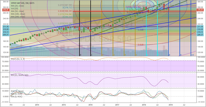
This next chart highlights key time/price cycles on the SPY Monthly chart to help us keep the timing of these events in perspective. As we have suggested, above, a major down-cycle even may be unfolding that results in a deleveraging even across the global markets. If this does, in fact, take place, there are a number of elements that will likely play out. First, currencies will fluctuate dramatically as deleveraging takes root. Capital will seek out and identify the safest and most suitable returns by rushing away from risky markets and into safer markets. Additionally, a prolonged deleveraging of global equities may take place where valuations are reduced as capital attempts to establish a balance between expectations and true market value. Overall, this is a very healthy event for the markets as long as it does not result in a total collapse of price, as we saw in 2008-09.
This SPY chart highlights three key components of the markets current setup. First, the RED LINE (a 2.618 Fibonacci extension from the 2015-2016 price rotation at $266.50) is acting like a strong support level in the markets. This level, along with the 2018 lows near $254.78, are important levels that we are watching to determine if any further downside price activity is unfolding. As long as these two levels are not breached to the downside, we can confidently say that the upside trend is still intact. Second, the two BLUE price channels, which originate from the 2009 market bottom, establish a powerful upside price channel that will act as critical support should price reach near the lower level of this channel. This means that any downside price rotation will likely find solid support near $232.00 or higher. Lastly, the vertical time/price series cycles are suggesting that May and Oct of 2019 are likely to prompt significant price reversal patterns/setups. This helps us to understand that any potential breakout moves (up or down) will likely reach some critical inflection point, or reversal points, near May and October of 2019.
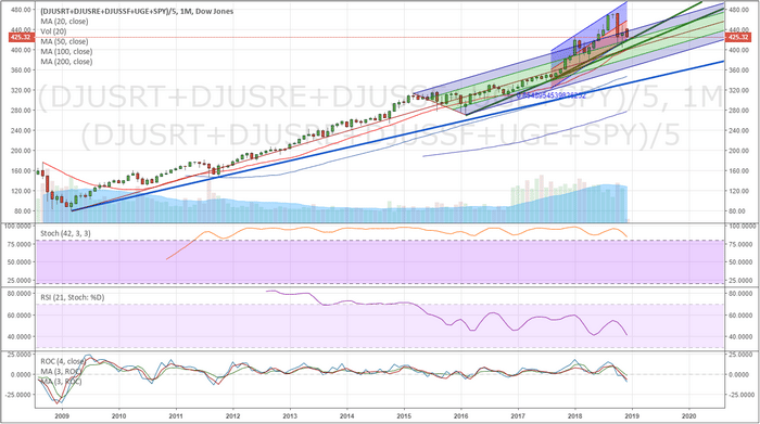
Next, we fall back to our Custom US Market Index chart on a Monthly basis. This chart, again, shows the support level originating from the lows of 2009 in a heavy BLUE line as well as two price channel levels that represent current price ranges. The first thing we want you to focus on is the breadth of the current rotation within the regression channel on this chart (the red/blue shorter price channel). Currently, the price is within this standard regression channel and has yet to break the longer-term, more aggressive, upward price channel. Additionally, we can see from this chart that the recent price activity is still measurably above the 2018 price lows near 374.12. Secondly, the Pitchfork channel, originating from the 2009 lows and spanning the range of the 2015~2016 price rotation, provides additional confirmation that we are still well above the middle and lower areas of this price channel. Even if the current price did fall by another 4~8%, the price would still be within the normal channel levels of this extended upside price channel.
So, when we consider the scale and scope of this current downside price rotation, we have to be very aware of the real expectations of the market. Yes, it looks frightening when we see it on a Daily or Weekly chart. But when we consider the real reality of the long-term perspective, we can begin to understand how the price is reacting to the recent upside acceleration since 2017.
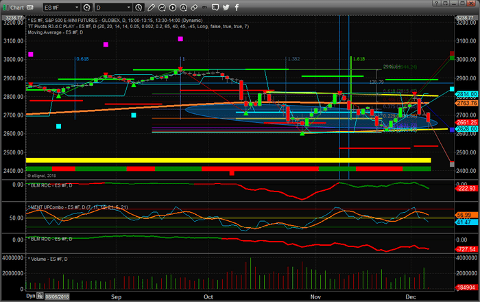
Lastly, this Daily ES chart is showing what we believe is the most important data of all and why all traders need to understand the risks involved in this rotating market. First, this chart shows our Adaptive Dynamic Learning Fibonacci price modeling system and the results of this chart are clear to our team or researchers – although it might be a bit cluttered to you. So we’ll try to explain the basic components of this chart for you.
The heavy RED and GREEN levels that are drawn above and below the price action are the Fibonacci Price Trigger levels. These indicate where and when we would consider a new price trend to be “confirmed” As you can see, the most recent “confirmed” trigger happened on Oct 10 with a huge breakdown of price confirming a bearish price trend. Since then, these Fibonacci Price Trigger Levels have expanded outside price as volatility and price rotation has also expanded. This indicates that price will have to make a bigger push, higher or lower, to establish any new confirmed price trend based on this modeling system.
There are two heavy YELLO lines bordering recent price rotation on this chart that help us to understand a rather wide flag/pennant formation appears to be forming within these rotation/channel levels. For example, the absolute low of the current bar touched this lower YELLOW level and rebounded to the upside very sharply. It is very likely that a washout-low price pattern executed today that may provide further price support near 2626 in the ES in the immediate future. Either way, the price will have to exit this YELLOW price channel if it is going to attempt any new upside or downside price trends. As long as it stays within this channel, we have a defined range that is currently between 2626 and 2800.
Lastly, the LIGHT BLUE oblique has been our estimated critical support level in the ES since our September 17 market call that a 5~8% downside price rotation was about to hit the markets. This level was predicted by our ADL predictive price modeling system and has been confirmed, multiple times, by price over the past few months. It is very likely that this level will continue to act as major support going forward and will be the last level of defense if price attempts a downside price move. In other words, as we stated above, 2600~2680 is a very strong support range in the markets right now. Any breakdown below this level could push the markets toward the 2018 price lows (or lower). As long as this level holds, we could see continued deleveraging in the markets as US Dollar, Energy, Commodity, Currency or global market price weakness while the US markets attempt to hold above the 2018 lows.
Pay very close attention to our Fibonacci price modeling and US Custom Index charts, above, because we believe these charts paint a very clear picture. Yes, a deleveraging event is likely already unfolding in the global markets. It has been taking root in various forms over the past 12+ months in all reality. The US markets are continuing to shake off the downside pricing pressures that we’ve seen in other global markets, and this is likely due to the “capital shift” event that is also unfolding throughout the globe.
Our advice for active traders would be to consider drastically reducing your trading sizes as well as pare back your open long positions if you are concerned about a market breakdown. Our modeling systems are suggesting we have many months of rotation within the market to reposition and evaluate our plans for future success. Unless the 2018 lows and the multiple critical support levels we’ve highlighted are threatened, we believe this rotation is nothing more than standard price rotation with acceptable ranges (see the charts above again if you have questions). Yes, there is still concern that a price breakdown may unfold and we are certainly seeing a deleveraging event taking place. We are not calling for a price collapse at the moment, and we have explained the reasons why we believe our research is accurate.
Use the best tools you can to assist you, just as we do for our members. The only thing you can do in a situation like this is taking factual data, evaluate the true price data and make an educated and logical conclusion about the markets. If you want to learn how we help our clients find and execute better trades and how we are preparing to make 2019 an incredibly successful year with our members, then visit www.TheTechnicalTraders.com and see what we offer our members.
Chris Vermeulen


