
53 years experience in researching and trading makes analyzing the complex and ever-changing financial markets a natural process. We have a simple and highly effective way to provide our customers with the most convenient, accurate, and timely market forecasts available today. Our stock and ETF trading alerts are readily available through our exclusive membership service via email and SMS text. Our newsletter, Technical Trading Mastery book, and 3 Hour Trading Video Course are designed for both traders and investors. Also, some of our strategies have been fully automated for the ultimate trading experience.
Archive for month: August, 2018
Our researchers at Technical Traders Ltd. have identified a potential in the markets that many people may have overlooked or are not prepared for. The recent strength in the markets has skewed many opinions toward the bullish perspective as the S&P, DOW, Transports and Nasdaq have all pushed towards new all-time highs.
We are writing this research post to alert our followers that we believe the US Indices and major markets may be setting up for a moderately deep price pullback that could be in excess of 5% or more.
Our proprietary price modeling systems and advanced learning models are warning us that the upside trend is likely still in place, yet there is a growing and stronger potential for a price pullback that could result in a 4~7% pullback in the near future. We want to alert all our followers that we believe an immediate price pullback is setting up and to protect your long positions.
The continued rally in the US majors has allowed many traders to become overly comfortable to the potential for a major pullback. Much like what happened in February 2018, when a bigger pullback did happen, all of the sudden traders were screaming that a massive top had formed and that everyone should watch out for a further breakdown in price values. We are not saying that right now and we want to be clear – so please read the following statement very clearly…
We believe a 4~7% price pullback is setting up in the US markets that will likely extend into September 2018 before forming a new price bottom and prompting the markets to rally to new all-time highs before the end of 2018. We believe this price pullback/rotation is healthy for the markets after such an extended rally and we believe many traders are discounting the potential for such a move and will surprise many traders. Protect your long positions and prepare for this type of price pullback. You will be able to re-enter your positions as the bottom sets up and a new rally begins.
Let’s take a look at some of the charts that support our research.
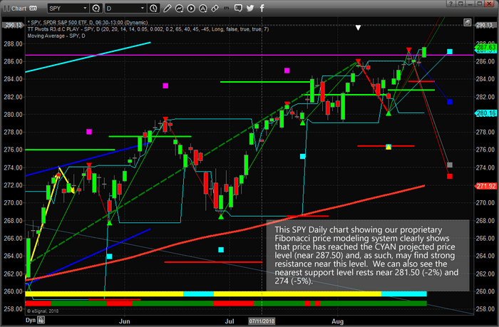
We’ll start with the SPY and highlight our proprietary Fibonacci price modeling system. The recent Daily price rotation in the SPY has illustrated that price has reached the CYAN projected price point. This should be the first level of resistance that price encounters within the current rally. The lower BLUE projected price point is the current major support level. The fact that we are currently breaching the all-time high levels adds greater weight to the fact that resistance should be relatively strong near these highs and that we could see a major price rotation setting up near these levels. The downside Fibonacci price targets suggest a 2~5% price decline is possible given current price ranges.
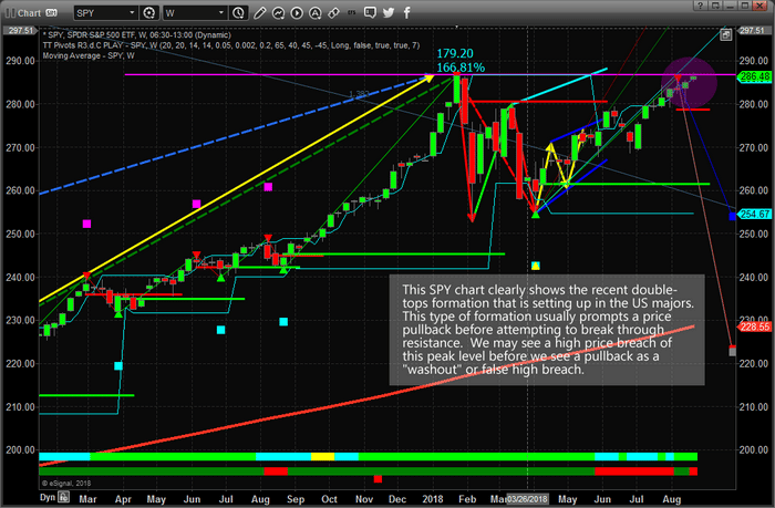
This Weekly SPY chart highlights the key resistance level that is currently at play in the markets from the February 2018 highs. Our proprietary Fibonacci price modeling system is suggesting that prices could, and should, continue to rally to well above the current highs over time. Yet, the current Weekly downside price projection levels show a potential for price to move to 254.65 as the nearest key Fibonacci support level – and possibly even lower to near $224. Yes, this Weekly chart is indicating the SPY could fall -12% on a medium-term pullback or as far as -22% with a deeper pullback and still have the potential for new highs before the end of 2018.
You might be asking, “how could this happen and what would prompt this move?”. We assume it would be some geopolitical or global economic mini-crisis that would prompt such a move, but it could be that investors simply rotate capital out of the US markets chasing opportunities in other foreign markets or debt instruments. The fundamentals for a continued US rally are still in place for at least 6+ months – we are just concerned that a moderately deeper pullback than many are expecting is right around the corner and about to hit the markets. We don’t believe this pullback will be the start of a new bearish price trend.
If you want to learn more about our research, services and how we can help you find and execute better trades, then please visit www.TheTechnicalTraders.com to learn about our team of researchers and products for traders. You can also review all of our past research posts to learn how we have been calling these market moves for the past 12+ months. We urge you to pay attention to our work because we believe we have some of the most advanced and accurate market timing tools on the planet. Time will tell if we are correct with Today’s call – bet we want you to understand the risks and potential rewards that are presented right now in the markets. Take a minute to see how we can help you become a better trader as these moves play out over the next 12+ months.
The recent downward price swing in Gold has kept Goldbugs frothing at what they believe is a very unusual and unexplained price function in the face of so much uncertainty throughout the globe. With Turkey, Russia, China and many others experiencing massive economic and currency crisis events, Gold has actually been creeping lower as the US Dollar strengthens. It is almost like a “Twilight Zone” episode for Gold Bulls.
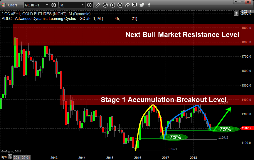
The setup for a gold rally has been in place for over a decade. Much like in 2006 through 2008, the current price and volatility of Gold is simply mundane. For the past two years, Gold has rotated between $1190 and $1360 – within a $180 range. Certainly, Gold traders were able to find some profits within this range, but no breakout trends have been established since early 2016 when the price of Gold changed from Bearish to Bullish and a 31% rally took place driving prices $328.80 higher from the lows.
Our team of researchers, at www.TheTechnicalTraders.com, believe something very interesting may be taking place in Gold right now – almost like a “Deja Vu” of the past. A double setup appears to have taken place recently and we believe the bottom may have already formed in Gold for now.
In early 2016 through November 2016 where price rallied 31% then retraced nearly 75% to form the second leg higher. This deep retracement of price was indicative of a wide price rotation before another leg higher pushed back up to near the all-time highs.
From 2017 until now the Gold chart shows another 75% price retracement from recent highs once again. This second 75% retracement could be a massive bottom formation setting up in Gold and could be a huge “wash-out” low price. We believe this unique retracement is indicative of a massive price breakout over the next year or so as the price of gold is forming what Stan Weinstein calls a Stage 1 Accumulation.
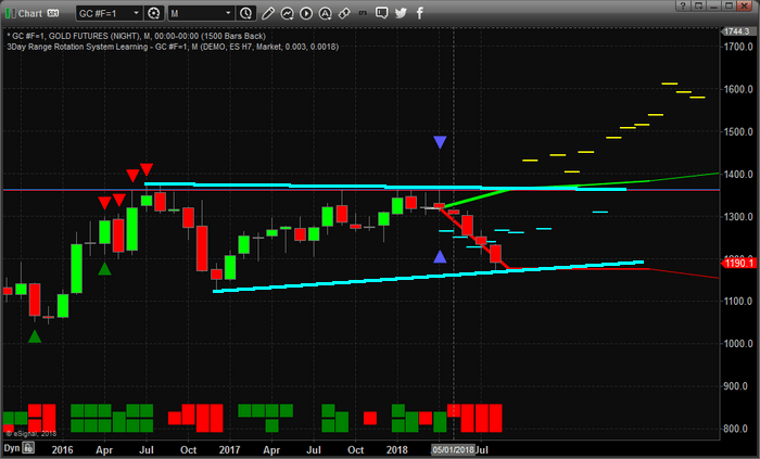
Now, let’s zoom in and take a look at the weekly chart and our Adaptive Dynamic Learning model, the predictive analysis suggests that Gold prices should begin to bottom within the next week or two and begin to climb much higher over the next 3~10+ weeks.
This pattern consists of 12 unique instances of data and suggests that the future upswing will start rather mild for the first 2 weeks, then begin to accelerate as time progresses. It appears we have a strong potential to see prices above $1400 within the next 5~8 weeks or so and you look at the previous chart above, what is the $1400 level? You got it! Resistance, and if price breaks out above $1400 a new bull market would be triggered!
As many of you are aware, Gold is often a move to safety when the global economy begins to show signs of chaos or weakness. We believe the move in the US Dollar will stall and possibly correct as this move takes place. If Gold were to rally while the US Dollar continued to strengthen, you can clearly assume that a flight to safety is taking place and it includes a massive capital migration toward US equities and GOLD. If the rally in gold is seen while the US Dollar weakens or stalls, then we are seeing a move to safety while the currency markets address regional and global currency market issues.
Either way, we expect Gold to begin a new rally higher off of this 75% retracement level to complete the Pennant formation that is currently set up for a Wave 5 upside price expansion. Some of this technical analysis may be over your head as it can be confusing, but you should get the gist of things which is that precious metals should find a bottom and there is the potential that a massive bull market could be on the horizon if price rallies quickly. Be prepared for this move because the Gold shorts will likely be forced to cover their positions within the next few weeks as this move begins to accelerate higher.
Visit www.TheTechnicalTraders.com to learn how we can help you find these types of swings in the major markets. We alert our clients well in advance of these swings and deliver daily video content to all of our members before the market opens each day. Our objective is to make you a better trader and to help you find successful setups to create greater success. Visit our website to learn how we can help you become a better trader today.
Chris Vermeulen
Technical Traders Ltd.
Follow our analysis and read all of our past research posts by visiting www.TheTechnicalTraders.com. Learn how we can help you stay ahead of these moves and find new opportunities in the markets. 53 years experience in researching and trading makes analyzing the complex and ever-changing financial markets a natural process. We have a simple and highly effective way to provide our customers with the most convenient, accurate, and timely market forecasts available today. Our stock and ETF trading alerts are readily available through our exclusive membership service via email and SMS text. Our newsletter, Technical Trading Mastery book, and 3 Hour Trading Video Course are designed for both traders and investors. Also, some of our strategies have been fully automated for the ultimate trading experience.
Recently, the Solar Energy sector has popped up on our watch-list of potential sectors to pay attention to. Over the past few weeks, the Solar Energy sector has been under some pricing pressure and has retraced nearly 50% of the previous trend across the sector. We, the research team at Technical Traders Ltd. understand the Trade War and uncertainty resulting from geopolitical tensions can sometimes create opportunities in the markets for all traders/investors. We just have to be smart enough to find them end execute them efficiently.
Is Solar Energy the next big trend to hit in the Energy sector? What is the potential for these stocks to move 10%, 20% or even 30%+ higher? Let’s take a look.
This first chart, a Weekly chart of First Solar (FSLR) presents us with an interesting price setup. After a dramatic price decline in May and June of 2018, the price decline abruptly halted near $52.00. In fact, this downside move ended almost as if prices “legged down” to the last known true support level. Historically, looking all the way back to the lows of 2012, this downside move represents just a little over a 38.2% retracement from the highs and coincides almost perfectly with a 50% retracement from the lows in 2017. These two numbers interest us because they show us that $53.50~55.00 is very likely a strong support level that is currently being tested.
Simple Fibonacci expansion analysis tells us any upside potential could target $61.35 (+12.65%), 69.95 (+28.44%) & 76.20 (+39.99%). These levels don’t take into consideration the potential for new breakout highs above $82.50. If this were to happen, we could see a +50% or more price upside happen.
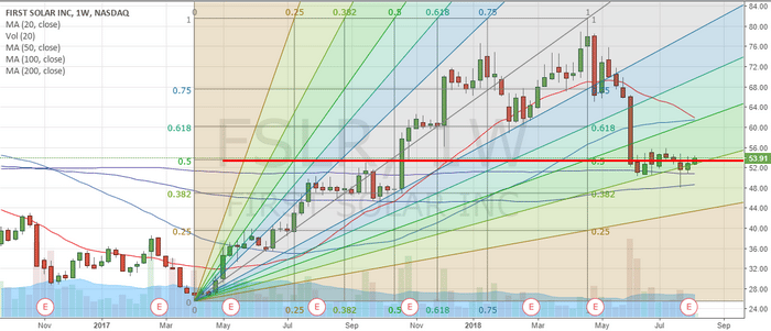
Before we get too far ahead of ourselves, what would cause the Solar sector to begin a price advance at this stage in the economy? Renewed interest in the new technology of new infrastructure/government contracts? Replacing older technology with newer, higher performance, technology? Renewed interest from personal and corporate clients? What could cause this move?
You may remember that we’ve been suggesting that capital, cash, is always attempting to find solid sources of growth and opportunity while avoiding risk and depreciation. We’ve been suggesting that the spare cash on the planet has been rushing into the US stock markets by the boatload to take advantage of the strong dollar and the strong US stock market values. Could it be time for that capital to shift away from the FANGs and other leaders and move back into opportunistic equities that are somewhat off the radar?
Earnings for these companies for Q3 are set to be announced near October 28, 2018. With FSLR, the Q3 earnings have typically been fairly strong. One could attempt to assume Q3 2018 sales value may surprise the markets again and this could be a good time to consider the Solar Sector as an opportunity.
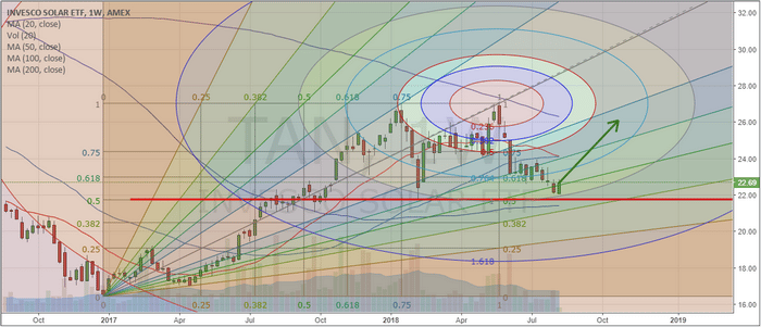
Our next chart is a Weekly ETF chart of INVESCO SOLAR (TAN). This chart presents a similar picture as the previous chart – a relatively strong pullback from April~June of 2018. The price pullback ends near a 50% Fibonacci retracement level and coincides quite nicely with our Tesla Vibrational Price Arc. We’ve drawn an arrow on the chart that suggests where we believe prices could be headed as long at this $21.75 support level holds.
Again, it does not take a genius to understand that any price advance from the $22.70 level to above $26.00 (or higher) would represent an almost +15% move. Any move above $28.00 from current levels would represent a +23.34% move. There is room for profits if our analysis is correct.
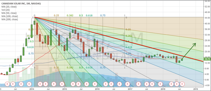
Lastly, we want to highlight what might be the most interesting setup in the Solar sector so far – Canadian Solar Inc (CSIQ). This Monthly chart attempt to show our readers exactly what has been transpiring in the Solar Sector for the past 5+ years. After peaking in early 2014, Solar technology lost its sparkle with investors. Slowly, over time, prices waned and dropped while attempting to find support. Technically, we view that support as the lows established in 2016 (prior to and near the US Presidential elections).
After that point it time, it is pretty clear to see that some renewed interest in the Solar Sector began to take place. Slowly, price advanced from the low as volume stayed somewhat muted. New rotational highs were established while the most recent low is still testing the 2016 lows. This tells us that the price trend, at least until we see a new breakdown low, is attempting to move higher.
CSIQ is currently trading near $14.75 and has upside potential above $21.00 on a breakout move. We are not saying this is definitely going to happen, but we do believe the Solar sector is setting up for an upside move and we do believe the potential for a new rotational high price to be established is quite strong. This means, finding the proper entry point and understanding the downside risk of these trades is critical.
Once CSIQ breaks our Red downward price sloping line, we would assume the price channel has been broken and we would expect the price to begin to rise dramatically.
As a member of our subscription services, you will be alerted to these, and other triggers, as our research team identifies them for the best chances at future success. Please take a minute to visit www.TheTechnicalTraders.com to learn how we can help you find new opportunities in the markets and stay ahead of these trends. Our most recent trade in UDOW returned 12.6% for our members last week. Please take a few minutes to understand how a small, dedicated, team of researchers with 53+ years of experience can make a difference in your future.
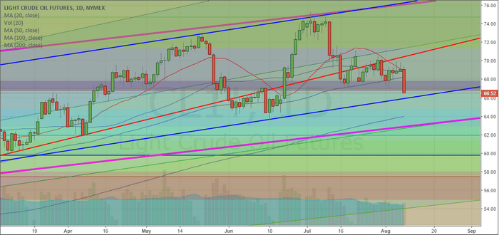
If you have been following our analysis and research of the Crude Oil trend and the energy sector, you know we’ve been suggesting Crude would attempt a move lower and attempt to retest the $58~63 level. It appears the breakdown in prices has begun.
Our research team, at www.TheTechnicalTraders.com, uses an array of proprietary technology, price modeling tools and price cycle modeling tools to attempt to keep our followers up to date with trend reversals, trend expansions and more. This recent downside price move is something we have been expecting for the last 20+ days. The breakdown of support in the Crude oil market, as well as the oversupply of oil on the planet, is setting up for a downside move that could be extraordinary.
This Daily Crude Oil chart shows some of our trend following work where we attempt to identify break ranges, channels, Fibonacci levels and other advanced technical analysis studies. The daily chart only shows a shorter time span and is perfect for attempting to identify immediate support or resistance levels for the price. One can see from this chart that the current breakdown in price is attempting to breach a number of key Fibonacci levels. Should the $66.50 level be broken, we would expect Crude prices to fall to near $64.75 or $62.90. These are the next support levels below the current Fibonacci levels.
The Blue and Magenta levels on this chart are price channels that will become more evident on the next chart – the Weekly chart.
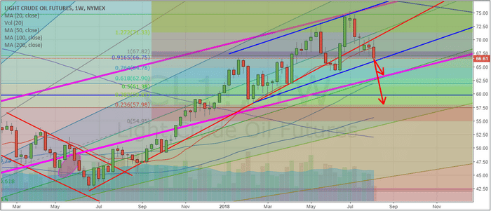
This Weekly Crude Oil chart provides a better, longer-term, perspective of the Oil market. We can see from this chart the Magenta price channel originates from 2016 price rotation. The Blue price channel originates from early 2018 price rotation. The lower, Red, support level originates from the low in June 2017. All of these play an important role in understanding how the price is breaking free of these price channels and may attempt to move dramatically lower.
We’ve already broken the Red support levels, are attempting to breach the Blue price channels and that only leaves the Magenta price channels as final support. Breaking all three of these levels would put Crude prices below $63.00 ppb and we believe that type of move could draw prices to below $60 ppb.
Pay close attention to the size of the most recent Weekly candles – they are much bigger in range than the late 2017 candle ranges. This indicates that volatility in the Crude Oil market is extended and any breakout/breakdown trend could be very aggressive in nature.
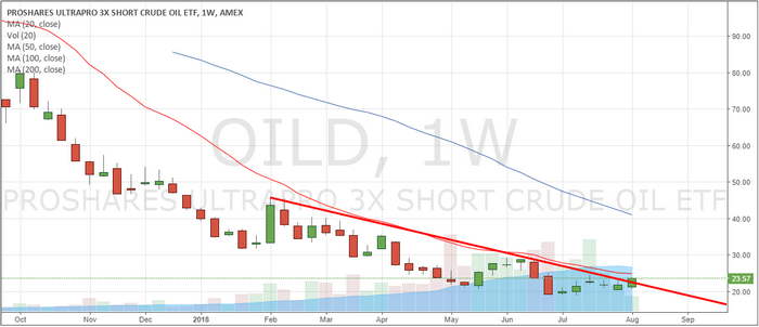
The last chart we have for you today is the OILD 3x Short Oil ETF. It is pretty easy to see that any downside price break in oil, with any longer-term capitulation, would likely drive the OILD prices from about $23.50 to possibly well above $27~32. This type of move could present an opportunity for a 20~40% ROI on a small position if Crude Oil breaks further to the downside. Any opportunity to buy OILD below $22.50 should be considered a strong potential setup as we believe Crude Oil will move to between $60~63 ppb before attempting to find any real support.
Follow our analysis and read all of our past research posts by visiting www.TheTechnicalTraders.com. Learn how we can help you stay ahead of these moves and find new opportunities in the markets. 53 years experience in researching and trading makes analyzing the complex and ever-changing financial markets a natural process. We have a simple and highly effective way to provide our customers with the most convenient, accurate, and timely market forecasts available today. Our stock and ETF trading alerts are readily available through our exclusive membership service via email and SMS text. Our newsletter, Technical Trading Mastery book, and 3 Hour Trading Video Course are designed for both traders and investors. Also, some of our strategies have been fully automated for the ultimate trading experience.
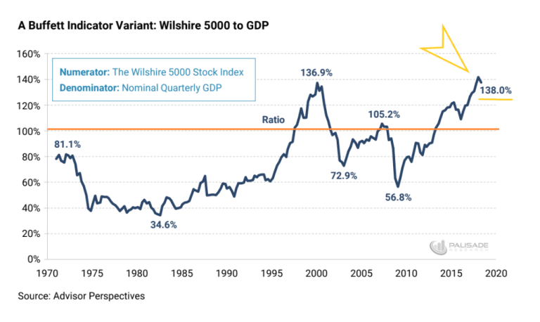
Now, we are ready to share some new research that will help all of us understand the current and future market conditions given the ratios of the capital markets to GDP as represented in our previous article Part I. The research team at www.TheTechnicalTraders.com believe we have identified a means of structurally understanding the US capital markets in relation to risks or reversal and crisis contagion. As the Buffet Indicator is now warning that the US capital market may be nearing a critical price top, we can now attempt to put this data into perspective in relation to capital flows and capabilities. Yes, in terms of historical price appreciation, we are now at or near levels that have historically been associated market tops and price collapses. Let’s look at how the Buffet Indicator has reacted at times using our new Custom Market Cap Volatility Index.
This Daily Custom Market Cap Volatility Index shows data from 2016 until now. It clearly shows the deeper price rotation near the elections in 2016 and the deep price rotation in February 2018. Let’s compare these levels to the Buffet Indicator reactions. In 2016, the Buffet Indicator fell nearly 15% as the US stock market indexes fell 13.5%. In February 2018, the Buffet Indicator fell nearly 8.5% as the US stock market fell 11.88%. Our Custom Market Cap Volatility index operates as a range of price rotation that assists us in determining if and when the price is outside normal price ranges. We are attempting to map price appreciation in relation to volatility in a historical form. When price retraces or contracts, volatility spikes higher. With this process of volatility increasing and price decreasing, the increased VIX levels will show up as very deep Custom Market Cap Volatility price corrections. The VIX will increase much faster than price will collapse, thus any price collapse will likely stay within these ranges, or fall outside these ranges if the price collapse is more extended.
Extended price collapses will result in much higher VIX levels while prices continue to decrease. If the price collapse is very aggressive, the increase in VIX will shoot higher and our Custom Market Cap Volatility Index will crash to very low levels. If the price collapse is an orderly price decline, then the VIX levels will increase as price decreases more gradually and the Custom Market Cap Index will likely stay within moderate ranges. At least we hope this works as we are suggesting. Let’s take a look a longer-term data.
This Weekly Custom Market Cap Volatility Index shows the same date range as the previous Daily chart. We should be able to see the Blue channel levels that originate much earlier as normal price channel ranges. We have added a Std. Deviation channel to this chart originating from the 2010 lows that show the range as associated by the deviation ranges.
This data tells us that US stock market prices have recently rallied from near the middle of these historical channels and still has quite a bit of room to the upside. This would indicate to us that the US stock market is not overly priced and that capital is still working into the US stock market in ways that support further price appreciation. Once price reaches above the Std. Deviation channel and above our Blue price channel levels, then we would start to become concerned that prices may retrace as they did in February 2018.
Take a look at the rally from 2016 until now. Notice how the lows near 2016 represented a relatively depressed price channel range with our Custom Market Cap Volatility Index. In other words, prices were hovering near the lower channels with no real signs of risk as prices did not collapse below these levels. One correlation we can make with the Buffet Indicator that may become evident in our Custom Market Cap Volatility Index is that as US Bond rates increase, capital is usually moving away from the stock market and into Treasuries. When we consider the past actions of the US Fed and the correlations of the Buffet Indicator to these central bank actions – we might find a direct correlation.
Yet we believe our Custom Market Cap Volatility Index is valuable for a number of reasons; first, we can use this index as a measure of price rotation and standard deviation low price identification. This will allow us to determine when prices are poised to form a bottom setup and when an opportunity exists for upside price acceleration. Second, we can identify when prices are nearing the upper channel as an early warning that prices may be attempting to hammer out a longer-term top formation – allowing us to reduce risk and scale back our positions. Lastly, we can look for cycles that may help us determine key dates for price rotation.
This cycle chart highlights the deeper low price rotations in our Custom Market Cap Volatility Index. These low points are when the US stock market has seen increases in volatility and moderately deep or deep price corrections. Notice how the early 2018 price collapse is clearly shown as a very deep price rotation in our Custom Market Cap Volatility Index. Notice how the 2016 and 2017 deeper price rotation on the Custom Market Cap Volatility Index correlate with price rotation in the US major indexes. Also, pay attention to the price appreciation that took place after these deeper price corrections.
These cycles suggest that the US stock market should continue to push higher for at least the next 90+ days till near November 2018. Near this date, there is a relatively strong likelihood that some type of deeper price correction will hit the US markets – possibly a bit sooner or after this date. The cycle frequency and accuracy of these bottoms suggest that the price of the US stock market will likely push higher over the next 30+ days – then possibly stall while attempting to form a potential top. It is likely that this top formation or horizontal price range will become extended consolidation before any deeper price correction begins. In the meantime, we believe the US stock market will continue to push higher as our Custom Market Cap Volatility Index shows.
Our suggestion at this point is that the Buffet Indicator is failing to correlate the global capital pool that exists currently and is also failing to adequately reflect the capital migration that is currently taking place throughout the globe. We believe the US stock market could continue much higher at this point, depending on how the global markets react to this shift in capital and the longer term debt issues that are playing out. We certainly don’t want to mislead anyone – so we are alerting you that November or December of 2018 appears to be a time where prices may rotate a bit more violently to the downside. This may be correlated to some type of global crisis event or it could be an extended capital shift away from the US stock market where capital flees to new opportunities in other global markets. All we know right now is that the US stock market is still on a path to move higher and we still have quite a bit of room for market cap growth over the next 3+ months.
If you want to know how our other proprietary price modeling systems and indicators help us keep our valued members and subscribers informed of future market moves, then visit www.TheTechnicalTraders.com to learn how we can help you find and execute better trading decisions with our specialized research, daily video updates, detailed trading signals and more. Don’t let the other news fool you with generic content and comments – true researchers pull from resources or create new resources to give them a much clearer understanding of the market dynamics ahead. Get ready for further upside prices and watch for an end of year price rotation that could be dramatic.
53 years experience in researching and trading makes analyzing the complex and ever-changing financial markets a natural process. We have a simple and highly effective way to provide our customers with the most convenient, accurate, and timely market forecasts available today. Our stock and ETF trading alerts are readily available through our exclusive membership service via email and SMS text. Our newsletter, Technical Trading Mastery book, and 3 Hour Trading Video Course are designed for both traders and investors. Also, some of our strategies have been fully automated for the ultimate trading experience.
Our research team at Technical Traders Ltd. have been laboring over the recent market moves attempting to identify if and when the market may be likely to turn lower or contract. We’ve been pouring over all types of various data from numerous sources and have concluded the following is the most likely outcome for when the US stock markets may find a reason to pause of contract. As you read this research post, please allow us a brief introduction of the facts that supported our research.
 (source: https://palisade-research.com/warren-buffet-indicator-signaling-market-crash/)
First, our research team started this investigative work after watching the Buffet Indicator climb from the 2015~16 rotation levels to new highs and achieve some recent news events. This indicator, being one of Warren Buffet’s favorite tools for understanding market valuations in comparison to debt levels provides some interesting components for our team to study. Yet, we believed this indicator chart lacked something relating to the global markets and the use of the debt capital to spur future global economic activity.
Therefore, our team went off in search of something that could help us rationalize these high Buffet Indicator levels in true relation to the global markets and in relation to the capital shift that we believe is currently taking place throughout the planet. The first component of our assumption about the global markets is that capital is rushing away from riskier markets and towards more stable markets. The second component of our assumption is that national debt obligations are being re-evaluated based on perceived risks and contagion issues throughout the globe. The last component of our assumption is that the new US President is shaking up quite a bit of the old constructs throughout the globe and that the processes and policies put in place by President Trump are creating a very dynamic global capital market environment at the moment.
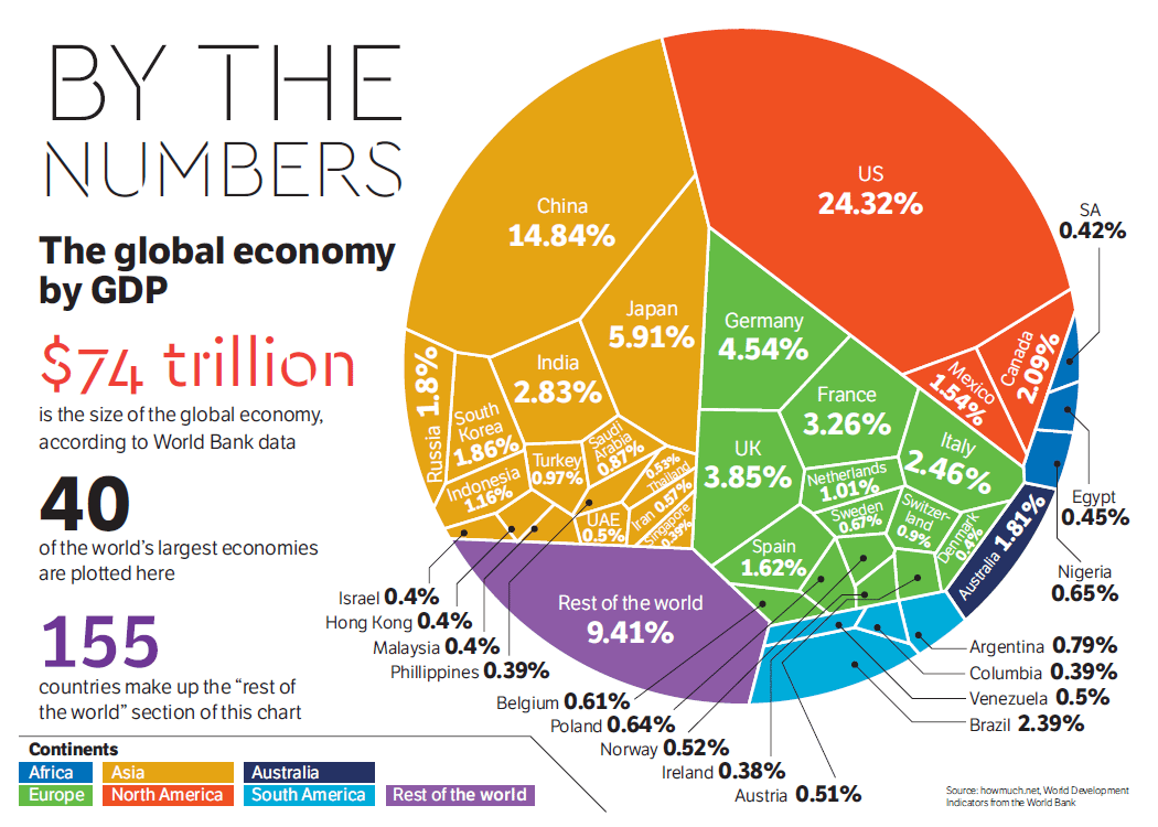
When you consider these three components and their combined results on the global capital markets, we have to understand that there is a very strong possibility that the largest GDP producing countries on the planet, and their banking, institutional and investor classes, are all operating within some aspect of these three components. This means there is a potential for at least $7 to $15 Trillion (10~20% of total global GDP) US Dollars that are actively sourcing and seeking secure returns while avoiding risks and debt contagion. This is a massive capital shift that is taking place currently – likely the largest the planet has ever seen.
As the Buffet Indicator is showing, the US stock market is nearing or passing all-time highs in valuation in relation to US debt levels. Yet, how does the Buffet Indicator correlate the global capital shift that is taking place and equate these dynamics into fair value. The US market, being the likely target of this massive capital shift, is a fair source for valuations comparisons, but we are experiencing a capital shift that has never before been seen at the levels we are currently experiencing. Sure, there have been shifts of capital before – but not at the $10 to 20 trillion USD level.
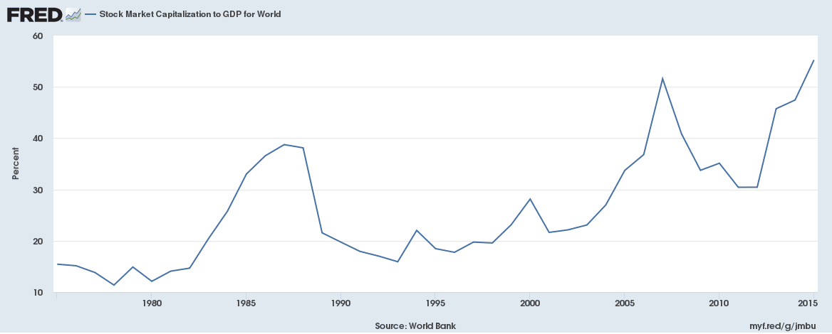
If we compare the Buffet Indicator to this Fred Global Stock Market Capitalization to GDP chart, some interesting facts begin to take shape. First, the peaks in 1974, 1999, 2008 and 2018 on the Buffet Indicator are not as evident on this chart. The 1974 peak is relatively nonexistent. The 1999 peak is a much more muted (28%) peak than on the Buffet Indicator chart and the 2008 and 2018 peaks are relatively correlated to the Buffet Indicator chart. One should be asking the question, “why are the two most recent peaks more correlated than previous peaks on this global capitalization to GDP chart?”. Our answer to that question is that after the 1999~2000 US market peak, the globe entered into a much more cooperative economic phase with the EU, China, South America and many other nations operating as global peers vs. global competitors. It was after this time that the capital markets began to “sync” in some form to the central banks policies and the unification processes that were taking place throughout the globe.
We should, therefore, assume that any global market contagion or crisis will likely take place in some measured form throughout nearly all global markets when it happens. Additionally, as regional debt or capital market crisis events occur in certain nations, capital that was deployed in these nations or capital markets will likely rush to new, safer environments for periods of time. Capital is always hunting for the safest and most secure returns while attempting to avoid risk and devaluation.
The central bank policies of the past two decades have allowed a massive increase in the available capital throughout the globe. Global GDP has risen from $33.57 Trillion in 2000 to $80.68 Trillion today – a whopping 140% increase in only 18 years. Historically, global GDP has risen by approximately these levels every 15~20 year for the past 50+ years. This is likely the result of the US moving away from the Gold standard and foreign nations following along with fiat currency central banks since after the 1960s~70s.
This tells us that the peak in 2000 on this global capital market to GDP chart resulted in a moderately isolated capital market peak that was uniquely available within the US and major economies – not globally. The 2008 peak represented a more globally equal capital market peak. This means the majority of the global capital market experienced capital appreciation. The same thing is happening right now – the global markets are experiencing an overall capital market appreciation that is a result of the past 20+ years of central bank policies and economic recovery efforts.
Stay Tuned for PART II Next with Charts and Trading Analysis!
53 years experience in researching and trading makes analyzing the complex and ever-changing financial markets a natural process. We have a simple and highly effective way to provide our customers with the most convenient, accurate, and timely market forecasts available today. Our stock and ETF trading alerts are readily available through our exclusive membership service via email and SMS text. Our newsletter, Technical Trading Mastery book, and 3 Hour Trading Video Course are designed for both traders and investors. Also, some of our strategies have been fully automated for the ultimate trading experience.
The US Federal Reserve is one of the only central banks to attempt to raise rates consistently over the past few years, has possibly learned a very valuable lesson – no good comes from raising rates to the point of causing another market collapse. The news that the US Fed will leave interest rates where they are, temporarily, is good news for a number of reasons.
First, this allows the markets to shake out weaker players and weaker components of the corporate world. Where corporate debt levels are concerned, interest rates are tied to debt repayment liabilities and refinancing costs. Firms that are unable to manage at current interest rates certainly would not be happy about rising rates. This allows these corporations to either struggle to resolve their debt issues or collapse under the weight of their own debt. This will also play out in the foreign markets as well.
Second, it allows the housing market and private debt markets to shake out some of the “at risk” consumers. We authored an article a few months ago about how foreclosures and pre-foreclosures were starting to increase in nearly all markets. At the time, many people in the real estate field shrugged off these increases as par for the course. With the decreasing foreign investment in real estate and the increasing pressures on the local consumer markets, we saw a dramatic slowdown in housing starts and sales activities recently. This is because the demand side of the market is falling much faster than the supply capacity.
The uncertainty in the foreign markets, global central banks, and foreign investments have prompted many people to pull out of the local markets – even the hot markets. The at-risk consumers that were trying to sell near this top suddenly found the buyers were just not there or ready to make the commitment. This put the at-risk consumers in a difficult position as they could not flip their houses as easily as they could 6 months ago.
Yet, in the global equity markets, investors can sell or buy with much faster transaction times – at the click of a mouse button in most cases. This allows equity investors to pull capital away from risky investments and migrate that capital into more secure investments in a matter of minutes or hours – not weeks or months. And that is exactly what has been happening over the past 30+ days in the global markets.
Capital is repositioning for the next phase of this market; where the US economy is strong, housing continues to weaken and at-risk consumers continue to feel the pressures of the US Fed interest rate policies. Where foreign consumers attempt to deal with their own version of “central bank hell” and asset devaluations in an attempt to find more secure investment vehicles for their capital. Money market funds, investment funds and, of course, the US value/blue-chip equities are looking very promising right about now.
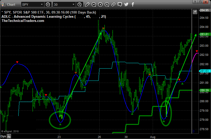
This Daily SPY chart shows our recent ADLC indicator (price cycle turning points) and our oversold extreme price levels shaded with lime green. When these two things align the market tends to rally for 1-3 days with strong momentum. During pre-market last week, we told our followers that the big gap lower in price was going to be bought and price should rally for 2-3 days, which is exactly what has unfolded thus far.
Global capital will continue to rush into the US markets as long as the US Fed does not do anything to derail things. Our research team believes the US Fed may even decrease the interest rates by 0.25% before the end of the year depending on how much pressure is placed on the economy by these “at risk” participants.
We will continue to keep you updated as to our findings and we want to urge you to visit www.TheTechnicalTraders.com/FreeMarketResearch to read all of our most recent research posts. You really owe it to yourself to understand what is happening in the global markets right now and how we have continued to stay 30~60 days ahead of these moves for our valued members. There are so many opportunities setting up in the markets for traders it is almost hard to understand the dynamics at play right now. If you want a dedicated team of researchers and traders to help you navigate these markets, then visit www.TheTechnicalTraders.com to learn how we can provide you with even more detailed daily research and support.
Chris Vermeulen