Over the past seven trading sessions we have seen stocks plummet in price because of the debt issues in the United States. I think a lot of individuals including myself thought that a bill would have been passed last week and with a plan underway money would flow back into stocks for a relief bounce at minimum. Instead, nothing was passed and that lead to strong selling into Friday’s close.

The next couple weeks are going to be very interesting for stocks, bonds, currencies and commodities as traders and investors process this event as it unfolds.

Let’s step back and take a quick technical look at the chart…

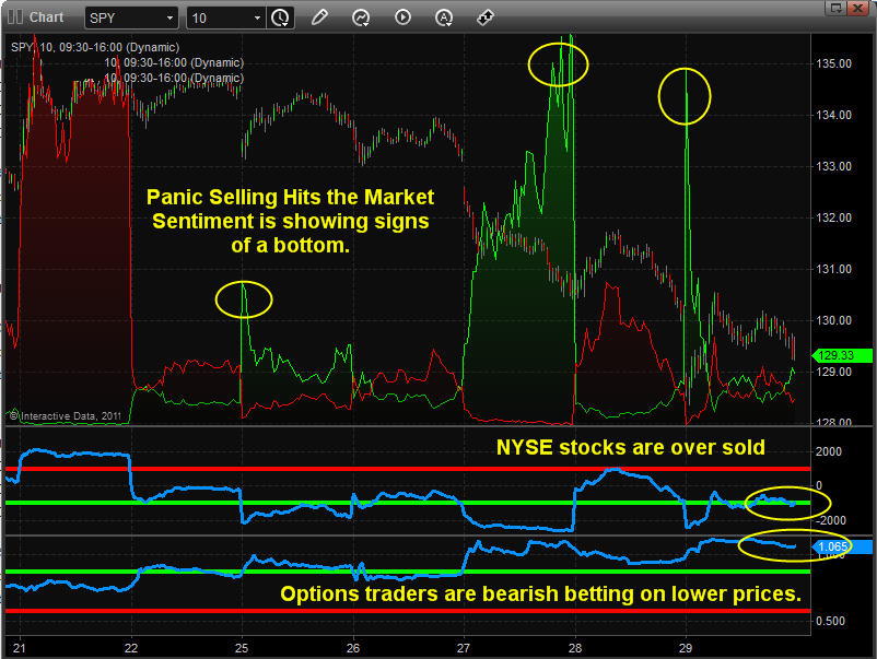
SPY – SP500 Index ETF – 10 Minute Chart
I call this chart my sentiment chart because I use three indicators to get a feel for what the masses are doing. The first indicator which is the green spikes on the price chart is my own custom indicator to measure panic selling in the stock market. Usually I look for strong selling days followed by an exhaustion gap lower within 1-3 days.

As you can see below, the last panic selling spike took place on a large gap down only 2 days after we saw extreme panic selling which actually got stronger as the session grew older. This is a bullish sign in my opinion.

Also if you look at the two other indicators at the bottom we can see the NYSE advance decline line trading down in an oversold zone. And the very bottom indicator is the put/call ratio showing everyone is trading puts and that means they are betting on lower prices.

To sum this chart up quickly I can tell that traders are selling everything they own because they are scared, stocks have moved down to quickly and likely ready for a bounce and also that options traders are expecting lower prices. So if everyone is bearish and has already sold their positions it only makes sense that a bounce or rally should take place in the next few sessions.

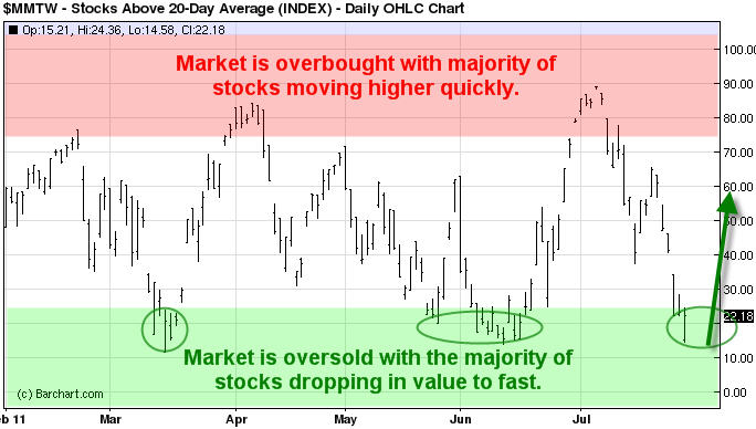
Percentage of Stocks Trading Above the 20 Moving Average
This chart helps me get more of an intermediate trend analysis for if stocks are oversold or over bought. This chart tells us the percentage of stocks that are trading above their 20 day moving average.

This is how I use the info:
Example: If we are in a long term bull market which we currently are… then I look at buy during these oversold conditions. Once this chart reaches the 75%+ level I become more aggressive with my positions and actively manage them (Take partial profits, tighten stops).

Example 2: During a major bear market you to the opposite (build short positions on the bounces to 75%+ level and then cover partial positions and tighten stops once stocks are oversold and ready for a dead cat bounce once below the 25% level.

SPY Daily Chart
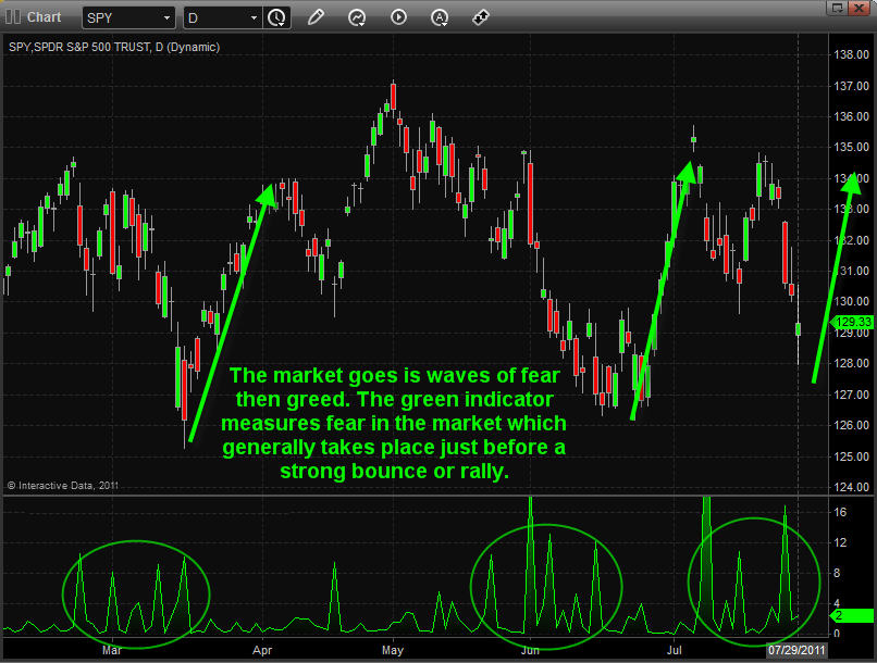
This chart below allows us to get a longer term view of my panic selling indicator. As we all know the market moves in waves (fear and greed). So with the SP500 traded by individual’s from all around the world it generally takes 5-15 days for everyone to become fearful and or greedy and to take action with their investments. This can be seen from looking at how long it takes for the sellers unload their positions.
If things play out in favor of what the charts are telling me we should have a nice bounce or rally just around the corner. Again this analysis is based strictly on technical analysis and not on economic data. Adding the economic/political data makes things very confusing and interesting to say the least and they do not always to hand-in-hand.

Weekend Trading Conclusion:
In short, this coming week the market has a big wild card on the table. Until we know what that is be very cautious with trading positions. Just now/tonight Obama said a deal was reached to end debt issue and urges both parties to do the right thing and support this deal over the next 2 days. This deal will raise the debt limit and will cut $2.5 trillion from the deficit over the next 10 years.

We are seeing a 20 point jump in the SP500 futures from this news just moments ago so this just may be the bounce/rally I am looking for.

Technically I feel higher prices should take place in stocks but we may have a couple volatile sessions with lower prices before a strong jump in price as this news is not set in stone just yet and we have a couple days before we know what the final decision is…

If you would like to receive these free weekly updated in your inbox please opt-in to my newsletter here: http://www.thegoldandoilguy.com/trade-money-emotions.php

Chris Vermeulen

It was an exciting trading session Wednesday to say the least… With all the uncertainty floating around it is causing the stock market to be more volatile than normal. It seems like every other day there is some big headline news causing either strong buying of stocks or strong selling to take place. It’s this type of price action which spooks the average investor causing them to panic out of positions at key support areas just before a continued move higher.

I like to focus on the market when I see extreme buying or selling taking place. During times of extreme buying or selling in equities, investors are reacting on emotions rather than logic and that’s when I benefit from everyone rushing to the door trying to get rid of their positions at any price they can get.

Let’s take a look at what the market is telling us right now…

SPY – SP500 Index Exchange Traded Fund – Daily Chart
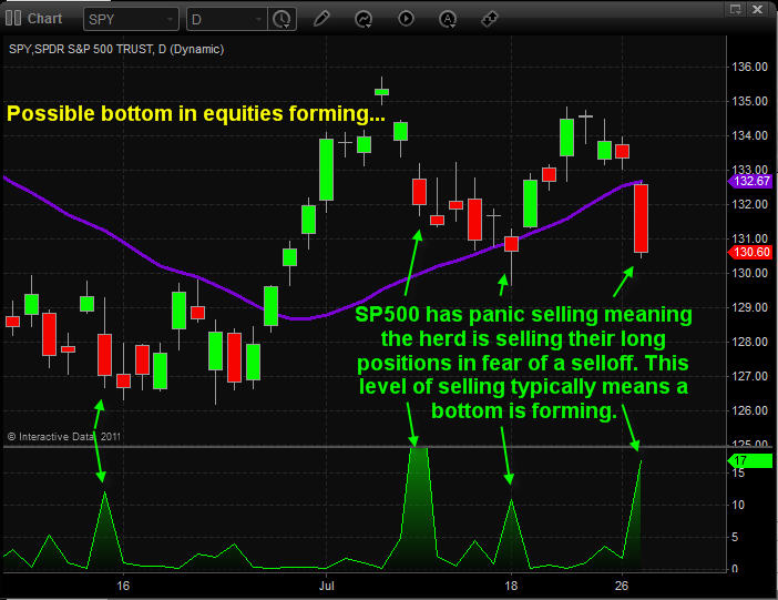
In this chart you can see my custom green indicator at the bottom. I use this to measure fear in the market. When this indicator is trading above 5 I know the masses are unloading stocks as quick as they can in pure fear that a market collapse is about to take place. But the biggest thing I learned trading over the past 12 years is that when everyone is doing something its best to skip the trade or start looking for technical setups which will get you in against the masses because the move is generally almost over.

What I get from this chart below is:
1. The trend is still up
2. We have not broken the previous pivot low from last week
3. The market is showing extreme panic selling and I anticipate some type of bounce or bottom shortly.

VIX – Volatility Index – Daily Chart
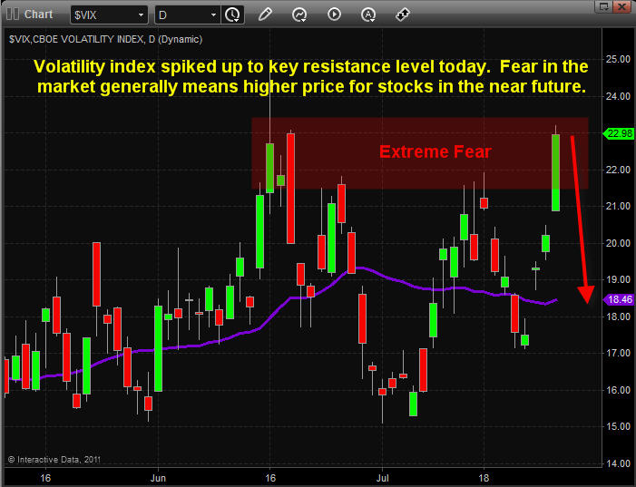
The volatility index measures fear in the market. So with the vix spiking up into a key resistance level, I would not be surprised to see it go a little higher then sharply reverse back down.

Trading off fear and greed can be very profitable but you must understand the two. Greed is a slow driving force in the financial market. As prices rise day after day the greedy continue to buy more and if they see any sharp dip they just look at it as an opportunity to buy even more (even though its a sign of smart money distribution selling) until eventually there is a huge collapse from the big money players unloading their positions and the greedy are left holding the back with a higher cost average price. This is the reason market tops tend to take 3-7 times longer to form than market bottoms.

Fear on the other hand is very quick. Think of it as if you were walking through your house at night down a dark hallway. When all of a sudden your friend jumps out and screams catching you completely off guard. What do you do? You jump, most likely yell and drop everything you were doing, then 30 seconds later you are back to normal. Well this is what happens in the stocks market also…

Traders hold their positions until a piece of news hits the wires or there is a strong selling day and their investments start falling quickly. This sudden news or price movement which they were not anticipating causes traders to panic and sell everything before the investment collapses. Typically a couple days later the price rebounds and after a strong bounce these traders decide to buy back their position and ride the price to new highs. So what if you were to get in near the bottom then let all the traders bought back after you? It generally means big money for you. This is what I look for and what I consider panic selling to be.

Stocks Showing Signs of Being Oversold
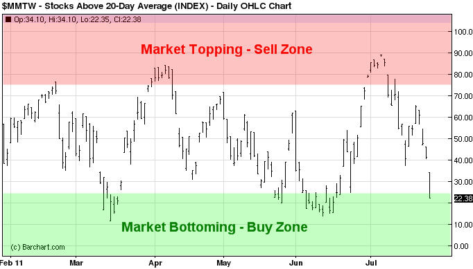
This chart below shows the percentage of stocks trading above the 20 day moving average. Over time I have found that when 75% or more of stocks are trading above their 20MA then the market is getting overbought and one should be looking to tighten stops, take partial profits and or look for short setups.

On the flip side when only 25% stocks are trading above the 20 day moving average I find the market usually puts in a bounce or rally which lasts several weeks.

As you can see in this chart after Wednesday’s sharp move lower we are now entering into an oversold market condition. I expect volatile prices for a few days as the market stabilizes then a move to the upside.

Mid-Week Trend Conclusion:
In short, I feel we are in for some choppy price action over the next 2-10 sessions. With the current market trends I do feel that the odds are pointing to higher prices for both stocks and commodities.

If you would like to receive these free weekly updated in your inbox please opt-in to my newsletter here: http://www.thegoldandoilguy.com/trade-money-emotions.php

Chris Vermeulen
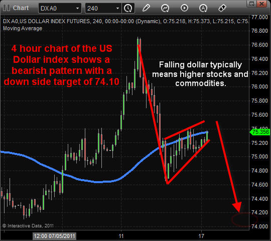
The dollar is and has been in a strong down trend for many years and I feel as though it’s getting close to another major land slide. It could take place any time in the next month or so according to my weekly chart analysis.

The general rule is if the dollar falls in value then we tend to see both stocks and commodities rise. The inverse relationship at times can be tick for tick meaning if the dollar ticks down one increment then we see the broad market or specific commodities move in the opposite direction at the same time.

Since 2009 the relationship between the dollar and investments has been so close that if you were to just focus on what the dollar was doing then you could almost trade equities and commodities without reading their charts. The dollar index chart is one of those trading tools everyone should be analyzing. At $80 a month for getting the dollar index data feed it’s not a cheap trading tool…

Dollar Index 4 Hour Candle Stick Chart:
This chart clearly shows this month’s price action for the dollar which is pointing to lower prices if things play out according to the charts. This short term chart shows that in the next day or so we should see the US dollar start to sell back down.

SP500 Daily Chart (Stock Market):
The SP500 index is a great barometer of what the overall stock market is doing. The chart below shows the 5 and 14 day simple moving averages and their recent crossovers.

Last Friday we had a bearish crossover and if the market does not rally early in the week then I am anticipating further weakness in stocks. While I am still bullish on stocks as of this moment the coming week will quickly tell us what stocks are going to do. If we get a bounce which turns into a strong follow through rally then we should see a sizable rally around the corner and also a falling dollar.

Gold Weekly Chart:
Back in May when gold was hit with strong distribution selling I posted my thoughts on how gold could be forming a 6-12 month topping pattern and how price could get choppy. Well, we are now entering that period which could prove to be interesting…
Keep in mind this is a weekly chart and from the looks of things this top could play out for another 5-6 months from here. Silver is in much of the same predicament but trading way below its May high. I’m thinking more of a double top in silver over the next few months.

Weekend Trend Trading Conclusion:
In short, I am bearish on the dollar for a week or so which should help boost stocks and commodities. After that we could see all investments make some big trend changes if buyers don’t step up to the plate to buy. If we any major headline news about the sky is falling then it could trigger a sharp correction. Unfortunately, at this time head line news is running wild spooking investors from buying much of anything other than gold. Any resolution to foreign economic issues will put pressure on both gold and silver and likely help boost stocks.

The past month I have been very cautious because the market is wound up and ready to explode in either direction. During times like this I prefer to stay mostly in cash until I get low risk setups and a clear trend.

That’s all for now, but if you would like to get my pre-market video analysis of the dollar index, each morning and intraday updates along with my trade alerts be sure to join my premium service at $59 a month which is less than the cost for the dollar index charting data feed!

Join Now: http://www.thegoldandoilguy.com/free-preview.php

Chris Vermeulen

The past couple months (May and June) have been tough on precious metals and crude oil. But recent price action shows that buyers are stepping back into the market buying up these commodities once again.

Let’s take a quick look at the charts…

Gold Futures Daily Chart:
As you can see from the chart below, gold is making a new high. The big question is if it will do what it has done many times in the past, which is make a new higher for only a few days to get the general public (herd) long, only to then get sold into and come back down? The next few sessions will give us a better feel for this breakout/rally.

Silver futures Daily Chart:
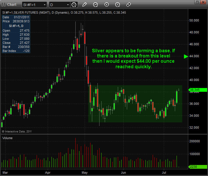
Silver on the other hand has not performed as well as its yellow sister. Rather we are seeing a base being formed. The exciting thing about base patterns is that the larger and longer the base takes to form, the larger the potential move once a breakout occurs.

Crude Oil Hourly Chart:
Crude oil looks to be forming a base and or inverse head & shoulders pattern. Both these patterns point to higher prices with a price target around the $110-112 area.

Mid-Week Trend Report:
In short, I feel commodities are now in the spot light and where investors will be looking to put their money to work over the next couple weeks as the falling dollar directly helps boost their prices.

The equities market continues to be volatile with large waves of buying and selling almost hitting the them every trading session. During key pivot points in the market we know pricing for investments get a little crazy at times and we manage positions accordingly and anticipate some moves.

That’s all for now, but if you would like to get my pre-market video analysis each morning and intraday updates along with trade alerts be sure to join my premium service here: http://www.thegoldandoilguy.com/free-preview.php

Chris Vermeulen

It’s been an exciting couple months as stocks and commodities have moved like they are a roller coaster at a theme park. We all know every good roller coaster has a few monster hills which make their clients scream in fear/excitement that’s what it’s all about!

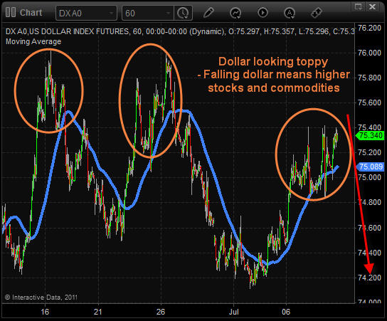
But if we step back into the financial world where fear/excitement cost people month it is not so fun. Look at the US Dollar index you will see three monster hills which investors/traders have just finished riding. These quick price movements were enough to make most traders hit the sell button in fear of wilder price action. This is the type of price action which can whip-saw traders in and out of positions for several back-to-back losses.

Having multiple losing trades back-to-back triggers a series of events causing most traders to lose large percentages of their trading capital.

First the trader starts to become frustrated and starts second guessing themselves. This causes revenge trading meaning they start to trade more frequently without proper setups and risk reward levels. Which lowers their confidence, while increasing the rate of their trading. This generally makes for a blowout trading session or week. Meaning they lose 20-50+% of their trading capital in a very short period of time all because they are trading off pure emotions and not clear trading rules.

Avoiding roller coaster rides with your trading capital/emotions is one of the things I do well. I do this by focusing on the US Dollar index because it plays a very large roll in what both stocks and commodities do. I analyze the dollar trends and use its price action to help gauge how big and long its next trend is. If the dollar index looks as though it may top, then I will be looking to buy/ accumulate some stocks and commodities simply because a falling dollar helps boost the value of stocks and commodities.

Take a look at the dollar index below. Just a quick glance and you get a gut feeling that it’s trying to top and could have another sharp sell off in the next 1-3 days.

Now if we take a look at the SP500 daily chart and use the dollar index analysis above, I would expect to see stock prices pause or pullback for a few days while the dollar tops and then look for a reversal pattern on the shorter time frame charts to add more to our position before stocks continues higher.

Looking at the price of gold we can see that it has been trading in a large sideways range since May and also near a resistance trend line (red line). We could easily see a 1-3 day pause/pullback in gold while it builds energy for another surge higher. Which could take it through the resistance level.

Pre-Week Market Trend Analysis:
In short, I feel the dollar is trying to put in a top which could take a few days to play out. If that unfolds then we should start seeing stocks pullback to support levels and then bounce with rising volume.

That’s all for now, but if you would like to get my pre-market video analysis each morning and intraday updates along with trade alerts be sure to join my premium service here: http://www.thegoldandoilguy.com/free-preview.php

Chris Vermeulen

This has been an interesting year for both gold and oil. There has been wild price swings due to extreme political, economic and weather events round the globe making these commodities a little more difficult to trade than normal. That being said if we look at the charts it appears we could be at the beginning stages of another major rally in both stocks and commodities.

Let’s just jump right into the charts…

Gold Miner Stock Bullish Percent Index:
If you take a look at the bullish percent chart for gold miner stocks it appears that stocks are trading at the lower reversal zone. The last time we had a similar setup like this gold rallied 15% and gold stocks jumped nearly 25% over the following 3 months.

Gold Bullion 4 Hour Futures Chart:
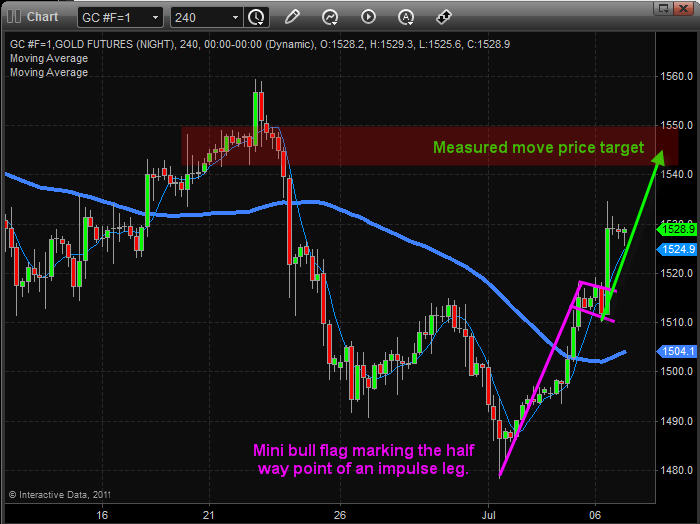
This chart of gold shows us that a bottom formed in early July and that buyers are now in control. It looks as though we are getting the first impulse leg which should top out around $1550. After that I would expect some type of pause or pullback before price continues higher. This is also when I will be looking to enter precious metals as long as price and volume action confirm this upward thrust.

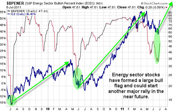
Energy Sector Bullish Percent Index:
While these bullish percent charts are not the best for entry points in the market, they do warn us of possible tops or bottoms. This allows us to adjust our protective stops, entry prices and or profit targets. This BP chart of the energy sector looks as though it’s trying to bottom. I would like to see the June high get taken out on both the BP chart and XLE etf before thinking energy is in a new uptrend.

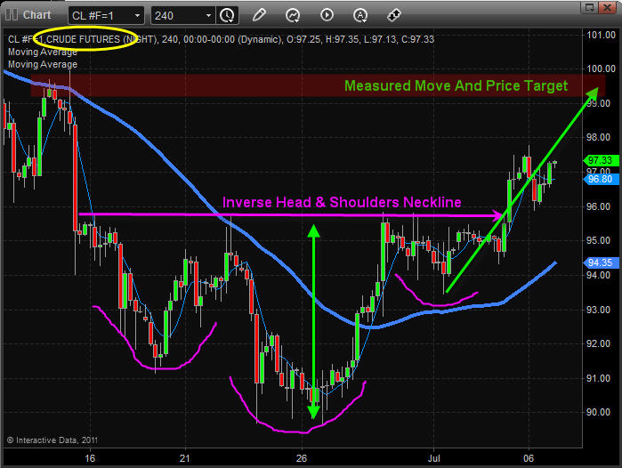
Crude Oil 4 Hour Futures Chart:
This chart shows the inverse head and shoulders pattern which formed over the past couple weeks. Simple analysis provides us with a short term bullish pattern and price target.

Mid-Week Trading Conclusion:
In short, I feel the US dollar is about to start heading lower once again and that will help boost stocks and commodities. Most stocks and commodities are trading just under key resistance levels so the next couple trading sessions are important. We need to see another push higher for these resistance levels to be taken out. If that happens then the sky is the limit for the next rally.

Also, I would like to see the energy and financial sectors start to rally here and Also we need to see the US dollar head back down in the coming sessions.

If you would like to receive these free weekly updated in your inbox please opt-in to my newsletter here: http://www.thegoldandoilguy.com/trade-money-emotions.php

Chris Vermeulen
I hope you fellow Canadians had a great Canada Day long weekend and Happy Independence Day to those south of the boarder!

A couple weeks back on June 19th I posted my analysis on how the stock market was bottoming and that we needed a couple key sectors to participate before we would get a solid bounce. You can quickly review the charts here if you like: http://www.thegoldandoilguy.com/articles/stock-market-flashing-a-buy-signal/ .

Today’s report plays directly off the June 19th analysis showing you the price movement from then on.

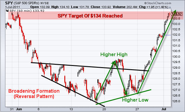
SP500 – SPY ETF Daily Chart
As you can see during early June the market became volatile with a broadening formation. This type of price action is an early warning that a trend reversal is near. It was only two days later when we saw stocks make a new high, which is the first ingredient for a trend reversal to take place. But once a higher high was made sellers quickly jumped back into the market pulling price back down. Keep in mind the higher high which was made was another early sign that a trend reversal was likely to happen.

During this time I was watching the charts like a hawk keeping a close eye on the time and sales window which I have filtered to show me only orders with a market value of $3million dollar or larger. This helps me keep a close eye on what the big money players are doing… Following their coat tails if done correctly will help keep you out of the market at times and also gets you in before the masses jump on the wagon.

The two key sectors I talked about on June 19th were the Financials and Tech. Both these sectors must move up if we are to get a decent bounce/rally in the market.

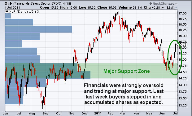
Financial Sector Daily Chart:
By zooming out on the daily chart we can see in terms of both price and volume that the financial sector was at a major support level. Also it had just fallen sharply for more than a week making it oversold and ready for a bounce.

Only a couple days later financial stocks rocketed 11% higher as expected and the broad market (SP500) posted some decent gains for us also.

Let’s take a look at the financial sector:
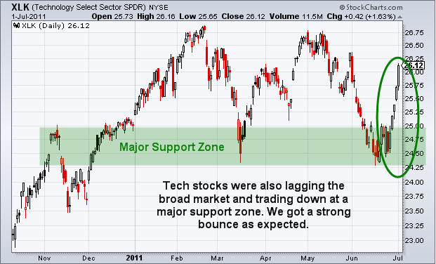
The tech sector was in the same boat as the financials above… Tech stocks jumped an average 6%.

Weekend Trading Conclusion:
In short, I feel the market has shown us some decent upward momentum and everything is now at the point where a pause is likely. I expect some type of pause or pullback in the coming week and then the market has a major decision to make. Will it continue and start a new leg higher or roll over and die… That’s the next key question/action about to take shape and I will help guide you through these times each day with my pre-market morning video analysis.

Get my Daily Pre-Market Trend Trading Videos, intraday updates and weekly market reports for at a big discount for July 4th only: http://www.thegoldandoilguy.com/4julyspecial.php

Chris Vermeulen